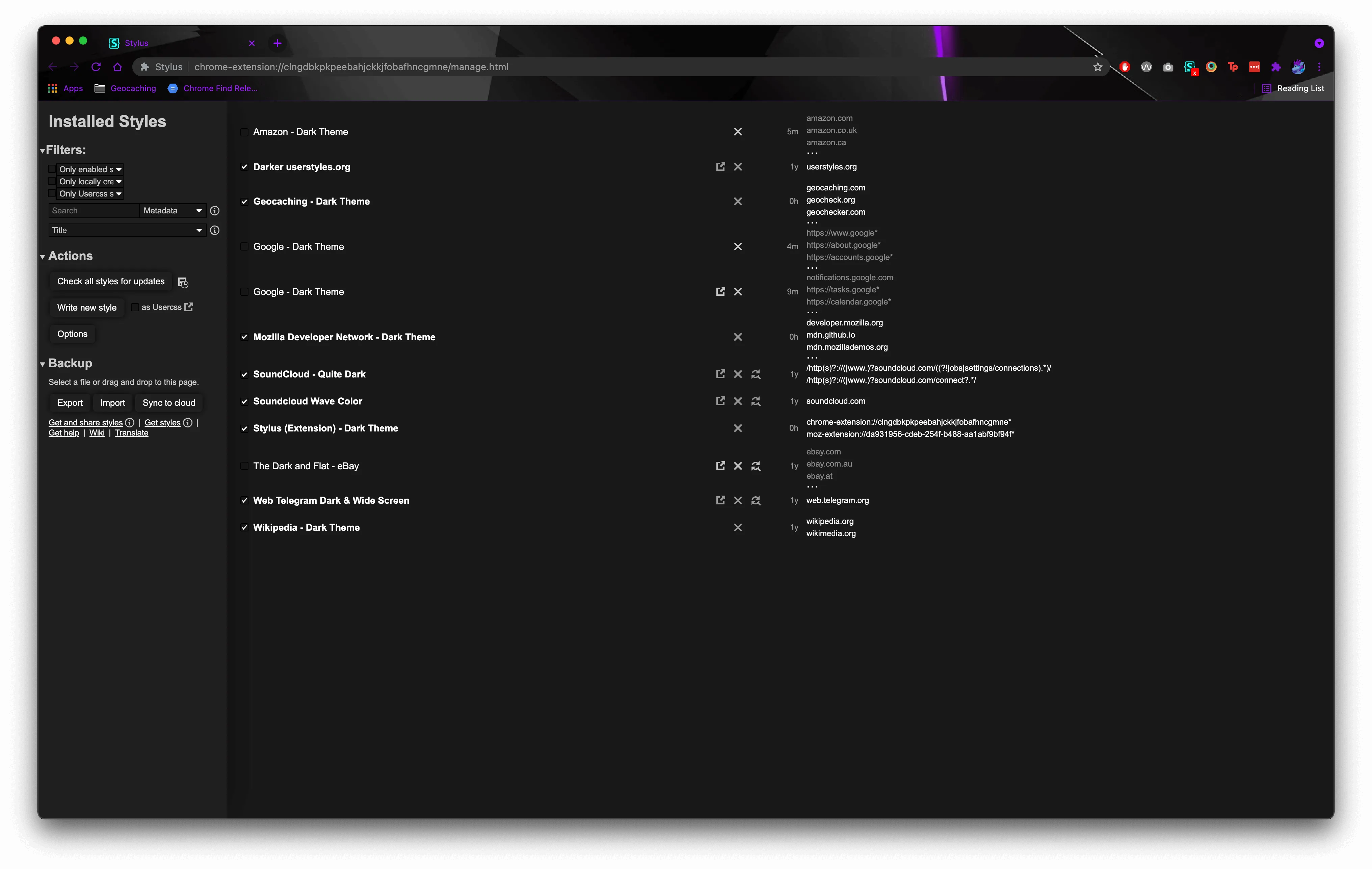
A dark theme for the Stylus extension, compatible with Chrome/Edge, Opera, and Firefox editions. Colors are adjustable via the variables set on :root. https://www.queengoob.org/darkthemes
Stylus (Extension) - Dark Theme by queengooborg
Imported and mirrored from https://github.com/queengooborg/darkthemes/raw/main/themes/stylus/stylus.user.css
Details
Authorqueengooborg
LicenseGPL-3.0
Categorystylus
Created
Updated
Size4.9 kB
Statistics
Learn how we calculate statistics in the FAQ.
Failed to fetch stats.
Description
Notes
Userstyle doesn't have notes.Source code
/* ==UserStyle==
@name           Stylus (Extension) - Dark Theme
@namespace      queengooborg
@author         Vinyl Da.i'gyu-Kazotetsu [https://queengoob.org]
@description    A dark theme for the Stylus extension, compatible with Chrome/Edge, Opera, and Firefox editions.  Colors are adjustable via the variables set on :root.  https://www.queengoob.org/darkthemes
@version        1.1.2
@license        GPL-3.0
==/UserStyle== */
@-moz-document url-prefix("chrome-extension://clngdbkpkpeebahjckkjfobafhncgmne"), url-prefix("chrome-extension://kdinfijomkigjcjcbigolloleeiianaif"), url-prefix("moz-extension://da931956-cdeb-254f-b488-aa1abf9bf94f") {
    /* -=- Root Colors -=- */
    :root {
        --background: #181818;
        --background-2: #202020;
        --background-3: #303030;
        --foreground: #ccc;
        --foreground-2: white;
        --foreground-3: #bbb;
        --foreground-black: black;
        --main: #2f6f64;
        --error: #ec0404;
        --border: #505050;
        --update-bg: #332e00;
        --update-border: #4e4618;
        --update-ready-bg: #003327;
        --update-ready-border: #3f8d8b;
    }

    /* -=- Styling -=- */
    #header, #backup-buttons .dropdown-content a:hover {
        color: var(--foreground) !important;
        background: var(--background-2) !important;
        border-style: none !important;
    }

    input, #backup-buttons .dropdown-content, select {
        background-color: var(--background) !important;
        color: var(--foreground) !important;
        border: 1px solid #000000 !important;
    }

    #installed::after {
        background-color: var(--background) !important;
    }

    button {
        background: var(--background-2) !important;
        border: 4px solid var(--background-2) !important;
        margin: 2px !important;
        color: var(--foreground-2) !important;
        border-radius: 5px !important;
        box-shadow: 0px 0px 10px 0px rgba(0, 0, 0, 0.82) !important;
    }

    button:hover {
        background: var(--background) !important;
        border: 4px solid var(--background) !important;
        color: var(--foreground-2) !important;
        border-radius: 5px !important;
    }

    body {
        color: var(--foreground-2) !important;
        background: var(--background) !important;
    }

    a, a:visited {
        color: var(--foreground-2) !important;
    }

    select {
        width: 100px !important;
    }

    #save-button:after {
        content: 'd' !important;
    }

    body.dirty #save-button:after {
        content: '?' !important;
    }

    #message-box > div, #message-box-buttons, #message-box-title {
        background-color: var(--background-2) !important;
    }

    .newUI .entry:nth-child(2n) {
        background-color: var(--background) !important;
    }

    .svg-icon:hover, .newUI .entry:hover .svg-icon:hover, input[type="checkbox"]:not(.slider):checked + .svg-icon.checked, .svg-icon.select-arrow {
        fill: var(--foreground-2) !important;
    }

    #message-box.danger #message-box-title {
        background-color: var(--error) !important;
    }

    .newUI .no-update:not(.update-problem):not(.update-done) .up-to-date, .newUI .can-update .update {
        color: var(--foreground-white);
    }

    #help-popup {
        background-color: var(--background) !important;
    }

    .CodeMirror {
        -moz-box-shadow: inset 0 0 20px rgba(0, 0, 0, 0.35) !important;
        -webkit-box-shadow: inset 0 0 20px rgba(0, 0, 0, 0.35) !important;
        box-shadow: inset 0 0 20px rgba(0, 0, 0, 0.35) !important;
        background: var(--background-2) !important;
        color: var(--foreground-3) !important;
        line-height: 1.4em !important;
        font-size: 13px !important;
        height: 70%;
        outline: transparent !important;
        border: 1px solid var(--border) !important;
    }

    #hotkey-info div:first-child, #hotkey-info div, #hotkey-info[data-active] {
        background-color: var(--background-2);
        border: solid 2px var(--background-2);
    }

    #confirm > div, .menu-items-wrapper {
        background-color: var(--background-2);
        border: solid 2px rgba(0, 0, 0, 0.52);
    }

    #options {
        background-color: var(--background-2);
    }

    #options-title {
        background-color: var(--main);
    }

    #options-close-icon .svg-icon, .svg-icon, .svg-icon.info:hover, .svg-icon.settings:hover {
        fill: var(--foreground);
    }

    .newUI .updater-icons > :not(.check-update):after {
        border-color: var(--update-border);
        background-color: var(--update-bg);
    }

    .newUI .can-update:not([data-details$="locally edited"]) .update:after {
        border-color: var(--update-ready-border);
        background-color: var(--update-ready-bg);
    }

    .cm-s-midnight span.cm-tag {
        /* Default theme's contrast is too low */
        color: #8484ff;
    }
}