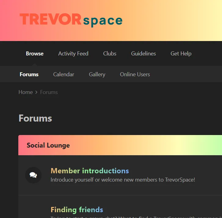
Adds this rainbow gradient everywhere.
Trevorspace Pride Gradient by pretzelvin_bin
Details
Authorpretzelvin_bin
LicenseNo License
Categorytrevorspace
Created
Updated
Size5.2 kB
Statistics
Learn how we calculate statistics in the FAQ.
Failed to fetch stats.
Description
Notes
If you find any colors out of place or want to request a style, dm me anywhere you can find me (put preferably on trevorspace) or comment on the forum thread, which I have linked as the homepage.
LAST UPDATED 7/16/2022: fixes live update stuff and the "found saved text" in the editor. added --default-normal-color or whatever it's called
Source code
/* ==UserStyle==
@name         Trevorspace Pride Gradient
@version      20221219.20.06
@namespace    userstyles.world/user/pretzelvin_bin
@description  Adds this rainbow gradient everywhere.
@author       pretzelvin_bin
@license      No License
==/UserStyle== */

@-moz-document url-prefix("https://www.trevorspace.org/") {
/* TREVORSPACE PRIDE GRADIENT */

/*
last update: fixes mention styles
to fix --- a bunch of private messaging styles
*/

:root {
    /* IF YOU DON'T LIKE THAT THE BRIGHT PURPLE IS THE BASIC COLOR JUST CHANGE IT */
    --default-normal-color: #fca2f9;
    --default-normal-rgb:  252, 162, 249;
    /* make sure that that ^ is the rgb code for the default normal color */
}

:root {
    --theme-page_background: var(--dark-gray);
    --rainbow-gradient: to right, #ff7383,#ffb973,#fffdb8,#8fff9e,#78aeff,#fca2f9;
    --short-rainbow: to right, #ffb973,#8fff9e,#78aeff;
    --theme-text_color: var(--light-text);
    --dark-gray: 33, 33, 33;
    --light-text:245, 245, 245;
    --theme-main_nav_font: var(--light-text);
    --theme-header_text: var(--dark-gray);
    --theme-section_title_font:var(--dark-gray);
    --theme-area_background_reset:42, 42, 42;
    --theme-area_background: 50, 50, 50;
    --theme-text_light:166, 166, 166;
    --theme-main_nav_tab_font: var(--theme-text_color);
    --theme-main_nav_tab:var(--theme-area_background_reset);
    --theme-important_button_font: var(--dark-gray);
    --theme-very_light_button: 110, 110, 110;
    --theme-area_background_light: var(--theme-area_background);
    --theme-text_dark: 245, 245, 245;
    --theme-timeline_color: 105, 105, 105;
    /* --positive-dark - the color of announcements at the top of the screen */
    --positive-dark: var(--default-normal-color);
    --theme-featured: var(--default-normal-rgb);
    --theme-active_input_border: var(--theme-featured);
    --theme-item_status: var(--default-normal-rgb);
    --theme-button_bar: var(--theme-area_background);
    --theme-pagination_active: var(--theme-featured);
    --theme-mentions: /* yes it's important that this is nothing */;
    --theme-area_background_dark: var(--default-normal-rgb);
    --theme-selected: 60, 60, 60;
}
#ipsLayout_header header {
    /* behind the ts logo */
    background-image: linear-gradient(var(--rainbow-gradient));
}
#ipsLayout_header nav {
    /* browse, activity feed, clubs */
    background: rgb( var(--dark-gray))
}
#ipsLayout_header nav::after {
    /* forums calender gallery */
    background: rgb(var(--theme-area_background_reset));
}
a{
    color: rgb(var(--theme-text_color));
}
.ipsItemStatus.ipsItemStatus_large{
    background-color: rgb(33, 33, 33);
}
.ipsWidget_title , .ipsMessage_info , .ipsType_sectionTitle{
    background-image: linear-gradient(var(--rainbow-gradient));
}
.ipsMessage_info{
    color: rgb(var(--dark-gray))
}
ul.ipsDataItem_subList.ipsList_inline > li > a , span strong , .ipsType_pageTitle{
    color: rgb(189, 189, 189);
}
.ipsType_medium.ipsType_reset > strong > a , h4.ipsDataItem_title.ipsType_break a{
    background-image: linear-gradient(var(--short-rainbow));
    -webkit-background-clip: text;
    color:transparent;
}
.ipsButton_important{
    background-image: linear-gradient(var(--short-rainbow)) !important;
}
li.ipsDataItem_lastPoster__title a{
    filter: brightness(100);
}
.ipsMenu_title{
    color: rgb(var(--theme-text_color));
}
#elProfileStats , .ipsTabs , #elClubControls{
    background-image: linear-gradient(var(--rainbow-gradient));
    color: rgb(var(--dark-gray));
}
.ipsType_minorHeading{
    color:rgb(110, 110, 110);
}
a:hover{
    color: var(--default-normal-color);
}
.cAuthorPane_author{
    background-image: linear-gradient(var(--rainbow-gradient));
    -webkit-background-clip: text;
    color:transparent;
}
.ipsApp .cke_top {
    background-color: rgb(var(--light-text));
    border-radius: 10px;
}
.ipsBadge_positive, .ipsBadge_style4 {
    background: rgba(var(--theme-area_background_reset), 0.9);
}
div.cClubCard  > div.ipsPad > a{
    background: rgb(var(--dark-gray));
    color: rgb(var(--light-text))
}
#ipsMultiQuoter{
    background: rgb(var(--theme-area_background_reset))
}
.ipsComposeArea_editorPaste{
    border-radius: 5px;
    /* the sharp corners were bothering me personally */
}
.ipsLiveActivity {
    background: var(--default-normal-color);
    color: rgb(var(--dark-gray));
}
.ipsType_pageTitle [data-role="editableTitle"]:hover, .ipsType_pageTitle[data-role="editableTitle"]:hover, .ipsType_editable:hover{
    background: none !important;
}
.ipsType_richText.ipsContained > p > a:before{
    content: "☆"
}
a[data-mentionid] {
    /* mentions */
    color: rgba(var(--theme-area_background));
    background-image: linear-gradient(var(--short-rainbow));
}
a[data-mentionid]:hover{
    /*mentions hover*/
    color: rgba(var(--theme-text_color));
    background-image: linear-gradient(var(--short-rainbow));
}
p{
    background-color: transparent !important
}
}

@-moz-document url("https://www.trevorspace.org/guidelines/") {
/* fixes the guidelines page */
b span , span b , strong{
    background-image: linear-gradient(var(--rainbow-gradient));
    -webkit-background-clip: text;
    color:transparent !important;
}
}