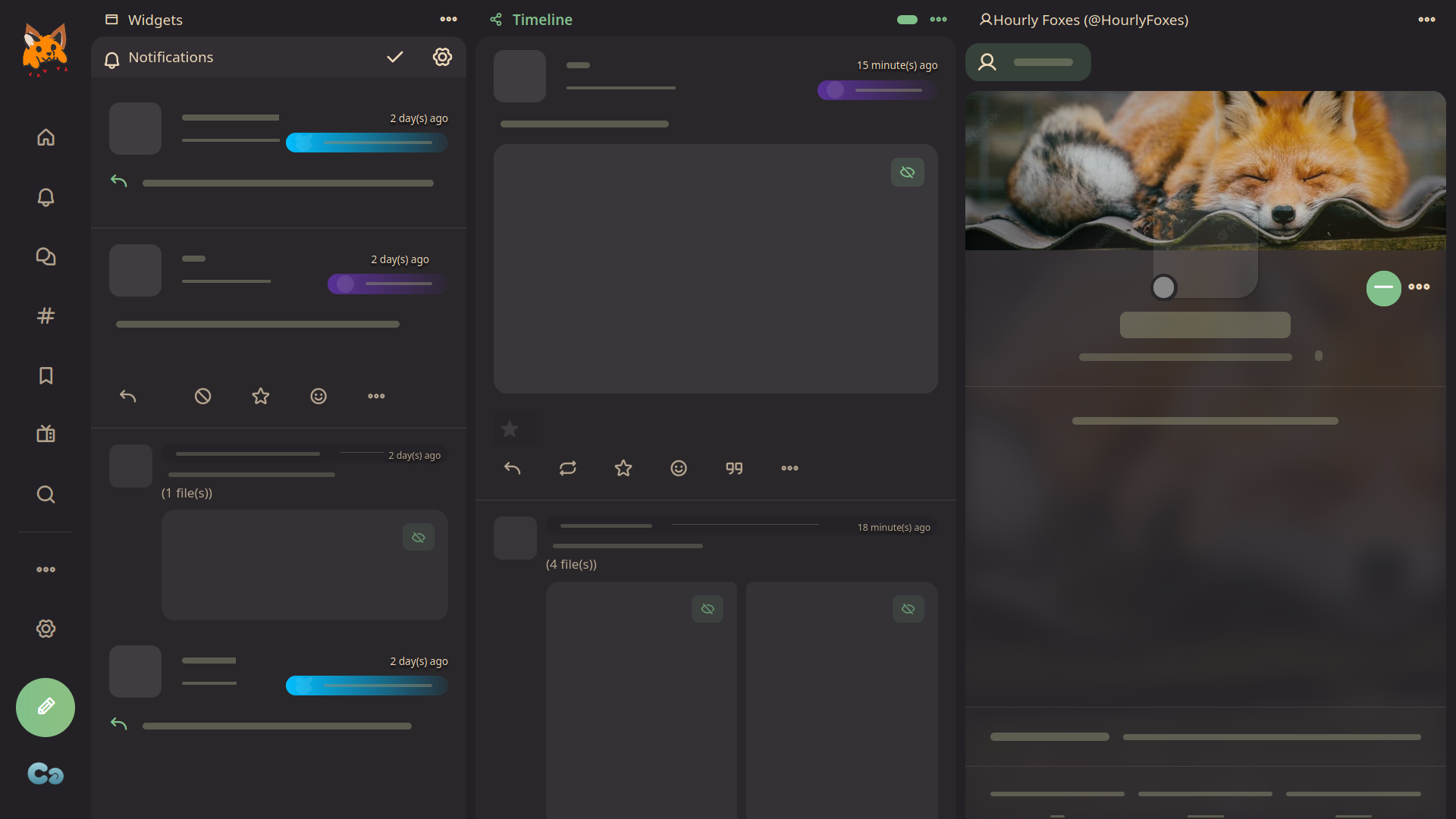
A collection of tweaks for Firefish
Firefish Tweaks by Freeplay
Imported and mirrored from https://codeberg.org/Freeplay/UserStyles/raw/branch/main/calckey/tweaks.user.css
Details
AuthorFreeplay
LicenseNo License
CategoryMisskey
Created
Updated
Size8.0 kB
Statistics
Learn how we calculate statistics in the FAQ.
Failed to fetch stats.
Description
Notes
Userstyle doesn't have notes.Source code
/* ==UserStyle==
@name           Firefish Tweaks
@version        2.0.1
@description    A collection of tweaks for Firefish
@preprocessor   stylus

@namespace      Freeplay
@author         Freeplay (https://freeplay.codeberg.page/)
@homepageURL    https://codeberg.org/Freeplay/UserStyles
@supportURL     https://codeberg.org/Freeplay/UserStyles/issues

@var checkbox hideBorders "Hide borders" 0
@var checkbox fadeHeader "Faded header" 0
@var checkbox unfixImg	"Media: Auto Height (if you're okay with content jumping)" 0
@var checkbox plyrMenu  "Video Player: Browser controls on right click" 1
@var checkbox reactionOutline "Reactions: Harsher outline" 1

@var range    tlWidth   "Timeline: Width (max = full-width)" [800, 600, 1000, 50, "px"]
@var range    centeredWidth "Centered UI: Center column width" [800, 600, 1000, 50, "px"]
@var checkbox altDeck	"Deck UI: Alternative Design" 1
@var checkbox hideDeck	"Deck UI: Hide controls" 1
@var range    columnMin	"Deck UI: Columns Minimum Width (enable flexible column)" [330, 330, 1000, 10, "px"]
@var range    columnMax	"Deck UI: Columns Maximum Width (enable flexible column)" [600, 330, 1000, 10, "px"]
==/UserStyle== */

#firefish_app, #iceshrimp_app {
bg() {
	content ""
	position absolute
	inset 0
}


[style="max-width: 800px;"], .gbhvwtnk .main {
	max-width tlWidth !important
	if tlWidth == 1000 {
		max-width unset !important
	}
}

.centered {
	> .contents {
		width centeredWidth
	}
}

.column[style^="flex: 1 1 0%"] {
	min-width columnMin !important
	max-width columnMax
	flex-grow 999999 !important
}

if altDeck {
	.mk-deck {
		--navBg transparent
		--X14 transparent

		&::before, &::after {
			content ""
			flex 1 9999 0px !important
		}
		> div:first-child {
			position sticky !important
			left 0
			backdrop-filter blur(20px)
			z-index 2

			.body {
				position static
			}
			&::before {
				content ""
				position absolute
				inset 0
				background var(--bg)
				z-index -1
				opacity .8
			}
		}
		> .main {
			// flex-grow 0 !important
			// width max-content !important
			display contents !important
		}
		.columns {
			// padding-left 4px
			margin-left -80px
			padding-left 80px
			flex-grow 0 !important
			width max-content !important
			// width max-content
			display contents !important
		}
		.column {
			border 0 !important
			margin-left 0 !important
			margin-right 8px !important
			display flex
			flex-direction column
			overflow visible !important
			background none !important
			&.paged {
				background none !important
			}
			> header, > section > header {
				height 30px !important
				background none !important
				align-items center
				overflow visible !important
				padding-inline var(--radius) !important
				box-shadow none
				// text-shadow 0 0 4px var(--bg), 0 0 2px var(--bg), 0 0 4px var(--bg) ,0 4px 4px var(--bg)
				.menu {
					transform rotate(90deg)
				}
				&.indicated {
					box-shadow none

					* {
						color var(--accent) !important
					}
					font-weight 600
					._button {
						order 2
					}
					&::after {
						content ""
						width 20px
						height 8px
						background-color var(--accent)
						border-radius 100px
					}
				}
				.header {
					align-items center !important
					display flex !important
					overflow visible
					i {
						font-size 1em !important
					}
				}

			}
			> section {
				--deckColumnHeaderHeight 30px
				&:not(:last-child) {
					border-radius var(--radius) !important
				}
				> header {
					button {
						width 42px
					}
				}
			}
			> header {
				margin-top 2px
			}
			> header + div {
				border-radius var(--radius) var(--radius) 0 0 !important
				height 0 !important
				flex-grow 1 !important

				box-shadow 0 2px 4px rgba(0,0,0,0.04)

				[style="padding: 12px;"], > div {
					padding 0px !important
				}
				&, & > div {
					// background var(--bg)
					// overflow clip
					[style="padding: 20px;"] {
						background var(--bg)
						border-radius var(--radius)
					}
				}
			}
			.main._gap {
				&, & > ._gap {
					margin-top 0 !important
				}

			}
			[data-sticky-container-header-height] {
				width 800px
				margin auto
				max-width 100%
			}
			header + div > div > [style*="position: sticky; top: var(--stickyTop"] {
				> div {
					border 0 !important
				}
				border-radius var(--radius)
				overflow clip
				.highlight {
					inset-block 6px !important
					height unset
					border-radius var(--radius)
					z-index -1
					opacity .2
				}
				.active {
					font-weight 600
				}
				button {
					display inline-flex !important
					align-items center
				}

				& + div {
					height 0
					overflow-y auto
					flex-grow 1
					--stickyTop 0 !important
					border-radius var(--radius) var(--radius) 0 0

				}
			}
			.banner::after {

				// content unset !important
				top 100px !important
				border-radius var(--radius) var(--radius) 0 0 !important
			}

		}
		.sideMenu {
			// margin-left 0 !important
			order 2
		}
	}
}


if unfixImg {
	.grid-container {
		margin-block .7em !important
		padding 0
	}
	.grid-container::before {
		content: unset !important
	}
	.grid-container > div {
		position static !important
		height auto !important
		max-height 80vh !important
		min-height 100px
		border-radius var(--radius)
		padding 0 !important
		overflow clip
	}
}

// Hide deck menu until hovering
if hideDeck {
	.sideMenu {
		transition width .2s, opacity .1s .15s
	}
	.sideMenu:not(:hover) {
		width 1px !important
		overflow hidden
		opacity 0
		transition width .2s .1s, opacity .2s
	}
}

if plyrMenu {
	.plyr__video-wrapper {
		pointer-events: none;
	}
	video {
		pointer-events: all;
	}
}

if reactionOutline {
	.mk-emoji.icon {
		s = .5px
		filter drop-shadow(0 1px 2px rgba(0,0,0,0.04)) \
				drop-shadow(s 0 var(--panel)) \
				drop-shadow(0 s var(--panel)) \
				drop-shadow((- s) 0 var(--panel)) \
				drop-shadow(0 (- s) var(--panel)) !important
	}
}

if hideBorders {
	/* make sure the profile banner isn't clipped */
	.sidebar .body, .sidebar {
		overflow: visible !important;
		contain: unset !important;
		z-index: 1001 !important;
	}
	/* side borders */
	.dkgtipfy > .contents {
		border: 0 !important;
	}
	/* disable gaps in timeline to apply */
	.sqadhkmv.noGap {
/* 		^[0] #maincontent ^[1..-1] {
			background none !important
		} */
		> :not(:last-child) {
			border 0
			border-bottom 2px solid var(--bg) !important
/* 			^[0] #maincontent ^[1..-1]  {
				background var(--panel)
				border 0 !important
				margin-bottom 2px !important
			} */
		}
	}
	/* header */
	.fdidabkb {
		&::before {
			border 0 !important
		}
	}
	.sidebar:not(.iconOnly) .banner {
		pointer-events: none;
		top: -20% !important;
		mask: radial-gradient(farthest-side at top,hsl(0,0%,0%) 0%,hsla(0,0%,0%,.987) .3%,hsla(0,0%,0%,.951) 1.4%,hsla(0,0%,0%,.896) 3.2%,hsla(0,0%,0%,.825) 5.8%,hsla(0,0%,0%,.741) 9.3%,hsla(0,0%,0%,.648) 13.6%,hsla(0,0%,0%,.55) 18.9%,hsla(0,0%,0%,.45) 25.1%,hsla(0,0%,0%,.352) 32.4%,hsla(0,0%,0%,.259) 40.7%,hsla(0,0%,0%,.175) 50.2%,hsla(0,0%,0%,.104) 60.8%,hsla(0,0%,0%,.049) 72.6%,hsla(0,0%,0%,.013) 85.7%,hsla(0,0%,0%,0) 100%) !important;
		-webkit-mask: radial-gradient(farthest-side at top,hsl(0,0%,0%) 0%,hsla(0,0%,0%,.987) .3%,hsla(0,0%,0%,.951) 1.4%,hsla(0,0%,0%,.896) 3.2%,hsla(0,0%,0%,.825) 5.8%,hsla(0,0%,0%,.741) 9.3%,hsla(0,0%,0%,.648) 13.6%,hsla(0,0%,0%,.55) 18.9%,hsla(0,0%,0%,.45) 25.1%,hsla(0,0%,0%,.352) 32.4%,hsla(0,0%,0%,.259) 40.7%,hsla(0,0%,0%,.175) 50.2%,hsla(0,0%,0%,.104) 60.8%,hsla(0,0%,0%,.049) 72.6%,hsla(0,0%,0%,.013) 85.7%,hsla(0,0%,0%,0) 100%) !important;
		width: 125% !important;
		left: -12.5% !important;
		height: 145% !important;
	}
}

if fadeHeader {
	.fdidabkb {
		overflow visible !important
		backdrop-filter none !important
		&::before {
			backdrop-filter blur(12px)
		}
		&::before, &::after {
			border 0 !important
			bottom -30px !important
			pointer-events none
			mask linear-gradient(to bottom, var(--gradient)),
					 linear-gradient(to bottom, var(--gradient))
		}
	}
}


}