Colour themes for the new Material You–styled Google Drive.
M3 Themes for Google Drive by winghongchan
Details
Authorwinghongchan
LicenseGPL-3.0-or-later
Categorygoogle
Created
Updated
Code size31 kB
Code checksum7b250d31
Statistics
Learn how we calculate statistics in the FAQ.
Failed to fetch stats.
Description
Notes
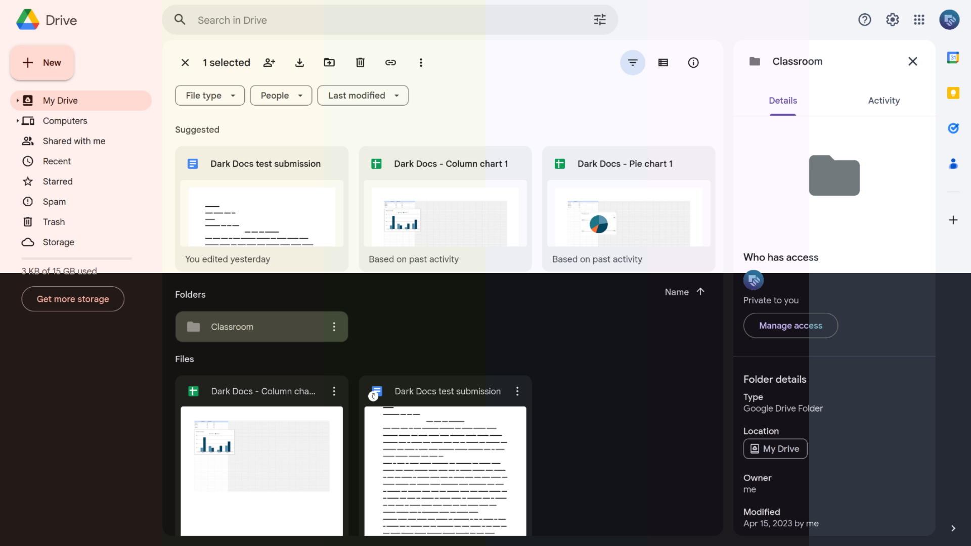
This userstyle lets you change the colours in Google Drive similar to how you can change themes in Android 12 and up.
Included colour themes: red, orange, yellow, green, blue, violet, and nord
Each theme supports light and dark modes.
Latest updates
-
2024.05.13
- Fixed a lot of stuff (I apologize for my 5 month disappearance).
- Removed this userstyle’s own light/dark/auto switcher. M3 Themes for Google Drive now uses Google Drive’s own theme selector (from drive.google.com, go to ⚙️ → Settings → Appearance).
- Nord theme looks a little better now.
- Some things don’t follow your selected colour theme, and these will be fixed in the coming updates. However, since M3 Themes for Google Drive now uses Google Drive’s light/dark mode selector, you shouldn’t see too many bright eyesores in dark mode and vice versa.
-
2023.12.17
- Made the text buttons in the out of storage banner legible.
- Fixed the background for the Google Workspace account area.
-
2023.07.21
- Search bar fix. Should be more resilient to randomly changing class names now.
- The “Clear all” button that appears when using filter chips is now legible in dark themes.
Browser-specific notes
No known compatibility issues with supported versions of major browsers.
Source code
Source code has over 10K characters, so we truncated it. You can inspect the full source code on install link./* ==UserStyle==
@name M3 Themes for Google Drive
@namespace userstyles.world/user/winghongchan
@version 2024.05.13
@description Colour themes for the new Material You–styled Google Drive.
@author Walter winghongchan
@supportURL https://github.com/winghongchan/m3-themer-gdrive/issues
@license GPL-3.0-or-later
@preprocessor less
@var select dynamic-colour-theme "Colour theme" ["Red", "Orange", "Yellow", "Green", "Blue", "Violet", "Nord*"]
==/UserStyle== */
// Please note
// If you change things in the configuration dialog, you may have to turn M3 Themable Google Drive off and on again to apply changes.
@-moz-document url-prefix("https://drive.google.com/drive/"), regexp("https:\\/\\/drive\\.google\\.com.*\\/odp\\/embed\\?host_context=CAgSGCICIAEqAggBMgoIARABGAEgASgBOAFIARohZHJpdmUud2ViLWZyb250ZW5kXzIwMjMwN.*&origin=https%3A%2F%2Fdrive.google.com&odbc=1&online=1") {
// Recolouring
.light-theme() when (@dynamic-colour-theme = Red) {
--m3themer-primary: #a03f28;
--m3themer-on-primary: #ffffff;
--m3themer-primary-container: #ffdad2;
--m3themer-on-primary-container: #3d0700;
--m3themer-secondary: #7a564d;
--m3themer-on-secondary: #ffffff;
--m3themer-secondary-container: #ffdad2;
--m3themer-on-secondary-container: #2e150e;
--m3themer-tertiary: #6e5d28;
--m3themer-on-tertiary: #ffffff;
--m3themer-tertiary-container: #f9e09f;
--m3themer-on-tertiary-container: #241a00;
--m3themer-error: #ba1a1a;
--m3themer-on-error: #ffffff;
--m3themer-error-container: #ffdad6;
--m3themer-on-error-container: #410002;
--m3themer-background: #FFF8F6;
--m3themer-on-background: #201a19;
--m3themer-surface-dim: #E8D6D2;
--m3themer-surface: #FFF8F6;
--m3themer-surface-bright: #FFF8F6;
// The HCT color picker at https://www.figma.com/community/plugin/1227923985322908257/HCT-color-picker was very useful in this. Turns out, HCT stands for hue, chroma, tone and is what the Material Design website means when they refer to different tones. HCT is a new colour system Google invented. I’m adopting it mostly so the dark theme looks better with the surface bright role.
--m3themer-surface-container-lowest: #FFFFFF;
--m3themer-surface-container-low: #FFF0ED;
--m3themer-surface-container: #FCEAE6;
--m3themer-surface-container-high: #F7E4E0;
--m3themer-surface-container-highest: #F1DFDB;
--m3themer-on-surface: #201a19;
--m3themer-on-surface-variant: #534340;
--m3themer-inverse-surface: #362f2d;
--m3themer-inverse-on-surface: #fbeeeb;
--m3themer-outline: #85736f;
--m3themer-outline-variant: #d8c2bd;
}
.light-theme() when (@dynamic-colour-theme = Orange) {
// Generated by the Material Theme Generator https://m3.material.io/theme-builder
// Using this image: https://unsplash.com/photos/ZwPuquZBnyM
--m3themer-primary: #7c563f;
--m3themer-on-primary: #ffffff;
--m3themer-primary-container: #ffdbc9;
--m3themer-on-primary-container: #2f1504;
--m3themer-secondary: #695c54;
--m3themer-on-secondary: #ffffff;
--m3themer-secondary-container: #f2dfd5;
--m3themer-on-secondary-container: #231914;
--m3themer-tertiary: #615f4c;
--m3themer-on-tertiary: #ffffff;
--m3themer-tertiary-container: #e7e3cb;
--m3themer-on-tertiary-container: #1d1c0d;
--m3themer-error: #ba1a1a;
--m3themer-on-error: #ffffff;
--m3themer-error-container: #ffdad6;
--m3themer-on-error-container: #410002;
--m3themer-background: #FFF8F5;
--m3themer-on-background: #221A15;
--m3themer-surface-dim: #E7D7CF;
--m3themer-surface: #FFF8F5;
--m3themer-surface-bright: #FFF8F5;
--m3themer-surface-container-lowest: #FFFFFF;
--m3themer-surface-container-low: #FFF1EA;
--m3themer-surface-container: #FCEAE2;
--m3themer-surface-container-high: #F6E5DD;
--m3themer-surface-container-highest: #F0DFD7;
--m3themer-on-surface: #221A15;
--m3themer-on-surface-variant: #4c4542;
--m3themer-inverse-surface: #1A120D;
--m3themer-inverse-on-surface: #F0DFD7;
--m3themer-outline: #7e7572;
--m3themer-outline-variant: #cfc4c0;
}
.light-theme() when (@dynamic-colour-theme = Yellow) {
--m3themer-primary: #626033;
--m3themer-on-primary: #ffffff;
--m3themer-primary-container: #e9e5ac;
--m3themer-on-primary-container: #1e1d00;
--m3themer-secondary: #605f51;
--m3themer-on-secondary: #ffffff;
--m3themer-secondary-container: #e6e3d1;
--m3themer-on-secondary-container: #1d1c11;
--m3themer-tertiary: #52625a;
--m3themer-on-tertiary: #ffffff;
--m3themer-tertiary-container: #d5e7dc;
--m3themer-on-tertiary-container: #101e18;
--m3themer-error: #ba1a1a;
--m3themer-on-error: #ffffff;
--m3themer-error-container: #ffdad6;
--m3themer-on-error-container: #410002;
--m3themer-background: #FDF9EC;
--m3themer-on-background: #1c1c19;
--m3themer-surface-dim: #DEDACD;
--m3themer-surface: #FDF9EC;
--m3themer-surface-bright: #FDF9EC;
--m3themer-surface-container-lowest: #FFFFFF;
--m3themer-surface-container-low: #F8F4E6;
--m3themer-surface-container: #F2EEE0;
--m3themer-surface-container-high: #ECE8DB;
--m3themer-surface-container-highest: #E6E2D5;
--m3themer-on-surface: #1c1c19;
--m3themer-on-surface-variant: #484741;
--m3themer-inverse-surface: #31302e;
--m3themer-inverse-on-surface: #f4f0ec;
--m3themer-outline: #797770;
--m3themer-outline-variant: #c9c6be;
}
.light-theme() when (@dynamic-colour-theme = Green) {
--m3themer-primary: #496727;
--m3themer-on-primary: #ffffff;
--m3themer-primary-container: #c9ee9e;
--m3themer-on-primary-container: #0f2000;
--m3themer-secondary: #59614e;
--m3themer-on-secondary: #ffffff;
--m3themer-secondary-container: #dde6cd;
--m3themer-on-secondary-container: #171e0e;
--m3themer-tertiary: #426462;
--m3themer-on-tertiary: #ffffff;
--m3themer-tertiary-container: #c5eae7;
--m3themer-on-tertiary-container: #00201f;
--m3themer-error: #ba1a1a;
--m3themer-on-error: #ffffff;
--m3themer-error-container: #ffdad6;
--m3themer-on-error-container: #410002;
--m3themer-background: #F9FAEF;
--m3themer-on-background: #1b1c18;
--m3themer-surface-dim: #D9DBD0;
--m3themer-surface: #F9FAEF;
--m3themer-surface-bright: #F9FAEF;
--m3themer-surface-container-lowest: #FFFFFF;
--m3themer-surface-container-low: #F3F5E9;
--m3themer-surface-container: #EEEFE4;
--m3themer-surface-container-high: #E8E9DE;
--m3themer-surface-container-highest: #E2E3D8;
--m3themer-on-surface: #1A1C16;
--m3themer-on-surface-variant: #45483f;
--m3themer-inverse-surface: #30312d;
--m3themer-inverse-on-surface: #f2f1eb;
--m3themer-outline: #75786e;
--m3themer-outline-variant: #c5c8bc;
}
.light-theme() when (@dynamic-colour-theme = Blue) {
--m3themer-primary: #255fa4;
--m3themer-on-primary: #ffffff;
--m3themer-primary-container: #d5e3ff;
--m3themer-on-primary-container: #001c3b;
--m3themer-secondary: #555f70;
--m3themer-on-secondary: #ffffff;
--m3themer-secondary-container: #d9e3f8;
--m3themer-on-secondary-container: #121c2b;
--m3themer-tertiary: #6e5675;
--m3themer-on-tertiary: #ffffff;
--m3themer-tertiary-container: #f7d8fe;
--m3themer-on-tertiary-container: #27142f;
--m3themer-error: #ba1a1a;
--m3themer-on-error: #ffffff;
--m3themer-error-container: #ffdad6;
--m3themer-on-error-container: #410002;
--m3themer-background: #F9F9FF;
--m3themer-on-background: #191C20;
--m3themer-surface-dim: #D9DAE0;
--m3themer-surface: #F9F9FF;
--m3themer-surface-bright: #F9F9FF;
--m3themer-surface-container-lowest: #FFFFFF;
--m3themer-surface-container-low: #F3F3FA;
--m3themer-surface-container: #EDEDF4;
--m3themer-surface-container-high: #E7E8EE;
--m3themer-surface-container-highest: #E1E2E9;
--m3themer-on-surface: #191C20;
--m3themer-on-surface-variant: #43474e;
--m3themer-inverse-surface: #2f3033;
--m3themer-inverse-on-surface: #f1f0f4;
--m3themer-outline: #74777f;
--m3themer-outline-variant: #c4c6cf;
}
.light-theme() when (@dynamic-colour-theme = Violet) {
--m3themer-primary: #6750A4;
--m3themer-on-primary: #ffffff;
--m3themer-primary-container: #EADDFF;
--m3themer-on-primary-container: #21005D;
--m3themer-secondary: #625B71;
--m3themer-on-secondary: #ffffff;
--m3themer-secondary-container: #E8DEF8;
--m3themer-on-secondary-container: #1D192B;
--m3themer-tertiary: #7D5260;
--m3themer-on-tertiary: #ffffff;
--m3themer-tertiary-container: #FFD8E4;
--m3themer-on-tertiary-container: #31111D;
--m3themer-error: #B3261E;
--m3themer-on-error: #ffffff;
--m3themer-error-container: #F9DEDC;
--m3themer-on-error-container: #410E0B;
--m3themer-background: #FDF7FF;
--m3themer-on-background: #1D1B20;
--m3themer-surface-dim: #DED8E0;
--m3themer-surface: #FDF7FF;
--m3themer-surface-bright: #FDF7FF;
--m3themer-surface-container-lowest: #FFFFFF;
--m3themer-surface-container-low: #F8F2FA;
--m3themer-surface-container: #F2ECF4;
--m3themer-surface-container-high: #ECE6EE;
--m3themer-surface-container-highest: #E6E0E9;
--m3themer-on-surface: #1D1B20;
--m3themer-on-surface-variant: #49454F;
--m3themer-inverse-surface: #2f3033;
--m3themer-inverse-on-surface: #f1f0f4;
--m3themer-outline: #79747E;
--m3themer-outline-variant: #CAC4D0;
}
.light-theme() when (@dynamic-colour-theme = Nord) {
--m3themer-primary: #00687a;
--m3the...