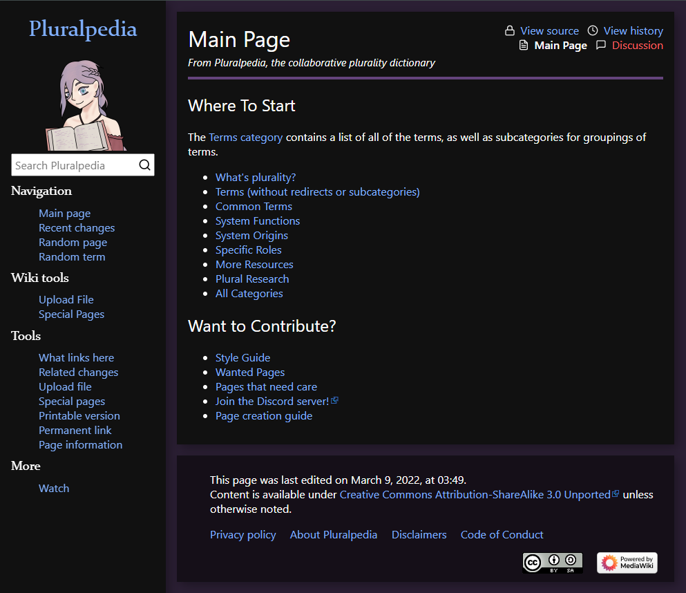
My take on a dark theme for Pluralpedia.
Pluralpedia: Alternate PlurpleDark by vee0ne
Details
Authorvee0ne
LicenseNo License
Categorypluralpedia
Created
Updated
Code size4.5 kB
Code checksum71c7e72
Statistics
Learn how we calculate statistics in the FAQ.
Failed to fetch stats.
Description
Notes
CURRENTLY A WORK IN PROGRESS, but mostly functional.
Source code
/* ==UserStyle==
@name           Pluralpedia: Alternate PlurpleDark
@namespace      github.com/openstyles/stylus
@version        1.0.0
@description    My take on a dark theme for Pluralpedia.
@author         orniidiien
==/UserStyle== */

@-moz-document domain("pluralpedia.org") {
    body {
        color: #FFF;
        background-color: #2b1f34;
    }

    a,
    .oo-ui-popupToolGroup.oo-ui-popupToolGroup-active > .oo-ui-popupToolGroup-handle,
    .oo-ui-listToolGroup-tools .oo-ui-tool-active.oo-ui-widget-enabled .oo-ui-tool-link .oo-ui-tool-title,
    .oo-ui-popupToolGroup.oo-ui-popupToolGroup-active > .oo-ui-popupToolGroup-handle:hover,
    .oo-ui-popupToolGroup-tools .oo-ui-tool-active.oo-ui-widget-enabled .oo-ui-tool-link .oo-ui-tool-title
    {
        color: #81b1ff;
    }

    .oo-ui-tabSelectWidget-frameless .oo-ui-tabOptionWidget.oo-ui-optionWidget-selected,
    .oo-ui-tabSelectWidget-frameless .oo-ui-tabOptionWidget.oo-ui-widget-enabled:hover {
        color: #81b1ff;
        box-shadow: inset 0 -2px 0 0 #81b1ff;
    }

    a:visited {
        color: #cf7fcf;
    }

    a.new {
        color: #ff6161;
    }

    .main-panel,
    #mw-navigation,
    .menu-button,
    .oo-ui-toolbar-bar,
    .oo-ui-popupToolGroup-tools,
    .oo-ui-listToolGroup-tools .oo-ui-tool.oo-ui-widget-enabled:hover {
        background-color: #111;
    }

    .oo-ui-iconElement-icon,
    .oo-ui-indicatorElement-indicator {
        filter: invert(1);
    }

    .oo-ui-image-error.oo-ui-icon-error, .mw-ui-icon-error-error:before {
        filter: invert(0);
    }

    .oo-ui-tool-active > .oo-ui-tool-link > .oo-ui-iconElement-icon,
    .oo-ui-popupToolGroup-handle[aria-expanded="true"] > .oo-ui-iconElement-icon {
        filter: invert(0) brightness(1.9) saturate(0.8) hue-rotate(13deg);
    }

    .oo-ui-toolbar-bar,
    .views svg,
    .ve-ui-specialCharacterPage h3,
    .oo-ui-listToolGroup-tools .oo-ui-tool.oo-ui-widget-enabled:hover,
    #pagehistory li.selected {
        color: #ededed;
    }

    .mw-footer {
        background-color: #150f18;
    }

    header {
        border-bottom: 4px solid #64437c;
    }

    .menu-button,
    .oo-ui-tabOptionWidget {
        color: #ddd;
    }

    .menu-button:hover,
    .menu-button:active,
    .oo-ui-popupToolGroup.oo-ui-widget-enabled > .oo-ui-popupToolGroup-handle:hover,
    .oo-ui-tool.oo-ui-widget-enabled.oo-ui-tool-active > .oo-ui-tool-link,
    .oo-ui-popupToolGroup.oo-ui-popupToolGroup-active > .oo-ui-popupToolGroup-handle,
    .oo-ui-tool.oo-ui-widget-enabled > .oo-ui-tool-link:hover,
    .oo-ui-optionWidget-highlighted,
    .oo-ui-buttonElement-framed.oo-ui-widget-enabled.oo-ui-flaggedElement-primary.oo-ui-flaggedElement-progressive > .oo-ui-buttonElement-button:hover {
        background: #333 !important;
    }

    .oo-ui-processDialog-actions-safe .oo-ui-widget-enabled.oo-ui-iconElement:not(.oo-ui-labelElement) > .oo-ui-buttonElement-button:hover {
        background-color: #333;
        border-right-color: #333;
    }

    .oo-ui-barToolGroup-tools.oo-ui-toolGroup-enabled-tools .oo-ui-tool.oo-ui-widget-disabled.oo-ui-flaggedElement-primary > .oo-ui-tool-link .oo-ui-tool-title,
    .oo-ui-barToolGroup-tools.oo-ui-toolGroup-disabled-tools .oo-ui-tool.oo-ui-flaggedElement-primary > .oo-ui-tool-link .oo-ui-tool-title,
    .oo-ui-buttonElement-framed.oo-ui-widget-disabled > .oo-ui-buttonElement-button {
        color: #333;
    }

    .oo-ui-processDialog-content .oo-ui-window-head, .oo-ui-processDialog-content .oo-ui-window-foot {
        outline: 1px solid #333;
    }

    .menu-popout,
    .oo-ui-popupWidget-popup,
    #pagehistory li.selected{
        background-color: #070707;
    }

    .vcard,
    .thumb {
        background-color: #44314d !important;
    }

    .infobox {
        border: 1px solid #333;
        color: #fff;
    }

    .oo-ui-popupWidget-popup {
        border: 1px solid #333;
    }

    .mw-editsection a {
        color: #7e4e00;
        filter: invert(1);
    }

    .oo-ui-textInputWidget .oo-ui-inputWidget-input {
        background-color: #808080;
    }

    .oo-ui-popupWidget-anchored-top .oo-ui-popupWidget-anchor {
        left: 9px !important;
        filter: invert(0.97)
    }
}