stolen btw
Racks! by mackeylol
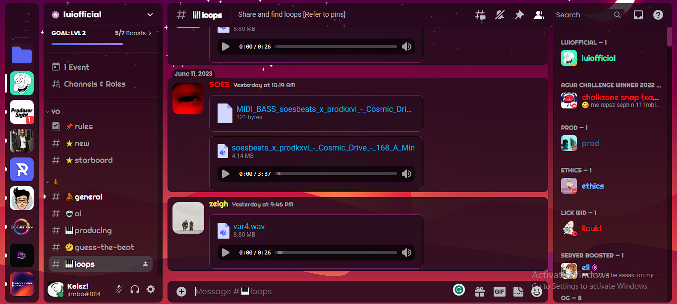
Details
Authormackeylol
LicenseNo License
Categorydiscord
Created
Updated
Code size3.8 kB
Code checksum5daa20c0
Statistics
Learn how we calculate statistics in the FAQ.
Failed to fetch stats.
Description
Notes
Userstyle doesn't have notes.Source code
/* ==UserStyle==
@name         discord.com
@version      20230612.09.03
@namespace    ?
==/UserStyle== */

@-moz-document url-prefix("https://discord.com/") {
/**
 * @name Discord+
 * @author PlusInsta
 * @authorId 309931975102300160
 * @authorLink https://plusinsta.xyz
 * @version 3.2.1
 * @description A sleek, customizable Discord theme.
 * @donate https://ko-fi.com/plusinsta
 * @website https://plusinsta.github.io/discord-plus
 * @source https://github.com/PlusInsta/discord-plus
 * @updateUrl https://plusinsta.github.io/discord-plus/DiscordPlus.theme.css
 * @invite 2Jwh2nS
*/
@import url(https://plusinsta.github.io/discord-plus/src/DiscordPlus-source.theme.css);

/* I've commented most of these values so you can change them yourself. If you're having trouble, or you want to do more than what these values allow for, a volunteer might be able to help you in my server. */

.theme-dark {
/* Backdrop image which is shown behind the app. Can also be an HTML color. Falls back to accent color if invalid.
   To use an image from your computer, upload it somewhere first, copy its link, then paste it below. */
  --dplus-backdrop: url(https://i.imgur.com/3AiL3yN.png);

/* Accent color, used to decorate the UI with colors. */
  --dplus-accent-color-hue: 320;
  --dplus-accent-color-saturation: 60%;
  --dplus-accent-color-lightness: 31%;

/* Foreground color: For things like text and icons. */
  --dplus-foreground-color-hue-base: 210;
  --dplus-foreground-color-hue-links: 197;
  --dplus-foreground-color-saturation-amount: 1;
  --dplus-foreground-color-lightness-amount: 1;

/* Background color: Covers the backdrop so the app is easier to read. */
  --dplus-background-color-hue: 320;
  --dplus-background-color-saturation-amount: 1;
  --dplus-background-color-lightness-amount: 1;
  --dplus-background-color-alpha: 0.8;
}

/* If you use light theme, you can give it unique settings that are separate from dark theme. */
.theme-light {
  --dplus-backdrop: url(https://i.imgur.com/3AiL3yN.png);

  --dplus-accent-color-hue: 320;
  --dplus-accent-color-saturation: 60%;
  --dplus-accent-color-lightness: 31%;

  --dplus-foreground-color-hue-base: 210;
  --dplus-foreground-color-hue-links: 197;
  --dplus-foreground-color-saturation-amount: 1;
  --dplus-foreground-color-lightness-amount: 1;

  --dplus-background-color-hue: 320;
  --dplus-background-color-saturation-amount: 1;
  --dplus-background-color-lightness-amount: 1;
  --dplus-background-color-alpha: 0.8;
}

:root {
/* Fonts */
/* You can use any installed font on your device. */
  --dplus-font-ui: 'Poppins';
  --dplus-font-body: 'Roboto';
  --dplus-font-header: 'Righteous';

/* Round corner sizes, measured in pixel radius.
Set avatar/server radius to 50% to make them circular.
   UI radius must be in pixels, otherwise things break. */
  --dplus-radius-ui: 10px;
  --dplus-radius-avatar: 20%;
  --dplus-radius-server: 20%;

/* This decides how much breathing room there should be between things like buttons and content. */
  --dplus-spacing-ui: 10px;

/* This sets how much space there should be between the app contents and the edges of the window. It also affects the distance between major UI elements, such as the server list to the channel list and channel list to the chat. */
   --dplus-spacing-app: 10px;

/* Size of user and server icons */
--dplus-icon-avatar-chat: 64px;
--dplus-icon-avatar-list: 32px;
--dplus-icon-avatar-profile: 80px;

--dplus-icon-server-sidebar: 48px;
--dplus-icon-server-list: 32px;

/* The Home icon on the top left */
--dplus-icon-home-dark: url(https://plusinsta.github.io/discord-plus/assets/discord/home_dark.svg);
--dplus-icon-home-light: url(https://plusinsta.github.io/discord-plus/assets/discord/home_light.svg);
}

}