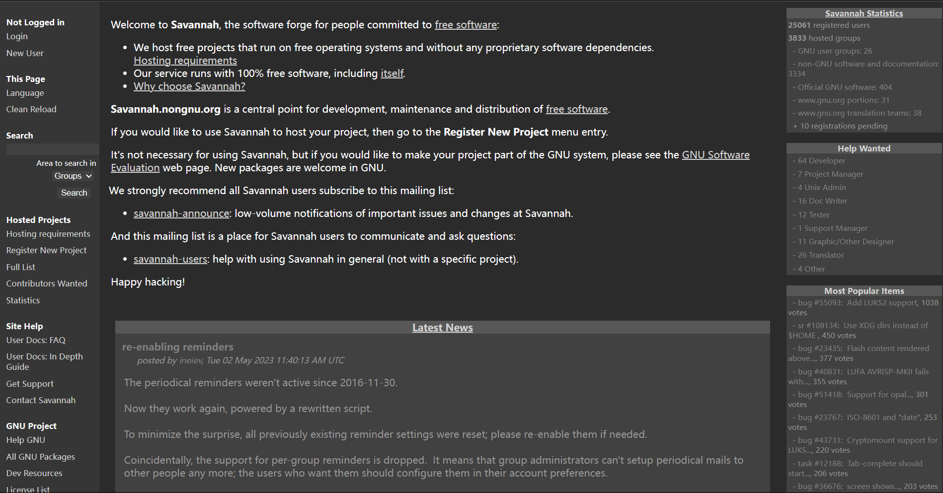
This is a basic dark mode and flattening for the Savannah (only GNU and non-GNU sites are supported)
Savannah Dark Mode (Basic) by WithLithum
Details
AuthorWithLithum
LicenseCC BY-SA 4.0 International
Categorysavannah.gnu.org
Created
Updated
Code size3.5 kB
Code checksum55528460
Statistics
Learn how we calculate statistics in the FAQ.
Failed to fetch stats.
Description
Notes
Userstyle doesn't have notes.Source code
/* ==UserStyle==
@name         Savannah Dark Mode (Basic)
@version      20230614.07.14
@namespace    userstyles.world/user/WithLithum
@description  This is a basic dark mode and flattening for the Savannah (only GNU and non-GNU sites are supported)
@author       WithLithum
@license      CC BY-SA 4.0 International
==/UserStyle== */

@-moz-document regexp("https://savannah\\.(gnu|nongnu)\\.org(/.*)?") {
/* --- Main --- */

:root {
  --bg-layer0: rgb(32,32,32);
  --bg-layer1: rgb(43,43,43);
  --bg-layer2: rgb(54,54,54);
  --bg-layer3: rgb(65,65,65);
  --bg-layer4: rgb(87,87,87);
}

body {
  color: lightgray;
  background-color: var(--bg-layer0);
}

td {
  color: lightgray;
}

td a {
  color: lightgray;
}

td a:hover {
  color: white;
}

.menu {
  background-color: var(--bg-layer2);
  color: white;
}

li.menulogo {
  display: none;
}

li.menutitle {
  color: white;
  border-bottom-style: none;
  padding-top: 5px;
  padding-bottom: 0.5px;
  padding-left: 5px;
  padding-right: 5px;
}

li.menuitem {
  border-bottom-style: none;
  border-top-style: none;
  text-align: left;
}


div.realbody {
  background-color: var(--bg-layer0);
}

div.main {
  background-color: var(--bg-layer1);
  color: white;
}

/* Generic Links */

a {
  color: lightgray;
}

a:hover {
  color: white;
}

a:active {
  color: gray;
}

/* Menu Links */

.menu a {
  color: lightgray;
  padding: 5px;
  text-decoration: none;
}

.menu a:hover {
  color: white;
  background-color: gray;
  text-decoration: none;
}

.menu a:active {
  color: gray;
  text-decoration: none;
}

/* Buttons */

button,input {
  background-color: rgb(65,65,65);
  border: 0px;
  margin: 5px;
  color: white;
}

button,input:hover {
    background-color: rgb(87,87,87);
  border: 0px;
  color: white;
}

/* Selects */

select {
  background-color: rgb(65,65,65);
  border: 0;
  margin: 5px;
  color: white;
}

/* h2 */

h2 {
  border: 0;
  background-color: rgb(43,43,43);

}

/* Footer */

p.footer {
  border: 0;
  background-color: rgb(43,43,43);
  color: rgb(100,100,100);
  margin: 0;
}

/* Top Navigation Menu */

div#topmenu {
  border: 0;
}

ul#topmenuitem {
    background-color: rgb(85,65,65);
}

a.tabselect {
  color: rgb(100,100,100);
}

li.topmenuitemmainitem {
  padding: 5px;
}

li.topmenuitemmainitem a {
  padding: 5px;
  text-decoration: none;
}

li.topmenuitemmainitem a:hover {
  background-color: gray;
}

span.topmenutitle {
  display: none;
  width: 0;
}

/* Top Bug Title */

h1.priore {
  background-color: rgb(43,43,43);
  border: 0;
}

/* Bug Table */

.preinput {
  font-style: normal;
  text-decoration: none;
}

tr {
  margin: 5px;
}

/* Bug Content */

blockquote.verbatim {
  color: rgb(160,160,160);
  background-color: rgb(54,54,54);
  border: 1px solid rgb(160,160,160);
  padding: 15px;
}

blockquote.verbatim p {
  margin: 0px;
}

a.preinput {
  color: rgb(160,160,160);
}

.boxhighlight,.boxhighlightextra,.boxitemalt {
  background-color: rgb(54,54,54);
}

.tracker_comment p {
  color: white;
}

/* Boxes */

.boxtitle {
  background-image: none;
  background-color: var(--bg-layer4);
  color: lightgray;
  border: 0;
}

.boxitem,.boxitemalt {
  background-color: var(--bg-layer3);
  border: 0;
  color: #959595;
}

.boxitem a, .boxitemalt a {
  color: gray;
}

.boxitem a:hover, .boxitemalt a:hover {
  color: lightgray;
  text-decoration: none;
}

/* WIKI PAGES */

.pageheader {
  background-color: var(--bg-layer2);
  color: white;
}

.page {
  background-color: var(--bg-layer1);
  color: lightgray;
}

h1 {
  border: 0;
}
}