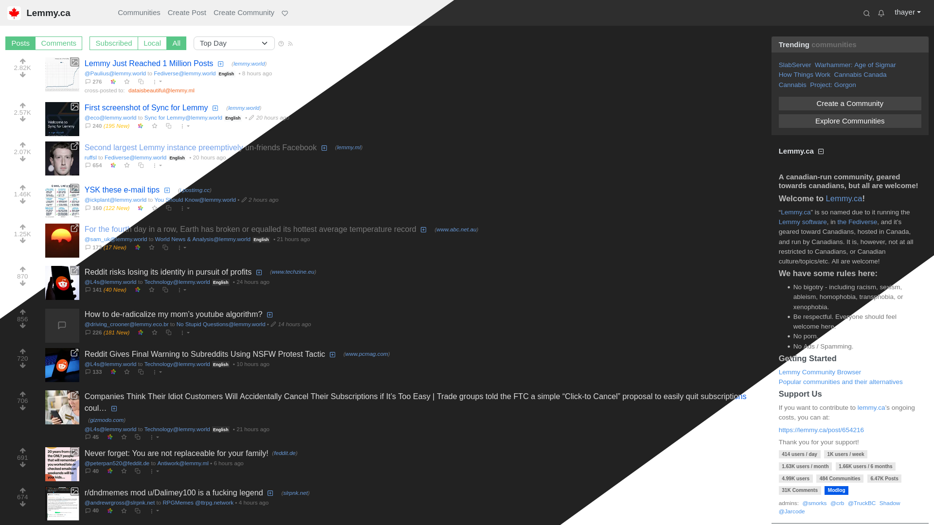
Lemonberry is a flexible, full-width light and dark theme for Lemmy v0.19+, inspired by reddit, digg, hacker news and others.
Lemonberry by thayer
Details
Authorthayer
LicenseCSS: CC BY-SA 4.0; Images: CC BY-NC-ND 4.0
CategoryLemmy
Created
Updated
Code size22 kB
Code checksume378dd85
Statistics
Learn how we calculate statistics in the FAQ.
Failed to fetch stats.
Description
Notes
Lemonberry's light mode offers a bright and refreshing palette that is reminiscent of the Summerfruit theme for Vim; a favourite of mine when I first started using Linux. Stylish light themes are so hard to find, and I hope you like the direction this one is heading.
Lemonberry's dark mode should be comfortable for anyone who likes the Reddit Enhancement Suite's dark mode. Mostly using Lemmy's default darkly theme, I've dropped the contrast of some elements and added blueberry links.
This theme is a work-in-progress and you may encounter an out-of-place colours here and there from default Lemmy theme. I'm tweaking things as I go.
Highlights include:
- Flexible full-width layout
- Dynamic light/dark theme based on OS and/or browser preference
- Strong focus on content and discussion
- Increased post list density
- No user or community circle-icons
- No community banners or logos
- Few rounded buttons or boxes
To enable rounded corners, comment out the following line near the top of the stylesheet by adding /* and */ to the beginning and end as shown below:
/* .rounded, .card, .alert, .badge, .btn { border-radius: 0 !important; } */
See https://github.com/thayerw/lemmy-lemonberry for additional screenshots and older versions.
Source code
Source code has over 10K characters, so we truncated it. You can inspect the full source code on install link./* ==UserStyle==
@name Lemonberry
@version 20240617.2102
@namespace https://userstyles.world/user/thayer
@homepageURL https://github.com/thayerw/lemmy-lemonberry
@description A flexible, full-width light and dark theme for Lemmy v0.19+, inspired by reddit, digg and hacker news
@author thayer (@thayer@lemmy.ca)
@license Non-image CSS licensed under CC BY-SA 4.0; images derived from Base64 are licensed under CC BY-NC-ND 4.0
==/UserStyle== */
@-moz-document domain("beehaw.org"), domain("discuss.tchncs.de"), domain("feddit.dk"), domain("feddit.nl"), domain("infosec.pub"), domain("lemmy.ca"), domain("lemmy.cafe"), domain("lemmy.sdf.org"), domain("lemm.ee"), domain("lemmy.fmhy.ml"), domain("lemmy.ml"), domain("lemmy.sdf.org"), domain("lemmy.world"), domain("midwest.social"), domain("programming.dev"), domain("sh.itjust.works"), domain("startrek.website") {
/* to remove any hint of rounded corners; change border-radius below to "0" */
.rounded, .card, .alert, .badge, .btn { border-radius: 0.2rem; }
.thumbnail { border-radius: 0.2rem !important; }
/* inbox notification badge */
li#navMessages .badge { border-radius: 1rem !important; background-color: red !important; color: white !important; }
/* set colours for OS/browser with light preference */
@media (prefers-color-scheme: light) {
@import "/css/themes/lightly.css";
:root {
--bs-primary: #0074e8;
--bs-secondary: #6ab581;
--bs-green: #3cb75f;
--bs-gray-150: #f0f0f0;
--bs-gray-400: #aaa;
--bs-gray-500: #888;
--bs-link-color: #004d88;
--bs-link-color-rgb: 51, 102, 170;
--bs-link-hover-color: #04a;
--bs-link-hover-color-rgb: 51, 102, 170;
--bs-secondary-color: #c6c6c6;
--bs-secondary-rgb: 136, 136, 136;
--lemonberry-badge-creator: #000;
--lemonberry-link: #7ea0c8;
--lemonberry-link-hover-hot: #ff2c87;
--lemonberry-link-titles: #0445d0;
--lemonberry-link-titles-pinned: #3d9e66;
--lemonberry-link-titles-pinned-visited: #59c687;
--lemonberry-link-titles-visited: #73a1ec;
--lemonberry-link-userspace: #3d9e66;
--lemonberry-navbar-bg: #f0f0f0;
--lemonberry-navbar-fg: #ffffff;
--lemonberry-navbar-link-hover: #59c687;
--lemonberry-pill-link-bg: #0059e8;
--lemonberry-pill-link-fg: #fff;
--lemonberry-pill-static-bg: #e8e8e8;
--lemonberry-pill-static-fg: #606060;
--lemonberry-text-primary: #444;
--lemonberry-text-muted: #aaa;
--lemonberry-text-secondary: #777;
}
/* override some button colours when in light mode */
/* colours for some disabled post, preview form buttons */
.btn:disabled, .btn.disabled, fieldset:disabled .btn {
background-color: #a9dbbe;
border-color: #a9dbbe;
}
/* don't colourize vote buttons when logged out */
div.vote-bar .btn {
background:none;
border: none;
}
/* sidebar create/explore buttons */
.btn-secondary {
--bs-btn-color: #fff;
--bs-btn-bg: #59c687;
--bs-btn-border-color: #59c687;
--bs-btn-hover-color: #fff;
--bs-btn-hover-bg: #3d9e66;
--bs-btn-hover-border-color: #3d9e66;
--bs-btn-focus-shadow-rgb: 38, 181, 98;
--bs-btn-active-color: #fff;
--bs-btn-active-bg: #257e4b;
--bs-btn-active-border-color: #257e4b;
--bs-btn-active-shadow: inset 0 3px 5px rgba(34, 34, 34, 0.125);
--bs-btn-disabled-color: #fff;
--bs-btn-disabled-bg: #a9dbbe;
--bs-btn-disabled-border-color: #a9dbbe;
}
/* post/comment sorting */
.btn-outline-secondary {
--bs-btn-color: #59c687;
--bs-btn-border-color: #59c687;
--bs-btn-hover-color: #fff;
--bs-btn-hover-bg: #59c687;
--bs-btn-hover-border-color: #59c687;
--bs-btn-focus-shadow-rgb: 0, 168, 70;
--bs-btn-active-color: #fff;
--bs-btn-active-bg: #59c687;
--bs-btn-active-border-color: #59c687;
--bs-btn-active-shadow: inset 0 3px 5px rgba(34, 34, 34, 0.125);
--bs-btn-disabled-color: #fff;
--bs-btn-disabled-bg: transparent;
--bs-btn-disabled-border-color: #59c687;
--bs-gradient: none;
}
/* block community */
.btn-danger {
--bs-btn-color: #fff;
--bs-btn-bg: #d36c6c;
--bs-btn-border-color: #d36c6c;
--bs-btn-hover-color: #fff;
--bs-btn-hover-bg: #be4f4f;
--bs-btn-hover-border-color: #be4f4f;
--bs-btn-focus-shadow-rgb: 153, 81, 45;
--bs-btn-active-color: #fff;
--bs-btn-active-bg: #a03939;
--bs-btn-active-border-color: #a03939;
--bs-btn-active-shadow: inset 0 3px 5px rgba(34, 34, 34, 0.125);
--bs-btn-disabled-color: #fff;
--bs-btn-disabled-bg: #ffb9b9;
--bs-btn-disabled-border-color: #ffb9b9;
}
}
/* set colours for OS/browser with dark preference */
@media (prefers-color-scheme: dark) {
@import "/css/themes/darkly.css";
:root {
--bs-primary: #0074e8;
--bs-secondary: #6ab581;
--bs-green: #486c52;
--bs-gray-150: #f0f0f0;
--bs-gray-400: #aaa;
--bs-gray-500: #888;
--bs-red: #e74c3c;
--bs-link-color: #004d88;
--bs-link-color-rgb: 51, 102, 170;
--bs-link-hover-color: #04a;
--bs-link-hover-color-rgb: 51, 102, 170;
--bs-secondary-color: #c6c6c6;
--bs-secondary-rgb: 136, 136, 136;
--lemonberry-badge-creator: #fff;
--lemonberry-link: #6698d7;
--lemonberry-link-hover-hot: #ff2c87;
--lemonberry-link-titles: #ddd;
--lemonberry-link-titles-pinned: #318f4c;
--lemonberry-link-titles-pinned-visited: #3b6648;
--lemonberry-link-titles-visited: #777;
--lemonberry-link-userspace: #458c63;
--lemonberry-navbar-bg: #2e2e2e;
--lemonberry-navbar-fg: #ffffff;
--lemonberry-navbar-link-hover: #59c687;
--lemonberry-pill-link-bg: #04a;
--lemonberry-pill-link-fg: #c4c4c4;
--lemonberry-pill-static-bg: #484848;
--lemonberry-pill-static-fg: #ccc;
--lemonberry-text-primary: #ccc;
--lemonberry-text-secondary: #bbb;
--lemonberry-text-muted: #717171;
}
/* darken danger buttons, such as community blocker when in dark mode */
.btn-danger {
--bs-btn-color: #fff;
--bs-btn-bg: #602a23;
--bs-btn-border-color: #602a23;
--bs-btn-hover-color: #fff;
--bs-btn-hover-bg: #8b342b;
--bs-btn-hover-border-color: #8b342b;
--bs-btn-focus-shadow-rgb: 235, 103, 89;
--bs-btn-active-color: #fff;
--bs-btn-active-bg: #a03227;
--bs-btn-active-border-color: #a03227;
--bs-btn-active-shadow: inset 0 3px 5px rgba(0, 0, 0, 0.125);
--bs-btn-disabled-color: #fff;
--bs-btn-disabled-bg: #4f3836;
--bs-btn-disabled-border-color: #4f3836;
}
}
body { font-family: Arial,system-ui,-apple-system,"Segoe UI",Roboto,"Helvetica Neue","Noto Sans","Liberation Sans",sans-serif,"Apple Color Emoji","Segoe UI Emoji","Segoe UI Symbol","Noto Color Emoji"; }
/* underline most links when hovered over */
a:hover { text-decoration: underline; }
/* but don't underline link text inside buttons */
.btn { text-decoration: none !important; }
/* the link colour for most elements */
.md-div a,
a.person-listing,
a.person-listing .text-muted,
ul.comments a.person-listing span,
a.community-listing,
a.community-link,
a.community-link .text-muted,
.link-dark,
.post-container .me-2 a,
/* post links on profile pages */
li.comment .ms-2 .me-2 {
color: var(--lemonberry-link) !important;
}
/* link colours within user posts and comments (userspace) */
#postContent a,
li.comment .md-div a,
.markdown-textarea .md-div a {
color: var(--lemonberry-link-userspace) !important;
text-decoration: underline;
}
/* adjust text whitespace everywhere */
.md-div p > :first-child, .md-div ul > :first-child, .md-div ol > :first-child, .md-div pre > :first-child, .md-div blockquote > :first-child, .md-div table > :first-child {
margin-top: 0;
}
.md-div p, .md-div ul, .md-div ol, .md-div pre, .md-div blockquote, .md-div table {
margin-top: 0.36rem;
margin-bottom: 0.36rem;
}
/* default to standard bullet list styling */
.md-div li {
list-style-type: disc;
}
/* hide user icons, community icons, etc. */
.person-listing img, .community-link img {
display: none !important;
}
/* decrease sort/post/nav button heights */
.mt-4 .btn, .mt-4 .form-select { line-height: 1; }
/* community stat pills (users/month, etc.) */
ul.badges li { margin-bottom: 0.3rem !important; }
ul.badges .text-bg-primary {
color: var(--lemonberry-pill-link-fg) !important;
background-color: var(--lemonberry-pill-link-bg) !important;
}
ul.badges .text-bg-secondary {
color: var(--lemonberry-pill-static-fg) !important;
background-color: var(--lemonberry-pill-static-bg) !important;
}
/* more verbose role tags, tweak their style */
span[aria-label="admin"],
span[aria-label="mod"] {
text-transform: lowercase;
}
span[aria-label="admin"],
span[aria-label="mod"],
span[aria-label="creator"] {
background-color: transparent !important;
border: 0 !important;
padding: 0 0.1rem;
}
span[aria-label="admin"]::after { content: "dmin"; }
span[aria-label="mod"]::after { content: "od"; }
span[aria-label="admin"] { color: var(--bs-red) !important; }
span[aria-label="mod"] { color: var(--bs-green) !important; }
span[aria-label="creator"] { color: var(--lemonberry-badge-creator) !important; }
/* navbar --------------------------------------------------------- */
/* basic navbar styling ...