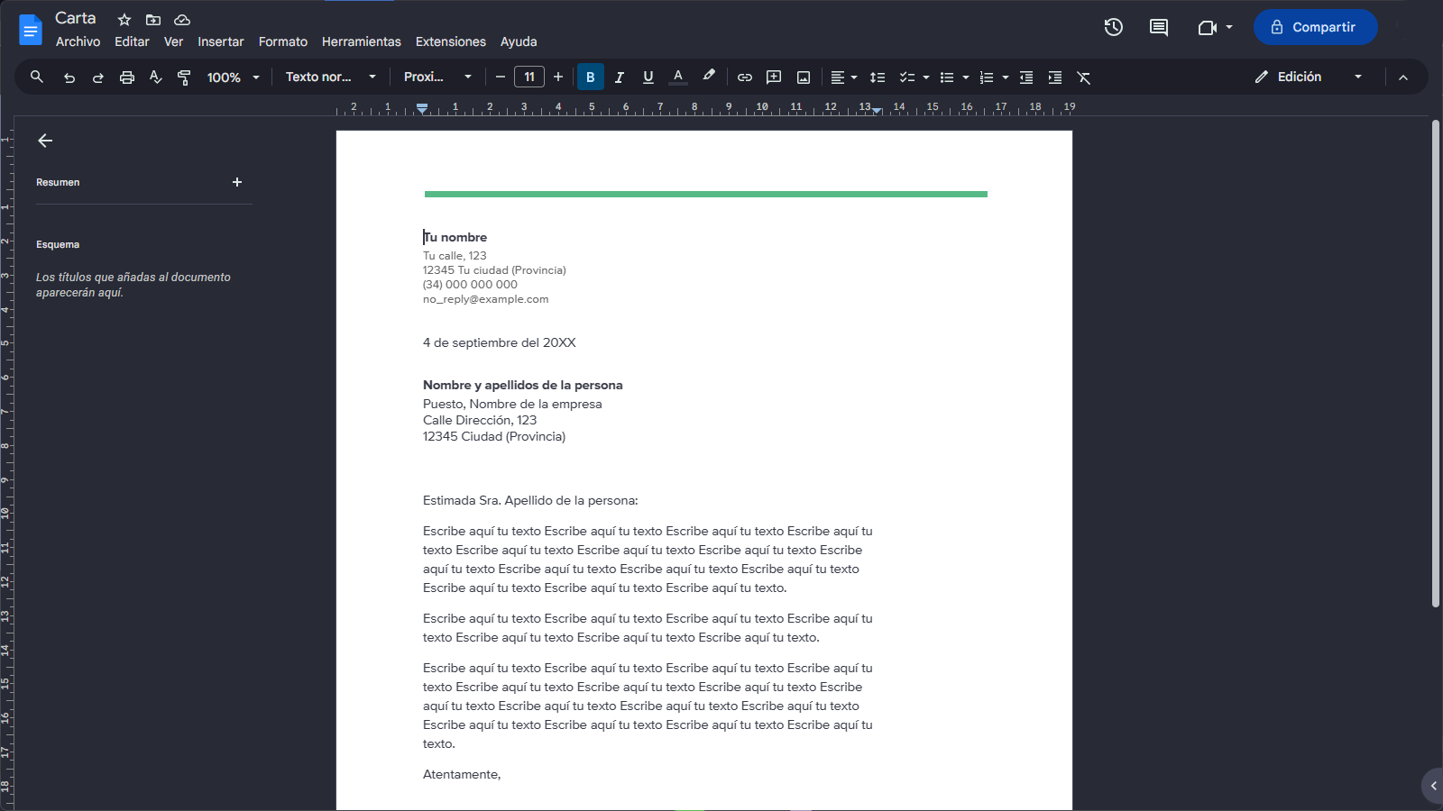
Are you tired of the same boring colors on Google Docs? Then try this modern color style based on the Dracula theme
Dracula for Google Docs by druxorey
Details
Authordruxorey
LicenseGNU General Public License v3.0
CategoryGoogle Docs
Created
Updated
Code size269 kB
Code checksum4ae13226
Statistics
Learn how we calculate statistics in the FAQ.
Failed to fetch stats.
Description
Notes
Official Dracula Theme Website: https://draculatheme.com/
Github Project: https://github.com/druxorey/dracula-for-stylus/blob/main/styles/dracula-for-google-docs
Source code
Source code has over 10K characters, so we truncated it. You can inspect the full source code on install link./* ==UserStyle==
@name Dracula for Google Docs
@namespace https://userstyles.world/user/druxorey
@version 1.0
@description "Are you tired of the same boring colors on Google Docs? Then try this modern color style based on the Dracula theme"
@author Modified by Druxorey; Made by Walter winghongchan
@homepageURL https://github.com/druxorey/StylusThemes/blob/main/Styles/dracula-for-google-docs
@license GNU General Public License v3.0
@preprocessor less
@var select document-filter "Document filter" {"none:None": "none", "dim:Dim": "contrast(80%) brightness(90%)", "invert:Invert*": "var(--darkfilter)"}
@var number document-contrast "Document contrast while inverted" [76, 40, 100, 1, "%"]
@var checkbox respect-pageless-document-color "Respect page color of pageless documents while a document filter is applied. May be laggy." 0
@var checkbox has-selector-missing-warning "Warn me if the :has() selector is not available in my browser." 1
==/UserStyle== */
@-moz-document url-prefix("https://docs.google.com/document/d/"), url-prefix("https://docs.google.com/document/u/"), regexp("https:\\/\\/docs\\.google\\.com\\/sharing\\/boq\\/driveshare\\?[\\s\\S]+origin=https%3A%2F%2Fdocs\\.google\\.com"), url-prefix("https://docs.google.com/picker/v2/home?req=%5B%22ireq%22%2C%5Bnull%2C%5B%5B1%5D%2C%5B%5D%2C%5B%5D%2C%5B%5D%2C%"), url-prefix("https://docs.google.com/picker/v2/home?req=%5B%22ireq%22%2C%5Bnull%2C%5B%5B1%2C6%5D%2C%5B%5D%2C%5B%5D%2C%5B%5D%2C%5B2048%2C2048%5D%5D%2C%5B1%5D%2Cnull%2Cnull%2C%5B"), regexp("https:\\/\\/docs\\.google\\.com\\/picker\\/v2\\/home\\?req=.*%22Google%20Drive%22.*%22Replace%22.*%22replace-image%22.*&parent=https%3A%2F%2Fdocs\\.google\\.com&pfname=&rpctoken=[0-9]+"), regexp("(https:\\/\\/meet.google.com\\/_\\/frame\\?authUser=\\d+&frameType=2&origin=https%3A%2F%2Fdocs.google.com#cb=pip_frame)"), regexp("https:\\/\\/docs\\.google\\.com\\/picker\\/v2\\/home\\?req=.*%22explore-drive.*&parent=https%3A%2F%2Fdocs\\.google\\.com&pfname=&rpctoken=[0-9]+"), regexp("https:\\/\\/docs\\.google\\.com\\/picker\\/v2\\/home\\?req=.*%22Google%20Photos%22.*&parent=https%3A%2F%2Fdocs\\.google\\.com&pfname=&rpctoken=[0-9]+") {
// Variables
:root {
// Colour
--ddocs-primary: #a8c7fa;
--ddocs-primary-icon: invert(100%) hue-rotate(180deg) brightness(75%) saturate(400%);
--ddocs-primary-hover: rgba(168, 199, 250, var(--ddocs-hover-state-layer-opacity)); // That’s right, standard (no fill or outline) icon buttons, when enabled (selected) and hovered, use a state layer of colour primary! Not on-primary-container or something. https://m3.material.io/components/icon-buttons/specs
--ddocs-primary-focus: rgba(168, 199, 250, var(--ddocs-focus-state-layer-opacity));
--ddocs-primary-pressed: rgba(168, 199, 250, var(--ddocs-pressed-state-layer-opacity));
--ddocs-on-primary: #062e6f;
--ddocs-on-primary-hover: #9bbaef;
--ddocs-on-primary-focus: #94b4e9;
--ddocs-on-primary-pressed: #94b4e9;
--ddocs-primary-container: #004a77;
--ddocs-on-primary-container: #c2e7ff;
--ddocs-on-primary-container-icon: invert(100%) hue-rotate(180deg) saturate(150%);
--ddocs-on-primary-container-hover: #0f5682;
--ddocs-on-primary-container-focus: #185d88;
--ddocs-on-primary-container-pressed: #185d88;
--ddocs-secondary: #7fcfff;
--ddocs-on-secondary: #003355;
--ddocs-secondary-container: #0842a0;
--ddocs-secondary-container-hover: #184fa8; // Determined the colour by overlapping the -on colour at 8% opacity on top of the container. Not a problem until Dark Docs begins support for custom colours.
--ddocs-secondary-container-focus: #2156ac;
--ddocs-on-secondary-container: #d3e3fd;
--ddocs-on-secondary-container-hover: rgba(211, 227, 253, var(--ddocs-hover-state-layer-opacity));
--ddocs-on-secondary-container-focus: rgba(211, 227, 253, var(--ddocs-focus-state-layer-opacity));
--ddocs-on-secondary-container-pressed: rgba(211, 227, 253, var(--ddocs-pressed-state-layer-opacity));
--ddocs-tertiary: #6dd58c;
--ddocs-on-tertiary: #0a3818;
--ddocs-on-tertiary-hover: #64c882;
--ddocs-on-tertiary-focus: #61c27e;
--ddocs-on-tertiary-pressed: #61c27e;
--ddocs-tertiary-container: #0f5223;
--ddocs-on-tertiary-container: #c4eed0;
--ddocs-error: #f2b8b5;
--ddocs-on-error: #601410;
--ddocs-error-container: #8C1D18;
--ddocs-on-error-container: #F9DEDC;
--ddocs-background: #282a36;
--ddocs-on-background: #e3e3e3;
--ddocs-on-background-hover: rgba(227, 227, 227, var(--ddocs-hover-state-layer-opacity)); // Just the state layer.
--ddocs-on-background-focus: rgba(227, 227, 227, var(--ddocs-focus-state-layer-opacity));
--ddocs-on-background-pressed: rgba(227, 227, 227, var(--ddocs-pressed-state-layer-opacity));
--ddocs-surface: #282a36;
--ddocs-surface-container-low: #28282a; // I’m stealing these from screenshots, so I don’t know the actual surface tint. (I tried to find it.)
--ddocs-surface-container: #1d1e27;
--ddocs-surface-container-high: #44475a;
--ddocs-on-surface: #e3e3e3;
--ddocs-on-surface-disabled: rgba(227, 227, 227, 12%);
--ddocs-on-surface-hover: rgba(227, 227, 227, var(--ddocs-hover-state-layer-opacity));
--ddocs-on-surface-focus: rgba(227, 227, 227, var(--ddocs-focus-state-layer-opacity));
--ddocs-on-surface-pressed: rgba(227, 227, 227, var(--ddocs-pressed-state-layer-opacity));
--ddocs-surface-container-highest: #44475a;
--ddocs-on-surface-variant: #c4c7c5;
--ddocs-on-surface-variant-hover: rgba(196, 199, 197, var(--ddocs-hover-state-layer-opacity));
--ddocs-on-surface-variant-focus: rgba(196, 199, 197, var(--ddocs-focus-state-layer-opacity));
--ddocs-on-surface-variant-pressed: rgba(196, 199, 197, var(--ddocs-pressed-state-layer-opacity));
--ddocs-outline: #8e918f;
--ddocs-outline-variant: #44475a;
--ddocs-inverse-surface: #e3e3e3; // inverse colours taken from the “Signed in as” bar. Might be a relic of m2
--ddocs-inverse-on-surface: #44475a;
--ddocs-inverse-on-surface-hover: #d5d6d6;
--ddocs-inverse-on-surface-focus: #cfcfd0;
--ddocs-inverse-on-surface-pressed: #cfcfd0;
--ddocs-surface-tint: #6750A4; // Definitely not this.
// State layers (a translucent overlay is placed over things that are hovered, focused, &c.)
--ddocs-hover-state-layer-opacity: 8%;
--ddocs-focus-state-layer-opacity: 12%;
--ddocs-pressed-state-layer-opacity: 12%;
--ddocs-dragged-state-layer-opacity: 16%;
// Shape
--ddocs-corner-none: 0rem;
--ddocs-corner-xs: 0.25rem;
--ddocs-corner-s: 0.5rem;
--ddocs-corner-m: 0.75rem;
--ddocs-corner-l: 1rem;
--ddocs-corner-xl: 1.75rem;
// Shadow
--ddocs-level2: 0px 2px 4px -1px rgba(0,0,0,0.2),0px 4px 5px 0px rgba(0,0,0,0.14),0px 1px 10px 0px rgba(0,0,0,0.12);
--paleblue-icons: hue-rotate(3.6deg) saturate(32.2%) brightness(170%); /* To desaturate blue icons to make them more legible against a dark background. If it is an inline SVG, changing its fill color to palerblue is preferable. */
--palegreen-icons: hue-rotate(-2deg) saturate(38%) brightness(182%);
--white-icons: brightness(280%) saturate(10%);
--whiter-icons: brightness(325%);
--darkfilter: invert(100%) hue-rotate(180deg) contrast(@document-contrast);
--on: background-color 0.02s ease-in, border-color 0.06s ease, color 0.05s ease, filter 0.01s ease;
--off: background-color 0.25s ease, border-color 0.1s ease, color 0.25s ease, filter 0.25s ease;
// Dark Docs m2 variables (will be removed once side panels and the homepage get Material U’d)
--palerblue: #8AB4F8; /* For blue text, icons, nearby items that need to be paleblue, and paleblue buttons on hover. */
--paleblue: #669DF7; /* For blue buttons and other wider areas of paleblue. */
--blue-ripple: #394457; /* Background color to indicate that something is active (toggled on or being clicked, for example). */
--palergreen: #81C995; /* Mostly for suggesting mode. */
--green-ripple: #37493F;
--paleyellow: #FDD663; /* Mostly for comments. */
--yellow-ripple: #454134;
--lightestgray: #F8F9FA; /* For most text. */
--lightergray: #DADCE0;
--lightgray: #BDC1C6; /* For subtext that gives more info, like a placeholder, an email below a name, or a description under an option. */
--gray: #5F6368;
--mediumdarkgray: #4A4E51; /* Hover state on menus. */
--darkgray: #44475a; /* Multiple purposes, like outlining dialog boxes to make them separate from what's behind them, or menus. */
--darkergray: #1d1e27; /* A hover state. */
--darkestgray: #282a36; /* For backgrounds. */
/* Note to self: https://m3.material.io/foundations/interaction-states The state layer is an overlay with a fixed opacity for each state and uses the same color as the content. … components using the activated or selected states change the container and content color directly.
“The default for modern web browsers is 16px, so the conversion is SP_SIZE/16 = rem.” https://m3.material.io/styles/typography/type-scale-tokens So, 1rem = 16px font size. */
}
}
.states() {
transition: var(--off);
&:is(.jfk-button-hover) {
background-color: color-mix(in srgb, currentColor, transparent calc(100% - var(--ddocs-hover-state-layer-opacity)));
transition: var(--on);
}
&:is(.jfk-button-focused) {
background-color: color-mix(in srgb, currentColor, transparent calc(100% - var(--ddocs-focus-state-layer-opacity)));
}
&:is(.jfk-button-active) {
background-color: color-mix(in srgb, currentColor, transparent calc(100% - var(--ddocs-pressed-state-layer-opacity)));
}
}
@-moz-document url-prefix("https://docs.google.com/do...