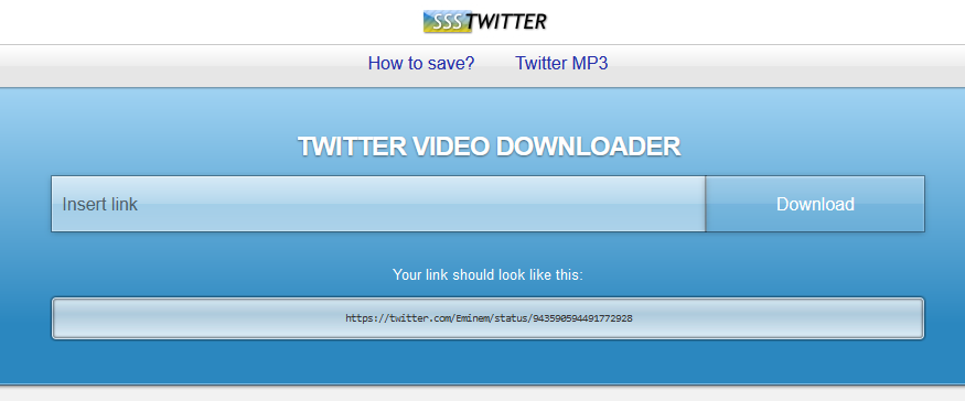
Skeuomorphic theme for sssTwitter, a website that allows you to download Twitter videos.
Skeuomorphic Theme for sssTwitter by magnum22
Details
Authormagnum22
LicenseMIT
Categoryssstwitter.com
Created
Updated
Code size5.1 kB
Code checksum41a669c7
Statistics
Learn how we calculate statistics in the FAQ.
Failed to fetch stats.
Description
Notes
2025-02-14
Wow thanks for 1000 installs, I forgot to put this here but I'm discontinuing this theme since I found better alternatives to that site.
2024-02-27
- Fixed the logo not showing because Discord CDN doesn't allow content to be displayed outside of Discord anymore. Revolt will be used for now.
Source code
/* ==UserStyle==
@name         ssskeuo
@version      20240227.21.19
@namespace    ?
==/UserStyle== */

@-moz-document domain("ssstwitter.com") {
main {background: hsl(0, 0%, 95%);}

.sss {content: url(https://autumn.revolt.chat/attachments/_MnlehmNdLscUmE_avoqfzSaJqxUyh3o254eRamats/ssstwitterlogo.jpg);
      margin: -11px 0px -8px 0px;}

.content-wrapper {background: hsla(0, 0%, 95%, 0);}

#menuToggle #menu {
    background: linear-gradient(to bottom,
                hsl(0, 0%, 100%) 0%,
                hsl(0, 0%, 93%) 49%,
                hsl(0, 0%, 90%) 51%);
    box-shadow: 0px -1px 0px hsla(0, 0%, 0%, .2),
                0px 1px 2px  hsla(208, 0%, 0%, .30);
    border: none
}

#splash #errorContainer.warning {
    box-shadow: inset 0 0 0 1px hsla(0, 0%, 100%, .3),
                inset 0 1px     hsla(0, 0%, 100%, .3),
                      0 0 0 1px hsla(0, 0%, 0%, .4),
                      0 1px 5px hsla(0, 0%, 0%, .4);
}

.is-icon { background: transparent }

#splash #errorContainer {
    background: linear-gradient(hsla(0, 0%, 100%, .7) 49%,
                                hsla(0, 0%, 100%, .6) 50%,
                                hsla(0, 0%, 100%, .5));
}

#splash #errorContainer.info {box-shadow: inset 0 0 0 1px hsla(0, 0%, 100%, .3),
                               inset 0 1px     hsla(0, 0%, 100%, .3),
                                     0 0 0 1px hsla(0, 0%, 0%, .3),
                                     0 1px 5px hsla(0, 0%, 0%, .3); }

.u-shadow--black { box-shadow: inset 0 0 0 1px hsla(0, 0%, 100%, .3),
                               inset 0 1px     hsla(0, 0%, 100%, .3),
                                     0 0 0 1px hsla(0, 0%, 0%, .3),
                                     0 1px 5px hsla(0, 0%, 0%, .3); }
.pure-form input[type] {
    border-radius: 0px;
    border: none;
    background: linear-gradient(hsla(0, 0%, 100%, .7),
                                hsla(0, 0%, 100%, .5) 49%,
                                hsla(0, 0%, 100%, .4) 50%,
                                hsla(0, 0%, 100%, .5));
    box-shadow: inset 0 0 0 1px hsla(0, 0%, 100%, .3),
                inset 0 1px     hsla(0, 0%, 100%, .3),
                0 0 0 1px       hsla(0, 0%, 0%, .3),
                0 1px 5px       hsla(0, 0%, 0%, .3);
}

.pure-button, a.pure-button, button.pure-button {
    color: hsl(0, 0%, 100%);
    border-radius: 0px;
    background: linear-gradient(hsla(0, 0%, 100%, .3),
                                hsla(0, 0%, 100%, .2) 49%,
                                hsla(0, 0%, 100%, .1) 50%);
    box-shadow: inset 0px 1px 1px hsla(0, 0%, 100%, .5),
                0 0 0 1px         hsla(0, 0%, 0%, .3),
                0 1px 5px         hsla(0, 0%, 0%, .3);
}

pre {
    border: 1px solid hsla(0, 0%, 0%, 0);
    box-shadow: inset 0 0px 2px 1px hsla(0, 0%, 0%, .5),
                      0 0px 1px 1px hsla(0, 0%, 0%, .5);
    background: linear-gradient(to bottom, hsla(0, 0%, 100%, .8) 0%,
                                           hsla(218, 5%, 90%, .7) 40%,
                                           hsla(0, 0%, 100%, .8) 90%);
}

.splash-container {
    box-shadow: inset 0 -1px 0px     hsla(0, 0%, 0%, .5),
                inset 0 -2px 0px 0px hsla(203, 79%, 80%, .7),
                0 0px 3px            hsla(0, 0%, 0%, .8);
    background: linear-gradient(180deg,hsl(203, 79%, 80%) 0,
                                       hsl(203, 63%, 46%) 80%);
}

.splash h1 {text-shadow: 0px 1px 2px hsla(0, 0%, 0%, .5);}

.sosial-buttons ul {display:none } hr {display: none}


img {
    box-shadow: inset 0 0px 0px 1px hsla(0, 0%, 0%, .5),
                      0 0px 0px 1px hsla(0, 0%, 0%, .5),
                      0 0px 3px 1px hsla(0, 0%, 0%, .5);
    border-radius: 0.1em !Important;
}


.splash-container.processed.success {
    background: linear-gradient(180deg,hsl(124, 66%, 31%) 0,
                                       hsl(112, 56%, 58%) 100%);}

.result {background: hsla(0, 0%, 0%, .15); }

h2 {color: white}

.result_overlay {background: rgba(255, 255, 255, 0); }

.content-wrapper .result_overlay a:hover {color: white; text-shadow: -1px -1px 1px hsla(0, 0%, 0%, .5)}

.footer {
    background: linear-gradient(hsl(0, 0%, 20%),
                                hsla(0, 0%, 0%, 0) 50%);
    box-shadow: inset 0 1px 0px     hsl(0, 0%, 0%),
                inset 0 2px 0px 0px hsla(203, 0%, 100%, .3),
                      0 0px 3px 2px hsla(0, 0%, 0%, .5);}

.footer .pure-menu-link:hover {
    box-shadow:      0 0px 0px 1px hsla(0, 0%, 0%, .4),
               inset 0 0px 0px 1px hsla(0, 0%, 100%, .2);

    background: linear-gradient( hsla(0, 0%, 100%, .2),
                                 hsla(0, 0%, 0%, 0));
    border:none;
}

#language-switcher .pure-menu-children {
    bottom: 1.5em;
    backdrop-filter: blur(3px);
    background: hsla(0, 0%, 0%, .65);
    box-shadow: inset 0 0 0 1px  hsla(0, 0%, 100%, .3),
                0px 1px 1px 1px  hsl(0, 0%, 0%);
}
}