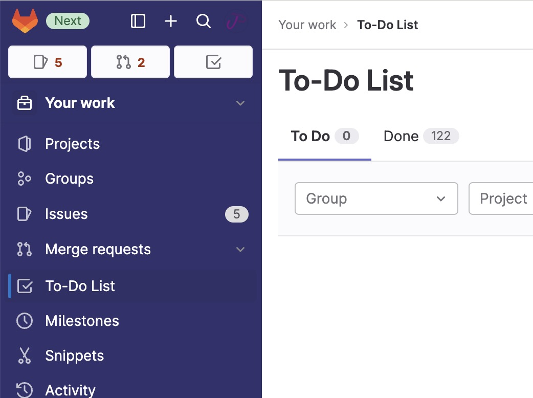
Adds color to the new (2023) navigation sidebar.
gitlab.com New Navigation Sidebar by jakeparis
Details
Authorjakeparis
LicenseNo License
Categorygitlab.com
Created
Updated
Code size3.0 kB
Code checksum527b2926
Statistics
Learn how we calculate statistics in the FAQ.
Failed to fetch stats.
Description
Notes
You can change the color of the sidebar by adjust the --sidebarBg css variable at the top of the file.
Source code
/* ==UserStyle==
@name         gitlab.com New Navigation Sidebar
@version      20230628.14.06
@namespace    userstyles.world/user/jakeparis
@description  Adds color to the new (2023) navigation sidebar.
@author       jakeparis
@license      No License
==/UserStyle== */

@-moz-document domain("gitlab.com") {
/* Adjust side navigation colors
*/
body {
	--sidebarBg: #32326d;
	--sidebarTextColor: hsl(0 0% 88%);
	--accentColor: #a42b00;
}


/* The topmost section of the sidebar */
.super-sidebar .user-bar {
	.gl-button.gl-button.btn-default-tertiary {
		mix-blend-mode: normal;
	}
	.gl-button.gl-button.btn-default .gl-icon {
		color: var(--sidebarTextColor);
	}
	.gl-button.gl-button.btn-default:hover .gl-icon {
		color: var(--accentColor);
	}
}
.super-sidebar .counter:hover {
	mix-blend-mode: normal;
	background: white;

	.gl-icon {
		color: var(--accentColor);
	}
}

/* These are the text in the 3 main action buttons at the top of sidebar
 */
.super-sidebar .user-bar .gl-text-gray-900 span {
	color: var(--accentColor);
	font-weight: bold;
}


/* The background of the side navigation bar
 */
.super-sidebar {
	background: var(--sidebarBg);
}

/* The sidebar text colors */
.super-sidebar {
	.gl-text-gray-900 ,
	a,
	.gl-button-text {
		color: var(--sidebarTextColor);
	}
}
/* Sidebar icons */
.super-sidebar nav[aria-label="Main navigation"] .item-icon {
	color: white;
	opacity: .7;
}

/* These are the actual links, not the top-level expander items */
.super-sidebar nav[aria-label="Main navigation"] a.nav-item-link .gl-text-gray-900 {
	font-weight: 200;
}

/* These are the top-level expander text items */
.super-sidebar button[data-qa-selector="menu_section_button"] .gl-text-gray-900 {
	font-weight: bold;
	color: white;
	opacity: .8;
}

/* The top-level expander, specifically the "Pinned" section expander */
.super-sidebar button[data-qa-section-name="pinned" i] {
	.gl-text-gray-900 {
/* 		mix-blend-mode: exclusion; */
/* 		font-size: 1.1em; */
		text-shadow: 0 0 4px var(--accentColor);
	}
}

/* The dividers */
.super-sidebar hr {
	opacity: .2;
}

/* The popover toggler in the sidebar */
.super-sidebar .gl-new-dropdown-custom-toggle {
	.gl-text-gray-700 {
		color: white;
	}
}

/* ... when it's active */
.super-sidebar .context-switcher-toggle[aria-expanded='true']
{
	mix-blend-mode: normal;
	background: hsl( 0 0% 0% / .4 ) !important;

	.gl-bg-t-gray-a-08 {
		background: transparent;
	}
}


/* The popover */
.super-sidebar .gl-new-dropdown-panel.gl-new-dropdown-panel {
	left: 2em !important;
	box-shadow: 3px 3px 12px hsl( 0 0% 0% / .5 );
	min-width: max( 17rem, 20vw );

	.gl-text-gray-900 {
		color: #333238;
	}

	:where(
		ul[aria-label="frequently visited projects" i] ,
		ul[aria-label="frequently visited groups" i] ,
		ul[aria-label="projects" i] ,
		ul[aria-label="groups" i]
	) li:last-of-type a {

		& svg {
			display: none;
		}

		.gl-text-gray-900 {
			text-align: center;
			padding-inline-end: 1em;
			color: hsl(0 0% 50%);
		}
	}
}


}