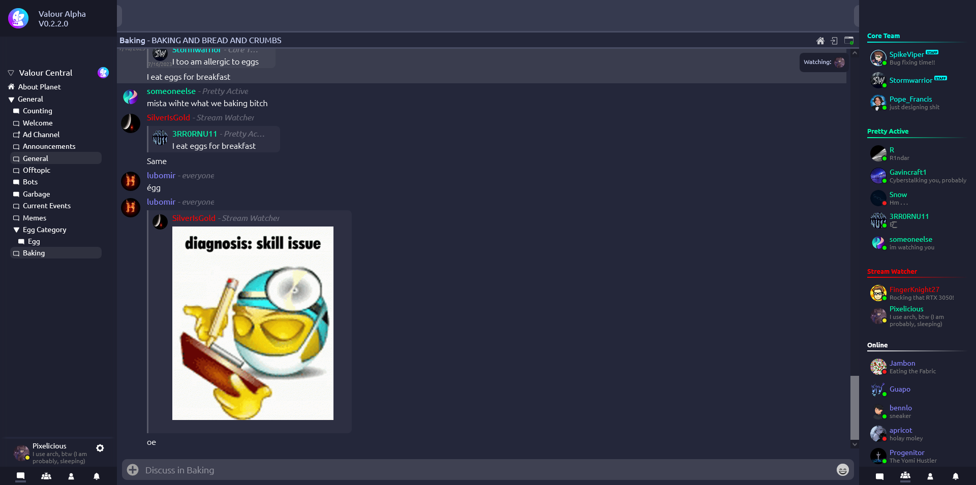
A basic Catppuccin style I threw together within a few minutes.
Catppuccin Macchiato | Valour by Pixeliciousx
Details
AuthorPixeliciousx
LicenseNo License
Categoryapp.valour.gg
Created
Updated
Code size17 kB
Code checksum3bf9cb40
Statistics
Learn how we calculate statistics in the FAQ.
Failed to fetch stats.
Description
Notes
Userstyle doesn't have notes.Source code
Source code has over 10K characters, so we truncated it. You can inspect the full source code on install link./* ==UserStyle==
@name 7/21/2023, 12:19:04 AM
@namespace github.com/openstyles/stylus
@version 1.0.0
@description A new userstyle
@author Me
==/UserStyle== */
/* ==UserStyle==
@name valour.gg - 7/10/2023, 1:06:04 AM
@namespace github.com/openstyles/stylus
@version 1.0.0
@description A new userstyle
@author Me
==/UserStyle== */
@-moz-document domain("app.valour.gg") {
:root {
--primary-color: #24273a;
--secondary-color: #1e2030;
--font-color: #cad3f5;
--bg-color: #24273a;
--heading-color: #040d14;
--link-color: #8aadf4;
--border-color: #181926e;
--alt-border-color: #181926;
--input-color: #000000;
--comment-hue: rgba(0, 0, 0, 0.02);
--main-1: #181926;
--main-2: #1e2030;
--main-3: #24273a;
--main-4: #363a4f;
--main-5: #494d64;
--v-purple: #c6a0f6;
--v-blue: #8aadf4;
--v-cyan: #91d7e3;
--v2-danger-dark: #4f1e1e;
--v2-danger-bright: #ed8796;
}
[b-tbvgsiiezu] .outer-circle .noti {
border-radius: 50%;
position: absolute;
width: 30%;
height: 30%;
background-color: #24273a;
left: 68.75%;
top: 0;
border: solid 3px #040d14;
text-align: center;
z-index: 1;
}
.version[b-qfzzt0diyc] {
position: absolute;
background-color: #181926;
;
z-index: 5;
display: flex;
flex-direction: row;
justify-content: flex-start;
padding: 16px;
width: 100%;
align-items: center;
}
.full-screen {
width: 100%;
height: 100%;
margin: 0px;
padding: 0px;
overflow-x: hidden;
overflow-y: hidden;
}
.v-span {
font-size: 0.9em;
color: var(--font-color);
opacity: 0.75;
}
.v-span.error {
color: red;
}
.v-span.info {
color: var(--v-cyan);
}
.v-inline {
display: inline-block;
}
.v-button {
color: #fff;
border-color: #fff;
background-color: rgba(0, 0, 0, 0);
opacity: 90%;
}
.v-button:hover {
color: var(--v-cyan);
border-color: var(--v-cyan);
}
.v-button.danger {
color: rgb(255, 0, 0);
border-color: rgb(255, 0, 0);
}
.v-button.danger:hover {
color: white;
border-color: white;
}
.v2-button {
background-color: var(--main-4);
color: white;
}
.v2-button:hover {
background-color: var(--main-5);
color: white;
}
.v2-button-danger {
background-color: var(--v2-danger-dark);
color: white;
}
.v2-button-danger:hover {
background-color: var(--v2-danger-bright);
color: white;
}
a {
color: var(--link-color);
user-select: text;
}
p {
user-select: text;
}
.p-1 {
color: var(--font-color);
user-select: text;
}
h1 {
color: var(--font-color);
user-select: text;
}
h2 {
color: var(--font-color);
user-select: text;
}
h3 {
color: var(--font-color);
user-select: text;
}
h4 {
color: var(--font-color);
user-select: text;
}
pre {
padding: 0;
}
label {
color: var(--font-color);
user-select: text;
}
.btn-primary {
color: #fff;
background-color: #1b6ec2;
border-color: #1861ac;
}
.form-control {
margin-top: 5px;
background-color: var(--main-1);
border-color: var(--main-5);
color: var(--font-color);
}
.form-control:disabled {
background-color: var(--border-color);
border-color: var(--alt-border-color);
color: var(--font-color);
}
.form-select {
background-color: var(--main-1);
border-color: var(--main-5);
color: var(--font-color);
}
body {
/* Theming */
background-color: var(--bg-color);
color: var(--font-color);
line-height: NORMAL;
}
.mobile-holder {
height: 100%;
width: 100%;
}
.chat-holder {
padding-right: 0.5rem;
}
.topline {
border-top: 3px solid var(--main-5);
width: 100%;
background-color: var(--main-3);
}
.topbar {
height: 61px;
min-height: 61px;
background-color: var(--main-4);
}
.window {
width: 100%;
}
.window .welcome-channel-description {
font-family: Ubuntu;
font-style: normal;
font-weight: 500;
font-size: 30px;
line-height: 34px;
color: #9E9E9E;
margin: 0px;
margin-left: 34px;
}
.window .welcome-divider {
border: 2px solid #FFFFFF;
margin: 0px;
margin-top: 24px;
margin-left: 34px;
}
.window .welcome-channel-name {
font-family: Ubuntu;
font-style: normal;
font-weight: normal;
font-size: 50px;
line-height: 57px;
color: #FFFFFF;
margin: 0px;
margin-left: 34px;
}
.window .welcome-text {
font-family: Ubuntu;
font-style: normal;
font-weight: 500;
font-size: 20px;
line-height: 23px;
color: #9E9E9E;
margin: 0px;
margin-top: 11px;
margin-left: 34px;
}
.window .start-chat-icon {
margin: 0px;
margin-left: 34px;
margin-top: 32px;
}
.sidebar-2 {
margin: 0px;
background-color: var(--main-2);
z-index: 1;
width: 100%;
display: flex;
flex-direction: column;
height: 100vh;
}
.channel-and-topbar {
display: flex;
margin: 0;
background-color: var(--main-1);
flex-direction: column;
height: 100%;
flex: 1;
overflow: hidden;
}
.channel-and-topbar-mobile {
flex: 0;
width: 100vw;
position: absolute;
}
.sidebar-2 .channel-name {
display: inline-block;
margin: 0px;
margin-top: 5px;
margin-left: 3px;
font-family: Ubuntu;
font-style: normal;
font-weight: normal;
font-size: 27.5px;
line-height: 32px;
color: #FFFFFF;
}
.sidebar-2 .top-bar {
width: 100%;
border-top: 3px solid var(--main-3);
}
.mobile .sidebar-2 .top-bar {
width: 100vw;
}
.sidebar-2 .channel-description {
font-family: Futura;
font-style: normal;
font-weight: 500;
font-size: 11px;
line-height: 15px;
color: #9E9E9E;
}
.sidebar-2 .channel-name-plus-pin .pin {
display: inline-block;
margin: 0px;
margin-left: 18px;
}
.sidebar-2 .viewing-current-channel {
margin-left: 15px;
}
.sidebar-2 .viewing-current-channel .pfp {
width: 34px;
height: 34px;
border-radius: 50%;
margin-left: -15px;
}
.sidebar-2 .current-channel-info {
padding-top: 16px;
margin-left: 16px;
height: 115px;
}
.mainrow {
width: 100%;
height: 100%;
display: flex;
align-items: stretch;
}
.sidebar {
width: 64px;
padding: 5px;
transition: width ease-in-out .2s;
}
.sidebar-container {
width: 0;
transition: width 0.5s ease-in-out;
z-index: 5;
}
.sidebar-container.sidebar-active {
width: 230px;
}
.mobile .sidebar-container.sidebar-active {
width: 100vw;
}
.sidebar-menu {
position: relative;
height: 100%;
display: flex;
align-items: stretch;
transition: transform 0.5s ease-in-out;
width: 230px;
transform: translate(-100%);
}
.flip .sidebar-menu {
transform: none !important;
}
.mobile .sidebar-menu {
width: 100vw;
}
.sidebar-container.sidebar-active .sidebar-menu {
transform: translate(0px);
}
.sidebar-embedded {
transition: width 0.5s ease-in-out;
}
.sidebar-embedded:hover {
width: 250px;
}
.sidebar-mobile-expanded {
width: 250px;
}
.sidebar:hover {
width: 250px;
}
.valour-version {
/* margin: 0px; */
margin-left: 10px;
margin-right: 10px;
margin-top: 5px;
margin-bottom: 4px;
font-family: Ubuntu, sans-serif;
font-style: normal;
font-weight: normal;
font-size: 12px;
line-height: 7px;
text-align: center;
color: #00FAFF;
}
.logo-container {
display: flex;
align-items: center;
margin-left: 18px;
margin-top: 12px;
}
.valour-name {
margin: 0px;
margin-top: 6px;
margin-left: 10px;
margin-right: 10px;
font-family: Ubuntu, sans-serif;
font-style: normal;
font-weight: bold;
font-size: 28px;
line-height: 28px;
text-align: center;
color: #00FAFF;
}
.valour-logo {
width: 50px;
margin-left: 5px;
margin-top: 5px;
margin-right: 5px;
margin-bottom: 0px;
display: inline-block;
}
body {
width: 100%;
height: 100%;
background-color: #040D14;
}
app {
width: 100%;
height: 100%;
}
.popup-box {
background-color: var(--main-2);
border-radius: 10px;
border-color: grey;
padding: 50px;
width: 400px;
z-index: 2;
box-shadow: 0px 0px 15px #000000;
margin: auto;
position: absolute;
top: 50%;
left: 50%;
transform: translate(-50%, -50%);
-ms-transform: translate(-50%, -50%);
}
/* Scrollbar */
*::-webkit-scrollbar {
width: 12px;
}
*::-webkit-scrollbar-track {
background: var(--main-4);
}
*::-webkit-scrollbar-thumb {
background-color: var(--main-1);
border-radius: 20px;
border: 3px solid var(--main-2);
}
*::-webkit-scrollbar-corner {
background: rgba(0, 0, 0, 0);
}
.context-menu {
width: 188px;
background: #030B11;
mix-blend-mode: normal;
border: 1px solid #192630;
box-sizing: border-box;
box-shadow: 0px 4px 4px rgba(0, 0, 0, 0.25);
border-radius: 6px;
position: absolute;
z-index: 2000;
}
.context-menu-item {
border-radius: 6px;
margin: 0px;
margin-top: 0px;
margin-left: 10px;
margin-right: 10px;
height: 35px;
cursor: pointer;
}
.context-menu-item:hover {
background-color: #192630;
}
.context-menu-item:nth-last-child(1) {
margin-bottom: 10px;
}
.context-menu-item-text {
font-family: Ubuntu;
font-style: normal;
font-weight: normal;
font-size: 15px;
margin-left: 10px;
margin-top: 10px;
line-height: 17px;
display: flex;
padding-top: 10px;
align-items: center;
mix-blend-mode: normal;
}
.home-buttons {
float: right;
margin-top: 15px;
}
.tri-button {
margin: 5px;
}
.logout-button {
background-color: var(--main-2);
width: 95%;
height: 35px;
line-height: 27px;
color: red;
cursor: pointer;
border-radius: 5px;
padding: 4px;
padding-left: 8px;
margin-t...