Dofusbook with more items per row and some QOL fixes
Dofusbook with more items per row by rhyn
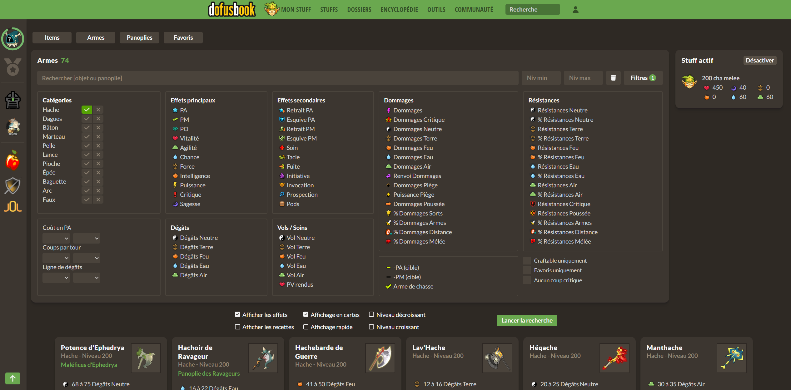
Details
Authorrhyn
LicenseNo License
Categoryhttps://www.dofusbook.net/
Created
Updated
Code size2.0 kB
Code checksum412b8ef7
Statistics
Learn how we calculate statistics in the FAQ.
Failed to fetch stats.
Description
Notes
Userstyle doesn't have notes.Source code
/* ==UserStyle==
@name           dofusbook.net - 7/25/2023, 7:30:59 PM
@namespace      github.com/openstyles/stylus
@version        1.0.0
@description    A new userstyle
@author         Me
==/UserStyle== */
@-moz-document domain("dofusbook.net") {

    /* Row instead of colum for search tab */
    .col-auto.px-3not:flex-column {
        width: auto;
        position: absolute;
    }

    .toto {
        width: 0px;
        height: 0px;
    }

    .flex-column.justify-content-center.col-auto.d-flex.align-items-center.px-3 {
        flex-direction: row !important;
        visibility: visible;
        height: 60px;
    }

    /* increased row when possible */
    @media (min-width: 1440px) {
        .MainWrapper {
            max-width: 94vw;
        }
    }

    @media (min-width: 1024px) {
        .MainWrapper {
            max-width: 94vw;
        }
    }

    .MainWrapper {
        margin: 0px 80px 0px 80px;
    }


    .col-24.col-xl-18 {
        width: 85%;
    }

    .col-24.col-xl-6 {
        width: 15%;
    }

    .col-24.col-md-8.pt-4 {
        max-width: 289px;
        padding: 10px 0 0 0 !important;
    }


    .col-sm-12.col-lg-8.px-3.pb-6 > .widget > .content > .body {
        display: flex;
        flex-direction: column;
        height: 100%;
    }

    .col-sm-12.col-lg-8.px-3.pb-6 > .widget > .content > .body > section {
        flex-grow: 2;
    }

    .py-2 > div > .row {
        display:flex;
        justify-content:center;
    }

    .py-2 > div > .row > .col-24.col-md-8.pt-4  > .rule {
        display:flex;
        justify-content:center;
    }

    /* re center search bar */
    .row.px-1.pb-6 {
        width: 50vw;
        margin: 0 30%;
    }

    /* Hide right side Skycraper */
    #Skycraper {
        visibility: hidden;
    }

    /* various fix qol */
    #search-results {
        display: flex;
        width: 94vw !important;
        justify-content: center;
    }

    #search-results > div {
        max-width: 300px;
    }
}