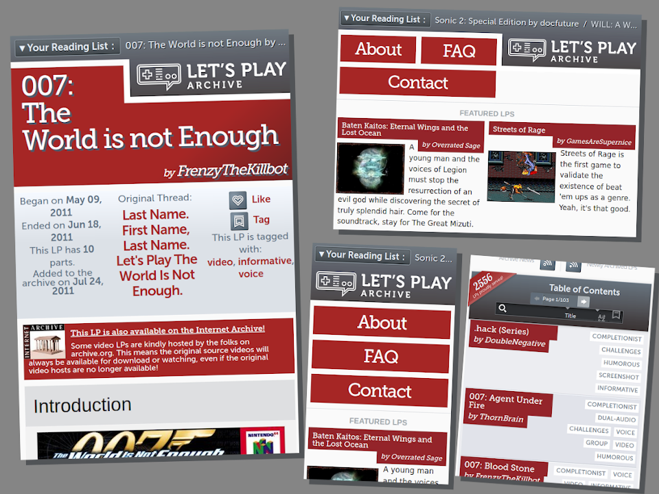
A more fluid and readable override, of LPArchive.org's current "2012/2.0.6" stylesheet.
LP Archive - More Fluid And Readable by squarecrow
Details
Authorsquarecrow
LicenseNo License
Categorylparchive.org
Created
Updated
Code size25 kB
Code checksum44abd411
Statistics
Learn how we calculate statistics in the FAQ.
Failed to fetch stats.
Description
Notes
Not officially final, some sections may still require tweaking at some point, such as the search results table, or the decorations for the front page "news" section.
Features:
- Fluid and responsive layouts
- Bigger, darker font sizes.
- More fluid re-implementation of the "overhanging" text block style, used for some elements of the site.
Tested on Firefox 115.0
Changelog:
- FAQ page is closer to being fully functional and fluid.
- Contact page layout is fluid.
- About/History page layout is fluid.
Source code
Source code has over 10K characters, so we truncated it. You can inspect the full source code on install link./* ==UserStyle==
@name LP Archive - More Fluid And Readable
@version 20230802.14.10
@namespace userstyles.world/user/squarecrow
@description A more fluid and readable override, of LPArchive.org's current "2012/2.0.6" stylesheet.
@author squarecrow
@license No License
==/UserStyle== */
/* ==UserStyle==
@name LP Archive - More Fluid And Readable
@version 0.1.9
@namespace userstyles.world/user/squarecrow
@description A more fluid and readable override, of LPArchive.org's current "2012/2.0.6" stylesheet.
@author squarecrow (https://gitlab.com/squarecrow)
@license No License
==/UserStyle== */
@-moz-document domain("lparchive.org") {
/* best results if lparchive's HTML pages have a “<meta name="viewport" content="width=device-width, initial-scale=1.0">” meta tag in the “<head>”. */
* {
box-sizing: border-box !important;
}
body {
width: 100%;
/*display: flex;*/
flex-wrap: wrap;
position: static;
max-width: 936px;
}
body.history > * {
width: initial !important;
}
html {
font-size: 18px;
}
html > body {
font-size: inherit;
}
div.header,
body.history div.header {
margin: 0 0px;
width: 100%;
/*width: 50%;*/
position: relative;
font-size: 1em;
margin-bottom: 12px;
background: none;
}
.live div.header {
min-height: 0px;
}
div.header .lp-history {
/*osition: absolute;*/
left: 0;
/*background-color: #9fa6ac;*/
width: 100%;
background: none;
font-size: 1em;
display: flex;
padding: 10px;
line-height: initial;
align-items: center;
}
.lp-history.lp-history-expanded {
flex-wrap: wrap;
}
div.header .lp-history .lp-history-title {
position: static;
width: initial;
padding: 0px;
white-space: pre;
background-color: inherit;
box-shadow: none;
line-height: inherit;
padding: 4px;
margin-right: 0.5em;
background-color: #4a5358;
border: 1px solid #949fa8;
background-image: linear-gradient(to top, #41484d, #656d73);
box-shadow: inset 0 0 2px 0px black;
border-radius: 4px;
}
div.header .lp-history .lp-history-title:hover {
background-color: #900e0e;
background-image: linear-gradient(to top, #be6565, #9c2c1e);
}
div.header .lp-history.lp-history-expanded .lp-history-title {}
div.header .lp-history .lp-history-title::before {
content: "\25BC";
display: inline-block;
height: 100%;
min-width: 20px;
color: inherit;
}
div.header .lp-history.lp-history-expanded .lp-history-title::before {
content: ">";
}
div.header .lp-history .lp-history-title::after {
content: ":";
width: 1em;
display: inline-block;
}
div.header .lp-history .lp-history-list {
line-height: inherit;
padding: 0px;
margin: 0;
overflow-x: hidden;
text-overflow: ellipsis;
width: 100%;
text-shadow: 1px 1px 0px black;
}
div.header .lp-history.lp-history-expanded .lp-history-list {
overflow: visible;
display: initial;
}
.lp-history.lp-history-expanded .lp-history-list li {
display: list-item;
margin: 5px 0;
transition: none;
}
.lp-history.lp-history-expanded .lp-history-list li::after {
content: initial;
}
div.header .index-link {
position: static;
float: right;
max-width: 100%;
line-height: 0px;
background-color: #616b73;
display: block;
}
div.header .index-link,
div.header .index-link:hover {
background-image: linear-gradient(to bottom, #666e7400, #423c4585, #4b4646 140px);
background-attachment: fixed;
}
div.header .index-link:hover,
div.header .index-link:active{
background-color: #bc2726;
}
div.header .index-link::before {
content: "";
background-color: inherit;
background-image: inherit;
position: absolute;
top: 0;
left: 0;
right: 0;
bottom: 0;
}
div.header .index-link .logo,
div.header .index-link:hover .logo {
position: relative;
top: 0;
border-style: none;
background: none;
padding: 5px;
overflow: hidden;
}
div.header .index-link .logo i {
max-width: 100%;
display: block;
margin-bottom: 12px;
margin-left: 12px;
}
div.header .index-link .logo::after {
content: "";
position: absolute;
top: 0;
left: 0px;
right: 0;
bottom: 0px;
border-left: 12px solid white;
border-bottom: 12px solid white;
}
a.indexlink:hover,
a#iarchive:hover,
a#authorsite:hover,
h1 a:hover,
h2 a:hover,
ul#menu li a:hover,
a.lp:hover strong,
a.lp:hover span,
a.contactblock:hover {
text-shadow: 0 0 8px rgb(255, 255, 255);
}
ul#menu,
body.history ul#menu {
height: initial;
margin: 0px;
display: flex;
/*width: 100%;*/
flex-wrap: wrap;
margin-right: 12px;
}
/*
.indexhead + *{
width: 50%;
order: -1;
margin:0px;
margin-top:35px !important;
flex-basis: initial !important;
}
*/
ul#menu li {
float: initial;
margin: 0 0 12px 12px;
flex: 1;
flex-basis: 150px;
display: flex;
}
ul#menu li a {
padding: 0;
width: 80px;
height: 64px;
min-width: 100%;
min-height: 0%;
line-height: 64px;
}
a.returnblock {
background-color: #575d62;
background-image: none;
display: flex;
justify-content: space-around;
}
a.returnblock::before,
a.returnblock::after {
content: "\25B2";
flex: 2;
}
div#featured_lps {
padding: 5px;
display: flex;
flex-wrap: wrap;
width: 100%;
}
.featured.blurbs h3 {
width: 100%;
position: static;
font-size: 1em;
font-weight: 900;
flex-basis: 100%;
}
div#featured_lps {
margin: 0;
padding: 5px;
display: flex;
flex-wrap: wrap;
}
div.featured div.lpbox {
float: unset;
clear: both;
margin: 0 auto;
flex-grow: 1;
flex-basis: 300px;
padding: 5px;
/*display: flex;*/
flex-wrap: wrap;
align-content: baseline;
align-items: start;
}
div.featured a {
display: block;
border-bottom: none;
float: left;
}
div.featured a.lp {
flex-basis: 100%;
float: initial;
}
div.featured div.lpbox img {
float: initial;
max-width: 100%;
height: initial;
margin: 10px 10px 0px 0px;
}
div.featured div.lpbox p {
margin: 5px;
flex-basis: 25%;
flex-grow: 1;
font-size: 1em;
}
div.cblock {
font-size: 1em;
}
div#news {
float: right;
margin: auto;
width: initial;
flex-basis: 429px;
flex-grow: 0;
max-width: 50%;
margin-bottom: 1em;
padding-left: 1em;
padding-right: 1em;
padding-top: 1em;
}
div.official-letter {
border: none;
float: initial;
max-height: unset;
width: 100%;
background-color: #ede8e4;
background-image: linear-gradient(to right, transparent 350px, #f5f3f1 450px), linear-gradient(to bottom, #986a1f00 600px, #f9f8f6 700px), url("/site_images/2012/paper-v2-news.jpg");
background-position-x: left;
margin: 0;
}
div#news p.nobama,
div#news h4 {
text-align: right;
}
div#kazuhisa.toppage,
div#letter.toppage,
div#excuses {
box-shadow: inset 0 0 2em #cbb9a6, 1px 2px 6px rgba(0, 0, 0, 0.17);
}
/* latest */
div#latest {
float: left;
margin: auto;
width: 100%;
max-width: 50%;
display: initial;
background-image: none;
}
div#latest h3 {
margin-top: 0px;
height: initial;
background-image: none;
text-align: center;
z-index: 4;
}
div#latest h3 strong:nth-child(1) {
position: static;
white-space: initial;
}
div#latest ul {
margin: 0;
padding: 0;
text-align: center;
position: relative;
z-index: 3;
display: flex;
flex-wrap: wrap;
background: #f8f9fd url("/site_images/paint_body.png") bottom center no-repeat;
background-size: 100% 100%;
}
div#latest ul::before {
content: "";
display: block;
position: absolute;
height: 100px;
width: 100%;
bottom: 100%;
transform: translateY(30px);
background-image: url("/site_images/paint_head.png");
background-position: bottom center;
background-repeat: no-repeat;
z-index: -1;
background-size: 100% 100%;
}
div#news div#kazuhisa {
margin: initial;
width: 100%;
}
@media (max-width:600px) {
div#news,
div#latest {
float: initial;
clear: both;
max-width: 100%;
}
}
ul#feeds {
width: 100%;
}
ul#feeds li a {
color: #324765;
font-size: 0.8em;
}
div.toc div#tocui form#search div.pagination a.disabled,
div.toc div#tocui form#search div.pagination a.disabled:hover,
div.toc div#tocui form#search div.pagination a.disabled:focus {
background-color: #616d7a;
box-shadow: none;
user-select: none;
}
.live div.toc {
flex: 1;
font-size: 1em;
}
.live div.toc div#tocui,
.live div#tocwrapper div#tocframeset {
width: 100%;
/* we override strange js-based width:0 using !important */
}
.live div.toc div#tocui {
width: 100% !important;
/* we override strange js-based width:0 using !important */
background-image: linear-gradient(to top, #3f3737, #68747f);
display: flex;
align-items: center;
position: sticky !important;
padding: 15px;
height: initial;
flex-wrap: wrap;
padding-right: 80px;
}
.live div.toc div#tocui::after {
content: "";
display: block;
left: 0;
top: 100%;
width: 100%;
height: 6px;
position: absolute;
background-image: linear-gradient(to top, transparent, #00000061 4px);
}
@media only screen and (max-width: 959px) {
.live div.toc div#tocui.pinned {
left: 0;
right: 0;...