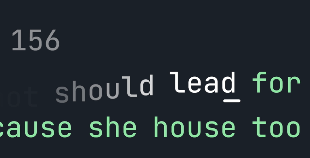
The letters fall down in a satisfying way.
Monkeytype Satisfying letter falling trail by Perseus333
Details
AuthorPerseus333
LicenseNo License
Categorymonkeytype.com
Created
Updated
Code size3.1 kB
Code checksumbfa23581
Statistics
Learn how we calculate statistics in the FAQ.
Failed to fetch stats.
Description
Notes
Userstyle doesn't have notes.Source code
/* ==UserStyle==
@name         Satisfying fall
@version      20230803.15.51
@namespace    ?
==/UserStyle== */

@-moz-document url-prefix("https://monkeytype.com/") {
@keyframes a1 {
  from {
    opacity: 1;
	transform: translate(0,0);
  }
  to {
    opacity: 0;
	transform: translate(0,50%);
  }
}


#words .word:not(.word.active~.word):not(.word.active) letter:nth-child(1) {
    animation: a1 1s forwards;
    animation-delay: 0s;
}


#words .word:not(.word.active~.word):not(.word.active) letter:nth-child(2) {
    animation: a1 1s forwards;
    animation-delay: 0.05s;
}

#words .word:not(.word.active~.word):not(.word.active) letter:nth-child(3) {
    animation: a1 1s forwards;
    animation-delay: 0.1s;
}

#words .word:not(.word.active~.word):not(.word.active) letter:nth-child(4) {
    animation: a1 1s forwards;
    animation-delay: 0.15s;
}

#words .word:not(.word.active~.word):not(.word.active) letter:nth-child(5) {
    animation: a1 1s forwards;
    animation-delay: 0.2s;
}

#words .word:not(.word.active~.word):not(.word.active) letter:nth-child(6) {
    animation: a1 1s forwards;
    animation-delay: 0.25s;
}

#words .word:not(.word.active~.word):not(.word.active) letter:nth-child(7) {
    animation: a1 1s forwards;
    animation-delay: 0.3s;
}

#words .word:not(.word.active~.word):not(.word.active) letter:nth-child(8) {
    animation: a1 1s forwards;
    animation-delay: 0.35s;
}

#words .word:not(.word.active~.word):not(.word.active) letter:nth-child(9) {
    animation: a1 1s forwards;
    animation-delay: 0.4s;
}

#words .word:not(.word.active~.word):not(.word.active) letter:nth-child(10) {
    animation: a1 1s forwards;
    animation-delay: 0.45s;
}

#words .word:not(.word.active~.word):not(.word.active) letter:nth-child(11) {
    animation: a1 1s forwards;
    animation-delay: 0.5s;
}

#words .word:not(.word.active~.word):not(.word.active) letter:nth-child(12) {
    animation: a1 1s forwards;
    animation-delay: 0.55s;
}

#words .word:not(.word.active~.word):not(.word.active) letter:nth-child(13) {
    animation: a1 1s forwards;
    animation-delay: 0.6s;
}

#words .word:not(.word.active~.word):not(.word.active) letter:nth-child(14) {
    animation: a1 1s forwards;
    animation-delay: 0.65s;
}

#words .word:not(.word.active~.word):not(.word.active) letter:nth-child(15) {
    animation: a1 1s forwards;
    animation-delay: 0.7s;
}

#words .word:not(.word.active~.word):not(.word.active) letter:nth-child(16) {
    animation: a1 1s forwards;
    animation-delay: 0.75s;
}

#words .word:not(.word.active~.word):not(.word.active) letter:nth-child(17) {
    animation: a1 1s forwards;
    animation-delay: 0.8s;
}

#words .word:not(.word.active~.word):not(.word.active) letter:nth-child(18) {
    animation: a1 1s forwards;
    animation-delay: 0.85s;
}

#words .word:not(.word.active~.word):not(.word.active) letter:nth-child(19) {
    animation: a1 1s forwards;
    animation-delay: 0.9s;
}

#words .word:not(.word.active~.word):not(.word.active) letter:nth-child(20) {
    animation: a1 1s forwards;
    animation-delay: 0.95s;
}

}