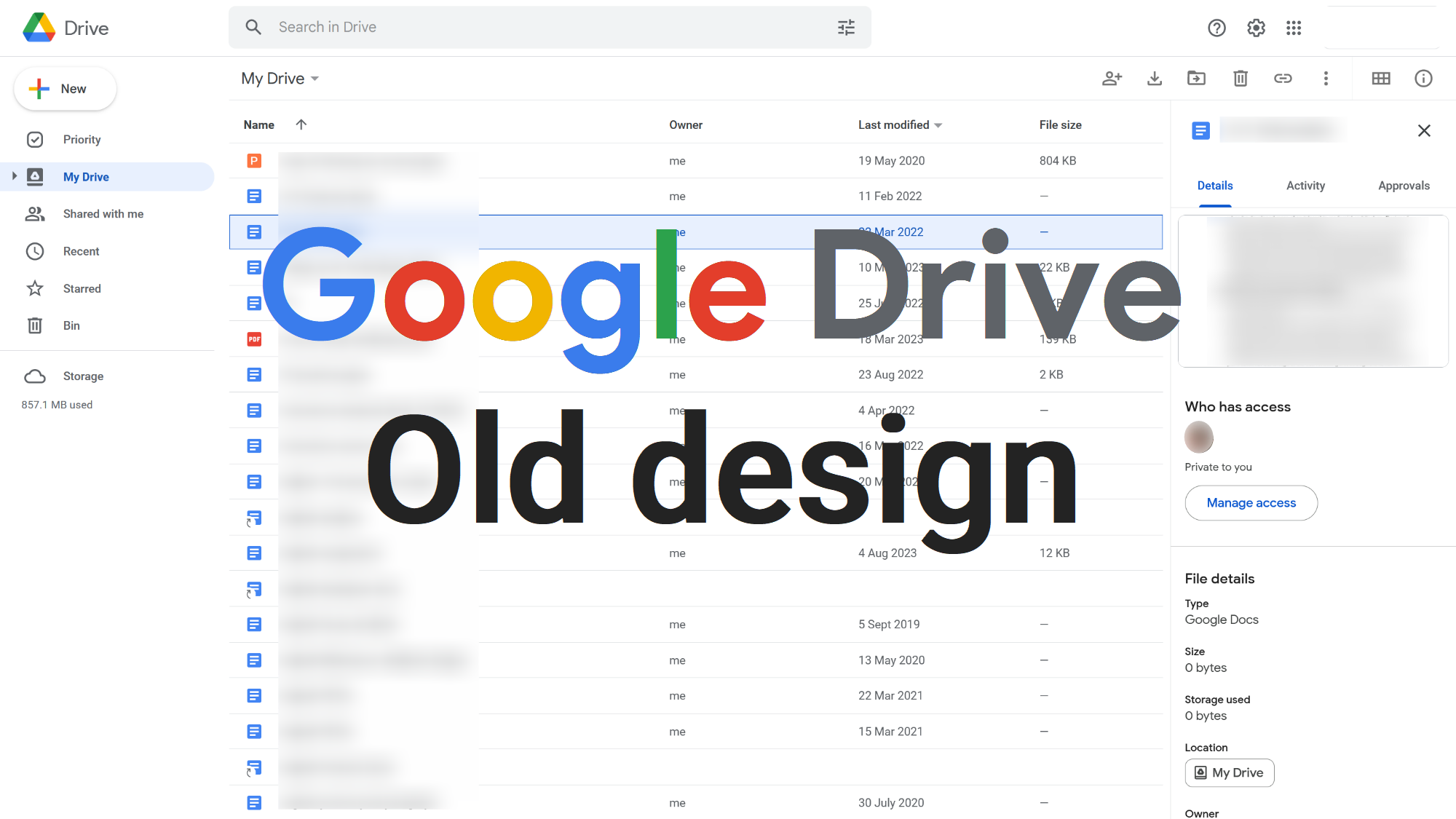
Undo the 2023 "Material 3" Google Drive redesign (blue backgrounds and rounded corners) and reverts back to the UI design initially introduced in May of 2018.
2018-2023 UI Design - Google Drive by JoesMamma
Details
AuthorJoesMamma
LicenseCC BY-NC-SA 4.0
Categorygoogle.com
Created
Updated
Code size20 kB
Code checksum70d55ba6
Statistics
Learn how we calculate statistics in the FAQ.
Failed to fetch stats.
Description
Notes
I have made this style for myself and my specific version of Google Drive but have decided to share it. So, you may find some unexpected behaviour on your version of Google Drive as some elements differ between accounts due to A/B testing, the timing of features released, or different account features. If you do just send me an email.
Source code
Source code has over 10K characters, so we truncated it. You can inspect the full source code on install link./* ==UserStyle==
@name 2018-2023 Google Drive
@namespace github.com/openstyles/stylus
@homepageURL https://userstyles.world/style/11392/2018-2023-ui-design-google-drive
@version 2025.03.09.1435
@description Undo the 2023 "Material 3" Google Drive redesign (blue backgrounds and rounded corners) and reverts back to the UI design initially introduced in May of 2018.
@author Joe's Mamma —— https://userstyles.world/user/JoesMamma —— feedback.joesmamma@gmail.com
@license CC BY-NC-SA 4.0
@var select display-gemini "Show Google Gemini button in top right corner" ["table-cell", "none:Hide"]
@var select display-activity "Show Activity tab in sidebar" ["inline:Show", "none:Hide"]
@var select display-workspaces "Show Home/Workspaces tab in sidebar" ["inline:Show", "none:Hide"]
@var select display-computers "Show Computers tab in sidebar" ["inline:Show", "none:Hide"]
@var select display-spam "Show Spam tab in sidebar" ["inline:Show", "none:Hide"]
@var select display-preview-popup "Show a preview popup when hovering on file/folder icons" ["visible:Show", "hidden:Hide"]
==/UserStyle== */
@-moz-document url-prefix("https://drive.google.com/drive") {
/* Seperate Google Drive's toolbar (First appeared in Personal Accounts only. Now applies to both types of accounts)
*/
/*toolbar height (method used to detect whether filter bar is open and adjust height doesn't work for personal accounts' drive because filter bar and toolbar are combined so therefore always open)*/
.S630me:has(.uEnUtd) {
height: 48px !important;
}
/*combined filter bar and toolbar (unique to personal accounts' drive)*/
.a-s-tb-sc-Ja-Q.a-s-tb-sc-Ja-Q-Nm.a-Ba-Ed.a-s-Ba-ce:has(.uEnUtd) {
position: absolute;
right: 104px;
}
/*toolbar and path bar parent with right side padding (adjustment)*/
.a-s-Ba-Ak {
padding-right: 10px !important;
}
/*toolbar blue and curved part*/
.uEnUtd {
background: none;
border-radius: 0;
margin: 4px 8px 4px 0;
}
/*toolbar buttons wrapper*/
.a-s-tb-sc-Ja.a-s-tb-Kg.a-s-tb-sc-Ja-J.a-s-Ba-Ed-Be-nAm6yf {
align-items: center;
}
/*toolbar buttons' wrappers*/
.a-s-tb-sc-Ja-Q.a-s-tb-sc-Ja-Q-Nm.a-s-tb-Kg-Q {
width: 40px;
height: 40px;
margin: 2px 4px;
}
/*toolbar buttons (excludes details and view-grid buttons)*/
.uEnUtd .h-sb-Ic.h-R-d.a-c-d {
width: 40px;
height: 40px;
margin: 0;
}
/*view and details buttons parent*/
.a-s-tb-sc-Ja-Q-x.a-Ba-Ed.a-s-Ba-dj {
align-items: center;
margin-inline: 10px 0 !important;
}
/*toolbar icons*/
.a-s-tb-sc-Ja-Q.a-s-tb-sc-Ja-Q-Nm.a-s-tb-Kg-Q svg {
width: 24px !important;
height: 24px !important;
}
/*filter chips wrapper*/
.CUYsae {
margin-right: 10px;
}
/*filter chips*/
.glX3de.frsiVb.CNlAe.EwXqJf.iXBMtb.oisqfd.Ss7qXc {
border-color: rgb(178, 184, 189) !important;
}
/*get more storage button*/
.AeBiU-d.AeBiU-d-Qu-dgl2Hf.jWOVfd-ml-d {
border-radius: 4px;
border-color: var(--dt-outline-variant);
padding: 8px 13px;
margin-top: 1em;
}
/*
End
*/
}
@-moz-document url-prefix("https://drive.google.com/drive") {
/* Main theme
*/
/*light variables*/
.vhoiae.KkxPLb {
--dt-on-background: rgb(60, 64, 67);
--dt-on-surface: rgb(60, 64, 67);
--dt-secondary-container: rgb(232, 240, 254);
--dt-on-secondary-container: rgb(24, 90, 188);
--dt-surface-container-low: white;
--dt-surface-container-high: rgb(241, 243, 244);
--dt-surface1: white;
--dt-surface3: rgb(241, 243, 244);
--dt-on-surface-variant: rgb(95, 99, 104);
--dt-body-medium-font: 500 .811rem Roboto;
--dt-title-small-font: 500 .811rem Roboto;
--dt-outline-variant: rgb(218, 220, 224);
--dt-corner-fab-large: .7rem;
--add-button-icon: center/70px url("https://ssl.gstatic.com/docs/templates/thumbnails/docs-blank-googlecolors.png");
--add-button-icon-filter: none;
--add-button-icon-filter-hover: none;
--button-icon-color: rgb(117, 117, 117);
--grid-view-icon: url("data:image/svg+xml,%3Csvg xmlns='http://www.w3.org/2000/svg' enable-background='new 0 0 24 24' height='24px' viewBox='0 0 24 24' width='24px' fill='rgb(117, 117, 117)'%3E%3Crect fill='none' height='24' width='24'/%3E%3Cpath d='M3,5v14h18V5H3z M19,11h-3.33V7H19V11z M13.67,11h-3.33V7h3.33V11z M8.33,7v4H5V7H8.33z M5,17v-4h3.33v4H5z M10.33,17v-4 h3.33v4H10.33z M15.67,17v-4H19v4H15.67z'/%3E%3C/svg%3E");
--list-view-icon: url("data:image/svg+xml,%3Csvg xmlns='http://www.w3.org/2000/svg' enable-background='new 0 0 24 24' height='24px' viewBox='0 0 24 24' width='24px' fill='rgb(117, 117, 117)'%3E%3Crect fill='none' height='24' width='24'/%3E%3Cpath d='M3,5v14h18V5H3z M7,7v2H5V7H7z M5,13v-2h2v2H5z M5,15h2v2H5V15z M19,17H9v-2h10V17z M19,13H9v-2h10V13z M19,9H9V7h10V9z'/%3E%3C/svg%3E");
}
/*dark variables*/
.vhoiae.LgGVmb {
--dt-background: rgb(27, 27, 27);
--dt-surface: rgb(27, 27, 27);
--dt-title-small-font: 500 .811rem Roboto;
--add-button-icon: center/70px url("https://ssl.gstatic.com/docs/templates/thumbnails/docs-blank.png");
--add-button-icon-filter: brightness(.645) contrast(2) invert(1) saturate(0) sepia(.2) hue-rotate(180deg);
--add-button-icon-filter-hover: brightness(.612) contrast(2) invert(1) saturate(0) sepia(.34) hue-rotate(180deg);
--button-icon-color: rgb(196, 199, 197);
--grid-view-icon: url("data:image/svg+xml,%3Csvg xmlns='http://www.w3.org/2000/svg' enable-background='new 0 0 24 24' height='24px' viewBox='0 0 24 24' width='24px' fill='rgb(196, 199, 197)'%3E%3Crect fill='none' height='24' width='24'/%3E%3Cpath d='M3,5v14h18V5H3z M19,11h-3.33V7H19V11z M13.67,11h-3.33V7h3.33V11z M8.33,7v4H5V7H8.33z M5,17v-4h3.33v4H5z M10.33,17v-4 h3.33v4H10.33z M15.67,17v-4H19v4H15.67z'/%3E%3C/svg%3E");
--list-view-icon: url("data:image/svg+xml,%3Csvg xmlns='http://www.w3.org/2000/svg' enable-background='new 0 0 24 24' height='24px' viewBox='0 0 24 24' width='24px' fill='rgb(196, 199, 197)'%3E%3Crect fill='none' height='24' width='24'/%3E%3Cpath d='M3,5v14h18V5H3z M7,7v2H5V7H7z M5,13v-2h2v2H5z M5,15h2v2H5V15z M19,17H9v-2h10V17z M19,13H9v-2h10V13z M19,9H9V7h10V9z'/%3E%3C/svg%3E");
}
/*file-icon preview-popup child-most container*/
.f06SLd,
.f06SLd * {
visibility: var(--display-preview-popup);
}
/*preview-popup second child-most, and child-most container*/
.f06SLd,
.yNiMb {
background-color: var(--dt-surface-bright);
border-radius: 4px !important;
}
/*preview popup name*/
.nkvT8 {
font: var(--dt-title-small-font);
}
/*preview popup image*/
.qKGwlb {
margin-inline: 0;
width: 100%;
border-radius: 0 !important;
}
/*path content-column hover popup*/
.M1VN,
.wKmAvc,
/*recent page*/
.Qq3aqe.LKbIxe {
background-color: var(--dt-surface-bright);
border-radius: 4px;
padding: 0;
}
.wKmAvc *,
/*recent page*/
.Qq3aqe.LKbIxe * {
font: var(--dt-body-medium-font) !important;
font-weight: 400 !important;
color: var(--dt-on-surface-variant);
}
/*child of above element with differing border-radius*/
.Qq3aqe.LKbIxe .fmXc2b {
border: none;
}
/*content font-weight*/
.O5x1db {
font-weight: 400;
}
/*name font-weight*/
.tyTrke.M3pype {
font-weight: 500;
}
/*owner profile pic*/
.BsLd3, .BabZC.Kf6K3d /*recent page*/ {
display: none;
}
/*content columns' widths*/
/*name*/
.PEfnhb[data-column-auto-width-id="4,6,8,12,3,14"] .M3pype:nth-child(2) {
flex-basis: 447px !important;
width: 447px !important;
}
/*owner*/
.PEfnhb[data-column-auto-width-id="4,6,8,12,3,14"] .M3pype:nth-child(3) {
flex-basis: 212px !important;
width: 212px !important;
}
/*last modified*/
.PEfnhb[data-column-auto-width-id="4,6,8,12,3,14"] .M3pype:nth-child(4) {
flex-basis: 203px !important;
width: 203px !important;
}
/*file size*/
.PEfnhb[data-column-auto-width-id="4,6,8,12,3,14"] .M3pype:nth-child(5) {
flex-basis: 88px !important;
width: 88px !important;
}
/*end*/
.PEfnhb[data-column-auto-width-id="4,6,8,12,3,14"] .M3pype:nth-child(6) {
flex-basis: 49px;
width: 49px;
}
/*content headers (name, owner, file-size, etc.)*/
.N7iPof.O5x1db.i4aPLb {
height: 48px;
padding-top: 8px;
}
/*content headers -text*/
.iZz7md.M3pype {
font: 500 .811rem Roboto;
}
/*content headers -name*/
.iZz7md.M3pype.aaQsNb.ncj6Ve.m2dIJf .Sos6ae {
margin-left: 0.25rem;
font: 600 .811rem Roboto;
}
/*content container*/
.S630me,
.PolqHc {
border-radius: 0 !important;
margin-bottom: 0;
}
/*hover action buttons and ellipsis*/
.mM47yb.M3pype,
.sIPyzd.YY3N9,
/*recent page*/
.YMwAs.aYfL6,
.YMwAs.aYfL6 .CUYsae {
visibility: hidden !important;
}
/*date grouping headings in "Shared with me"*/
.yHnyPe.Tguc8d {
padding-left: 0.75rem;
}
/*content*/
.PolqHc {
margin-right: 3.75vw;
}
/*content thumbnails-view*/
.s55KNe .jGNTYb {
background: transparent;
border-radius: 8px;
border: 1px solid var(--dt-outline-variant);
}
/*content thumbnails-view outline*/
.Hb-ja-Na .s55KNe .dPmH0b .jGNTYb::after {
border-radius: 7.3px;
}
/*content thumbnails-view selected*/
.s55KNe:not(.KBj6Qd) .GZwC2b .jGNTYb,
.s55KNe:not(.KBj6Qd) .GZwC2b .jGNTYb:hover,
.aabwZd:not(.KBj6Qd) .GZwC2b:has(.jGNTYb) {
background: linear-gradient(color-mix(in srgb, var(--dt-secondary-container), var(--dt-on-secondary-container) 10%), color-mix(in srgb, var(--dt-secondary-container), var(--dt-on-secondary-container) 20%));
}
/*apps side panel*/
.oLzOxb {
border-left: 1px solid var(--dt-outline-variant);
}
/*folder path and toolbar*/
.S630me {
border-bottom: 1px solid var(--dt-outline-variant);
}
.a-s-Ba-Ak.a-D-B-Ak {
min-height: 0 !important;
}
.a-l-Ba .a-s-Ba-ic .a-s-Ba-ic,
.a-l-Ba .a-s-Ba-dj .a-s-Ba-dj {
padding: 0;
}
.S630me:has(.hWG7gb.eLNT1d),
.aQh4x,
.a-s-Ba-Ak.a-D-B-Ak.Hb-ja-Na,
.a-s-tb-sc-Ja-Q.a-s-tb-sc-Ja-Q-Nm,
.a-s-tb-sc-Ja-Q-x {
height: 48px;
}
/*For old seperate-row/drop-down filter-bar. Now it is same row as new seperate-row toolbar*/
/*when filter bar is open (.hWG7gb is child-most filter bar element that fully fills the space, and when it closes .eLNT1d is added as shown above
.S630me:has(.hWG7gb) {...