Experience ChatGPT with a sleek Material Dark theme. For Developers By A Developer, Enjoy a Highly Customizable AI interaction with better CODE BOX!
ChatGpt Material Dark With Wide Mode Option by Ameer-Jamal
Details
AuthorAmeer-Jamal
LicenseCC BY-ND 4.0
Categoryhttps://chat.openai.com/
Created
Updated
Size50 kB
Statistics
Learn how we calculate statistics in the FAQ.
Failed to fetch stats.
Description
Notes
🌙 ChatGPT Material Dark
If you like it please review lets get this everywhere!
Also if you would like to support : https://buymeacoffee.com/ameerjamal
For feedback please contact me with information about your problem at www.linkedin.com/in/ameer-jamal or raise a github issue here : https://github.com/Ameer-Jamal/ChatGpt-Material-Dark
and ill be happy to fix any arising issues.
Note:
- Make sure chatGPT General Theme settings is set to dark for best results
- I prioritize High Customizability with this theme, check the theme settings (how to access below) to change colors to your liking
🔍 About this Theme:
Transform your ChatGPT experience with a sleek material dark theme. This theme provides a visually pleasing dark mode with improved readability, ensuring a more comfortable and immersive user experience during extended chat sessions.
🎨 Features:
-
2.1.3 : Made Wide mode default due to it being a big reason people download + fixes and enhancements
-
2.1.0 GPT Canvas Support
-
2.0 update!! :
Im trying to do LOTS of color customization in stylus settings (see how to access below) so you can make GPT look as you want
Also: -
Fixing many color issues
-
using better calibrated screen for better colors showing on devices
-
themed settings
-
better hover effects
-
themed menus
-
bug fixes in theme
-
NEW customizable feature for adjusting the maximum height of the User Text Input Bar directly from the Stylus settings, enhancing your reading experience for composing and reviewing larger questions.
-
NEW Remove Team subscription Advertising in Chat History Option from stylus settings (On By default)
-
NEW: GPT WIDE MODE! allow chats to be wide great for programmers that like bigger code blocks (details below)
- Added the ability select your own input and output text colors (details below)
- A deep and consistent dark color scheme inspired by material design.
- Better Selection Highlighting with HighContrast
- User input and GPT output now are different colors for easier on the eyes reading and also faster distinguishing between input and output
- Better Code Syntax Highlight within text to function like Slack's embedded orange code ( when code written out of code-box)
- Strong white headings on silver easy on the eyes main text for GPT output
- Border + Color separation in chat between GPT and user to allow for easier to see differentiation of question and answer
- Better Code Box!
- VS Code Dark+ Code Background
- FIRA CODE Font
- Better letter spacing
- Top Code Bar language highlight
- Font smoothed/Antialiased (for low resolution displays)
- Better horizontal scroll bar visibility
- Clearer thicker scroll Bars for better navigation horizontally and vertically
- Better Alert Colors
- Enhanced code sections with improved background and text contrast.
- Integration with popular Google Fonts for enhanced readability.
📦 Installation & Setup
Enhance your ChatGPT experience with these initial steps:
- Add UserStyle: Install the "ChatGpt Material Dark With Wide Mode Option" UserStyle using Stylus or a similar supported browser extension. Make sure to navigate to ChatGPT post-installation.
- Enable Dark Mode: Switch to GPT Dark mode to prevent any style conflicts by:
- On https://chat.openai.com/ after logging in
- Click your username at the bottom left corner.
- Navigate to Settings > General.
- Click on the Theme and select Dark.
🔧 Customizing ChatGPT and enabling options with Stylus
Tailor your ChatGPT interface effortlessly:
- Open Stylus Plugin: Click the Stylus extension icon on your browser's toolbar.
- Find the Theme: Search for "ChatGPT Material Dark" in your UserStyles list.
- Customize Colors 🌈 & Activate Wide Mode 🖥️: Utilize the gear icon next to the theme for customization. Here, you can alter the text colors and toggle the GPT WIDE MODE for an expanded chat interface, ideal for larger code blocks or extensive text.
💡 Note: Compatibility
This setup is compatible with various extensions and features, enhancing your ChatGPT experience:
- ChatGPT Chat Organizer
- Dark Reader
- Suitable for ChatGPT Plus Subscription users.
Source code
Source code has over 10K characters, so we truncated it. You can inspect the full source code on install link. /* ==UserStyle==
@name ChatGpt Material Dark With Wide Mode and Customization
@namespace ameer-jamal.github.io/
@version 2.2.5
@description Experience ChatGPT with a sleek Material Dark theme. Enjoy a distraction-free, immersive AI interaction on chat.openai.com.
@author Ameer Jamal
@license CC BY-ND 4.0
@preprocessor less
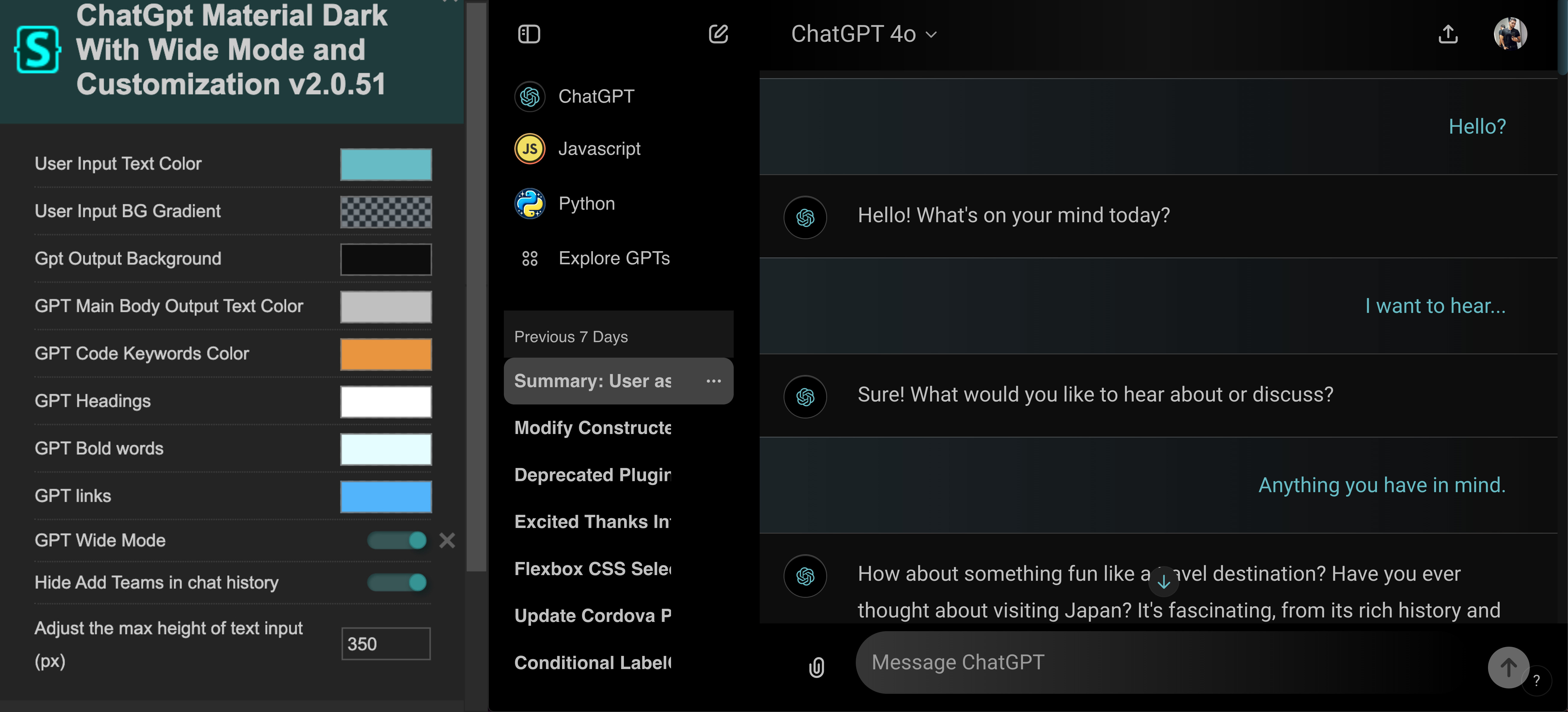
@var color userInputTextColor "User Input Text Color" rgb(105,187,197)
@var color userInputBackgroundGradientColor "User Input BG Gradient" #2b404c61
@var color userInputBubbleColor "User Input Background Bubble" rgba(0,0,0,0)
@var color gptOutputBackground "Gpt Output Background" #000000
@var color gptMainBodyOutputColor "GPT Main Body Output Text Color" #C0C0C0
@var color codeKeyWordsOutput "GPT Code Keywords Color" #E8922E
@var color headingOutput "GPT Headings" #fff
@var color boldOutput "GPT Bold words" #e5fdff
@var color linksOutput "GPT links" #53b7ff
@var color verticalChatLines "Paragraph line split color" #2fffd2
@var color lineColor "Line work/borders color" rgba(255, 255, 255, .2)
@var checkbox wideMode "GPT Wide Mode" 1
@var checkbox hideAddTeams "Hide Add Teams in chat history" 1
@var checkbox noTextWrap "Show Full Chat Descriptions (No Text Wrap)" 0
@var number textInputBarMaxHeight "Adjust the max height of text input (px)" ['px', 350, 1, null, 1]
==/UserStyle== */
/*
* License: Creative Commons Attribution-NoDerivatives 4.0 International (CC BY-ND 4.0)
*
* You are free to:
* - Share — copy and redistribute the material in any medium or format.
*
* Under the following terms:
* - Attribution — You must give appropriate credit, provide a link to the license, and indicate if changes were made.
* You may do so in any reasonable manner, but not in any way that suggests the licensor endorses you or your use.
* - No Derivatives — If you remix, transform, or build upon the material, you may not distribute the modified material.
* - No Commercial Use — You may not use t
* For the full license text, visit https://creativecommons.org/licenses/by-nd/4.0/
* For any questions or concerns, please reach out to the original author.
*/
@-moz-document regexp("https://chat.openai.com(/.*)?"), regexp("https://auth.openai.com(/.*)?"), regexp("https://auth0.openai.com(/.*)?"), regexp("https://chatgpt.com(/.*)?") {
@import (css) url('https://fonts.googleapis.com/css2?family=Roboto&display=swap');
@import (css) url('https://fonts.googleapis.com/css2?family=JetBrains+Mono&display=swap');
@import (css) url('https://fonts.googleapis.com/css2?family=Fira+Code:wght@500&display=swap');
@import (css) url('href="https://fonts.googleapis.com/css2?family=Montserrat:ital,wght@0,100..900;1,100..900&display=swap');
:root {
--futuristic-gradient: linear-gradient(to right, #0f2027c4, #203a43b0, #2c5364cf);
--darker-futristic-gradient: linear-gradient(to right, #245062c4, #203a43b0, #000000cf);
/* W3C, IE 10+/ Edge, Firefox 16+, Chrome 26+, Opera 12+, Safari 7+ */
--chat-background-gradient: linear-gradient(180deg, rgb(32 33 35 / 0%), rgb(32 33 35) 58.85%);
--all-chat-history: @gptOutputBackground;
--main-chat-border-color: rgba(137, 126, 109, 0.35);
--deep-space: linear-gradient(to left, #000, #434343cc);
--deep-space-to-top-transparent: linear-gradient(to top, #4343434f, #0D0D0D);
--alerts: linear-gradient(to right, #ff512ff0, #f09819f0);
--code-background: #1E1E1E;
/* Vscode Dark+ */
--code-topbar: radial-gradient(circle at -5.9%, #2c5364 0%, #00283a 15.9%, #1E1E1E 24.5%, #1E1E1E 100%);
--user-input: linear-gradient(to right,
#2c53646e 0%,
#000000 100%);
--selected-chat-gradient: linear-gradient(to right, @userInputBackgroundGradientColor , #0D0D0D 100%);
--canvas-top-bar-gradient: linear-gradient(to right, #0D0D0D, @userInputBackgroundGradientColor);
--chat-history-list: #C0C0C0;
--sidebar-surface-secondary: #676767a6;
/*Highlight selected chat not used in favor of --sidebar-surface-tertiary*/
/* Alternative user input text color: #B0C4DE */
--user-input-text: @userInputTextColor;
--user-input-bubble-color: @userInputBubbleColor;
--user-input-text-less-transparent: rgba(@userInputTextColor, 0.5);
--main-body-output: @gptMainBodyOutputColor;
--code-key-words: @codeKeyWordsOutput;
--heading-output: @headingOutput;
--bold-output: @boldOutput;
--links-output: @linksOutput;
--line-color: @lineColor;
--vertical-chat-lines: @verticalChatLines;
/* Absolute black var */
--darkest-of-darks: #000
}
/*********************************************************************************/
/**************HOME PAGE WHEN NEW CHAT STARTING **********************************/
/*logo*/
.mb-3.h-12.w-12 {
filter: invert(1);
}
/*Auto prompts on home screen*/
button.btn.relative.btn-neutral.group.w-full.whitespace-nowrap.rounded-xl.px-4.py-3.text-left.text-token-text-primary.md\:whitespace-normal:hover {
background: var(--futuristic-gradient)!important;
border-radius: 10px;
}
/* Keyframes for red to white background transition */
@keyframes redPulseBG {
0% {
background-color: #585858;
}
50% {
background-color: #979797;
}
100% {
background-color: #585858;
}
}
/* Input box send message animation */
@keyframes heartbeat {
0% {
transform: scale(1);
}
14% {
transform: scale(1.1);
}
28% {
transform: scale(1);
}
42% {
transform: scale(1.1);
}
70% {
transform: scale(1);
}
}
/* Stop Generating button */
button[aria-label*="Stop"] {
animation: heartbeat 4s ease-in-out infinite;
background: #cf2500eb !important;
}
/* Stop Generating button */
button[aria-label*="Stop"] {
background: #cf2500eb !important;
}
/* Send to GPT button */
button[data-testid="send-button"]:not(:disabled) {
transition: background 2s ease-in-out;
}
/* Send to GPT button on hover */
button[data-testid="send-button"]:not(:disabled):hover {
transition: background 0.5s ease-in-out;
background: var(--user-input-text);
animation: heartbeat 4s ease-in-out infinite;
filter: saturate(1.5) contrast(1.5);
}
/* Talk with GPT */
button[data-testid="composer-speech-button"] {
background: var(--user-input-text);
}
/* Attachments button */
button.flex.items-center.justify-center.text-token-text-primary {
transition: background 0.5s ease-in-out;
/* Add transition for background */
}
/* Attachments button on hover */
button.flex.items-center.justify-center.text-token-text-primary:hover {
background: var(--user-input-text) !important;
animation: heartbeat 2s ease-in-out infinite;
filter: saturate(1.5) contrast(1.5);
}
/* SVG inside the attachments button on hover */
button.flex.items-center.justify-center.text-token-text-primary:hover svg {
filter: invert(1);
transform: scale(1.2);
transition: transform 0.5s ease-in-out;
}
.align-center.flex.h-full.w-full.flex-col.justify-center.self-center.px-2.pb-2.md\:pb-\[8vh\] {
background: var(--darkest-of-darks) !important;
}
circle.origin-\[50\%_50\%\].-rotate-90.transition-\[stroke-dashoffset\] {
stroke: var(--user-input-text);
filter: saturate(3) brightness(3) contrast(200%);
}
/*Xs for images attached*/
button.absolute.right-1.top-1.-translate-y-1\/2.translate-x-1\/2.rounded-full.border.border-token-border-heavy.bg-token-main-surface-secondary.p-0\.5.text-token-text-primary.transition-colors.hover\:opacity-100.group-hover\:opacity-100.md\:opacity-0 {
color: var(--user-input-text) !important;
filter: saturate(3) brightness(3) contrast(200%);
}
/* Input Dialog Bottom Bar */
._prosemirror-parent_15ceg_1.text-token-text-primary.max-h-\[25dvh\].max-h-52.overflow-auto.default-browser {
background: linear-gradient(to top, #121212, var(--darkest-of-darks)) !important;
border: 1px solid var(--user-input-text-less-transparent);
border-radius: 30px;
padding-left: 20px;
padding-right: 20px;
}
.align-center.flex.h-full.w-full.flex-col.justify-center.self-center.px-2.pb-2.md\:pb-\[8vh\] {
background: var(--darkest-of-darks);
}
/* current Model */
.draggable.no-draggable-children.sticky.top-0.p-3.mb-1\.5.flex.items-center.justify-between.z-10.h-header-height.font-semibold.bg-token-main-surface-primary.max-md\:hidden {
background: linear-gradient( to bottom,
rgb(0, 0, 0), /* Darker at the top */
rgba(0, 0, 0, 0.0)/* Fully transparent at the bottom */
);
backdrop-filter: blur(1px);
/* Apply blur effect */
}
/* current Model Text*/
[aria-label^="model" i] .text-token-text-secondary {
/* Your styles here */
color: var(--user-input-text);
/* Example style */
filter: saturate(0.7) contrast(1.1);
}
.draggable.no-draggable-children.sticky.top-0.p-3.mb-1\.5.items-center.h-header-height.font-semibold.bg-token-main-surface-primary.z-30.mx-auto.flex.w-full.justify-center.gap-2.whitespace-nowrap.pt-\[1\.125rem\] {
background: linear-gradient( to bottom,
rgb(0, 0, 0), /* Darker at the top */
rgba(0, 0, 0, 0.0)/* Fully transparent at the bottom */
);
backdrop-filter: blur(1px);
/* Apply blur effect */
}
.pb-64 {
padding-bottom: 0px !important;
}
/*********************************************************************************/
/* replace bg color */
.dark body,
.dark html {
background-color: rgba(18, 18, 18, 1);
}
#__next > div.overflow-hidden.w-full.h-full.relative.flex.z-0 > div.relative.flex.h-full.max-w-full.flex-1.overflow-hidden > div > main > div.flex-1.overflow-hidden {
background-color: rgba(18, 18, 18, var(--tw-bg-opacity));
}
#__next > div.overflow-hidden.w-full.h-full.relative.flex.z-0 > div.relative.flex.h-full.max-w-full.flex-1.overflow-hidden > div > main > div.flex-1.overflow-hidden > div > div > div > div.flex.items-center.justify-center.gap-1.border-b.border-black\/10.bg-gray-5...