A dark or light, modernized, and customizable userstyle for NikoMaker, inspired by Windows 10's design language.
Modern NikoMaker by logan
Details
Authorlogan
LicensePublic Domain
Categoryprincessrtfm
Created
Updated
Code size10 kB
Code checksum7b93f65c
Statistics
Learn how we calculate statistics in the FAQ.
Failed to fetch stats.
Description
Notes
Suggestions or bug reports? Send them to my Discord: @arcticniko (my DMs are open)
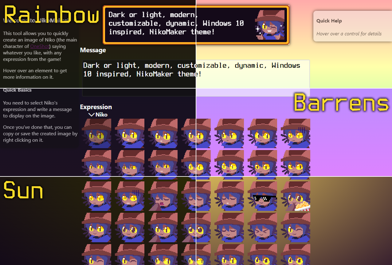
Modern NikoMaker is a userstyle that modernizes the experience of NikoMaker, adding features like a dark mode, background themes, modern icons, dynamic feedback, more thorough UI design, etc. to fix the dated appearance of Vanilla NikoMaker! It also allows for user customization to be made too.
A lot of the userstyle was inspired by Windows 10's design language (Microsoft Design Language 2 a.k.a. Metro v2 and Fluent Design 1), thus, some Windows 10 elements (like the Segoe UI font, MDL2 icons, etc.) are present here. However, it isn't fully Windows 10's design language, and thus, will contain elements that don't follow that design language.
v1.1.6
- Fix a bug where the render shadow wouldn't apply to the specialized version of the render, explained below.
v1.1.5
- Revise the "Don't use integer scaling on .5x scaling increments" for better clarity.
- Fix a bug with anything related to the render where any render-affecting tweaks wouldn't apply to the "specialized version" of the render, which can pop up if using NikoMaker FaceParty (an upcoming userscript), by running NikoMaker locally, or by any other rare means.
- Correct the namespace field.
- Brighten the text colour for visited links in dark mode for better contrast.
- Revise the userstyle description in the userstyle's metadata.
v1.1.4
- Remove a double space in the "Don't use integer scaling on .5x scaling increments" option.
v1.1.3
- Change "non-blurry integer scaling" to "non-blurry face & border" in the "Don't use integer scaling on .5x scaling increments" option for better clarity, and the fact that integer scaling has already been previously mentioned.
v1.1.2
- Change "pixelate" to "use integer scaling" in the "Don't use integer scaling on .5x scaling increments" option for better clarity and term usage.
v1.1.1
- Add an option to not use integer scaling on the message box render if using .5x/50% display scaling increments, which can be used to correct weird-looking text at the expense of the face & border becoming blurry. If the option has no effect, it is not for your scenario or there is no problem.
v1.1
- First update in 2024! This update primarily focuses on more customization and features.
- Added a light mode option, for those that prefer light mode websites.
- Added a toggleable option to darken faces when hovered over or selected, for more dymanic feedback.
- Made the "Message is too long, only 3 lines can render" error modern, with a Windows 10 warning icon.
- Added some more goodies, like properly pixelating the faces & render on high-DPI screens that supported it.
- Fixed some bugs, like the link colour being out of place.
v1.0-ns
- Updated the "namespace" parameter in the userstyle code because it turns out I was using them completely wrong.
v1.0
- Released the userstyle.
Pre-1.0
- Any version below v1.0 was either private or a beta testing version for the public release. Although this userstyle used to be truly private, at one point, I decided that I wanted to make the userstyle public, which is what to led to this today.
Source code
Source code has over 10K characters, so we truncated it. You can inspect the full source code on install link./* ==UserStyle==
@name Modern NikoMaker
@namespace userstyles.world/user/logan
@version 1.1.6
@description A dark or light, modernized, customizable userstyle for NikoMaker.
@author Logan
@preprocessor stylus
NOTE: New options added in v1.1.0 over will have a full name instead of a 3-letter version. The ones added before v1.1 will have its name unchanged to keep pre-existing user settings.
@var select bg 'Background' [
'Rainbow',
'Barrens',
'Sun'
]
@var checkbox lightmode "Use light mode" 0
@var checkbox ihp "Make help panels inactive when not hovered on" 1
@var checkbox imb "Make message box inactive when not in focus" 1
@var checkbox rendershadow "Add shadow to generated message box" 1
@var checkbox modernarrows "Use modern arrows on face sections" 1
@var checkbox darkenfaces "Darken faces on selection and hover" 1
@var checkbox mfp "Add more space between faces" 1
@var checkbox nisrenderhiscale "Don't use integer scaling on message render on .5x display scaling increments, can correct text quality (preview only, not exporting) at the cost of blurring the face & render" 0
@var checkbox noanims "Disable animations" 0
==/UserStyle== */
@-moz-document url-prefix("https://gh.princessrtfm.com/niko.html") {
@font-face { /* if the user is running another os other than windows, we have to load the segoe ui font from another source */
font-family: "Segoe UI Fallback";
src: url('https://files.catbox.moe/5urap1.woff2');
}
@font-face { /* above but bold */
font-family: "Segoe UI Fallback";
src: url('https://files.catbox.moe/nsuj2t.woff2');
font-weight: bold;
}
@font-face { /* italic */
font-family: "Segoe UI Fallback";
src: url('https://files.catbox.moe/01jrmu.woff2');
font-style: italic;
}
@font-face { /* Segoe MDL2 Assets Fallback for systems without the font installed */
font-family: "Segoe MDL2 Assets Fallback";
src: url('https://files.catbox.moe/1a83ve.woff2');
}
html { /* this is for the background */
if lightmode {
background-color: #ccf;
} else {
background-color: #112;
}
if not lightmode {
if bg == 'Rainbow' {
background-image: linear-gradient(#211, #221, #121, #112, #212); /* rainbow looks cool :3 */
} else if bg == 'Barrens' {
background-image: linear-gradient(#112, #212);
} else if bg == 'Sun' {
background-image: radial-gradient(#330, #140a19);
}
} else {
if bg == 'Rainbow' {
background-image: linear-gradient(#faa, #ffa, #afa, #aaf, #faf); /* rainbow looks cool :3 */
} else if bg == 'Barrens' {
background-image: linear-gradient(#99f, #f7f);
} else if bg == 'Sun' {
background-image: radial-gradient(#FFDC64, #38202F);
}
}
background-attachment: fixed;
height: 100%;
}
body {
if lightmode {
color: #0a0a0a;
} else {
color: whitesmoke;
}
font-family: 'Segoe UI', 'Segoe UI Fallback', system-ui, sans-serif;
}
/* links. default windows 10 accent colours used */
a {
color: #0078d7;
}
a:visited {
if lightmode {
color: #881798;
} else {
color: #b146c2;
}
}
if rendershadow {
#render, #shadow { /* shadow for the actual dialog box itself */
box-shadow: 0px 0px 10px #000;
}
}
/* "Message too long" warning */
#errortext {
background: #635826;
border: 2px solid #7F6718;
outline: 0;
color: #ffe;
box-shadow: 0 0 5px #7F6718;
if lightmode {
background: #FFE263;
border-color: #FFCE30;
box-shadow: 0 0 5px #FFCE30;
color: #110;
}
}
.ui-icon-alert { /* the warning icon */
background-image: url(https://files.catbox.moe/x16mrw.svg)!important; /* Windows 10 Warning Icon - Vector Version */
background-position: 0;
background-size: contain;
margin-right: 2px;
}
.face { /* seletion cursor for faces */
cursor: pointer;
if mfp {
margin: 3px 6px;
}
if not noanims {
transition: filter 0.1s;
}
}
/* detect if the display scaling being used is integer or is a .5 multiple (2x, 2.5x, 3x, etc. not 1.25x, 2.6x, etc.) and is not 1x. if so? use integer scaling on the faces & render to prevent bluriness. causes problems with the text in the render, but i dont find it bad enough to sacrifice consistency */
@media (resolution: 1.5x), (resolution: 2x), (resolution: 2.5x), (resolution: 3x), (resolution: 3.5x), (resolution: 4x), (resolution: 4.5x), (resolution: 5x), (resolution: 5.5x), (resolution: 6x), (resolution: 6.5x), (resolution: 7x), (resolution: 7.5x), (resolution: 8x), (resolution: 8.5x), (resolution: 9x), (resolution: 9.5x), (resolution: 10x), (resolution: 10.5x), (resolution: 11x), (resolution: 11.5x), (resolution: 12x), (resolution: 12.5x), (resolution: 13x), (resolution: 13.5x), (resolution: 14x), (resolution: 14.5x), (resolution: 15x), (resolution: 15.5x), (resolution: 16x), (resolution: 16.5x), (resolution: 17x), (resolution: 17.5x), (resolution: 18x), (resolution: 18.5x), (resolution: 19x), (resolution: 19.5x), (resolution: 20x), (resolution: 20.5x), (resolution: 21x), (resolution: 21.5x), (resolution: 22x), (resolution: 22.5x), (resolution: 23x), (resolution: 23.5x), (resolution: 24x), (resolution: 24.5x), (resolution: 25x) {
.face, #render, #photoshop {
image-rendering: pixelated;
}
}
if nisrenderhiscale { /* dont use integer scaling on the message box render if using .5x incremenets, toggable option */
@media (resolution: 1.5x), (resolution: 2.5x), (resolution: 3.5x), (resolution: 4.5x), (resolution: 5.5x), (resolution: 6.5x), (resolution: 7.5x), (resolution: 8.5x), (resolution: 9.5x), (resolution: 10.5x), (resolution: 11.5x), (resolution: 12.5x), (resolution: 13.5x), (resolution: 14.5x), (resolution: 15.5x), (resolution: 16.5x), (resolution: 17.5x), (resolution: 18.5x), (resolution: 19.5x), (resolution: 20.5x), (resolution: 21.5x), (resolution: 22.5x), (resolution: 23.5x), (resolution: 24.5x), (resolution: 25x) {
#render, #photoshop {
image-rendering: unset;
}
}
}
if darkenfaces {
.face:hover {
filter: brightness(0.9);
}
.face#selected {
filter: brightness(0.7);
}
}
#faces>.face-header::before { /* those like face tabs */
margin-right: 3px;
font-size: 1em;
}
if modernarrows {
#faces>.face-header::before { /* change font, increase font size to get modern icons, and fix alignment */
font-size: 1.1em;
font-family: 'Segoe MDL2 Assets', 'Segoe MDL2 Assets Fallback';
vertical-align: sub;
}
#faces>.face-header:not(.collapsed)::before { /* not collapsed */
content: '';
}
#faces>.face-header.collapsed::before { /* collapsed */
content: '';
}
}
#message { /* this is the text box */
background: #111;
border: 2px solid #222;
outline: 0;
color: white;
box-shadow: 0px 0px 10px #111;
if not noanims {
transition: box-shadow 0.2s, background 0.2s;
}
if lightmode {
background: #eee;
border-color: #ddd;
box-shadow: 0 0 10px #aaa;
color: black;
}
}
if imb { /* text box focus states */
#message {
if lightmode {
background: #fff9;
} else {
background: #111a;
}
box-shadow: none;
}
#message:focus {
if lightmode {
background: #eee;
box-shadow: 0 0 10px #aaa;
} else {
background: #111;
box-shadow: 0px 0px 10px #111;
}
}
}
/* those help boxes at the sides
@media only screen and (max-width: 1152px) { /* screen too small? optimize the help boxes for this
#leftbar {
left: -10%!important;
}
if ihp {
#leftbar:hover {
padding-left: 10px!important;
left: 0%!important;
}
}
}
nah whatever */
#leftbar, #rightbar { /* universal side panel css rules */
padding-top: 0;
padding-bottom: 0;
height: fit-content;
box-shadow: 0px 0px 10px #111;
padding-left: 10px;
if lightmode {
background: #eeea;
} else {
background: #111a;
}
}
#leftbar { /* the left help panel */
left: 0;
border-top-right-radius: 10px;
border-bottom-right-radius: 10px;
if not noanims {
transition: padding-left 0.2s, left 0.2s, opacity 0.2s;
}
}
#rightbar { /* the right help panel */
right: 0;
border-top-left-radius: 10px;
border-bottom-left-radius: 10px;
if not noanims {
transition: padding-right 0.2s, left 0.2s, opacity 0.2s;
}
}
...