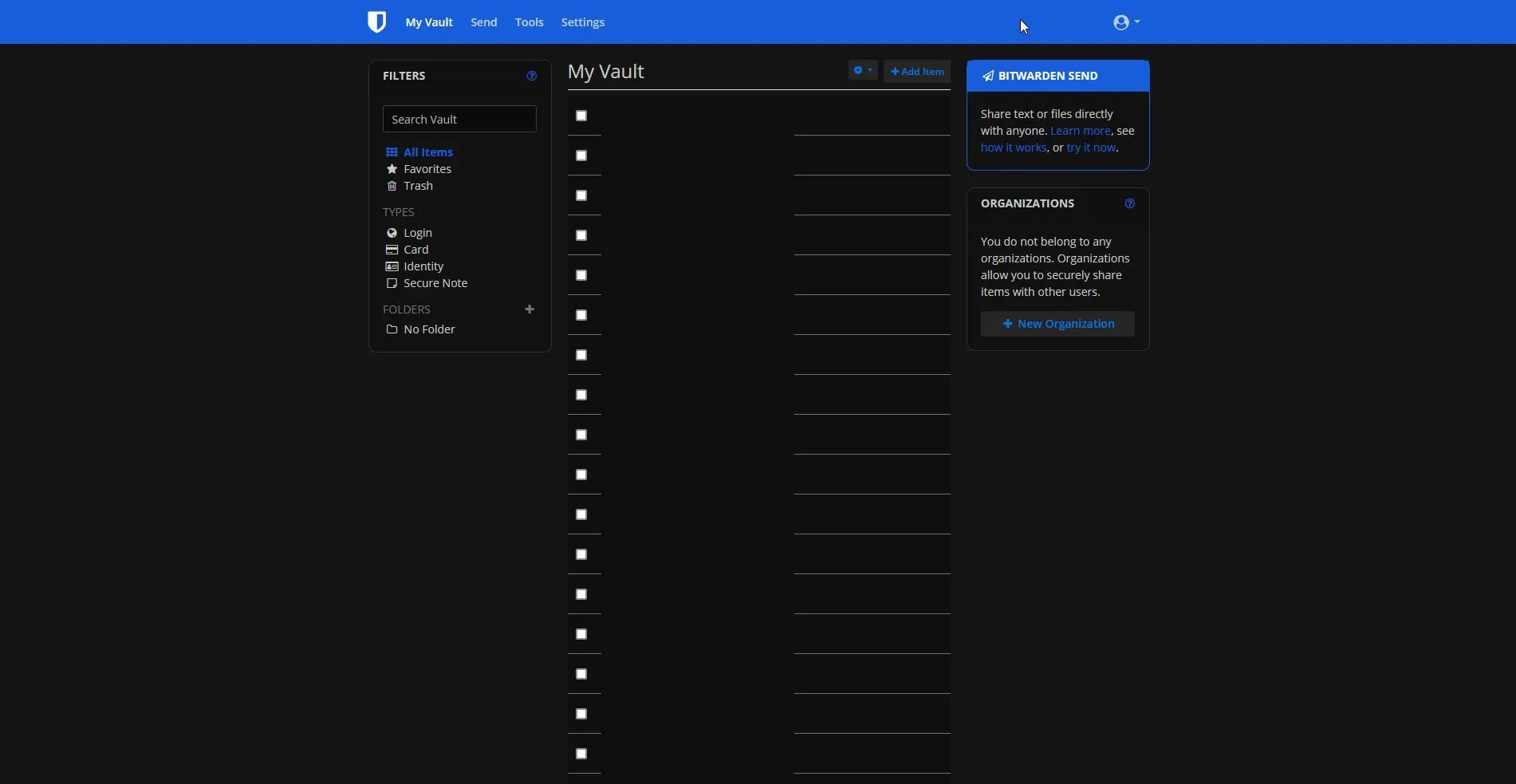
A dark mode for the web vault of Bitwarden.
Bitwarden_Dark by adaoh2
Details
Authoradaoh2
LicenseNo License
Categorybitwarden
Created
Updated
Size5.1 kB
Statistics
Learn how we calculate statistics in the FAQ.
Failed to fetch stats.
Description
Notes
Allows for easy AMOLED mode when you change the colors in the top variables to #000000 (black)
Source code
/* ==UserStyle==
@name           Bitwarden_Dark
@namespace      https://github.com/Adaoh2/bitwardenvault-dark
@version        1.0.4
@description    A dark mode for the bitwarden vault
@author         Adaoh2
==/UserStyle== */

@-moz-document domain("vault.bitwarden.com") {
	/* =================================== */
	/* 			COLOR VARIABLES
	/* =================================== */
	:root {
		--main-bg: #141414; /* main background for the edit cards and main site */
		--card-bg: #111111; /* background for the cards on the side and on login */
		--text-form-bg: #0b0b0b; /* background for the text inputs */
		--primary-blue: #0079E4; /* color of the default blue */
		--secondary-grey: #1E1E1E; /* bad name, more like grey button hover (cursor over the button) */
		--button-grey: #252525; /* color of the grey buttons when not hovering */
		--middle-element: #0f0f0f; /* color of the middle password list */
		--middle-element-hover: #161616; /* color of the middle password list when hovering */
		--main-text: #ccc; /* color of the main text elements */
	}
	/* =================================== */

	/*
	to change the colors, simply change the colors here, all the
	colors with the tags associated with the --tag will be changed at once.
	please note that not all elements are targetted by the variables as it
	would take a very long time to list them all
	*/

	/*--- Login Page ---*/
	html {
		background-color: var(--main-bg);
	}
	body.layout_frontend {
		background-color: var(--main-bg);
	}
	img.logo {
		filter: invert(1);
	}
	.text-center {
		color: var(--main-text);
	}
	.card {
		background-color: var(--card-bg);
		border: 1px solid rgba(255, 255, 255, .125);
		border-radius: 10px;
	}
	label {
		color: #b7b7b7;
	}
	.form-control,
	.form-control:focus {
		color: #d3d3d3;
		background-color: var(--text-form-bg);
		border: 1px solid #3e3e3e;
	}
	.btn[class*="btn-outline-"]:not(:hover),
	.swal2-popup .swal2-actions button[class*="btn-outline-"]:not(:hover) {
		border: 0px;
		color: var(--primary-blue);
		background-color: var(--button-grey);
	}
	.btn-outline-secondary:hover:not(:disabled),
	.swal2-popup .swal2-actions button.swal2-cancel:hover:not(:disabled) {
		color: var(--primary-blue);
		border: 0px;
		background-color: var(--secondary-grey);
	}
	.btn-outline-secondary:not(:disabled):not(.disabled):active,
	.swal2-popup .swal2-actions button.swal2-cancel:not(:disabled):not(.disabled):active,
	.btn-outline-secondary:not(:disabled):not(.disabled).active,
	.swal2-popup .swal2-actions button.swal2-cancel:not(:disabled):not(.disabled).active,
	.show > .btn-outline-secondary.dropdown-toggle,
	.swal2-popup .swal2-actions .show > button.dropdown-toggle.swal2-cancel {
		color: var(--primary-blue);
		background-color: var(--secondary-grey);
	}

	/*----- My Vault Page -----*/
	body {
		background-color: var(--main-bg);
		color: var(--main-text);
	}
	app-vault-groupings .card .card-body a,
	app-org-vault-groupings .card .card-body a,
	.groupings .card .card-body a {
		color: var(--main-text);
	}
	/*- middle list darker -*/
	.table.table-list tr {
		background-color: var(--middle-element);
	}

	/* color of the lines in between the middle passwords list */
	.table th,
	.table td {
		border-top: 1px solid #6f6f6f;
	}

	/* color of the username under the name of the element/site */
	.table.table-list td small,
	.table.table-list td > .fa,
	.table.table-list td .icon {
		color: #b9b9b9;
	}
	.dropdown-item-text {
		color: #fff;
	}
	/*--- Edit Item card----*/
	.modal-header,
	.modal-content,

	.modal-footer {
		background-color: var(--main-bg);
		border: 1px solid var(--main-bg);
	}

	.modal-body {
		border-radius: 10px;
	}
	.close:hover,
	.close {
		color: #f00;
		text-shadow: 0 0px;
	}

	/* this one inverts the image for when there is no TOTP setup. 92% makes the background match with the main-bg color*/
	img.ml-2 {
		filter: invert(92%);
	}

	.cdk-drag-preview {
    background-color: var(--secondary-grey);
}
	/*---- Tools section ----*/
	app-password-generator .card-password .card-body {
		background-color: var(--secondary-grey);
	}
	.bg-light {
		background-color: #fff0 !important;
	}
	.list-group-item.active {
		color: #fff;
		background-color: var(--button-grey)
	}
	.list-group-item {
		background-color: var(--secondary-grey);
	}
	.dropdown-item:hover,
	.dropdown-item:focus {
		color: #e1e1e1;
		background-color: #1a1a1a;
	}
	/*------ settings section ------*/
	.form-control:disabled,
	.form-control[readonly] {
		background-color: #393939;
		color: #c8c8c8;
	}
	.callout {
		background-color: var(--secondary-grey);
	}
	table.table.mb-2.ng-star-inserted,
	table.table-hover.table-list.ng-star-inserted {
		color: #c8c8c8;
	}
	.table-hover tbody tr:hover {
		color: #c8c8c8;
		background-color: var(--middle-element-hover);
	}
	.dropdown-menu.show {
		background-color: var(--secondary-grey);
	}
	.dropdown-item {
		color: #c8c8c8;
	}
	.table {
		color: #c8c8c8;
	}
}