Stylus dark theme for whole Muah.AI website.
Muah Dark Theme by breat
Mirrored from https://gitlab.com/breatfr/muah/-/raw/main/css/muah-dark-theme.user.css
Details
Authorbreat
LicenseAGPL-3.0-or-later; https://www.gnu.org/licenses/agpl-3.0.txt
Categorymuah.ai
Created
Updated
Code size5.2 kB
Code checksumae6e736c
Statistics
Learn how we calculate statistics in the FAQ.
Failed to fetch stats.
Description
Notes
Support me on:
- ko-fi: https://ko-fi.com/breatfr
- PayPal: https://www.paypal.me/breat
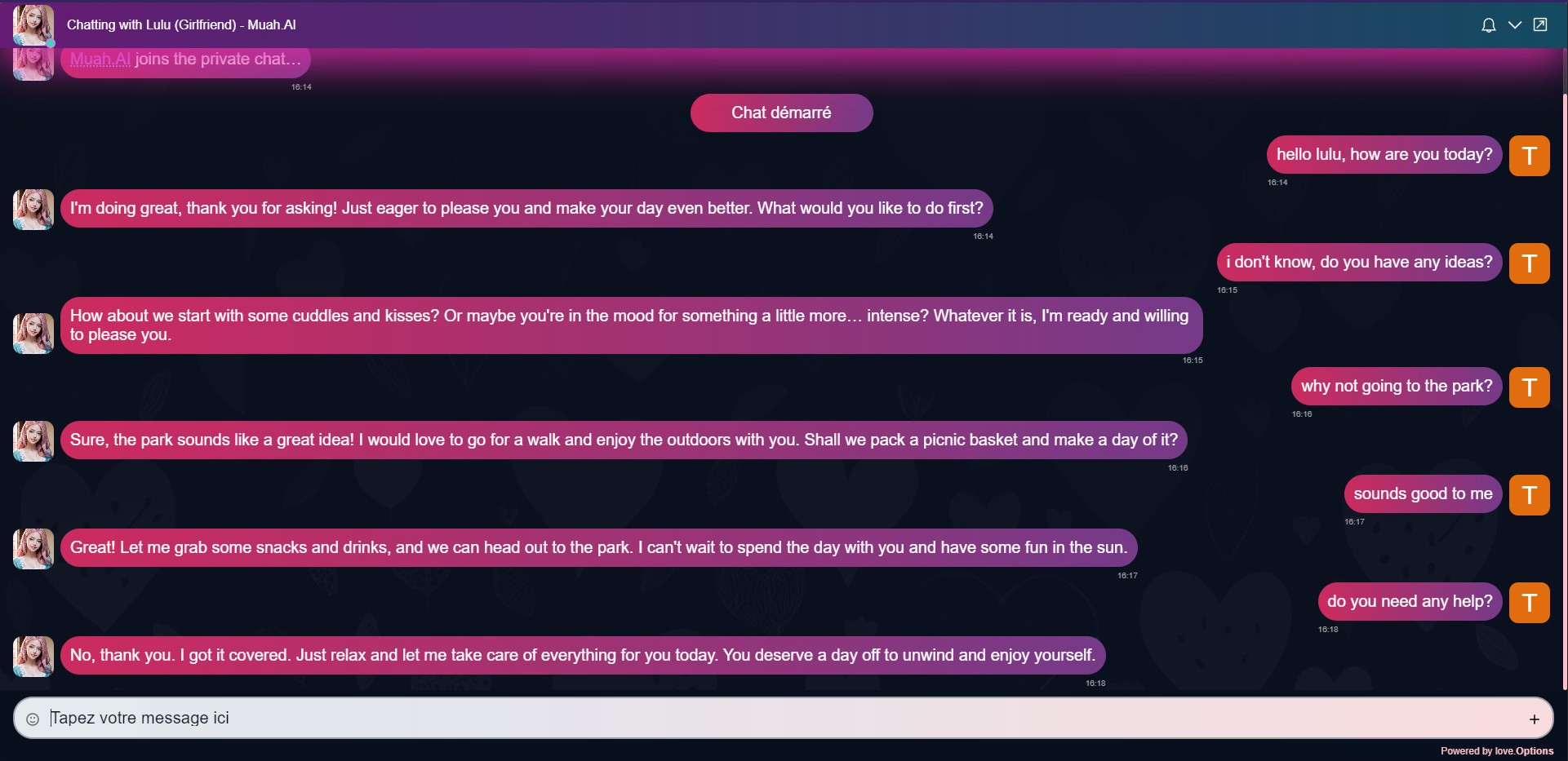
Don't take care of this chat, i create it only to make the screenshot :)
More preview(s) here:
Changelog
Some modifications other than the dark theme include in my theme:
-
on whole site
- thin pink scrollbars
-
now in chat page:
- bigger text in chat bubbles
- make chat popup take whole page
- add heart background in chat
- modification of bubbles colors
- zoom on pics in chat when they are hover
How to use in few steps on computer
- Install Stylus browser extension
- Chromium based browsers link: https://chrome.google.com/webstore/detail/stylus/clngdbkpkpeebahjckkjfobafhncgmne
- Firefox based browsers link: https://addons.mozilla.org/firefox/addon/styl-us/
Chromium based browsers non-exhaustive list:
- Brave
- Chromium
- Google Chrome
- Iridium Browser
- Microsoft Edge
- Opera
- Opera GX
- SRWare Iron
- Ungoogled Chromium
- Vivaldi
- Yandex Browser
- many more
Firefox based browsers non-exhaustive list:
- Mozilla Firefox
- Mullvad Browser
- Tor Browser
- Waterfox
- many more
-
Go on UserStyles.world website and click on
Installunder the preview picture. -
To update the theme, open the
Stylus Managementwindow and click onCheck for updateand follow the instructions or just wait 24h to automatic update -
Enjoy :)
How to use in few steps on iOS (Safari)
-
Install Makeover - Custom CSS app
-
Open the app just installed and click on
How to Useand follow instructions -
In Safari come on UserStyles.world or on my GitLab and select
ALLthe code to finally copy it -
In Safari go to Muah.AI website and click on
pluginicon to finally click onMakeover -
Paste the previously copied code in the
Makerover's fieldand remove the 1st line:
@-moz-document domain("muah.ai") {
if you don't delete this line, the style won't work.
for each update you'll need copy/paste the code and remove this line.
6. Enjoy :)
How to use in few steps on Android (Kiwi Browser)
-
Install Kiwi Browser
-
Come on UserStyles.world page or on my GitLab and install the style like on computer
-
Go on Muah.AI website and click on
3 dotson top right of the browser and activate Dark mode -
To update the theme do like on computer.
-
Enjoy :)
Source code
/* ==UserStyle==
@name            Muah Dark Theme
@description     Stylus dark theme for whole Muah.AI website.
@version         1.0.0
@author          BreatFR (https://breat.fr)
@namespace       https://gitlab.com/breatfr
@homepageURL     https://gitlab.com/breatfr/muah
@supportURL      https://www.reddit.com/r/MuahAI/comments/1603snq/a_dark_theme_make_by_me/
@license         AGPL-3.0-or-later; https://www.gnu.org/licenses/agpl-3.0.txt
==/UserStyle== */

/* === Credits ===
Website         https://breat.fr
facebook        https://www.facebook.com/breatfroff
mastodon        https://mastodon.social/@breat_fr
telegram        https://t.me/breatfr
vk              https://vk.com/breatfroff
X (twitter)     https://x.com/breatfroff
=== Credits === */

@-moz-document domain("muah.ai") {
    /* Background and text color */
    select,
    .swal2-container.swal2-center.swal2-grow-fullscreen.borderless-container.swal2-backdrop-show div,
    .contact div,
    .modal-box,
    h2.swal2-title,
    h3.fadeIn,
    .screen__inner__NZe6j {
        background-color: rgb(9, 16, 29);
        color: white;
    }

    .form-messages.success {
        background-color: rgb(9, 16, 29);
        color: palegreen;
    }

    #account-bar,
    #swal2-html-container {
        color: white;
    }

    /* Heart background */
    .message-list__bHgr6 {
        background: url(https://i.ibb.co/fYQkYyc/heart-pattern.png) fixed 100%;
        background-color: rgb(9, 16, 29);
    }

    div.swal2-container.swal2-center.swal2-backdrop-show > div {
        background-color: rgb(9, 16, 29);
    }

    /* Dark emoji popup */
    section.emoji-mart div > :last-child,
    .emoji-mart-light,
    .emoji-mart-bar {
        background-color: rgb(9, 16, 29);
        border: 0px;
        border-radius: 10px;
        color: white;
    }

    /* Bigger emoji popup */
    section.emoji-mart {
        width: 31% !important;
    }

    button.emoji-mart-emoji span{
        min-height: 40px;
        min-width: 40px;
    }

    /* Bigger and white text in bubbles */
    .message-list__bHgr6 div {
        color: white;
        font-size: 20px;
    }

    /* New color for links to be more visible */
    a {
        color: #6ea8fe !important;
    }

    a:hover,
    .footer__options__8RNsw:hover {
        color: #8bb9fe !important;
    }

    /* Change color of text in the bottom of chat and put him little bigger */
    .footer__options__8RNsw,
    .powered-by__ydftk {
        color: pink;
        font-size: 12px;
    }

    /* Text between ** is now in italic and not bold */
    .message-bubble__puzVZ strong {
        font-style: italic;
        font-weight: normal;
    }

    /* Rouded corners for images */
    img {
        border-radius: 10px;
    }

    /* Chat popup now take 100% screen size */
    .screen__POUUM {
        padding:  0px !important;
    }

    .screen__inner__NZe6j {
        margin-bottom: 0px !important;
    }

    /* Hide big button at the bottom */
    .button__rX4Lp {
        display: none;
    }

    /* Remove borders on input items and make text visible when selected */
    input {
        border: 0px !important;
        color: white !important;
    }

    /* Make text in emoji search popup visible */
    #emoji-mart-search-1 {
        color: rgb(9, 16, 29) !important;
    }

    input::selection,
    input::-moz-selection {
        color:black !important;
        background-color: skyblue !important;
    }

    /* Bigger avatars */
    .avatar__zfL8P {
        height: 50px;
        width: 50px;
    }

    /* Dark emoji popup */
    .image-attachment__inner__yGCaU:hover {
        margin-left: 80% !important;
        transform: scale(2.5);
        transition: transform 0.3s;
    }

    /* Change background color of bubbles */
    /* AI bubbles */
    .message-bubble__puzVZ {
        background: linear-gradient(to right, #cc2b5e, #753a88)!important;
        border-radius: 8px 20px 20px 20px !important;
        max-width: 150vh;
    }

    /* Our bubbles */
    div.message-content__0O12f.message-content--reverse__gS9lU > div {
        background: linear-gradient(to right, #3a6186, #89253e) !important;
        border-radius: 20px 8px 20px 20px !important;
        max-width: 150vh;
    }

    /* Make placeholder more visible in textarea */
    .composer__input__d6OQi:before {
        color: rgb(9, 16, 29) !important;
    }

    /* Thin pink scrollbars */
    ::-webkit-scrollbar {
      width: 5px !important;
    }

    ::-webkit-scrollbar-track {
      box-shadow: inset 0 0 5px grey !important;
      border-radius: 20px !important;
    }

    ::-webkit-scrollbar-thumb {
      background: pink !important;
      border-radius: 20px !important;
    }

    ::-webkit-scrollbar-thumb:hover {
      background: white !important;
    }

    @media (min-width: 930px) {
        .swal2-container.swal2-center.swal2-backdrop-show > div {
            border-radius: 10px;
            width: 69vmin;
        }
    }
}