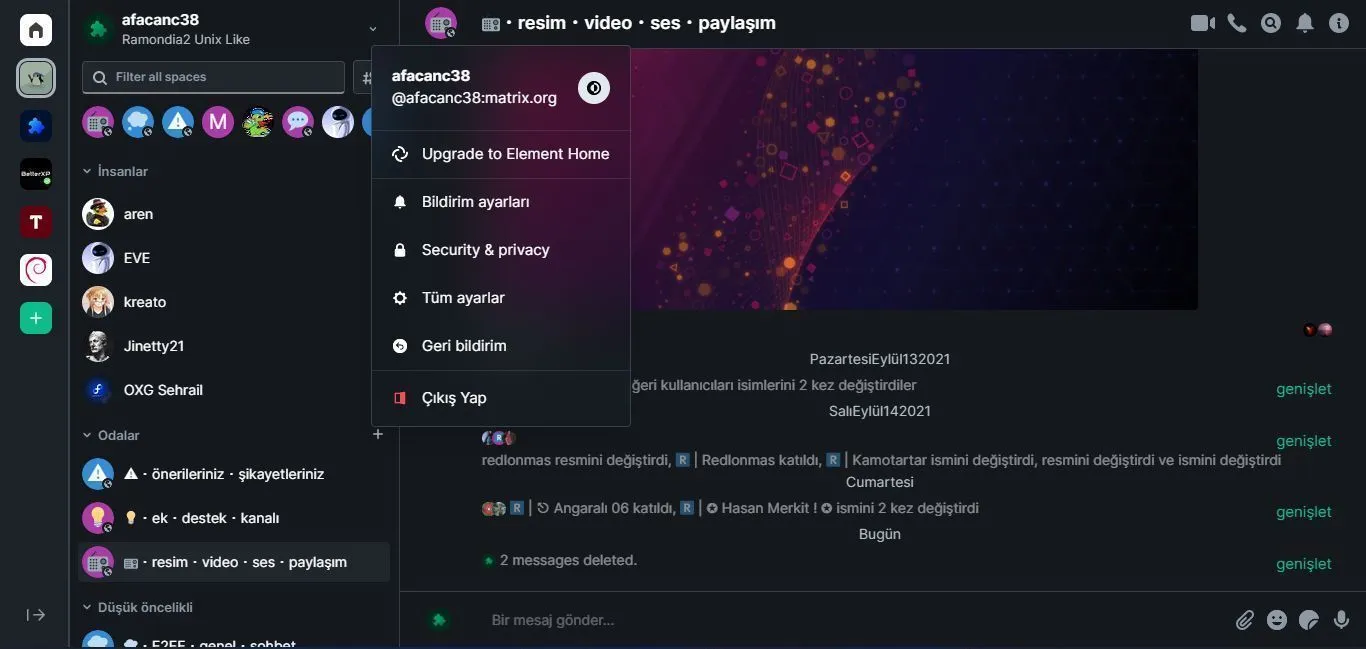
Element is now darker and beautiful with various color edits and blur effects.
Element darker by afacanc38
Details
Authorafacanc38
LicenseWTFPL
Categorymatrix, element, element,io, app.element.io, dark, darker
Created
Updated
Code size4.1 kB
Code checksumee4a990e
Statistics
Learn how we calculate statistics in the FAQ.
Failed to fetch stats.
Description
Notes
If you are using Firefox, go to about:config and change the following settings as "True". Otherwise blur effects do not work.
- gfx.webrender.all
- layout.css.backdrop-filter.enabled
Source code
/* ==UserStyle==
@name         Element darker
@version      20210923.14.23
@namespace    userstyles.world/user/afacanc38
@description  # Element darker

@author       afacanc38
@license      WTFPL
==/UserStyle== */

@-moz-document domain("app.element.io") {
:root {
    --default-color: #0dbd8b;
    --default-background: rgb(21 25 30);
    --radius: 4px;
    --button-color: rgba(141,151,165,.1);
    --focus-color: rgb(25, 30, 35);
    --border: 1px solid rgba(141,151,165,.3);
    --input-border: 2px solid rgb(136, 136, 136);
    --input-focus-border: 2px solid var(--default-color);
    --border-active: 1px solid var(--default-color);
    --blur: saturate(180%) blur(32px);
    --blur-color: rgba(21, 25, 30, .6);
    --shadow: 0px 16px 24px rgb(0 0 0 / 16%);
}

.mx_MessageComposer_wrapper {
    border-top: var(--border);
    padding: -6px;
    background: var(--default-background);
}

.mx_MessageComposer_wrapper * {
    color: white;
}

.mx_SendMessageComposer {
    margin-left: 10px !important;
}

.mx_MessageComposer_avatar .mx_BaseAvatar {
    padding: 0;
}

.mx_RoomHeader {
    border-bottom: var(--border);
}

.mx_LeftPanel_wrapper .mx_LeftPanel_wrapper--user, .mx_LeftPanel {
    background-color: var(--default-background) !important;
    border: 1px solid rgba(141,151,165,.3);
    border-top: 0;
    border-bottom: 0;
    color: white;
}

.mx_SpacePanel{
    background: rgb(29 34 41);
}

.mx_RoomSearch {
    border-radius: var(--radius);
    background: var(--button-color);
    border: var(--border);
    border-bottom: var(--input-border);
}

.mx_RoomSearch.mx_RoomSearch_focused {
    border-radius: var(--radius) !important;
    background: var(--focus-color) !important;
    border: var(--border) !important;
    border-bottom: var(--input-focus-border) !important;
    box-shadow: none !important;
}

.mx_RoomTile.mx_RoomTile_hasMenuOpen, .mx_RoomTile.mx_RoomTile_selected, .mx_RoomTile:focus-within, .mx_RoomTile:hover {
    border-radius: var(--radius);
    background: var(--button-color);
}

.mx_ContextualMenu {
    border-radius: var(--radius);
    border: var(--border);
    box-shadow: var(--shadow);
    background: var(--blur-color);
    backdrop-filter: var(--blur);
}

.mx_ContextualMenu * {
    color: white !important;
}

.mx_Dialog {
    background-color: rgba(21, 25, 30, .2);
    backdrop-filter: var(--blur);
    box-shadow: var(--shadow);
    border: var(--border);
}

.mx_BaseAvatar_image {
    background-color: transparent;
}

.mx_Field input, .mx_Field select, .mx_Field textarea {
    background: transparent;
}

.mx_Field {
    border: var(--border);
}

.mx_AccessibleButton_kind_primary {
    border-radius: var(--radius);
    background: transparent;
    border: var(--border-active);
    color: var(--default-color);
}

.mx_TabbedView_tabsOnLeft .mx_TabbedView_tabLabel_active {
    border-radius: var(--radius);
    background: transparent;
    border: var(--border-active);
    color: var(--default-color);
    font-weight: 900;
}

.mx_TabbedView_tabsOnLeft .mx_TabbedView_tabLabel_active .mx_TabbedView_maskedIcon:before {
    color: var(--default-color) !important;
    background: var(--default-color) !important;
}

.mx_LeftPanel .mx_LeftPanel_roomListContainer .mx_LeftPanel_filterContainer .mx_LeftPanel_exploreButton {
    background: var(--button-color);
    border-radius: var(--radius);
    border: var(--border);
}
.mx_Dialog_buttons button, .mx_Dialog_buttons input[type=submit], .mx_Dialog button, .mx_Dialog input[type=submit] {
    border:none;
    color: white;
}
.mx_Dialog_buttons button.mx_Dialog_primary, .mx_Dialog_buttons input[type=submit].mx_Dialog_primary, .mx_Dialog button.mx_Dialog_primary, .mx_Dialog input[type=submit].mx_Dialog_primary {
    background: transparent;
    border-radius: var(--radius);
    color: var(--default-color);
    border: var(--border-active);
}

.mx_Dialog * {
    color: white;
}

.mx_Dialog a {
    color: #63b1ff;
}
.mx_HomePage_default .mx_HomePage_default_buttons .mx_AccessibleButton {
    background: transparent;
    border: var(--border);
    border-radius: var(--radius);
}
}