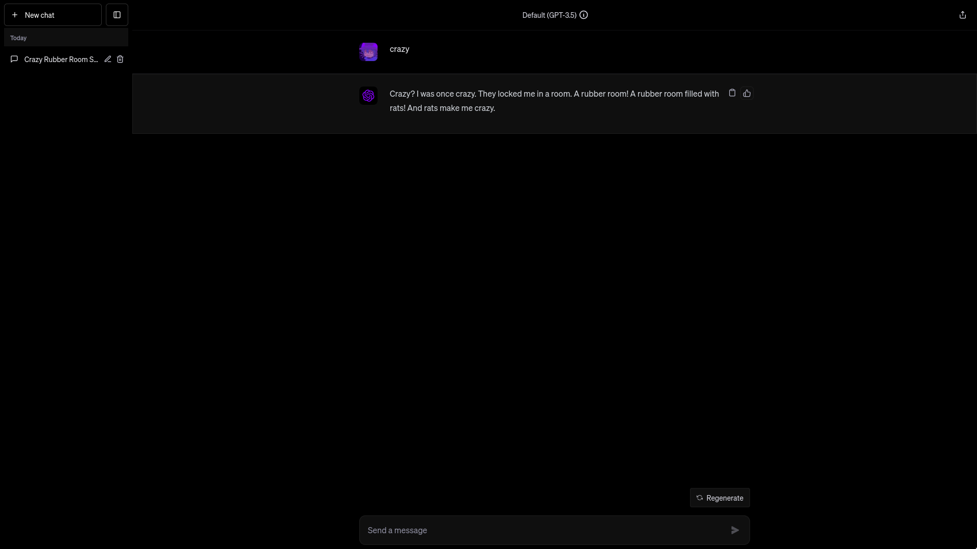
pitch black theme for chatgeepete the talker
chatgpt black by Meqativ
Details
AuthorMeqativ
LicenseMIT
Categorychat.openai.com
Created
Updated
Code size3.0 kB
Code checksum138b347b
Statistics
Learn how we calculate statistics in the FAQ.
Failed to fetch stats.
Description
Notes
Userstyle doesn't have notes.Source code
/* ==UserStyle==
@name         chatgpt black
@version      20241011.11.27
@namespace    https://userstyles.world/user/Meqativ
@description  pitch black theme for chatgeepete the talker
@author       Meqativ
@license      MIT
==/UserStyle== */

@-moz-document domain("chat.openai.com"), domain("chatgpt.com") {
.dark body,
.dark html {
    background-color: #000;
}
.dark {
--text-primary: var(--gray-100);
  --text-secondary: var(--gray-300);
  --text-tertiary: var(--gray-500);
  --text-quaternary: var(--gray-700);
  --surface-primary: hsl(269, 50%, 2.5%);
  --surface-secondary: hsl(269, 50%, 5%);
  --surface-tertiary: #000;
  --border-light: rgba(255,255,255,255,.15);
  --border-heavy: rgba(255,255,255,.2);
  --border-xheavy: rgba(255,255,255,.25);
  --main-surface-primary: #090909;
  --main-surface-secondary: #151515;
  --sidebar-surface-primary: var(--main-surface-primary);
  --sidebar-surface-secondary: #2f2f2f;
  --popover-surface-primary: #111;
}
.dark .gizmo-shadow-stroke::after {
    --tw-shadow: none !important;

}
/* div.text-sm div.w-full > div > div > div:nth-child(1) > div > div > div, div.text-sm div.w-full > div > div > div:nth-child(1) > div > div > div div:has(svg), div.text-sm div.w-full > div > div > div:nth-child(1) > div img, div.text-sm div.w-full > div > div > div:nth-child(1) > div > div > div div svg */
.gizmo-bot-avatar {
    width: 2.5rem !important;
    height: 2.5rem !important;
}
.gizmo-bot-avatar > div > svg {
    width: 95%;
    height: 95%;
}
.dark .text-gray-500 {
    color: #fff;
}

.dark .btn-neutral {
    background-color: rgb(255, 255, 255, 0.05);
}

.dark .btn-neutral:hover {
    background-color: rgb(255, 255, 255, 0.10);
}

.dark .dark\:from-gray-700 {
    --tw-gradient-from: rgb(35, 35, 35) var(--tw-gradient-from-position);
    --tw-gradient-to: rgba(0, 0, 0, 0) var(--tw-gradient-to-position);
    --tw-gradient-stops: var(--tw-gradient-from), var(--tw-gradient-to);
}

.gizmo :is(.dark .gizmo\:dark\:shadow-\[0_0_0_2px_rgba\(52\2c 53\2c 65\2c 0\.95\)\]) {
    --tw-shadow: 0 0 0 2px rgba(0, 0, 0, .95);
}

.gizmo :is(.dark .gizmo\:dark\:bg-gray-800) {
    background-color: rgb(0, 0, 0, 0.05);
}

.dark .dark\:bg-gray-600\/70 {
    background-color: #000000aa;
    backdrop-filter: blur(8px);
}

div.scrollbar-trigger.relative.h-full.w-full.flex-1.items-start.border-white\/20 > nav > div.flex.flex-col.border-t.border-black\/20.pt-2.empty\:hidden.gizmo\:border-t-0.gizmo\:border-token-border-light.dark\:border-white\/20 > a {
    display: none;
}

.dark .dark\:bg-gray-800,
.dark .dark\:bg-gray-800\/90.sticky {
    background: transparent none;
}

nav .dark\:bg-gray-800:hover {
    background-color: rgba(0, 0, 0, .05);
}

/* div.relative.z-0.flex.h-full.w-full.overflow-hidden > div.relative.flex.h-full.max-w-full.flex-1.flex-col.overflow-hidden > main > div.flex.h-full.flex-col > div.flex-1.overflow-hidden {
    display: none;
    height: 100%;
}
[role="presentation"].flex-col {
    flex-direction: column-reverse;
} */

}