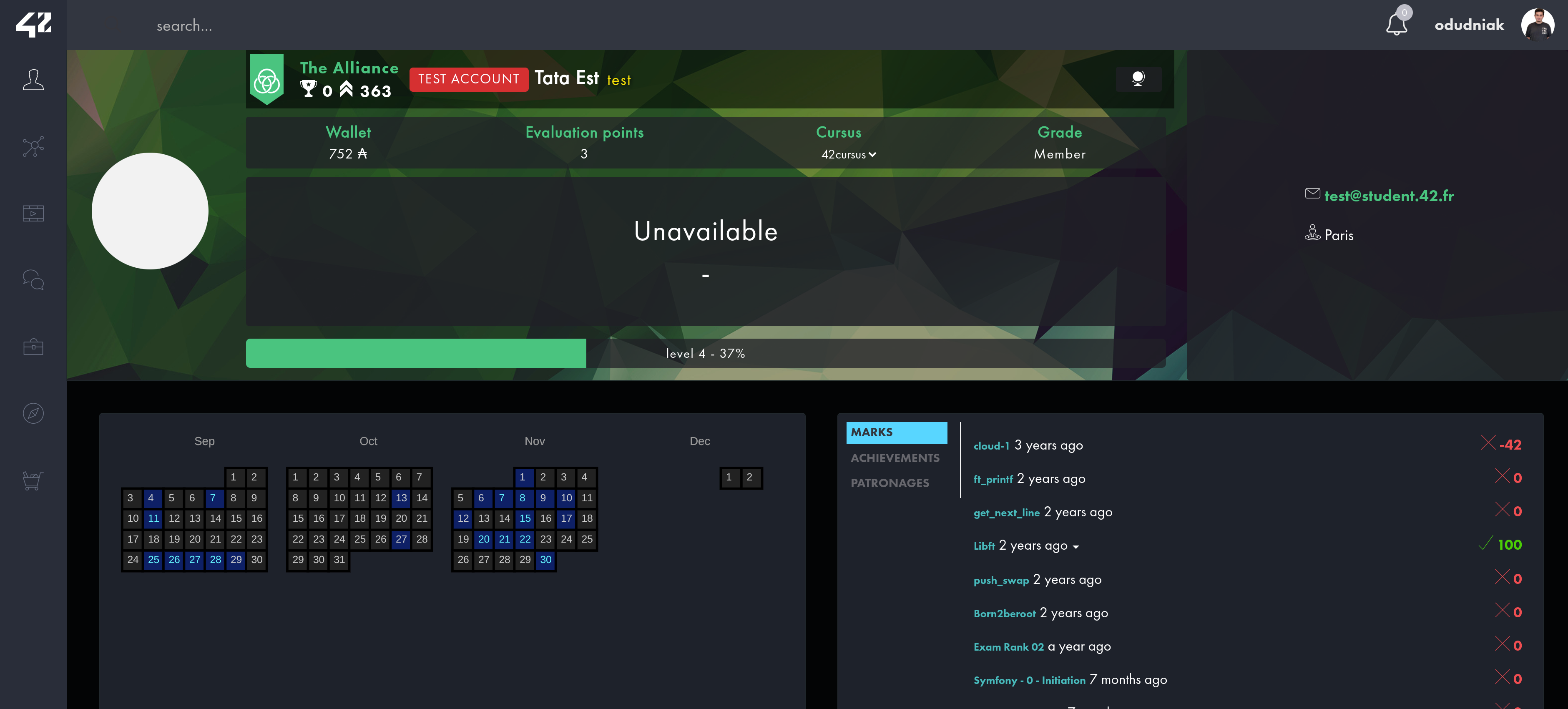
Small changes which could save your eyes from the light theme of intra.
Tags: 42 42fr ft intra profile.intra.42.fr
AuthorSandoramix
LicenseNo License
Category42 FR
Created
Updated
Code size12 kB
Code checksum1e65ca9
Learn how we calculate statistics in the FAQ.
Failed to fetch stats.
Small changes which could save your eyes from the light theme of intra.
Tags: 42 42fr ft intra profile.intra.42.fr
/* ==UserStyle==
@name         Intra 42 FR - Dark theme
@version      20240314.06.32
@namespace    https://userstyles.world/user/Sandoramix
@description  Small changes which could save your eyes from the light theme of intra.
@author       Sandoramix
@license      No License
==/UserStyle== */

/* ==UserStyle==
@name           Intra 42 FR - Dark theme
@namespace      github.com/openstyles/stylus
@version        1.0.0
@description    Intra 42 FR - Dark theme
@author         Sandoramix
==/UserStyle== */

@-moz-document domain("projects.intra.42.fr") {
#slotSelectionModalContainer > div > div > div.modal-body > select {
    color: black;
}


.repo-url.form-control{
    color: whitesmoke;
}

.scale-div {
    background-color:transparent;
}

.projects-list--header {
    padding: .5rem 1rem !important;
}

.main-title {
    padding: 2rem 1.5rem !important;
    color: #E6E6E6;
}

.projects-list--filters--pod {
    display: flex;
    justify-content: start !important;
    align-items: center;
}

.projects-list--filters--pod .btn-group {
    display: flex;
    align-items: center;
    justify-content: end;
    flex-grow: 1;
}

.projects-list-container .projects-list--header span.top-legend, .btn--action span {
    color: #177B86;
}

.projects-list-container .projects-list--list .project-item .project-recomendation {
    flex-basis: 104px;
}

.projects-list-container .projects-list--list .project-item .project-difficulty {
    flex-basis: 90px;
}

.projects-list--list {
    overflow-y: auto;
    max-height: calc(100vh - 448px);
}

.projects-list-container .projects-list--list-header .project-item:hover, .projects-list-container .projects-list--list .project-item:hover {
    background-color: #001420;
}

.team-item .team-content *:not(.text-danger, .text-success, .input-group-addon, .icon-paste) {
    color: var(--c1);
}

.correction-item .corrected-item .correction-comment-item {
    background-color: var(--cnt-bg-neutral);
}

.table-list li.table-item:hover, .pagination > li > a {
    background-color: #081522;
}

.pagination > li > a:hover, .pagination > li > a:focus {
    background-color: #030B14;
    color: white;
}

.pagination > .disabled > a:hover {
    background-color: #111;
}

.pagination > .disabled > a {
    background-color: #000;
}

[style = "background-color: #ccc; height: 200px;"] {
    background-color: #3F4D53 !important;
}
}

@-moz-document domain("intra.42.fr") {
:root {
    --bg: #030405;
    --cnt-bg: #1E222B;
    --cnt-bg-neutral: #212A31;
    --c2: #BBB;
    --c1: #FFF;
    --c3: #EAEAEA;
    --hue-rotation: 0deg;
    --navbar-height: 60px;
    --body-height: 100vh;
    --body-height: 100dvh;
    --page-height: calc(var(--body-height) - var(--navbar-height));
}


#accordion > div > .panel-heading{
    background-color:#0A1E25;
    color: #BAFFE8;
}
#accordion > div, .notification-list{
    border: solid 1px #000;
    background-color:var(--cnt-bg-neutral);
}
.notification-list .notification-item:hover{
    background-color: #011017;
}

*, *::before, *::after {
    box-sizing: border-box !important;
}

*::placeholder {
    color: #B1B1B1;
}

.text-danger {
    color: #FF5050;
}

.text-success {
    color: #05CD05;
}

input, .form-control, .team-item .team-repo .input-group input {
    background-color: #182228;
    color: #fff;
}

.form-control[disabled] {
    background-color: #2F3537;
}

#coalition-score, #coalition-rank{
    font-weight: 600;
}

#coalition-scores table {
    background-color: #2D2D2D;
}

#coalition-scores table tr:nth-child(even) {
    background: #3A4143;
}

#coalition-scores .table-striped > tbody > tr:nth-of-type(odd) {
    background: #1B1C1C;
}

.title-surline {
    color: var(--c2);
}

.profile-item .user-primary .user-infos .profile-name #title-selector.btn-group span.login, .profile-name span.login {
    color: #FFE300;
    text-shadow: 1px 1px 5px #000;
    font-weight: 700;
    font-family: 'Courier New';
    position: relative;
    margin: 0;
}

.coalition-span {
    font-weight: 600;
}

.profile-item .user-primary .user-infos .profile-name {
    background: #0000008F;
    padding: 5px !important;
    display: flex;
    gap: 1rem;
    align-items: center;
    justify-content: start;
    width: 100%;
    height: 100%;
}

.profile-item .user-primary .user-infos .profile-name span, .profile-item .user-primary .user-infos .profile-name #title-selector.btn-group button.btn.btn-default.dropdown-toggle, .profile-item .user-primary .user-infos .profile-name #title-selector.btn-group button.btn-default.dropdown-toggle.broadcasts-filters-btn {
    margin: 0 !important;
}

.profile-item .user-primary .user-infos .profile-name #title-selector.btn-group [data-toggle = "dropdown"] {
    position: relative;
}

.profile-item .user-primary .user-infos .profile-name #title-selector.btn-group .dropdown-menu {
    right: unset;
    left: 0;
    bottom: 0;
}

.profile-item .user-primary .user-infos .profile-name #title-selector.btn-group {
    margin: 0 !important;
    display: flex;
    justify-content: start;
    align-items: center
}

.fa-bell, .main-navbar .main-navbar-user-nav > .dropdown > a > span {
    fill: var(--c3);
    color: var(--c3);
}

.main-navbar {
    background-color: #323640;
}

.right-sidebar-fix {
    display: none;
}

h1, h2, h3, h4, h5, h6, p, .icon-file, .current-article, input {
    color: var(--c3);
}
.icon-file{
    color:#fff !important;
}

.note-title, .profile-title, .event-subname {
    color: var(--c2);
}

.highcharts-axis-labels :is(tspan, text) {
    fill: var(--c2) !important;
    color: var(--c2) !important;
}

body, .container-fullsize, .page, .page-content {
    background-color: var(--bg) !important;
    color: var(--c1);
}

body:has(:not(embed)) {
    filter: hue-rotate(var(--hue-rotation));
    height: var(--body-height);
    overflow-x: hidden;
}

[fill = "#FFFFFF"] {
    fill: #222A36;
}

[color = "#000"] {
    color: #fff !important;
    fill: #000;
}

.page-content .container-item {
    overflow-x: visible;
}

.main-navbar {
    height: var(--navbar-height);
}

.page {
    overflow-y: auto;
    height: var(--page-height);
}

@media (max-width: 480px) {
    .page {
        height: 100%;
        margin-top: 0;
    }

    .profile-item .user-primary .user-infos {
        padding: 88px 0 0 0;
    }
}

.container-fullsize .container-inner-item, .container-item {
    background-color: var(--cnt-bg);
    outline: 1px solid #20282D;
    border: none;
    overflow-x: auto;
    padding: 1rem;
}

.app-sidebar-right {
    display: none;
}

.notion-grid > .notion-item .notion-title, .container-breadcrumb .breadcrumb {
    background-color: var(--bg);
}

.notion-grid > .notion-item, .notion-grid > .subnotion-item, .subnotion-grid > .notion-item, .subnotion-grid > .subnotion-item {
    background-color: transparent;
}

.achievement-item .achievement-item--container .achievement-item--content h1 {
    color: white;
}

.list-group-item, .main-navbar .main-navbar-user-nav .dropdown-menu > li > a, .main-navbar .main-navbar-user-nav .dropdown-menu {
    background-color: #021017;
    color: white;
}

.main-navbar .main-navbar-user-nav .dropdown-menu > li > a:hover {
    background-color: #134A66;
}

.achievement-item .achievement-item--container .achievement-item--image {
    padding: 0rem;
    height: 100%;
    display: flex;
    justify-content: center;
    align-items: center;
    flex-direction: column;
}

.achievements-nav--filter-container {
    margin: 0;
}

.achievement-item.stacked .achievement-item--container {
    background-color: rgba(0, 213, 255, .09);
}

.achievement-item--image {
    padding: 5px !important;
    width: 100px !important;
}

.achievement-item .achievement-item--container .achievement-item--image img {
    object-fit: scale-down;
    width: 100%;
    max-width: 75px;
}

.achievement-item--tier[data-tier] {
    font-weight: 600;
    padding: 4px;
    width: 100%;
}

.achievement-item--tier[data-tier = medium] {
    background-color: #4C5053;
}

.search-item.search-user-item {
    border: 2px solid #000;
    border-radius: 5px;
}


.search-item.search-user-item .search-item-main {
    background-color: #000;
}

#user-locations [data-toggle = "tooltip"]:not([data-original-title="0h00"]) > rect{
    fill: #062066;
}


#user-locations [data-toggle = "tooltip"] > rect {
    fill: #222;
    stroke: #000;
}

#user-locations [data-toggle = "tooltip"] > rect:is([fill = "rgba(0, 186, 188, 100)"], [fill = "rgba(0, 186, 188, 0.48)"]) {
    fill: #050D367D;
}

#user-locations [data-toggle = "tooltip"] > text:is([fill = "rgba(0, 186, 188, 100)"], [fill = "#007B7C"]) {
    fill: #00F6FF;
}

span[data-date], .changelog-main:hover, .tt-menu {
    background-color: var(--cnt-bg-neutral) !important;
}

.tt-menu {
    outline: 1px solid #000;
}

.achievement-item h1 {
    border: whitesmoke !important;
}

.profile-title a:hover.simple-link {
    color: cyan;
    border: 1px solid cyan;
}

a:hover {
    color: #03CC97;
}

.btn.btn-default {
    color: #fff;
    background: #023F4F;
}

.btn.btn-warning {
    background-color: #FF7B00;
}

.btn.btn-warning:hover {
    background-color: #ED6A04;
}
.btn.btn-success:not(.active){
    color: #14ff00;
    background-color: #142b12;
}
.btn.btn-success:hover:not(.active){
    color: #fff !important;
    background-color: #528b4d  !important;
}

.scale-question-answers{
    background-color: #151b1c;
}
.scale-final-submit .btn{
    width: 90% !important;
    margin: 0 auto;
}

.scale-final-comments{
    color:#fff;
}

.scale-final-comments textarea{
    background-color: var(--cnt-bg-neutral);
    margin: 0 auto;
    border:1px solid #000;
    width: 100% !important;
}

.checkbox-input:checked + .checkbox-label.btn-danger, .checkbox-input:checked + .checkbox-label.btn-danger:hover{
    background-color: #841010;
}
.btn.btn-danger:hover:not(.active){
    color: #fff !important;
    background-color: #be0000  !important;
}

.profile-menu .nav li.active a {
    background-color: #34D6FF;
}

.profile-menu .nav li a:h...