based off notion-enhancer themes, edited for more block color support + a brighter dark theme
notion.so - basic boost (dark) by auggiebog
Details
Authorauggiebog
LicenseNo License
Categorynotion.so
Created
Updated
Code size131 kB
Code checksum2b78478a
Statistics
Learn how we calculate statistics in the FAQ.
Failed to fetch stats.
Description
Notes
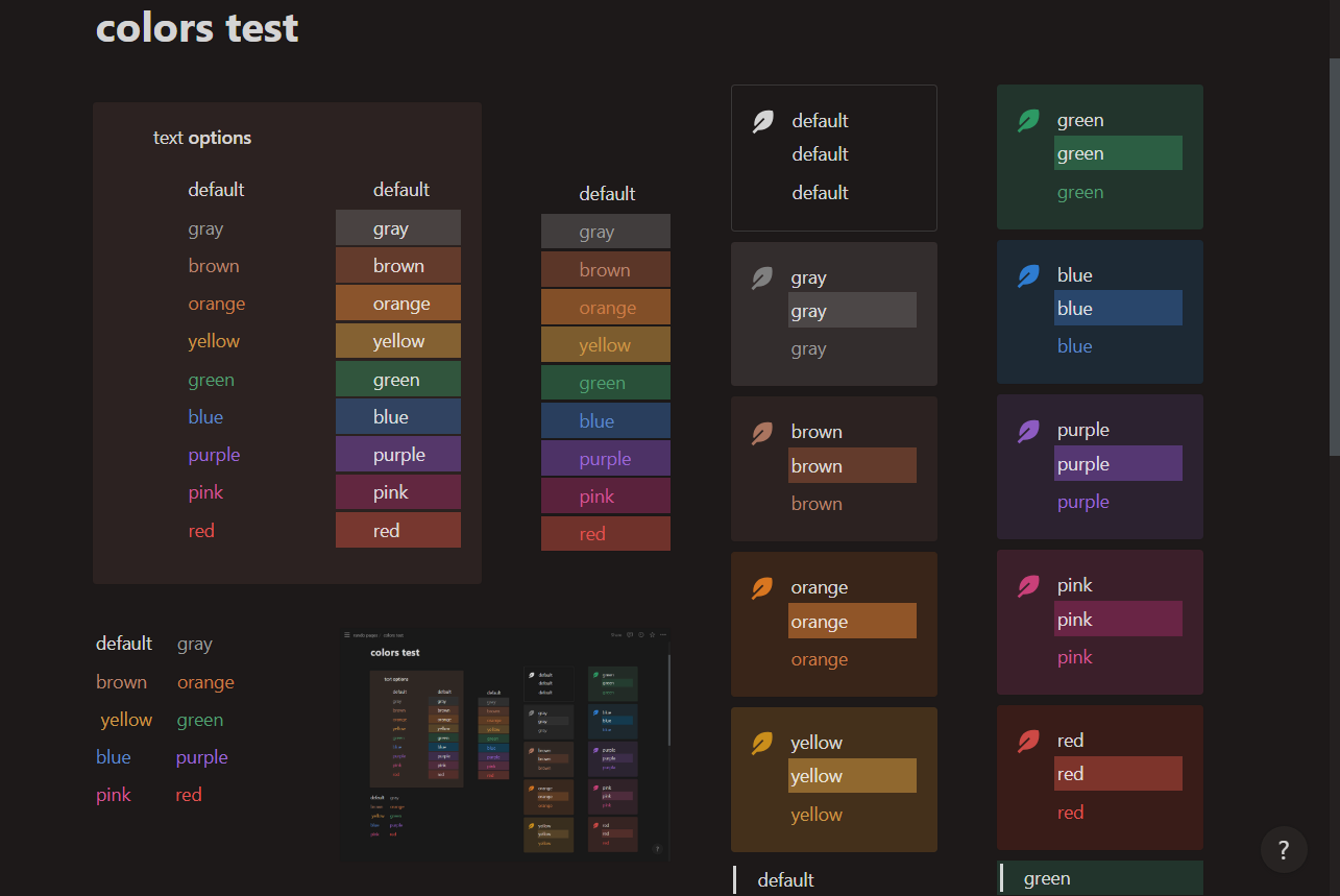
this file is made using the theme.css and variables.css files from the notion-enhancer repo. i have edited it to add bg color support to quotes, headings, page links, and more ! currently only dark theme colors have been edited ahead, it is close to default with slightly brighter colors + better overlap.
Source code
Source code has over 10K characters, so we truncated it. You can inspect the full source code on install link./* ==UserStyle==
@name notion.so - basic boost (dark)
@namespace github.com/openstyles/stylus
@version 1.0.0
@description based off the theme.css and variables.css files from the notion-enhancer repo. i have edited it to add bg color support to quotes, headings, and more ! currently only dark theme colors have been edited ahead, close to default just with a boost in color.
@author x
==/UserStyle== */
@-moz-document url-prefix("www.notion.so/") {
/* Insert code here... */
}
/**
* notion-enhancer
* (c) 2023 dragonwocky <thedragonring.bod@gmail.com> (https://dragonwocky.me/)
* (https://notion-enhancer.github.io/) under the MIT license
* edited by august / x !
*/
/* below are the colors for the dark theme ! here is what they do:
* fg primary and secondary are the "default" text color
* fg border is the line that separates the sidebar background from the content
* the fg colors are the selectable font colors !
*bg primary and secondary are the site background and sidebar background
*bg hover i think is like, the highlight on the buttons on the side?
*bg overlay is the color put behind the settings / peek views
*the bg colors are the font bg colors and the tag bg colors
*the dim colors are the bg colors for callout blocks, quotes, headings, and kanban cards */
body.dark {
--theme--font-sans: ui-sans-serif, -apple-system, BlinkMacSystemFont,
"Segoe UI", Helvetica, "Apple Color Emoji", Arial, sans-serif,
"Segoe UI Emoji", "Segoe UI Symbol";
--theme--font-serif: Lyon-Text, Georgia, ui-serif, serif;
--theme--font-mono: iawriter-mono, Nitti, Menlo, Courier, monospace;
--theme--font-code: "SFMono-Regular", Menlo, Consolas, "PT Mono",
"Liberation Mono", Courier, monospace;
--theme--fg-primary: rgba(255, 255, 255, 0.81);
--theme--fg-secondary: rgb(155, 155, 155);
--theme--fg-border: rgb(47, 47, 47);
--theme--fg-gray: rgba(155, 155, 155, 1);
--theme--fg-brown: rgba(186, 133, 111, 1);
--theme--fg-orange: rgba(199, 125, 72, 1);
--theme--fg-yellow: rgba(202, 152, 73, 1);
--theme--fg-green: hsl(145, 32%, 44%);
--theme--fg-blue: rgba(94, 135, 201, 1);
--theme--fg-purple: rgba(157, 104, 211, 1);
--theme--fg-pink: rgba(209, 87, 150, 1);
--theme--fg-red: rgba(223, 84, 82, 1);
--theme--bg-primary: hsl(0, 0%, 5%);
--theme--bg-secondary: hsl(0, 0%, 10%);
--theme--bg-hover: rgba(255, 255, 255, 0.055);
--theme--bg-overlay: rgba(15, 15, 15, 0.8);
--theme--bg-light_gray: rgb(55, 55, 55);
--theme--bg-gray: rgb(90, 90, 90);
--theme--bg-brown: hsl(17, 40%, 25%);
--theme--bg-orange: hsl(27, 53%, 32%);
--theme--bg-yellow: hsl(36, 53%, 33%);
--theme--bg-green: hsl(146, 45%, 22%);
--theme--bg-blue: hsl(214, 45%, 27%);
--theme--bg-purple: hsl(269, 45%, 26%);
--theme--bg-pink: hsl(331, 45%, 28%);
--theme--bg-red: hsl(6, 45%, 26%);
--theme--dim-light_gray: hsla(0, 0%, 24%, .7);
--theme--dim-gray: hsla(0, 2%, 20%, .7);
--theme--dim-brown: hsla(17, 40%, 20%, .7);
--theme--dim-orange: hsla(24, 40%, 20%, .7);
--theme--dim-yellow: hsla(33, 40%, 20%, .7);
--theme--dim-green: hsla(156, 40%, 20%, .7);
--theme--dim-blue: hsla(206, 40%, 20%, .7);
--theme--dim-purple: hsla(270, 40%, 20%, .7);
--theme--dim-pink: hsla(334, 40%, 20%, .7);
--theme--dim-red: hsla(9, 40%, 20%, .7);
--theme--accent-primary: rgb(35, 131, 226);
--theme--accent-primary_hover: rgb(0, 117, 211);
--theme--accent-primary_contrast: rgb(255, 255, 255);
--theme--accent-primary_transparent: rgba(35, 131, 226, 0.14);
--theme--accent-secondary: rgb(235, 87, 87);
--theme--accent-secondary_hover: rgba(235, 87, 87, 0.1);
--theme--accent-secondary_contrast: white;
--theme--scrollbar-track: rgba(202, 204, 206, 0.04);
--theme--scrollbar-thumb: #474c50;
--theme--scrollbar-thumb_hover: rgba(202, 204, 206, 0.3);
--theme--code-inline_fg: #eb5757;
--theme--code-inline_bg: rgba(135, 131, 120, 0.15);
--theme--code-block_fg: rgba(255, 255, 255, 0.81);
--theme--code-block_bg: rgba(255, 255, 255, 0.03);
--theme--code-keyword: rgb(209, 148, 158);
--theme--code-builtin: rgb(189, 224, 82);
--theme--code-class_name: rgba(255, 255, 255, 0.81);
--theme--code-function: var(--theme--code-class_name);
--theme--code-boolean: var(--theme--code-keyword);
--theme--code-number: var(--theme--code-keyword);
--theme--code-string: var(--theme--code-builtin);
--theme--code-char: var(--theme--code-builtin);
--theme--code-symbol: var(--theme--code-keyword);
--theme--code-regex: rgb(238, 153, 0);
--theme--code-url: rgb(245, 184, 61);
--theme--code-operator: var(--theme--code-url);
--theme--code-variable: var(--theme--code-url);
--theme--code-constant: var(--theme--code-keyword);
--theme--code-property: var(--theme--code-keyword);
--theme--code-punctuation: var(--theme--code-class_name);
--theme--code-important: var(--theme--code-regex);
--theme--code-comment: rgb(153, 128, 102);
--theme--code-tag: var(--theme--code-keyword);
--theme--code-attr_name: var(--theme--code-builtin);
--theme--code-attr_value: var(--theme--code-keyword);
--theme--code-namespace: var(--theme--code-class_name);
--theme--code-prolog: var(--theme--code-comment);
--theme--code-doctype: var(--theme--code-comment);
--theme--code-cdata: var(--theme--code-comment);
--theme--code-entity: var(--theme--code-url);
--theme--code-atrule: var(--theme--code-keyword);
--theme--code-selector: var(--theme--code-builtin);
--theme--code-inserted: var(--theme--code-builtin);
--theme--code-deleted: rgb(255, 0, 0);
}
body:not(.dark) {
--theme--font-sans: ui-sans-serif, -apple-system, BlinkMacSystemFont,
"Segoe UI", Helvetica, "Apple Color Emoji", Arial, sans-serif,
"Segoe UI Emoji", "Segoe UI Symbol";
--theme--font-serif: Lyon-Text, Georgia, ui-serif, serif;
--theme--font-mono: iawriter-mono, Nitti, Menlo, Courier, monospace;
--theme--font-code: "SFMono-Regular", Menlo, Consolas, "PT Mono",
"Liberation Mono", Courier, monospace;
--theme--fg-primary: rgb(55, 53, 47);
--theme--fg-secondary: rgba(25, 23, 17, 0.6);
--theme--fg-border: rgb(233, 233, 231);
--theme--fg-gray: rgba(120, 119, 116, 1);
--theme--fg-brown: rgba(159, 107, 83, 1);
--theme--fg-orange: rgba(217, 115, 13, 1);
--theme--fg-yellow: rgba(203, 145, 47, 1);
--theme--fg-green: rgba(68, 131, 97, 1);
--theme--fg-blue: rgba(51, 126, 169, 1);
--theme--fg-purple: rgba(144, 101, 176, 1);
--theme--fg-pink: rgba(193, 76, 138, 1);
--theme--fg-red: rgba(212, 76, 71, 1);
--theme--bg-primary: white;
--theme--bg-secondary: rgb(251, 251, 250);
--theme--bg-hover: rgba(55, 53, 47, 0.08);
--theme--bg-overlay: rgba(15, 15, 15, 0.6);
--theme--bg-light_gray: rgba(227, 226, 224, 0.5);
--theme--bg-gray: rgb(227, 226, 224);
--theme--bg-brown: rgb(238, 224, 218);
--theme--bg-orange: rgb(250, 222, 201);
--theme--bg-yellow: rgb(253, 236, 200);
--theme--bg-green: rgb(219, 237, 219);
--theme--bg-blue: rgb(211, 229, 239);
--theme--bg-purple: rgb(232, 222, 238);
--theme--bg-pink: rgb(245, 224, 233);
--theme--bg-red: rgb(255, 226, 221);
--theme--dim-light_gray: rgba(249, 249, 245, 0.5);
--theme--dim-gray: rgba(247, 247, 245, 0.7);
--theme--dim-brown: rgba(250, 246, 245, 0.7);
--theme--dim-orange: rgba(252, 245, 242, 0.7);
--theme--dim-yellow: rgba(250, 247, 237, 0.7);
--theme--dim-green: rgba(244, 248, 243, 0.7);
--theme--dim-blue: rgba(241, 248, 251, 0.7);
--theme--dim-purple: rgba(249, 246, 252, 0.7);
--theme--dim-pink: rgba(251, 245, 251, 0.7);
--theme--dim-red: rgba(253, 245, 243, 0.7);
--theme--accent-primary: rgb(35, 131, 226);
--theme--accent-primary_hover: rgb(0, 117, 211);
--theme--accent-primary_contrast: rgb(255, 255, 255);
--theme--accent-primary_transparent: rgba(35, 131, 226, 0.14);
--theme--accent-secondary: rgb(235, 87, 87);
--theme--accent-secondary_hover: rgba(235, 87, 87, 0.1);
--theme--accent-secondary_contrast: white;
--theme--scrollbar-track: #edece9;
--theme--scrollbar-thumb: #d3d1cb;
--theme--scrollbar-thumb_hover: #aeaca6;
--theme--code-inline_fg: #eb5757;
--theme--code-inline_bg: rgba(135, 131, 120, 0.15);
--theme--code-block_fg: rgb(55, 53, 47);
--theme--code-block_bg: rgb(247, 246, 243);
--theme--code-keyword: rgb(0, 119, 170);
--theme--code-builtin: rgb(102, 153, 0);
--theme--code-class_name: rgb(221, 74, 104);
--theme--code-function: var(--theme--code-class_name);
--theme--code-boolean: rgb(153, 0, 85);
--theme--code-number: var(--theme--code-boolean);
--theme--code-string: var(--theme--code-builtin);
--theme--code-char: var(--theme--code-builtin);
--theme--code-symbol: var(--theme--code-boolean);
--theme--code-regex: rgb(238, 153, 0);
--theme--code-url: rgb(154, 110, 58);
--theme--code-operator: var(--theme--code-url);
--theme--code-variable: var(--theme--code-regex);
--theme--code-constant: var(--theme--code-boolean);
--theme--code-property: var(--theme--code-boolean);
--theme--code-punctuation: rgb(153, 153, 153);
--theme--code-important: var(--theme--code-regex);
--theme--code-comment: rgb(112, 128, 144);
--theme--code-tag: var(--theme--code-boolean);
--theme--code-attr_name: var(--theme--code-builtin);
--theme--code-attr_value: var(--theme--code-keyword);
--theme--code-namespace: rgb(55, 53, 47);
--theme--code-prolog: var(--theme--code-comment);
--theme--code-doctype: var(--theme--code-comment);
--theme--code-cdata: var(--theme--code-comment);
--theme--code-entity: var(--theme--code-url);
--theme--code-atrule: var(--theme--code-keyword);
--theme--code-selector: var(--theme--code-builtin);
--theme--code-inserted: var(--theme--code-builtin);
--theme--code-deleted: var(--theme--code-boolean);
}
.notion-body.dark :is([style^="color: rgba(255,255,255,0.81)"], [style^="color:rgba(255, 255, 255, 0.81)"], [style*=";color: rgba(255, 255, 255, 0.81)"], [style*=";color:rgba(255, 255, 255, 0.81)"], [style*=" co...