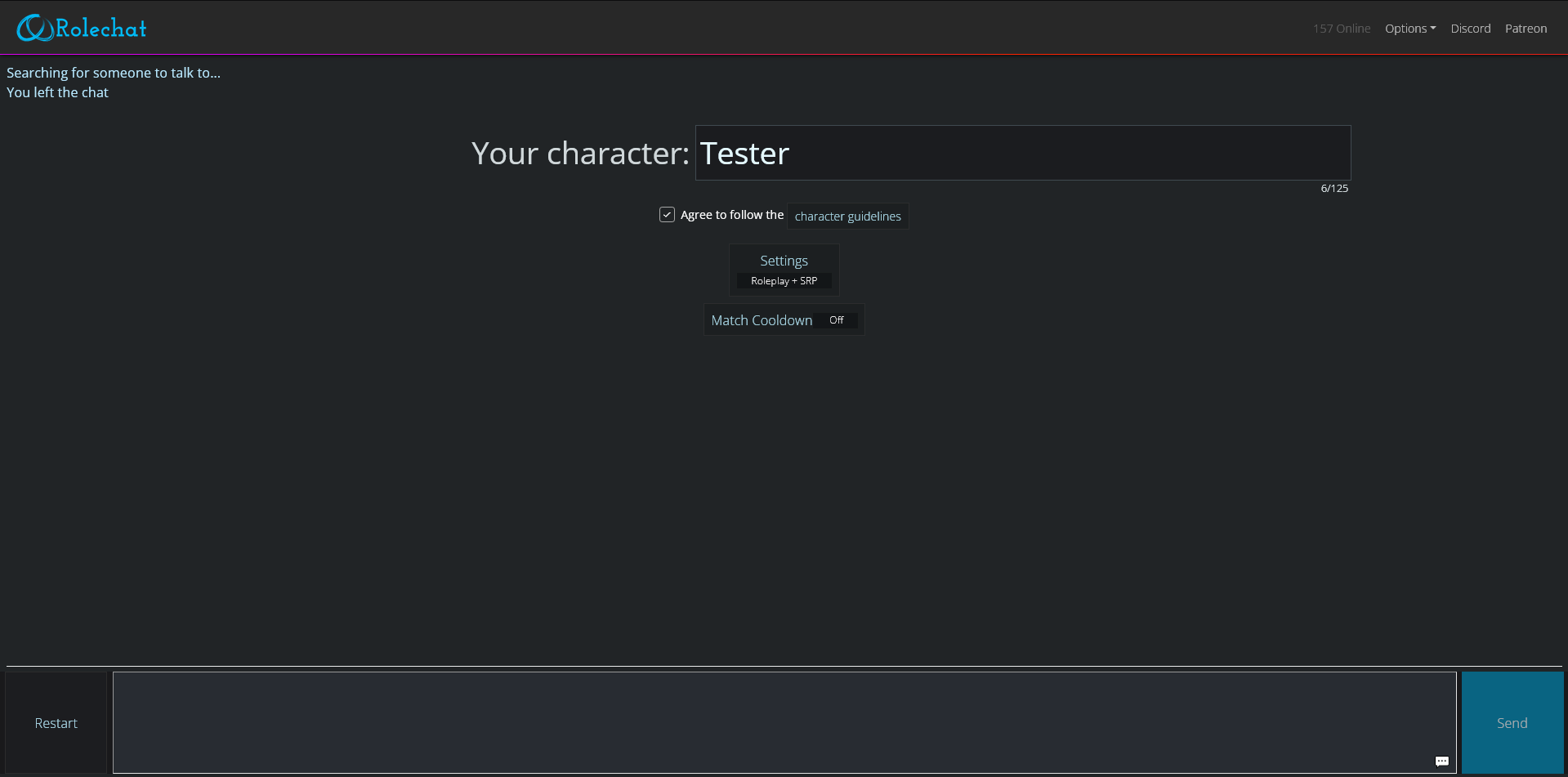
A style created to improve the current one. While the mods have done an excellent job and actually added a dark mode, mine replaces all white elements.
Rolechat Dark Mode+ by TwatSavingEyes
Details
AuthorTwatSavingEyes
LicenseNo License
Categoryhttps://www.rolechat.org/
Created
Updated
Code size4.2 kB
Code checksum1fabc295
Statistics
Learn how we calculate statistics in the FAQ.
Failed to fetch stats.
Description
Notes
If you'd like to get a different colour, please just open the file in a code editor (or even Stylus' own CSS editor!) and feel free to click on each HEX to change the colour! Very customisable!
Source code
/* ==UserStyle==
@name           www.rolechat.org - Nov 2023
@namespace      github.com/openstyles/stylus
@version        1.0.0
@description    A new userstyle
@author         Me
==/UserStyle== */
@-moz-document domain("https://www.rolechat.org/"){
    /* Insert code here... */
}

h1 {
    color: #d0d8e0;
}

.myname {
  color: #539de7;
  font-weight: 700;
}

.partnername {
    color: #9ca8ff;
}

#root {
    background-color: #212426;
}

.navbar {
    background-color: #1c1e21
}

.bg-light {
    background-color: #1c1f23 !important;
}


.lead {
    color: #f3fcff
}

.option {
    color: #d0d7da
}

#characterinput {
    color: #e4f9ff;
    background-color: #1b1c1f;
    border-color: #414a51;
}
.btn:not(:disabled):not(.disabled) {
    background-color: #2f353b;
    border-color: #414a51;
    color: #F3FCFF
}

label {
    color: #fff;
}

.badge {
    background-color: #121417;
    color: #Fff
}

.footer {
    background-color: #19191b;
}

.modal-header {
    background-color: #2c3139;
    color: #fff;
}

.modal-body {
    background-color: #1a1b1e;
    color: #c8e8f7;
}

.alert {
    background-color: #303e44;
    border-color: #435469;
}

.btn-secondary:not(:disabled):not(.disabled).active, .btn-secondary:not(:disabled):not(.disabled):active, .show > .btn-secondary.dropdown-toggle {
  background-color: #313641;
  border-color: #8895aa;
  color: #c1d9ff;
}

.btn:not(:disabled):not(.disabled) {
  background-color: #16191c;
  border-color: #252a2e;
  color: #7a868a;
}

.modal-dialog {
    background-color: #4d5770;
}

textarea {
    background-color: #1f2428;
    color: #c7cfd9;
}

.form-control-sm {
    background-color: #31353b;
    color: #b9c4d3;
}

.form-control:focus {
  background-color: #2c3740;
  border-color: #4eb0d1;
  box-shadow: 0 0 0 .2rem rgba(0,140,186,.25);
  color: #9eb5cd;
  outline: 0;
}

.list-group-item {
  background-color: #262a30;
  border: 1px solid rgba(0,0,0,.125);
  display: block;
  margin-bottom: -1px;
  padding: .75rem 1.25rem;
  position: relative;
}
*, ::after, ::before {
  box-sizing: border-box;
}

.modal-content {
  background-clip: padding-box;
  background-color: #374145;
  border: 1px solid #38444c;
  border-radius: 0;
  display: flex;
  flex-direction: column;
  outline: 0;
  pointer-events: auto;
  position: relative;
  width: 100%;
}


em {
    color: #abcaff;
}

.mt {
    color: #c2d8e4;
}

.notificationchat {
  color: #b8e8ff;
  text-align: left;
}

a:hover {
  color: #6bcdef;
  text-decoration: underline;
}

a {
    color: #45b0e1;
}

#bsMessage, #bsMessageMobile {
  background: #282c32;
  border-width: 1px;
  color: var(--main-text);
  line-height: 1.1em;
  overflow: auto;
  padding: 0 0 0 8px;
  resize: none;
}

.btn-primary.disabled {
  color: #fff;
  background-color: #3aabd0;
}

.navbar-light .navbar-toggler-icon {
  -webkit-filter: invert(100%);
  background-image: url("data:image/svg+xml;charset=utf8,%3Csvg viewBox=%270 0 30 30%27 xmlns=%27http://www.w3.org/2000/svg%27%3E%3Cpath stroke=%27rgba%280, 0, 0, 0.5%29%27 stroke-width=%272%27 stroke-linecap=%27round%27 stroke-miterlimit=%2710%27 d=%27M4 7h22M4 15h22M4 23h22%27/%3E%3C/svg%3E")
}

.preloadedAd {
  display: none;
}

.btn:not(:disabled):not(.disabled) {
  background-color: #1c1e21;
  border-color: #2d2e2f;
  color: #baeeff;
}

.navbar-light .navbar-nav .nav-link:focus, .navbar-light .navbar-nav .nav-link:hover {
  color: #b9e1ff;
}

.navbar-light .navbar-nav .nav-link {
  color: #b8e8ff;
}

.navbar-light .navbar-nav .nav-link.disabled {
  color: #8d9b9d;
}

.bg-light .dropdown-menu {
  background-color: #24282a;
}

.bg-light .dropdown-menu .dropdown-item.active, .bg-light .dropdown-menu .dropdown-item:focus, .bg-light .dropdown-menu .dropdown-item:hover {
  background-color: #303440;
  color: rgba(255, 255, 255, 0.7);
}

.bg-light .dropdown-menu .dropdown-item, .bg-light .dropdown-menu .dropdown-item:focus {
  color: rgba(255, 255, 255, 0.5);
}

#bsMessage {
    color: #fff;
}