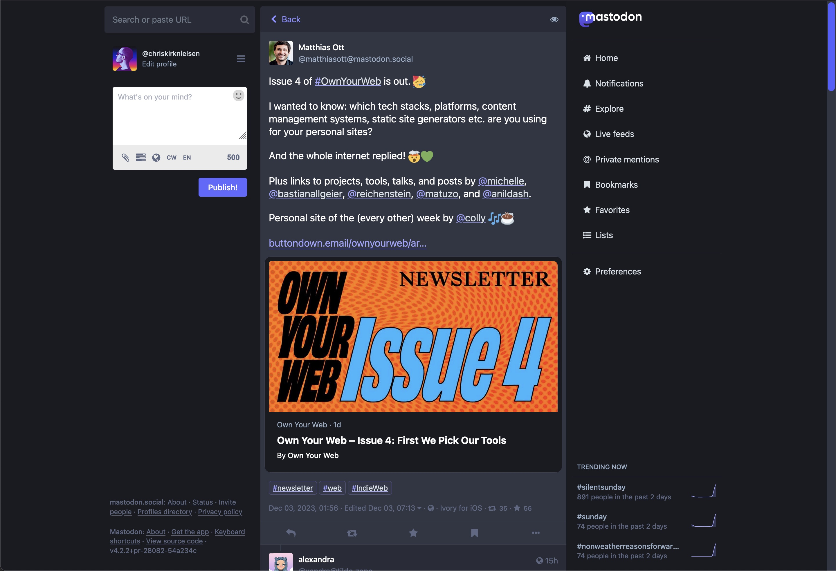
Improves the UI with better contrast, distinct links/hashtags/mentions, shrunk cards when no image is featured, muted favourites/reposts, and obvious DMs.
Mastodon Web Client (disambiguation) by chriskirknielsen
Details
Authorchriskirknielsen
LicenseNo License
Categorymastodon.social, front-end.social
Created
Updated
Code size8.4 kB
Code checksumf15e9203
Statistics
Learn how we calculate statistics in the FAQ.
Failed to fetch stats.
Description
Notes
Kindly tag me on Mastodon @chriskirknielsen@front-end.social.
Source code
/* ==UserStyle==
@name         Mastodon Web Client (disambiguation)
@version      20240530.02.42
@namespace    ?
==/UserStyle== */

@-moz-document domain("mastodon.social"), domain("front-end.social") {

/** DARK MODE (default) **/
:root { scrollbar-color: #595aff #313543; }
::-webkit-scrollbar-thumb { background: #595aff; }
::-webkit-scrollbar-track { background: #313543; }

:root {
    /* --C as a prefix for "Custom" */
    --C-link-idle-color: #a1a1ff;
    --C-link-idle-underline: var(--C-link-idle-color);
    --C-link-active-color: #ffffff;
    --C-link-active-underline: #8c8dff;

    --C-hashtag-idle-color: var(--C-link-idle-color);
    --C-hashtag-idle-underline: var(--C-hashtag-idle-color);
    --C-hashtag-active-color: var(--C-link-active-color);
    --C-hashtag-content-color: #d9e1e8;

    --C-muted-content-color: #6c7286;
    --C-muted-link-color: #52528b;

    --C-card-outline: hsl(223, 36%, 72%);
    --C-card-background: #191b22;

    --C-dm-bg-size: 20px;
    --C-dm-bg-c1: #202436;
    --C-dm-bg-c2: #2b2f41;

    --C-notif-bg: var(--C-muted-link-color);
    --C-notif-accent: var(--C-link-active-underline);
}


/*********************************************************/


/** LIGHT MODE **/
html:has(body.theme-mastodon-light):root { scrollbar-color: #3000a8 #eff3f5; }
html:has(body.theme-mastodon-light)::-webkit-scrollbar-thumb { background: #3000a8; }
html:has(body.theme-mastodon-light)::-webkit-scrollbar-track { background: #eff3f5; }

:root:has(body.theme-mastodon-light) {
    --C-link-idle-color: #5600ff;
    --C-link-idle-underline: var(--C-link-idle-color);
    --C-link-active-color: black;
    --C-link-active-underline: #3000a8;

    --C-hashtag-idle-color: var(--C-link-idle-color);
    --C-hashtag-idle-underline: var(--C-hashtag-idle-color);
    --C-hashtag-content-color: #1c1726;

    --C-muted-content-color: #7a8094;
    --C-muted-link-color: #7575ae;

    --C-card-outline: #af9ed1;
    --C-card-background: #eff3f5;

    --C-dm-bg-size: 20px;
    --C-dm-bg-c1: #d5dde9;
    --C-dm-bg-c2: #eff3f5;

    --C-notif-accent: var(--C-link-active-underline);
    --C-notif-bg: #e9caff;
}


/*********************************************************/


/** GLOBAL OVERRIDES **/
/* Standard links */
.status__content a.unhandled-link {
    color: var(--C-link-idle-color);
    text-decoration: underline;
    text-decoration-color: var(--C-link-idle-underline);
    text-decoration-thickness: 2px;
    text-underline-offset: 4px;
}
.status__content a.unhandled-link:is(:hover, :focus) {
    color: var(--C-link-active-color);
    text-decoration-color: var(--C-link-active-underline);
}

.link-button {
    color: var(--C-link-idle-color);
}
.link-button:is(:hover, :focus) {
    color: var(--C-link-active-color);
}

/* Hashtag and mention links */
.hashtag-bar a,
.mention.status-link:is(.hashtag, .u-url) {
    color: var(--C-hashtag-idle-color);
    text-decoration: underline;
    text-decoration-color: var(--C-hashtag-idle-underline);
    text-decoration-thickness: 1px;
    text-underline-offset: 1px;
}

.hashtag-bar a:is(:hover, :focus) span,
.mention.status-link:is(.hashtag, .u-url):is(:hover, :focus) span {
    color: var(--C-hashtag-active-color);
}

.hashtag-bar a span,
.mention.status-link:is(.hashtag, .u-url) span {
    color: var(--C-hashtag-content-color);
}

/* Action icons */
:is(.status-card, .icon-button):is(:hover, :focus) {
    box-shadow: 0 0 0 2px var(--C-card-outline);
}

/* Content in "muted" blocks */
.muted .status__content p,
.muted .status__content a.unhandled-link,
.muted .mention.status-link:is(.hashtag, .u-url) span {
    color: var(--C-muted-content-color);
}

.muted .mention.status-link:is(.hashtag, .u-url) {
    color: var(--C-muted-link-color);
}

/* New hashtag bar links */
.hashtag-bar a {
    padding: 0.25em 0.5em;

    border: 1px solid currentColor;
    border-radius: 4px;
    border-color: var(--C-muted-link-color);
    background-color: color-mix(in hsl, var(--C-muted-link-color), transparent 90%)
}
.hashtag-bar a:is(:hover, :focus) {
    border-color: var(--C-link-active-underline);
}

/* New card design */
.status-card__image:has(img) {
    border-radius: 4px;
}
.status-card__image-image,
.status-card__image-preview {
    max-height: 400px;
    border-radius: 4px;
}
.status-card {
    margin-inline: -8px;
    padding: 8px;
    border-radius: 12px !important;
    background: var(--C-card-background);
}
.status--in-thread .status-card {
    margin-inline-start: 56px;
    margin-inline-end: -8px;
    width: calc(100% - 56px - 8px);
}
.status-card__image:not(:has(img)) {
    aspect-ratio: 1 !important;
    width: calc(3rem + 1px);
    height: auto;
    margin-inline-end: 12px;
    float: left;
    border-radius: 8px !important;
    align-self: start;
}
.status-card__image:not(:has(img)) + .status-card__content {
    padding: 0;
}

/* Style direction messages differently (lifted from https://projects.verou.me/css3patterns/#zig-zag) */
.status__wrapper-direct {
    background:
        linear-gradient(135deg, var(--C-dm-bg-c1, #291a2b) 25%, transparent 25%) calc(var(--C-dm-bg-size) * -0.5) 0,
        linear-gradient(225deg, var(--C-dm-bg-c1, #291a2b) 25%, transparent 25%) calc(var(--C-dm-bg-size) * -0.5) 0,
        linear-gradient(315deg, var(--C-dm-bg-c1, #291a2b) 25%, transparent 25%),
        linear-gradient(45deg, var(--C-dm-bg-c1, #291a2b) 25%, transparent 25%);
    background-size: var(--C-dm-bg-size) var(--C-dm-bg-size);
    background-color: var(--C-dm-bg-c2);
}
.status__wrapper-direct:focus {
    --C-dm-bg-c1: var(--C-dm-bg-c2);
}

/* Make the selected Notifications tab more prominent */
.notification__filter-bar > button.active {
    background:
        radial-gradient(farthest-side at 50% 100%, var(--C-notif-bg) 0, transparent) no-repeat 50% 100%/90% 75%;
}
.notification__filter-bar > button.active > span {
    text-decoration: underline;
}

/* Style the scrollbar for the texarea consistently (light/dark mode selection is irrelevant as the textarea is always a white box) */
:is(.compose-form__autosuggest-wrapper, textarea) { scrollbar-color: #3000a8 #eff3f5; }
:is(.compose-form__autosuggest-wrapper, textarea)::-webkit-scrollbar-thumb { background: #3000a8; }
:is(.compose-form__autosuggest-wrapper, textarea)::-webkit-scrollbar-track { background: #eff3f5; }

/* Extra Fields on the Profile Page made into a two-col grid instead of stacked lines */
@media (min-width: 32rem) {
    .account__header__bio .account__header__fields {
    display: grid;
        grid-template-columns: auto 1fr;
    }
}
.account__header__bio .account__header__fields dl {
    display: grid;
    grid-template-columns: subgrid;
    grid-column: 1 / -1;
    gap: 0 2em;
    padding: 0.5em 1em;
}
.account__header__bio .account__header__fields dt {
    color: var(--C-card-outline);
}

/* Hide "Social Card" Preview image for favourited/reblogged posts of yours, make the link itself more discrete */
:is(.notification-favourite, .notification-reblog) .status-card__image {
    display: none;
}
:is(.notification-favourite, .notification-reblog).notification-favourite .status-card:not(:hover) {
    opacity: 0.5;
}

/* Show a badge of shame for images uploaded without a description */
.media-gallery__item-thumbnail:has(img:not([alt])) + .media-gallery__item__badges::after {
    content: '⚠️ No alt text! 😭';

    z-index: 10;
    pointer-events: none;

    display: block;
    padding: 2px 6px;

    font-size: 11px;
    font-weight: 700;
    line-height: 18px;
    text-transform: uppercase;

    color: #fff;
    border-radius: 4px;
    box-shadow: inset 0 0 0 1px red;
    background: rgba(160, 82, 45, .85);
}

/* Mute some underlines */
.status__info .status__display-name,
.status__prepend .status__display-name,
:is(.compose-panel, .navigation-panel) a:any-link { text-decoration-color: color-mix(in hsl, currentColor, transparent 75%) !important; }
a.status-card[class] { text-decoration: none !important; }

/* Avoid super tall images from taking up the entire screen */
.media-gallery { max-height: 67vh; }
}