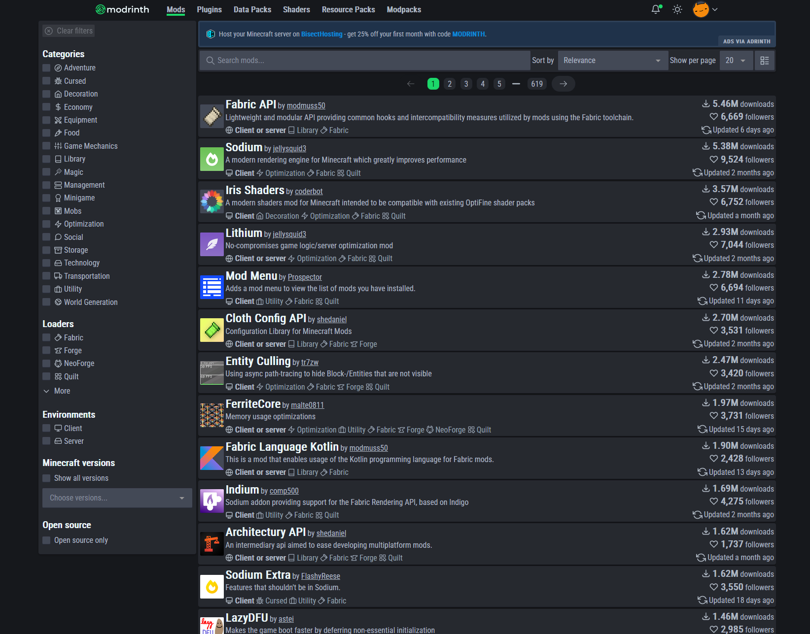
Makes Modrinth site more compact by using a condensed font and reducing padding and corner rounding, along with some other visual changes
Modrinth Compact by intergrav
Imported and mirrored from https://github.com/intergrav/mr-compact/raw/main/mr-compact.user.css
Details
Authorintergrav
LicenseMIT
Categorymodrinth.com
Created
Updated
Code size2.4 kB
Code checksumf6d170ff
Statistics
Learn how we calculate statistics in the FAQ.
Failed to fetch stats.
Description
Notes
Userstyle doesn't have notes.Source code
/* ==UserStyle==
@name           Modrinth Compact
@namespace      github.com/intergrav
@homepageURL    https://github.com/intergrav/mr-compact
@version        1.0.2
@description    Makes Modrinth site more compact by using a condensed font and reducing padding and corner rounding, along with some other visual changes
@author         intergrav
@license        MIT
==/UserStyle== */

@-moz-document domain("modrinth.com") {
	/* Import font into stylesheet */
	@import url('https://fonts.googleapis.com/css2?family=Roboto+Condensed');

	/* Rounding, padding, margin, etc modifications */
	body {
		--size-navbar-height: 1.5rem;
		--size-mobile-navbar-height: 2.75rem;
		--size-mobile-navbar-height-expanded: 10rem;
		--spacing-card-lg: 8px;
		--spacing-card-bg: 4px;
		--spacing-card-md: .2rem;
		--spacing-card-sm: .2rem;
		--spacing-card-xs: .2rem;
		font-family: 'Roboto Condensed', Inter, Arial, Helvetica, sans-serif;
	}
	html {
		--dark-color-base: #b0bac5;
		--dark-color-contrast: #ecf9fb;
		--gap-xs: 4px;
		--gap-sm: 4px;
		--gap-md: 4px;
		--gap-lg: 4px;
		--gap-xl: 4px;
	}
	.markdown-body li,
	.markdown-body p {
		line-height: 1.35;
	}
	.markdown-body table {
		line-height: 0.9;
	}
	.navigation-card {
		min-height: 2.5rem;
	}
	.normal-page {
		column-gap: 4px;
		max-width: 95rem;
	}
	.normal-page__content {
		max-width: 85rem;
	}
	.avatar {
		--size: 3rem !important;
	}
	.code {
		border-radius: 4px !important;
	}
	.square-button {
		height: 1.6rem;
		width: 1.6rem;
	}

	/* Cosmetic modifications [doesn't affect how compact the site is] */
	body {
		--size-rounded-xs: 1px;
		--size-rounded-sm: 2px;
		--size-rounded-md: 2px;
		--size-rounded-lg: 2px;
		--size-rounded-max: 999999999px;
		--size-rounded-card: 4px;
		--size-rounded-icon: 4px;
		--size-rounded-control: 2px;
		--size-rounded-tooltip: 2px;
	}
	html {
		--radius-xs: 2px;
		--radius-sm: 2px;
		--radius-md: 4px;
		--radius-lg: 4px;
		--radius-xl: 4px;
		--radius-max: 999999999px;
	}
	.dark-mode {
		--shadow-inset-sm: inset 0px -1px 0px rgba(17, 24, 39, .4);
	}
	.light-mode {
		--shadow-inset-sm: inset 0px -1px 0px rgba(17, 24, 39, .3);
	}
	.oled-mode {
		--shadow-inset-sm: inset 0px -1px 0px rgba(240, 240, 255, .125);
	}
	.page-number-container a {
		border-radius: 8px;
		padding: .2rem 0.5rem;
	}
	.nav-indicator {
		border-radius: 0px !important;
	}
	.logo svg {
		height: 1.25rem !important;
	}
}