Hello, this is a modification that I did to the Notenook App to fit more the everforest theme that I use on my system better. Hope you like it.
Notesnook - Everforest by Astonishskagen
Details
AuthorAstonishskagen
LicenseNo License
Categoryhttps://app.notesnook.com/notes
Created
Updated
Code size7.0 kB
Code checksum5a5ab313
Statistics
Learn how we calculate statistics in the FAQ.
Failed to fetch stats.
Description
Notes
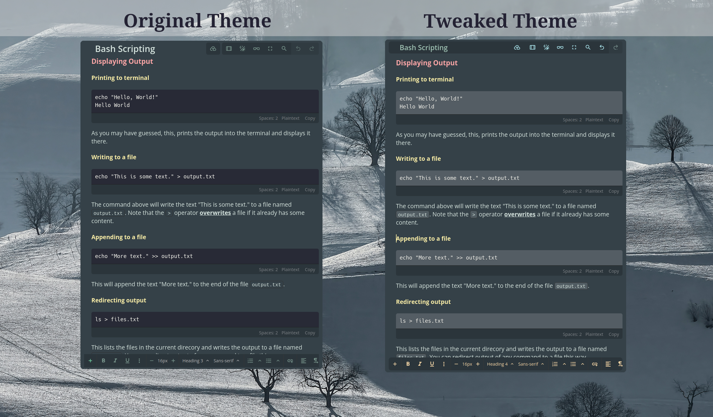
For this theme to work like in the image, you should use the Minty theme from
Settings > Appearance > Minty Theme
I am a CSS noob so my capabilities is limitied. I tried to add comments to make it easier to modify for whoever wants to modify it and also I have added some variables to make some changes faster.
Source code
/* ==UserStyle==
@name           app.notesnook.com - 11/17/2023, 2:41:40 PM
@namespace      github.com/openstyles/stylus
@version        1.0.0
@description    A new userstyle
@author         Astonish_Skagen
==/UserStyle== */

@-moz-document domain("app.notesnook.com") {

    :root {
        --plus-button: rgb(158, 236, 56); /*Plus button tool color*/
        --bold-text: rgb(236, 191, 56); /*Bold text tool color*/
        --italic-text: rgb(236, 131, 56); /*Italic text tool color*/
        --underline-text: rgb(237, 163, 108); /*Underline text tool color*/
        --three-dots: rgb(121, 189, 249); /*Three dots tool color*/

        --grouped-tool-1: rgb(255, 221, 171); /* Text tools Group 1*/
        --grouped-tool-2: var(--grouped-tool-1);
        --grouped-tool-3: var(--grouped-tool-1);
        --grouped-tool-4: var(--grouped-tool-1);
        --grouped-tool-5: var(--grouped-tool-1);
        --grouped-tool-6: var(--grouped-tool-1);
        --selection-background: rgb(118, 154, 152);

        --top-group-1: rgb(172, 232, 239); /* Publish Button Color*/
        --top-group-2: var(--top-group-1); /* Buttons right to the Publish Button*/
        --top-group-3: rgb(172, 210, 198); /*Redo button*/

        --note-title: rgb(158, 193, 178);
    }


    /*text selection background colour*/
     ::selection {
        background-color: var(--selection-background) !important;
    }

    /*Button Selection background colour*/
    .css-pzronn {
        background-color: var(--selection-background) !important;
    }


    /*Top Bar background colour*/
    .css-118glsl {
        background-color: rgb(43, 53, 59) !important;
        border-radius: 7px !important;
    }

    /*Note Title Color 1*/
    .css-1p7d0yd {
        color: var(--note-title) !important;
        font-size: 1.2rem !important;
    }

    /*Note Title Color 2*/
    #editor-title {
        color: var(--note-title) !important;
    }

    /* Color and style of the blockquote line */
    .ProseMirror blockquote {
        border-inline-start: 5px solid #e3ab54 !important;
        border-inline-start-style: double !important;
    }

    /* Background of code block */
    .css-157q1df:not(pre) > code[class*="language-"], .css-157q1df pre[class*="language-"] {
        background: rgb(84, 93, 100);
    }

    /* Comment this part to group text style elements - Comment Start A */
    /*
    .css-15b3gm5 > div:nth-child(1) > svg:nth-child(1) > path:nth-child(1) {
        fill: var(--plus-button) !important;
    }
    #tool-bold > div:nth-child(1) > svg:nth-child(1) > path:nth-child(1) {
        fill: var(--bold-text) !important;
    }
    #tool-italic > div:nth-child(1) > svg:nth-child(1) > path:nth-child(1) {
        fill: var(--italic-text) !important;
    }
    #tool-underline > div:nth-child(1) > svg:nth-child(1) > path:nth-child(1) {
        fill: var(--underline-text) !important;
    }
    #tool-more > div:nth-child(1) > svg:nth-child(1) > path:nth-child(1) {
        fill: var(--three-dots) !important;
    }
    */
    /* Comment this part to group text style elements - Comment End A */

    /* Uncomment to use text style element proporties grouped - Comment Start B */

    /* Grouped Text Style Buttons */
    .css-15b3gm5 > div:nth-child(1) > svg:nth-child(1) > path:nth-child(1), #tool-bold > div:nth-child(1) > svg:nth-child(1) > path:nth-child(1), #tool-italic > div:nth-child(1) > svg:nth-child(1) > path:nth-child(1), #tool-underline > div:nth-child(1) > svg:nth-child(1) > path:nth-child(1), #tool-more > div:nth-child(1) > svg:nth-child(1) > path:nth-child(1) {
        fill: var(--grouped-tool-1) !important;
        background-color: var(--selection-background) !important;
    }

    /* Uncomment to use text style element proporties grouped - Comment End B */

    /*Other bottom tool Elements*/
    /*Font size, font style tools*/
    #tool-minus > div:nth-child(1) > svg:nth-child(1) > path:nth-child(1), .css-1ikjxz9, #tool-plus > div:nth-child(1) > svg:nth-child(1) > path:nth-child(1), button.css-bx7dba:nth-child(1) > span:nth-child(1), button.css-bx7dba:nth-child(1) > div:nth-child(2) > svg:nth-child(1) > path:nth-child(1), button.css-bx7dba:nth-child(2) > span:nth-child(1), button.css-bx7dba:nth-child(2) > div:nth-child(2) > svg:nth-child(1) > path:nth-child(1){
        fill: var(--grouped-tool-2) !important;
        color: var(--grouped-tool-2) !important;
    }

    /*List Tools*/
    #tool-numberedList > div:nth-child(1) > svg:nth-child(1) > path:nth-child(1), div.css-3ih1we:nth-child(1) > button:nth-child(2) > div:nth-child(1) > svg:nth-child(1) > path:nth-child(1), #tool-bulletList > div:nth-child(1) > svg:nth-child(1) > path:nth-child(1), div.css-3ih1we:nth-child(2) > button:nth-child(2) > div:nth-child(1) > svg:nth-child(1) > path:nth-child(1) {
        fill: var(--grouped-tool-3) !important;
    }

    /*Link Button*/
    #tool-link > div:nth-child(1) > svg:nth-child(1) > path:nth-child(1) {
        fill: var(--grouped-tool-4) !important;
    }

    /*Alignment Tools*/
    #tool-alignLeft > div:nth-child(1) > svg:nth-child(1) > path:nth-child(1), #tool-ltr > div:nth-child(1) > svg:nth-child(1) > path:nth-child(1) {
        fill: var(--grouped-tool-5) !important;
    }

    /*Clear All Formatting Tool*/
    #tool-formatClear > div:nth-child(1) > svg:nth-child(1) > path:nth-child(1) {
        fill: var(--grouped-tool-6) !important;
    }

    /*Top Tool Elements*/
    .css-crp3hk > div:nth-child(1) > svg:nth-child(1) > path:nth-child(1) /*Publish Button*/ {
        fill: var(--top-group-1) !important;
    }

    /*Second Group of Top Buttons*/
    button.css-1bpw46u:nth-child(2) > div:nth-child(1) > svg:nth-child(1) > path:nth-child(1), button.css-1bpw46u:nth-child(1) > div:nth-child(1) > svg:nth-child(1) > path:nth-child(1), button.css-14z41v3:nth-child(3) > div:nth-child(1) > svg:nth-child(1) > path:nth-child(1), button.css-14z41v3:nth-child(4) > div:nth-child(1) > svg:nth-child(1) > path:nth-child(1), button.css-1bpw46u:nth-child(5) > div:nth-child(1) > svg:nth-child(1) > path:nth-child(1), button.css-1bpw46u:nth-child(6) > div:nth-child(1) > svg:nth-child(1) > path:nth-child(1)  {
        fill: var(--top-group-2) !important;
    }

    /*Redo Button Colors*/
    button.css-1bpw46u:nth-child(7) > div:nth-child(1) > svg:nth-child(1) > path:nth-child(1) {
        fill: var(--top-group-3) !important;
    }


    /* background of inline code */
    .tiptap > p:nth-child(29) > code:nth-child(1) {
        background-color: #515c62 !important;
    }

    /* border of the bottom tooltip */
    .css-rlkdne {
        border-radius: 7px !important;
    }

    /*background of inline code */
    .ProseMirror p code {
        background-color: #515c62 !important;
    }

}