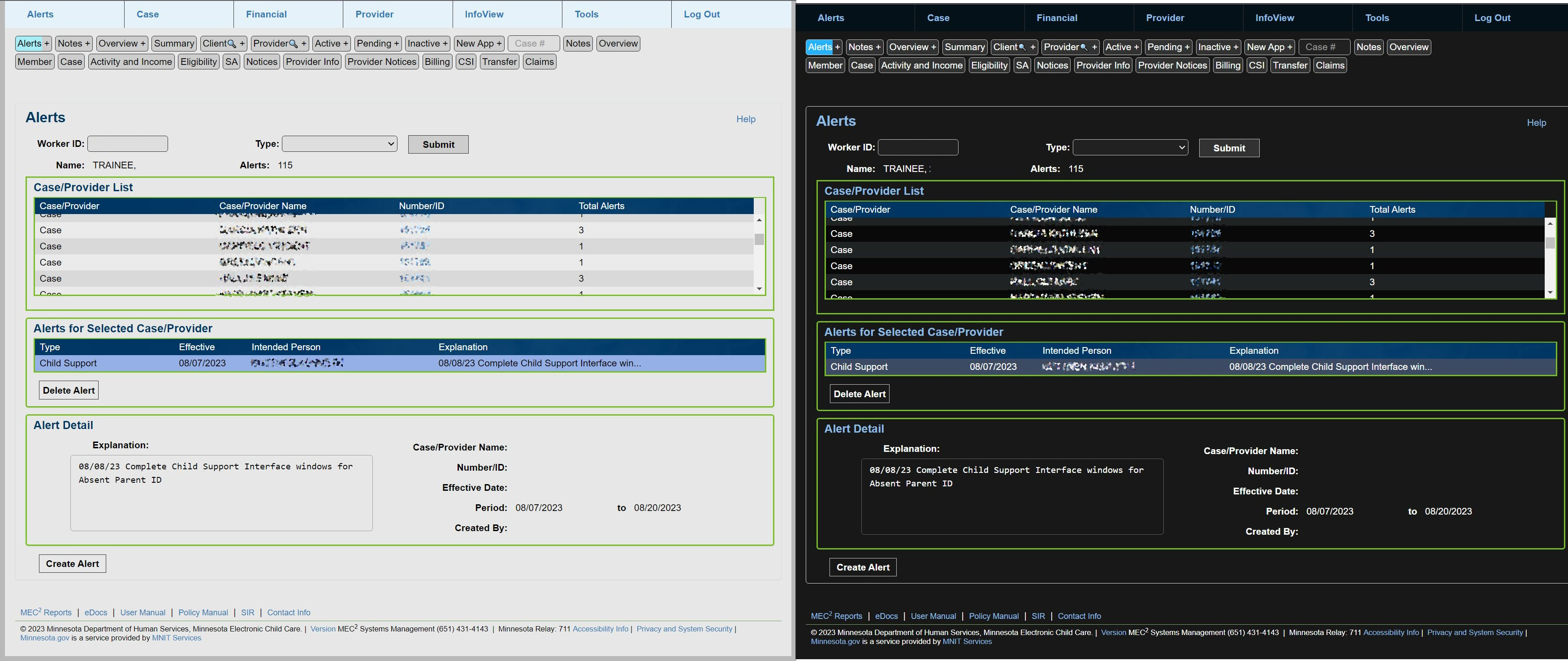
Aligns elements, minimizes blank-space, and adds a dark theme (follows operating system theme).
MEC2Stylus by MECH2-at-Github
Details
AuthorMECH2-at-Github
LicenseNo License
Categoryhttps://mec2.childcare.dhs.state.mn.us/
Created
Updated
Code size100 kB
Code checksum2f250ce1
Statistics
Learn how we calculate statistics in the FAQ.
Failed to fetch stats.
Description
Notes
This UserStyle is designed to work alongside the MEC2Navigation or MEC2Functions UserScript at github.
It requires Stylus to be installed.
Source code
Source code has over 10K characters, so we truncated it. You can inspect the full source code on install link./* ==UserStyle==
@name MEC2Stylus
@version 20250411.16.32
@namespace https://userstyles.world/user/MECH2-at-Github
@description Aligns elements, minimizes blank-space, and adds a dark theme (follows operating system theme).
@author MECH2-at-Github
@license No License
==/UserStyle== */
@-moz-document url-prefix("https://mec2.childcare.dhs.state.mn.us/ChildCare/") {
/* Smallify */
div.container:has(nav.navbar, #banner_honeycomb) {
display: none;
}
}
@-moz-document url-prefix("https://mec2.childcare.dhs.state.mn.us/ChildCare/") {
/* Version */
#versionNumber::after {
content: " - mec2stylus v25.4.11"
}
}
@-moz-document url-prefix("https://mec2.childcare.dhs.state.mn.us/ChildCare/") {
/* Variables (Sizes/Colors) */
:root {
--dateInput: 11ch;
--dateInputPlusControls: 13ch;
--8numbers: 11ch;
--15rows: 15lh;
--30rows: 30lh;
--60columns: 60ch;
--100columns: 100ch;
--font-size: clamp(12px, 1.4vw, 14px);
--multi-color-linear: linear-gradient(to right, red, yellow, green, cyan, blue, violet);
--multi-color-radial: radial-gradient(circle, red, yellow, green, cyan, blue, violet);
--1-12: 8.267%;
--2-12: 16.534%;
--3-12: 24.8%;
--4-12: 33.068%;
--5-12: 41.335%;
--6-12: 49.6%;
--7-12: 57.869%;
--8-12: 66.136%;
--9-12: 74.4%;
--10-12: 82.67%;
--11-12: 90.937%;
--12-12: 100%;
color-scheme: light dark;
--bodyBackground: light-dark(#b9b9b9, #3e3e3e);
--containerBackground: light-dark(#d9d9d9, #181818);
--formButtonBackground: light-dark(#bdbdbd, #323232);
--formButtonBackgroundDisabled: light-dark(#cdcdcd, #212121);
--fieldBGeditable: light-dark(hsl(0, 0%, 90%), #111111);
--fieldBGreadonly: light-dark(#c9c9c9, #212121);
--pageWrapDropDown: light-dark(#e6f2fa, #051119);
--borderColor1: light-dark(#9f9f9f, #5f5f5f);
/* --borderColor2: light-dark(#5f5f5f, #9f9f9f); */
--borderColor3: light-dark(#333333, #9f9f9f);
--textColor: light-dark(black, white);
--textColorNegative: light-dark(#CC0000, #CC0000);
--textColorPositive: light-dark(#298a41, #78BE21);
--textColorWarning: light-dark(#A94D15, #ffa700);
--disabledTextColor: light-dark(rgba(0, 0, 0, 40%), #ffffff80);
--aLinkColor: light-dark(#005192, #8cbbe5);
--disabledLinkColor: light-dark(#00519280, #8cbbe5a9);
--headerColor: light-dark(#003865, #8cbbe5);
--table-even: light-dark(#eaeaea, #090909);
--table-odd: light-dark(#d9d9d9, #202324);
/* --tableRemoved: light-dark(#4d5863, #4d5863); */
--tableSelected: light-dark(#95b0e6, #3d4a63);
--tableText: light-dark(black, white);
/* --tableOuterBorder: #78BE21; */
/* --tableRowBorder: light-dark(#333333, #333333); */
/* --highlightTable: light-dark(#820a0a, #820a0a); */
--cButtonHover: light-dark(#9fe845, #5d8c23);
--cButtonOpenPage: light-dark(#87caff, #1072bf);
--wizFormButton: light-dark(#02b502, #2b440b);
--absentDayPeriodHighlight: light-dark(rgb(119, 119, 119), #777777);
--absentDayPeriodOpacity: light-dark(.2, .5);
--absentDayDisabled: light-dark(rgb(128 128 128 / 50%), black);
--absentDayDisabledOpacity: light-dark(.5, 1);
--absentDaySelected: light-dark(rgb(53 8 72 / 26%), #612969);
--calendarBody: light-dark(#ccc, #262626);
--calendarText: light-dark(black, white);
/* --calendarHeaderText: light-dark(white, white); */
--calendarDatesBackground: light-dark(#8080807a, #555);
@media (prefers-color-scheme: light) {
color-scheme: light;
--highlightHover: inset 2px 2px 0 rgba(0, 0, 0, .05), inset 0 0 8px 2px rgba(27, 91, 142, .24);
--highlightFocus: 3px 3px 0 rgba(0, 0, 0, .05), 0 0 8px 2px rgba(27, 91, 142, .52);
--downCaret: url("data:image/svg+xml,%3Csvg width='64px' height='64px' viewBox='-2.88 -2.88 29.76 29.76' fill='none' xmlns='http://www.w3.org/2000/svg' stroke='%23000000' stroke-width='1.5'%3E%3Cpath d='M4.46938 9.39966C4.76227 9.10677 5.23715 9.10677 5.53004 9.39966L11.894 15.7636C11.9916 15.8613 12.1499 15.8613 12.2476 15.7636L18.6115 9.39966C18.9044 9.10677 19.3793 9.10677 19.6722 9.39966C19.9651 9.69256 19.9651 10.1674 19.6722 10.4603L13.3082 16.8243C12.6248 17.5077 11.5168 17.5077 10.8333 16.8243L4.46938 10.4603C4.17649 10.1674 4.17649 9.69256 4.46938 9.39966Z' fill='%23000000'%3E%3C/path%3E%3C/svg%3E");
}
@media (prefers-color-scheme: dark) {
color-scheme: dark;
--highlightHover: inset 0 0 8px 1px #78be2195;
--highlightFocus: 0 0 6px 3px #78be21;
--downCaret: url("data:image/svg+xml,%3Csvg width='64px' height='64px' viewBox='-2.88 -2.88 29.76 29.76' fill='none' xmlns='http://www.w3.org/2000/svg' stroke='%23ffffff' stroke-width='1.5'%3E%3Cpath d='M4.46938 9.39966C4.76227 9.10677 5.23715 9.10677 5.53004 9.39966L11.894 15.7636C11.9916 15.8613 12.1499 15.8613 12.2476 15.7636L18.6115 9.39966C18.9044 9.10677 19.3793 9.10677 19.6722 9.39966C19.9651 9.69256 19.9651 10.1674 19.6722 10.4603L13.3082 16.8243C12.6248 17.5077 11.5168 17.5077 10.8333 16.8243L4.46938 10.4603C4.17649 10.1674 4.17649 9.69256 4.46938 9.39966Z' fill='%23ffffff'%3E%3C/path%3E%3C/svg%3E");
}
}
}
@-moz-document url-prefix("https://mec2.childcare.dhs.state.mn.us/ChildCare/") {
/* Appearance Rules / Overrides */
html, html > body, html iframe html {
color: var(--textColor);
& > body {
background-color: var(--bodyBackground) !important;
}
}
.container {
background-color: var(--containerBackground) !important;
}
html button {
color: var(--textColor);
background-color: var(--formButtonBackground);
}
html :is(button, input):is(.form-button, .form-small-button) {
background-image: none;
color: var(--textColor);
background-color: var(--formButtonBackground);
border: 1px solid var(--borderColor3);
box-shadow: var(--borderColor3);
}
html button[disabled], html input[disabled], html select[disabled] {
background: var(--formButtonBackgroundDisabled);
border: 1px solid var(--borderColor1);
color: var(--textColor);
opacity: .7;
box-shadow: none;
position: relative;
}
html .form-control[disabled], html .form-control[readonly], html fieldset[disabled] .form-control {
background-color: var(--fieldBGreadonly);
border: none !important;
outline: 1px solid var(--borderColor1);
color: var(--textColor) !important;
box-shadow: none !important;
}
html body:not(.baseStyle) textarea, html body:not(.baseStyle) textarea.form-control:not(.borderless) {
--bg: var(--fieldBGeditable);
--bgro: var(--fieldBGreadonly);
--pad: 10px;
--spread: 10px;
--outline: var(--borderColor3);
--outline-disabled: var(--borderColor1);
--shadow: #78be21;
&:focus:not([readonly]) {
box-shadow: 0 0 0 var(--pad) var(--bg), 0 0 var(--spread) var(--pad) var(--shadow) !important;
}
&:is([readonly], [disabled]) {
box-shadow: 0 0 0 var(--pad) var(--bgro) !important;
background: var(--bgro) !important;
outline: 1px solid var(--outline-disabled) !important;
}
margin: var(--pad);
border: none !important;
outline: 1px solid var(--outline) !important;
outline-offset: var(--pad);
overflow: hidden !important;
padding: 0 !important;
box-shadow: 0 0 0 var(--pad) var(--bg) !important;
background: var(--bg) !important;
border-radius: 0 !important;
}
html > body :is(input, select, textarea).borderless {
background: transparent !important;
border: none !important;
}
html > body .panel {
background-color: var(--containerBackground);
}
div.modal-content.panel {
outline: 1px solid gray;
}
html .form-control, -internal-autofill-selected {
color: var(--textColor) !important;
background-color: var(--fieldBGeditable);
border: none !important;
outline: 1px solid var(--borderColor3);
box-shadow: var(--borderColor1) !important;
&.borderless {
border: none !important;
outline: none;
pointer-events: unset !important;
}
}
input[type=number] {
-webkit-appearance: none;
-moz-appearance: textfield;
margin: 0;
}
input:-webkit-autofill,
input:-webkit-autofill:focus {
background-color: var(--fieldBGreadonly) !important;
color: var(--textColor) !important;
}
#updateDate, #updateUser, #footer_info, #updateUserURL {
color: var(--textColor) !important;
opacity: 1;
background: none;
font-size: var(--font-size);
&#footer_info {
font-size: clamp(9px, 1.1vw, 12px)
}
&#updateUserURL > #updateUser {
width: 11ch !important;
}
&#updateDate {
width: 10ch !important;
}
}
a {
color: var(--aLinkColor) !important;
&:focus {
text-decoration: none;
outline: none;
}
&:hover {
text-decoration: underline;
}
}
button.float-right {
display: inline-flex;
align-items: center;
float: right !important;
height: clamp(23px, .8lh, 27px);
margin: .1lh 0 0 5px;
}
output {
color: inherit;
}
body, .form-control {
font-size: var(--font-size) !important;
}
h1, h2, h3, h4, h5 {
color: var(--headerColor) !important;
font-weight: bold;
width: fit-content;
&h1 {
font-size: 1.5em;
display: flex;
gap: 1rem;
}
&h2 {
font-size: 1.4em;
}
&h3 {
font-size: 1.3em;
}
&h4 {
font-size: 1.2em;
}
}
tbody > tr > td[class*="sorting"] {
background-color: var(--tableSorting) !important;
color: var(--textColor);
}
table.dataTable td {
border: none !important;
}
/* Custom Classes */
.red-outline {
outline: 1px solid var(--textColorNegative) !important;
}
.red-text {
color: var(--textColorNegative);
}
}
@-moz-document url-prefix("https://mec2.childcare.dhs.state.mn.us/ChildCare/") {
/* General Rules */
html, html > body {
overflow-x: hidden;
scrollbar-gutter: stable !importa...