Dark theme for Stylus.
Hint: Theme = "base16-dark"
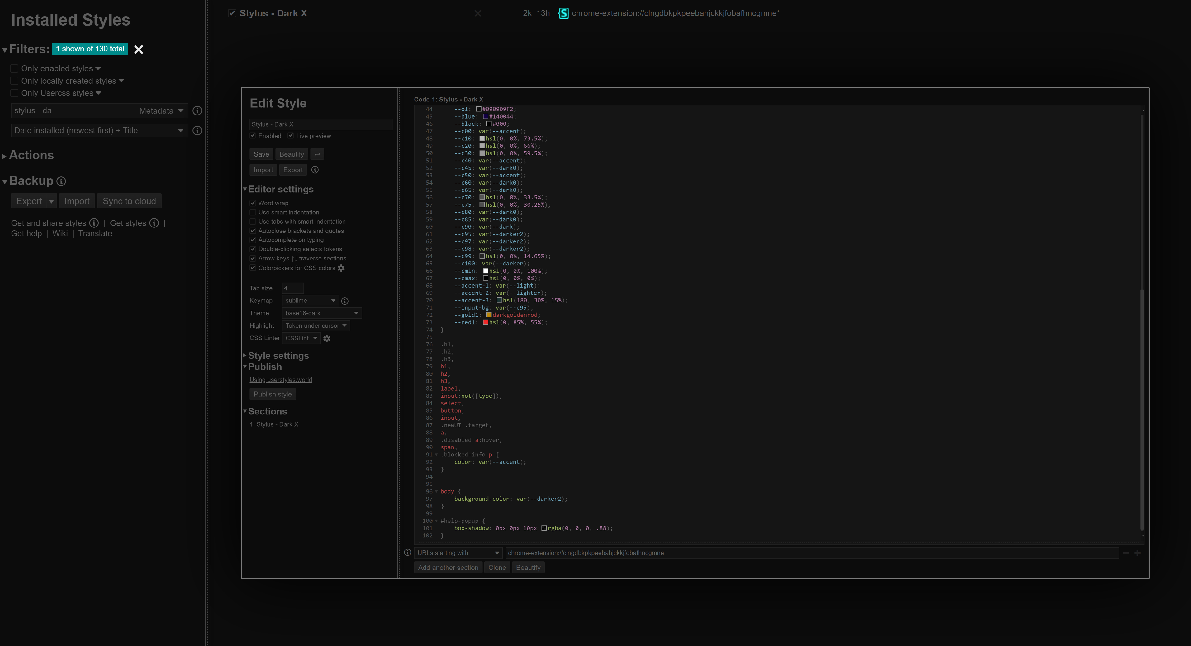
Stylus - Dark X by Saadski
Details
AuthorSaadski
LicenseNo License
Categorychrome-extension://clngdbkpkpeebahjckkjfobafhncgmne
Created
Updated
Code size2.5 kB
Code checksumcb9cc540
Statistics
Learn how we calculate statistics in the FAQ.
Failed to fetch stats.
Description
Notes
Userstyle doesn't have notes.Source code
/* ==UserStyle==
@name         Stylus - Dark X
@version      20240103.03.32
@namespace    ?
==/UserStyle== */

@-moz-document url-prefix("chrome-extension://clngdbkpkpeebahjckkjfobafhncgmne") {
/*Stylus - Dark X*/
/*SCROLLBAR*/
::-webkit-scrollbar
{
    height: 7px !important;
    width: 7px !important;
}

::-webkit-scrollbar-track,
::-webkit-scrollbar-corner
{
    background: #141414 !important;
}

::-webkit-scrollbar-thumb
{
    background: #3A3A3A !important;
    border-radius: 1px !important;
}

::-webkit-scrollbar-thumb:hover
{
    background: #3A3A3A !important;
}

::selection
{
    background: #353535B0 !important;
    color: #000 !important;
}

/*///SCROLLBAR///*/
:root,
*
{
    --dark0: rgb(33, 33, 33);
    --dark: rgb(28, 28, 28);
    --dark1: rgb(27, 27, 27);
    --darker: rgb(18, 18, 18);
    --darker2: rgb(12, 12, 12);
    --darker3: rgb(8, 8, 8);
    --bw: rgb(67, 67, 67);
    --light: rgb(146, 146, 146);
    --light1: rgb(193, 193, 193);
    --lighter: rgb(233, 233, 233);
    --accent: rgb(95, 95, 95);
    --shadow: rgba(0, 0, 0, 0.07);
    --tp: #fff0;
    --ol: #090909F2;
    --blue: #140044;
    --black: #000;
    --c00: var(--accent);
    --c10: hsl(0, 0%, 73.5%);
    --c20: hsl(0, 0%, 66%);
    --c30: hsl(0, 0%, 59.5%);
    --c40: var(--accent);
    --c45: var(--dark0);
    --c50: var(--accent);
    --c60: var(--bw);
    --c65: var(--dark0);
    --c70: hsl(0, 0%, 33.5%);
    --c75: hsl(0, 0%, 30.25%);
    --c80: var(--dark0);
    --c85: var(--dark0);
    --c90: var(--dark);
    --c95: var(--darker2);
    --c97: var(--darker2);
    --c98: var(--darker2);
    --c99: hsl(0, 0%, 14.65%);
    --c100: var(--darker);
    --cmin: hsl(0, 0%, 100%);
    --cmax: hsl(0, 0%, 0%);
    --accent-1: var(--light);
    --accent-2: var(--lighter);
    --accent-3: hsl(180, 30%, 15%);
    --input-bg: var(--c95);
    --gold1: darkgoldenrod;
    --red1: hsl(0, 85%, 55%);
}

.h1,
.h2,
.h3,
h1,
h2,
h3,
label,
input:not([type]),
select,
button,
input,
.newUI .target,
a,
.disabled a:hover,
span,
.blocked-info p
{
    color: var(--accent);
}

body
{
    background-color: var(--darker2);
}

#help-popup
{
    box-shadow: 0px 0px 10px rgba(0, 0, 0, .88);
}

[role="listbox"] li
{
    color: var(--accent) !important
}

[role="listbox"]
{
    background: var(--darker2) !important;
    border: 1px solid var(--dark0)!important
}

[role="listbox"] li:hover,
[role="listbox"] li:active,
[role="listbox"] li:focus
{
    background: var(--dark) !important;
    color: var(--light) !important
}
}