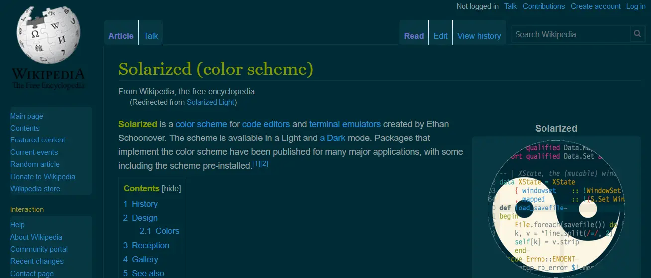
A fork of my Global Solarized Light style, which is a fork of Solarized Dark Everywhere and Global Dark Style.
Recommendation: use it with Global Solarized Light and Zenfox.
Imported and mirrored from https://raw.githubusercontent.com/uso-archive/data/flomaster/data/usercss/173656.user.css
Authordev-ittechca-com
LicenseNo License
Categoryuserstyles.world/style global-solarized-dark-css
Created
Updated
Code size15 kB
Code checksuma1af3e5e
Learn how we calculate statistics in the FAQ.
Failed to fetch stats.
A fork of my Global Solarized Light style, which is a fork of Solarized Dark Everywhere and Global Dark Style.
Recommendation: use it with Global Solarized Light and Zenfox.
2.0.0 (July 21st 2019): completely changed everything to be a fork of Global Dark Style. Using Solarized Dark Everywhere as a main base was making lots of sites break and images disappear.
2.1.0 (July 21st 2019): adapted remaining code, apparently functional. Changed license to match Global Dark Style.
2.2.0 (July 25th 2019): google and facebook improvements
2.3.0 (August 14th 2019): remove ::before and ::after styling, no longer excludes background images from div. This should make sites less broken and make buttons no longer invisible.
===Old Changelongs===
Version 1.0.0: partially broken for some sites, but good enough overall.
Version 1.1.0: removed most google domains since they were broken. Still works for google search.
Version 1.2.0: Fixed transparent popups. Changed name from "Solarized Light All Pages" to "Global Solarized Light". Removed more google domains, facebook, tripadvisor, instagram, tumblr, picrew. Cleaner regex.
Version 1.3.0: cleaner regex, now also accounts for links with "prefix" such as (prefix.sitename.com). Removed steam, epicgames, stackexchange, askubuntu, superuser, github, gitlab, whatsapp, feedly.
/* ==UserStyle==
@name         Global Solarized Dark
@namespace    USO Archive
@author       Void Crab
@description  A fork of my <a href="https://userstyles.org/styles/173443/global-solarized-light">Global Solarized Light</a> style, which is a fork of <a href="https://userstyles.org/styles/98305/solarized-dark-everywhere">Solarized Dark Everywhere</a> and <a href="https://userstyles.org/styles/31267/global-dark-style-changes-everything-to-dark">Global Dark Style</a>.    Recommendation: use it with <a href="https://userstyles.org/styles/173443/global-solarized-light">Global Solarized Light</a> and <a href="https://addons.mozilla.org/en-US/firefox/addon/zen-fox/">Zenfox</a>.
@version      20190814.11.37
@license      CC-BY-NC-SA-4.0
@preprocessor uso
==/UserStyle== */
@-moz-document url-prefix("ftp://"), url-prefix("file://"), url-prefix("about"), url-prefix("javascript"), regexp("https?:\\/\\/(?!(www.userstyles.world)|https://userstyles.world/style/13808)).*") {
/*Vars
base03    #002b36 rgba(0,43,54,1);
base02    #073642 rgba(7,54,66,1);
base01    #586e75 rgba(88,110,117,1);
base00    #657b83 rgba(101,123,131,1);
base0     #839496 rgba(131,148,150,1);
base1     #93a1a1 rgba(147,161,161,1);
base2     #eee8d5 rgba(238,232,213,1);
base3     #fdf6e3 rgba(253,246,227,1);
yellow    #b58900 rgba(181,137,0,1);
orange    #cb4b16 rgba(203,75,22,1);
red       #dc322f rgba(220,50,47,1);
magenta   #d33682 rgba(211,54,130,1);
violet    #6c71c4 rgba(108,113,196,1);
blue      #268bd2 rgba(38,139,210,1);
cyan      #2aa198 rgba(42,161,152,1);
green     #859900 rgba(133,153,0,1);
*/
/* Declares the colors */
*
{
    --base03: #002b36;
    --base02: #073642;
    --base01: #586e75;
    --base00: #657b83;
    --base0: #839496;
    --base1: #93a1a1;
    --base2: #eee8d5;
    --base3: #fdf6e3;
    --yellow: #b58900;
    --orange: #cb4b16;
    --red: #dc322f;
    --magenta: #d33682;
    --violet: #6c71c4;
    --blue: #268bd2;
    --cyan: #2aa198;
    --green: #859900;
    /* For debugging what the original code is doing */
    --debug: #FF007F;
}

html
{
    background: var(--base03)/* fixed */
    !important
}

/*----- DEFAULT TEXT, BORDER & BACKGROUND COLORS -----*/
*
{
    color: var(--base1) !important;
    border-color: var(--base02) !important;
    outline-color: var(--base02) !important;
    /* NOPE
    text-shadow: 0 0 3px var(--debug) !important*/
    text-shadow: none!important;
    box-shadow: none !important;
    background-color: transparent !important;
    border-top-color: var(--base02) !important;
    border-bottom-color: var(--base02) !important;
    border-left-color: var(--base02) !important;
    border-right-color: var(--base02) !important
}

body
{
    background: transparent !important
}

/* It makes no sense to change all those elements, pseudoelements can't be changed afterwards and will be perma transparent */
/*
*:before,
*:after
{
   background-color: transparent !important;
   border-color: var(--base02) !important
}
*/

a,
a *
{
    color: var(--blue) !important;
    text-decoration: none !important
}

a:hover,
a:hover *,
a:visited:hover,
a:visited:hover *,
span[onclick]:hover,
div[onclick]:hover,
[role="link"]:hover,
[role="link"]:hover *,
[role="button"]:hover *,
[role="menuitem"]:hover,
[role="menuitem"]:hover *,
.link:hover,
.link:hover *
{
    color: var(--yellow) !important;
    /* Never text shadow
   text-shadow: 0 0 5px var(--debug) !important
   */
}

a:visited,
a:visited *
{
    color: var(--violet) !important
}

a.highlight,
a.highlight *,
a.active,
a.active *,
.selected,
.selected *,
[href="#"]
{
    color: var(--orange) !important;
    font-weight: bold !important
}

h1,
h2,
h1 *,
h2 *
{
    color: var(--green) !important
}

h3,
h4,
h3 *,
h4 *
{
    color: var(--yellow) !important
}

h5,
h6,
h5 *,
h6 *
{
    color: var(--orange) !important
}

/* Bold and emphasis
Also added italic and underlined */
strong,
[id*="headline"],
[class*="headline"],
[id*="header"],
[class*="header"],
[class*="header"] td,
b,
i,
u
{
    color: var(--green) !important
}

/*
a h1, a h2, a h3, a h4, a h5, a h6, h1 a, h2 a, h3 a, a strong, a[id*="headline"], a[class*="headline"], a[id*="header"], a[class*="header"] {
   text-decoration: underline !important} */
[class*="error"],
[class*="alert"],
code,
span[onclick],
div[onclick]
{
    color: var(--orange) !important
}

::-moz-selection,
::selection
{
    background: var(--base2) !important;
    color: var(--base01) !important
}

:focus
{
    outline: none !important
}

/*----- MENU & CO BACKGROUND-COLORS -----*/
div[style="display: block;"],
div[role="navigation"]
{
    background: var(--base03) !important
}

table
{
    background: var(--base02) !important;
    border-radius: 6px !important
}

table > tbody > tr:nth-child(even),
table > tbody > tr > td:nth-child(even)
{
    background-color: var(--base02) !important
}

iframe,
embed,
nav,
label [onclick],
nav ul,
div[style*="position:"][style*="left:"][style*="visible"],
div[style*="z-index:"][style*="left:"][style*="visible"],
div[style*="-moz-user-select"],
div[role="menu"],
div[role="dialog"],
span[class*="script"] div,
[id*="menu"],
[id*="Menu"],
[class*="dropdown"],
[class*="popup"],
[class="title"],
ul[style*="display:"],
ul[style*="visibility:"] ul,
[id*="nav"] ul,
[class*="nav"] ul,
ul[class*="menu"],
a[onclick][style*="display"],
a[id*="ghosteryfirefox"],
#ghostery-purple-bubble,
#translator-popup,
.menu,
.tooltip,
.hovercard,
.vbmenu_popup
{
    background: var(--base02) !important;
    border-radius: 5px;
    /* Adds shadow around elements like ul, iframes and videos and etc */
    /* NOPE, ugly
   box-shadow: 1px 1px 5px var(--base01) !important
   */
}

header,
#header,
footer,
#footer
{
    background: var(--base02)!important;
    box-shadow: 0 0 5px var(--base01) !important
}

/* Idk what's this, will just leave it here */
body > #dialog,
body > .xenOverlay
{
    background: var(--base02)!important;
    background-clip: padding-box !important;
    box-shadow: 0 0 15px var(--base01) !important;
    border: 10px solid var(--debug) !important;
    border-radius: 0 !important;
}

[id*="overlay"],
[id*="lightbox"],
blockquote
{
    background-color: var(--base02) !important;
    border-radius: 5px
}

pre,
dl,
.Message code
{
    background-color: var(--base02) !important
}

/*----- DEFAULT BUTTONS, SEARCHBOXES & CO -----*/
input,
select,
button,
[role="button"],
a.button,
a.submit,
a.BigButton,
a.TabLink,
.install[onclick]
{
    -moz-appearance: none !important;
    -webkit-appearance: none !important;
    /* Might have to change here later, not sure which color to use
   background: var(--base02) !important;
   */
    color: var(--base0) !important;
    /* color of text you write*/
    transition: border-color 0.3s !important;
    /* Checkbox and etc border */
    border: 2px solid var(--base02) !important;
    /* Nope
   text-shadow: 0 1px var(--debug) !important;
   border-radius: 4px !important;
   box-shadow: 0 0 2px var(--debug) !important
   */
}

/*
*/
a[href="javascript:;"],
a[class*="button"]:not(:empty),
a[id*="button"]:not(:empty),
a[id*="Button"]:not(:empty),
div[class*="button"][onclick]
{
    background: var(--base02) !important;
    color: var(--base01) !important;
    transition: border-color 0.3s !important;
    border-color: var(--base02) !important;
    /* Nope
       text-shadow: 0 1px var(--debug) !important;
       box-shadow: 0 0 2px var(--debug) !important;
   */
}

a[href="javascript:;"]:hover,
a[class*="button"]:not(:empty):hover,
a[id*="button"]:hover,
a[id*="Button"]:not(:empty):hover,
div[class*="button"][onclick]:hover
{
    background: var(--base02) !important;
    color: var(--yellow) !important
}

input *,
select *,
button *,
a.button *,
a.submit *
{
    color: var(--base01) !important;
    text-shadow: none !important
}

input:hover,
input[type="button"]:hover,
select:hover,
button:hover,
[role="button"]:hover,
a.button:hover,
a.submit:hover,
a.BigButton:hover,
a.TabLink:hover
{
    color: var(--base01) !important;
    /* Border when hovering inputs, buttons and such */
    border: 2px solid var(--green) !important;
    border-top-color: var(--green) !important;
    border-bottom-color: var(--green) !important;
    border-left-color: var(--green) !important;
    border-right-color: var(--green) !important
}

input:focus,
select:focus
{
    /* Shadow when you are writing in a input box */
    box-shadow: 0 0 5px var(--green) !important
}

input *:hover *
{
    color: var(--base01) !important;
    /*    Nope
   text-shadow: 0 0 2px var(--debug) !important
   */
}

input[disabled],
select[disabled],
button[disabled],
input[disabled]:hover,
select[disabled]:hover,
button[disabled]:hover,
input[disabled]:focus,
select[disabled]:focus,
button[disabled]:focus
{
    opacity: 0.5 !important;
    border-color: var(--base02) !important
}

/* Disabled by the original author
input[type="checkbox"], input[type="radio"] {
   box-shadow: 0 0 0 2px var(--yellow) !important;
   opacity: 0.7;
   transition: box-shadow 0.2s, opacity 0.2s !important
}

input[type="checkbox"]:not([disabled]):hover, input[type="radio"]:not([disabled]):hover {
   opacity: 0.9
}

input[type="checkbox"]:not([disabled]):active, input[type="radio"]:not([disabled]):active {
   box-shadow: 0 0 0 2px var(--yellow) !important
}

input[type="checkbox"]:checked, input[type="radio"]:checked {
   box-shadow: 0 0 0 2px var(--green) !important
}

input[type="checkbox"][disabled], input[type="radio"][disabled] {
   opacity: 0.35
}
*/
input[type="checkbox"]
{
    border-radius: 1px !important
}

input[ty...