A simple theme that recolors the interface of ChatGPT to more aesthetically pleasing dark colors.
- New Update
v1.2(2/7/24)
AuthorIdkJared
LicenseMIT
Categoryopenai, chatgpt, dark, simple, minimalistic, customizable
Created
Updated
Code size3.7 kB
Code checksuma783d7af
Learn how we calculate statistics in the FAQ.
Failed to fetch stats.
A simple theme that recolors the interface of ChatGPT to more aesthetically pleasing dark colors.
v1.2 (2/7/24)Neatly Dark consists of three shades of grey. These shades are carefully implemented to create a simplistic, consistent, and enhanced experience.
Download Stylus Here
When installing or through the Stylus extension, if you wish to change any color of the theme, simply change the hex values on the configuration menu to any color of your choosing.
Configuration Menu:

(The default hex codes for this theme are listed above)
New Chat Without Sidebar

New Chat With Sidebar

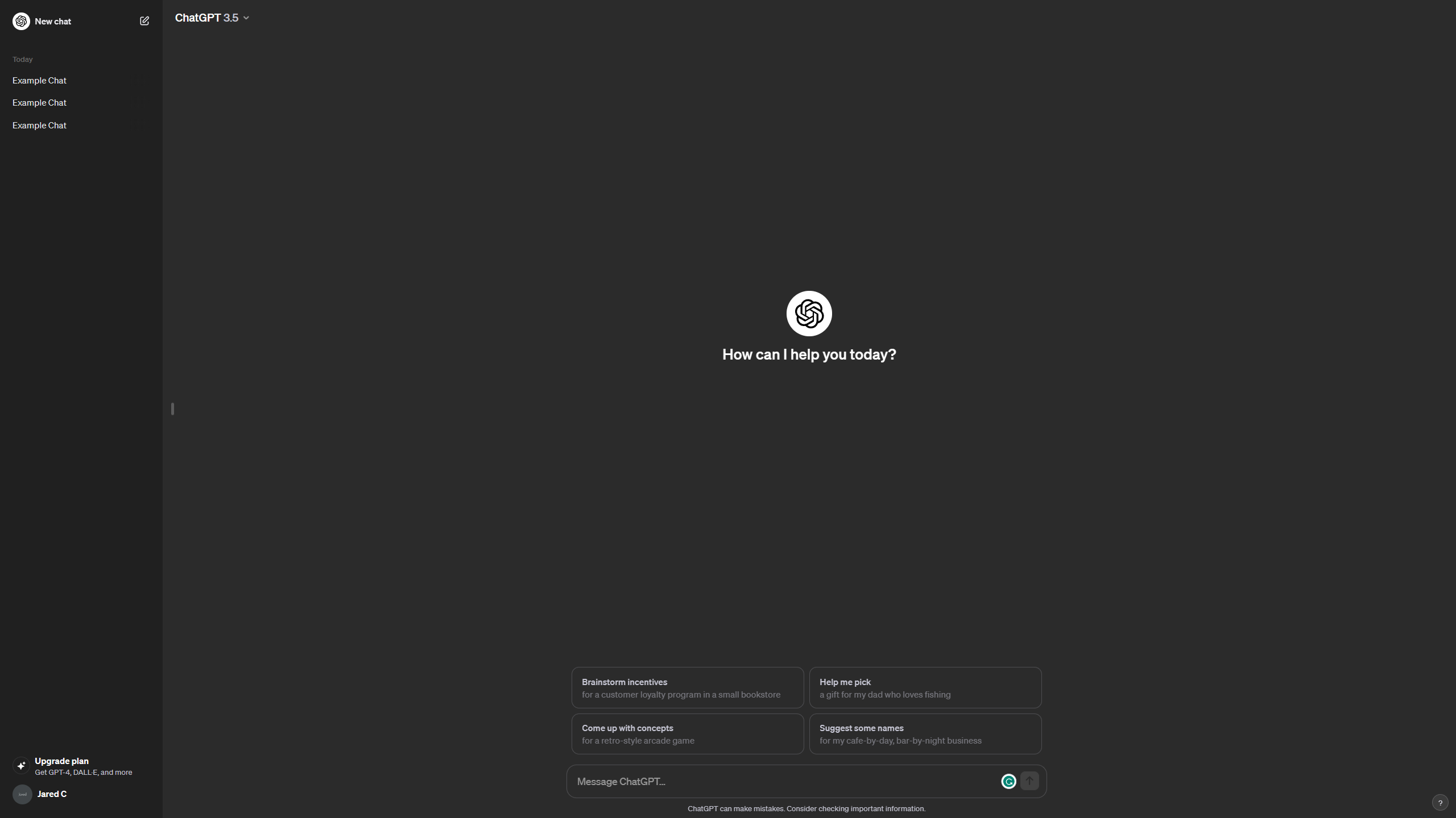
Example Chat With Sidebar

v1.2 Fixed Chat Background Color and Minor Inconsistencies. (2/7/2024)
v1.1 Support For New UI in Side Menu. Fixed Minor Inconsistencies. (1/12/2024)
v1.0 Initial Release (12/25/2023)
Feel free to contact me if you experience any bugs or inconsistencies and would like to provide feedback. Unfortunately, I have yet to set up a form of contact as I'm rather new to this type of development, although in the meantime feel free to add a review with any feedback!
/* ==UserStyle==
@name         Chat GPT Neatly Dark
@namespace    Openai
@version      1.2
@author       IdkJared
@license      MIT

@var text C1 'Lighter Accent' #3b3b3b
@var text C2 'Main Color' #2b2b2b
@var text C3 'Darker Accent' #202020
==/UserStyle== */
@-moz-document url-prefix("https://chat.openai.com/") {


/*Colors*/
:root{
    --lessdark: var(--C1);
    --dark: var(--C2);
    --moredark: var(--C3);
}

.dark{
    --surface-primary: var(--dark);
    --surface-tertiary: var(--lessdark);
	--main-surface-primary: var(--dark);
}


/*Chat*/
.dark body{
    background-color: var(--dark);
}

.dark .dark\:bg-gray-800{
    background-color: var(--dark);
}

.dark .btn-neutral{
    background-color: var(--dark);
    border-color: var(--border-heavy);
}
.dark .dark\:shadow-\[0_0_0_2px_rgba\(52\2c 53\2c 65\2c 0\.95\)\]{
    --tw-shadow: 0 0 0 2px var(--dark);
}

.dark .dark\:bg-white\/10{
    background-color: var(--lessdark);
}

.dark .dark\:bg-gray-600\/70{
    background-color: rgba(59,59,59,.7);
}

.dark .dark\:border-white\/10{
    border-color: var(--border-heavy);
}

.dark .dark\:bg-gray-950{
    background-color: var(--moredark);
}

.dark .dark\:border-gray-700{
    border-color: var(--border-heavy);
}

.bg-token-surface-primary{
    background-color: var(--dark);
}

.dark .dark\:radix-state-open\:bg-black\/20[data-state=open]{
    background-color: var(--moredark);
}

.dark .btn-neutral:hover{
    background-color: var(--lessdark);
    --tw-gradient-stops: var(--moredark);
}

.dark .dark\:text-gray-200{
    background-color: var(--lessdark);
    --tw-gradient-stops: var(--moredark);
}

.dark .dark\:bg-gray-700{
    background-color: var(--moredark);
}

.flex-wrap:hover{
    background-color: var(--lessdark);
}

.dark .dark\:bg-white:hover{
    background-color: var(--lessdark);
}

.dark .dark\:border-white:hover{
   background-color: var(--lessdark);
   border-color: var(--border-xheavy);
}

.dark .dark\:disabled\:bg-white:disabled:hover{
    background-color: hsl(0,0%,50%);
    border-color: var(--border-xheavy);
}

.dark .dark\:border-gray-700{
    background-color: var(--moredark);
}

.dark .dark\:bg-gray-900{
    background-color: var(--moredark);
}

.dark .dark\:text-black{
    color: var(--moredark);
}

.dark .dark\:text-gray-400:hover{
    background-color: var(--dark);
}

.dark .dark\:bg-gray-800\/90{
    background-color: var(--dark);
}

.text-gray-900{
    background-color: var(--moredark) !important;
}

.rounded-md{
    border-color: var(--border-heavy);
}

.dark .dark\:bg-token-surface-primary{
	background-color: var(--lessdark);
}

.dark .dark\:from-gray-700{
	--tw-gradient-from: var(--lessdark);
}
.dark .dark\:bg-token-surface-secondary{
background-color: var(--dark)
}
	.bg-gray-700{
		background-color: rgba(0,0,0,0)
	}

/*Side Menu*/
.bg-black{
    background-color: var(--moredark);
}

.dark .dark\:bg-black{
    background-color: var(--moredark);
}

.dark .dark\:from-black{
    --tw-gradient-from: var(--moredark);
}

.from-token-surface-secondary{
		--tw-gradient-from: var(--dark) var(--tw-gradient-from-position);
	}

.from-black{
	--tw-gradient-from: var(--moredark) var(--tw-gradient-from-position);
	}

.to-transparent{
	--tw-gradient-to: rgba(0,0,0,0) var(--tw-gradient-to-position)
	}

.bg-token-popover-surface-primary{
	background-color: var(--moredark);
}

/*Upgrade Plan*/
.bg-token-surface-secondary{
    background-color: var(--dark);
}

.md\:border-t-0{
    background-color: var(--dark);
}
.py-6{
	background-color: var(--moredark)
}

}