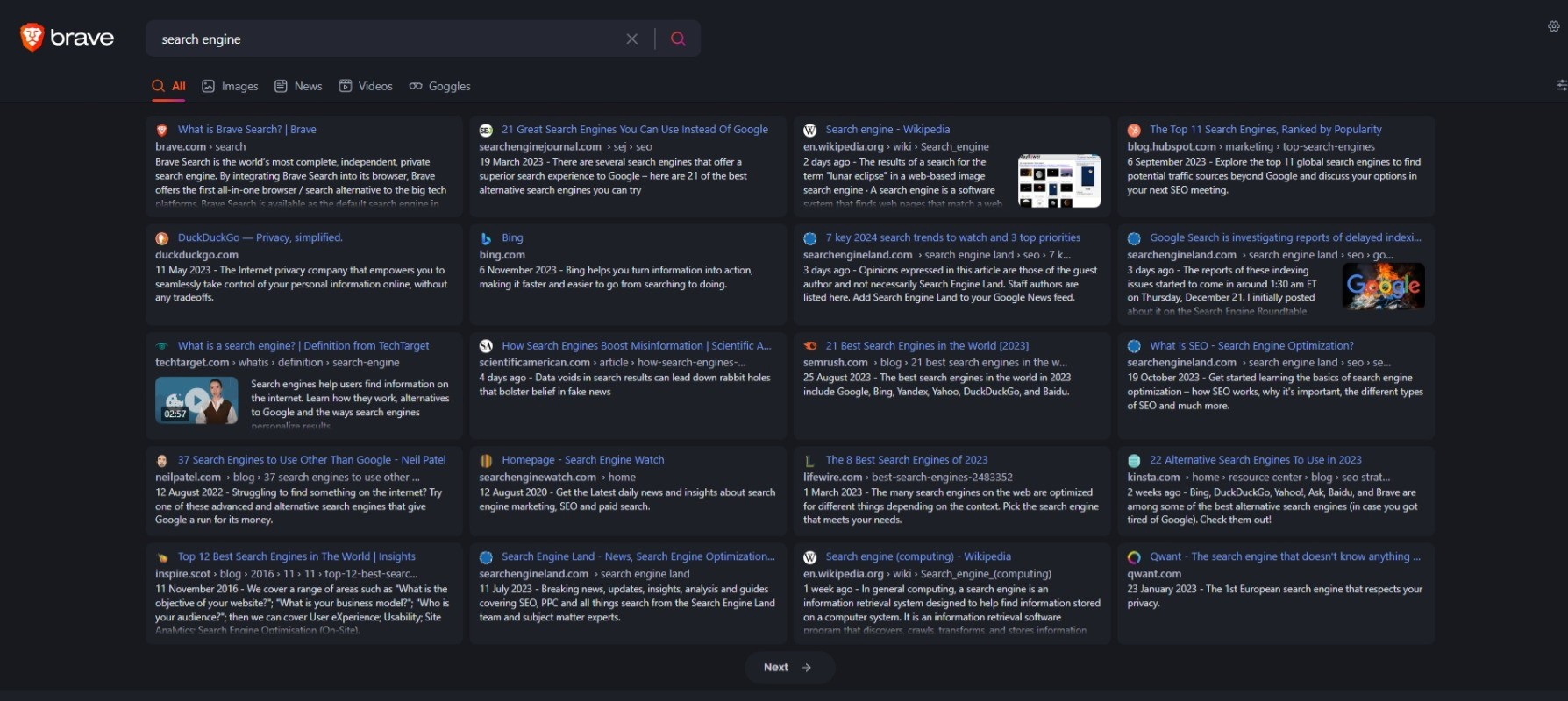
Take advantage of the width of your screen, minimize dead space
Brave Search Compact by TMSH
Details
AuthorTMSH
LicenseMIT
Categorysearch.brave.com/search
Created
Updated
Code size3.0 kB
Code checksum61351fc9
Statistics
Learn how we calculate statistics in the FAQ.
Failed to fetch stats.
Description
Notes
This style very aggressively removes everything but actual search results, even if you have optional elements such as "Discussions" and "Summarizer" enabled in your settings. "Fluff" such as deeplinks, product ratings and other metadata compiled by brave is also hidden from individual result boxes, to keep each result at a more-or-less uniform height, allowing a page of 20 results to fit comfortably on a 1920x1080 screen.
I've tried to make options you might want to alter, such as results per row, font selection etc. available as variables at the top of the userstyle.
Source code
/* ==UserStyle==
@name           Brave Search Compact
@namespace      userstyles.world/user/TMSH
@version        1.0.0
==/UserStyle== */
@-moz-document url-prefix('https://search.brave.com/search') {
    body {
        --results-per-row: 1;
		--results-gutters: var(--spacing-m);
        --result-min-width: calc((100% - var(--results-gutters) * (var(--results-per-row) - 1)) / var(--results-per-row));

        --result-padding: var(--spacing-m) var(--spacing-l) var(--spacing-l);
		--result-border-radius: var(--border-radius);

        --result-line-height: 1.4;
        --result-max-desc-height: 3.8lh;
        --result-overflow-fade: .7lh;

		--main-column-width: none;
		--main-font: 'Segoe UI', 'Inter', 'Helvetica', sans-serif;
	}

    @media (min-width: 600px)   { body { --results-per-row: 2; } }
    @media (min-width: 1000px)  { body { --results-per-row: 3; } }
    @media (min-width: 1400px)  { body { --results-per-row: 4; } }

	div.column-layout {
		max-width: none !important;

        & .sidebar { display: none; }

		& .main-column {
			& #results {
				display: flex;
				flex-wrap: wrap;
				gap: var(--results-gutters);

                min-height: 0;
				margin-right: 0;
				margin-bottom: var(--results-gutters);

                & .snippet {
					flex: 1;
					margin-bottom: 0;

                    min-width: var(--result-min-width);
					padding: var(--result-padding);
					border-radius: var(--result-border-radius);

					&#pagination-snippet { margin-top: 0; padding: 0; min-width: 100%; }

                    & .desktop-default-regular, & .text-small-regular, & .snippet-content, & .snippet-url { font-size: var(--text-sm-2); line-height: var(--result-line-height); }
                    & .heading-serpresult { font-size: var(--text-sm); }

					& .snippet-content { margin-top: 0; }
					& .snippet-description { max-height: var(--result-max-desc-height); position: relative; & strong { font-weight: 400; }  }
					& .snippet-description::after { content: ""; position: absolute; width: 100%; height: var(--result-max-desc-height); top: 0; left: 0; background-image: linear-gradient(to top, var(--search-bgd-04) 0, #0000 var(--result-overflow-fade)); }

                    & .snippet-content img, .video-snippet img { height: auto; max-height: var(--result-max-desc-height); }
                    & .video-snippet { margin-top: 0; & .video-thumb { margin-top: .3lh; } }

                    & .result-cluster, & .item-attributes, & .snippet-attributes, & .deep-results-buttons, & .snippet-fullwidth { display: none; }
                    &.no-bg:not(#pagination-snippet), &.standalone:not(#pagination-snippet), &#featured-snippet { display: none; }
				}
			}
		}
	}

	footer { margin-top: 0 !important; }

	@media (min-width: 848px) {
		div.column-layout { padding-right: var(--main-content-padding) !important; }
	}
}