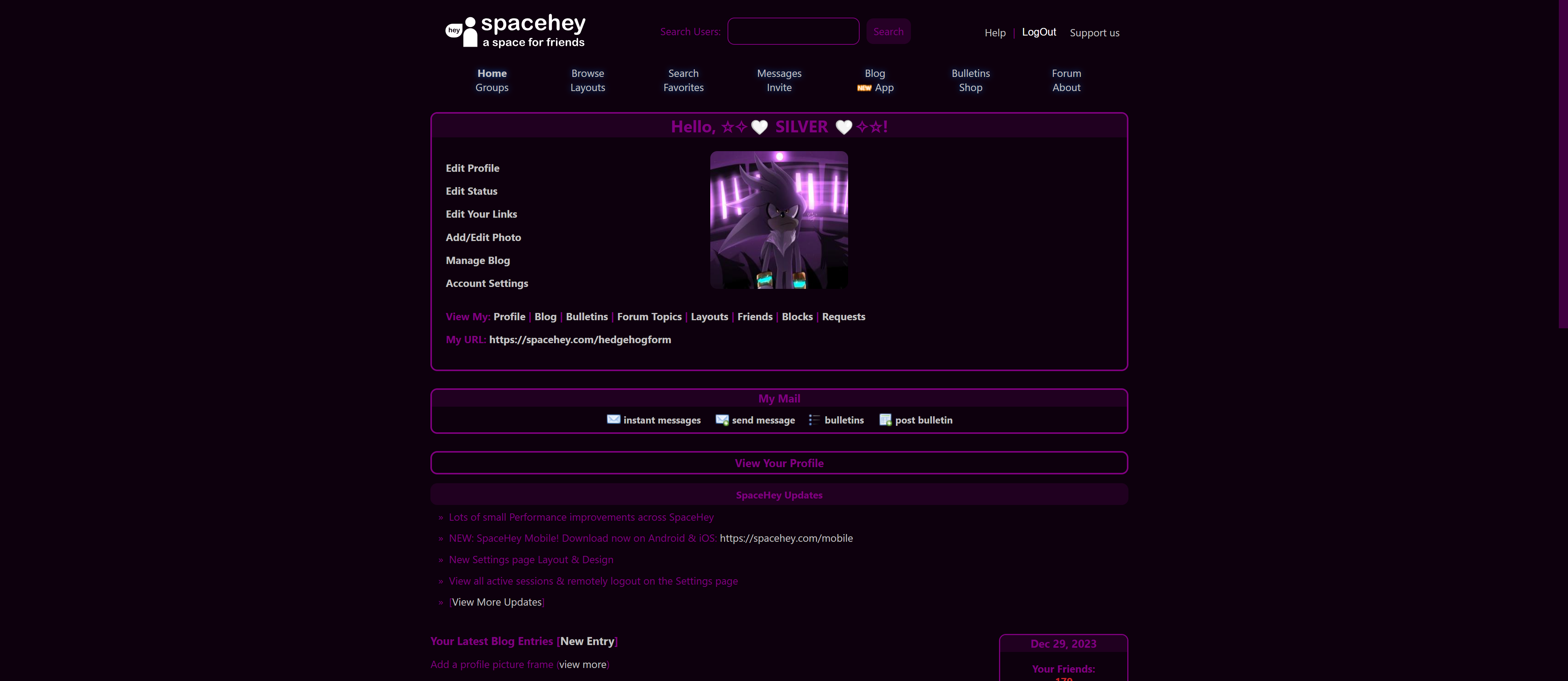
A modern theme for SpaceHey (Custom color). Please go and edit the code for --primary-color to your color of choice.
Modern Theme by ultimateshadsform
Details
Authorultimateshadsform
LicenseMIT
Categoryspacehey
Created
Updated
Code size10 kB
Code checksum1aebc043
Statistics
Learn how we calculate statistics in the FAQ.
Failed to fetch stats.
Description
Notes
Userstyle doesn't have notes.Source code
Source code has over 10K characters, so we truncated it. You can inspect the full source code on install link./* ==UserStyle==
@name Modern Theme
@namespace github.com/ultimateshadsform/spacehey-modern-theme
@version 1.0.1
@description A modern theme for SpaceHey. Please go and edit the --primary-color to your color of choice.
@author Me
==/UserStyle== */
@-moz-document domain("https://spacehey.com"), url("https://spacehey.com/home"), url-prefix("https://layouts.spacehey.com/"),
url-prefix("https://spacehey.com/browse"),
url-prefix("https://spacehey.com/search"),
url("https://spacehey.com/bulletins"), url("https://spacehey.com/edit"), url-prefix("https://spacehey.com/friends"),
url("https://spacehey.com/favorites"),
url("https://spacehey.com/notifications"),
url("https://spacehey.com/about"),
url-prefix("https://im.spacehey.com/"),
url("https://blog.spacehey.com/"),
url("https://forum.spacehey.com/"),
url("https://spacehey.com/requests"),
url("https://spacehey.com/createbulletin"), url("https://spacehey.com/advancedsearch"), url("https://groups.spacehey.com/"), url("https://spacehey.com/invite"), url("https://spacehey.com/mobile")
{
:root {
--primary-color: purple;
}
* {
font-family: system-ui;
color: var(--primary-color);
::-webkit-scrollbar {
width: 12px;
/* width of the entire scrollbar */
}
::-webkit-scrollbar-track {
background: transparent;
/* color of the tracking area */
}
::-webkit-scrollbar-thumb {
background-color: color-mix(
in srgb,
var(--primary-color) 50%,
hsl(0, 0%, 0%)
);
/* creates padding around scroll thumb */
}
}
a {
color: #c3c3c3 !important;
transition: color 200ms ease;
&:hover {
color: #fff !important;
}
}
button {
background: color-mix(in srgb, var(--primary-color) 30%, hsl(0, 0%, 0%));
border: none;
padding: 0.5rem;
border-radius: 0.5rem;
cursor: pointer;
transition: background 200ms ease;
&:hover {
background: color-mix(in srgb, var(--primary-color) 50%, hsl(0, 0%, 0%));
}
}
input {
background: transparent;
border: 1px solid var(--primary-color);
border-radius: 0.5rem;
padding: 0.5rem;
}
.trumbowyg-box {
border: 1px solid var(--primary-color);
}
.trumbowyg-button-pane {
background: color-mix(in srgb, var(--primary-color) 35%, hsl(0, 0%, 0%));
}
select {
background: color-mix(in srgb, var(--primary-color) 35%, hsl(0, 0%, 0%));
}
.edit-info {
background: transparent;
border: 1px solid var(--primary-color);
border-radius: 0.5rem;
}
.comments-table td,
.comments-table td:first-child,
.music-table td:first-child {
background: color-mix(in srgb, var(--primary-color) 10%, hsl(0, 0%, 0%));
}
body {
background: color-mix(in srgb, var(--primary-color) 10%, hsl(0, 0%, 0%));
.blog-entries .entry,
.topic-box,
.reply-box,
ul.group-actions li {
background: transparent;
}
.topic-info,
.reply-info {
border-right: 3px solid var(--primary-color);
}
.topic-box,
.reply-box,
.group-actions {
border: 1px solid var(--primary-color);
}
ul.group-actions li {
color: var(--primary-color);
transition: background 200ms ease;
&:hover {
background: color-mix(
in srgb,
var(--primary-color) 35%,
hsl(0, 0%, 0%)
);
}
}
.im-container {
.im-nav,
.chat-box,
.chat-header,
.tabpanel menu button {
background: transparent;
}
.chat-box,
.tabpanel .content,
.connection-status,
.chat-box .new-message .center textarea,
.tabpanel menu button {
border: 1px solid var(--primary-color);
}
.chat-box .new-message {
border-top: 1px solid var(--primary-color);
}
.status,
.message {
background: color-mix(
in srgb,
var(--primary-color) 20%,
hsl(0, 0%, 0%)
);
border: 1px solid var(--primary-color);
&:before {
border-left: 8px solid
color-mix(in srgb, var(--primary-color) 20%, hsl(0, 0%, 0%));
border-bottom: 8px solid
color-mix(in srgb, var(--primary-color) 20%, hsl(0, 0%, 0%));
}
}
.status:before {
filter: drop-shadow(-1px -2.5px var(--primary-color));
}
.message-container:not(.self) .message:not(.slim)::before {
border-right: 8px solid
color-mix(in srgb, var(--primary-color) 20%, hsl(0, 0%, 0%));
border-top: 8px solid
color-mix(in srgb, var(--primary-color) 20%, hsl(0, 0%, 0%));
filter: drop-shadow(-2.8px -1px var(--primary-color));
}
.message-container.self .message:not(.slim)::after {
border-left: 8px solid
color-mix(in srgb, var(--primary-color) 20%, hsl(0, 0%, 0%));
border-top: 8px solid
color-mix(in srgb, var(--primary-color) 20%, hsl(0, 0%, 0%));
filter: drop-shadow(2.6px -0.94px var(--primary-color));
}
.tabpanel .content,
.chat-box .messages .newchat-info,
.chat-box .messages .nochat-info,
.connection-status,
.chat-header,
.new-message,
textarea {
background: transparent;
}
.chat-item:not(:last-child),
.chat-header,
.options-list a.option:not(:last-child) {
border: unset;
}
.im-nav a:hover .item,
.im-nav a:active .item {
box-shadow: inset 0.1em 0.2em 0.8em var(--primary-color);
}
}
nav {
.top,
.links {
background: color-mix(
in srgb,
var(--primary-color) 10%,
hsl(0, 0%, 0%)
);
}
.top {
display: flex;
align-items: center;
form {
display: flex;
justify-content: center;
place-items: center;
column-gap: 0.5rem;
}
.right {
display: flex;
place-items: center;
column-gap: 0.5rem;
.support-right {
margin: 0 !important;
}
}
}
.links {
display: grid;
grid-template-columns: 1fr 1fr 1fr 1fr 1fr 1fr 1fr;
justify-items: center;
li:not(:last-child)::after {
content: '';
}
}
}
main {
background: transparent;
.info {
display: none;
}
.new-people {
border: 1px solid var(--primary-color);
border-radius: 0.5rem;
overflow: hidden;
.top {
text-align: center;
}
.top {
background-color: color-mix(
in srgb,
var(--primary-color) 25%,
hsl(0, 0%, 0%)
);
}
.inner {
display: grid;
grid-template-columns: repeat(auto-fit, minmax(6rem, 1fr));
justify-content: center;
justify-items: center;
.person {
a:last-child img {
object-fit: cover;
width: 80px !important;
height: 80px !important;
border-radius: 0.5rem;
}
}
}
}
.forum-table th,
.forum-table td,
.groups-table th,
.groups-table td,
.bulletin-table th,
.bulletin-table td,
table {
border: 1px solid
color-mix(in srgb, var(--primary-color) 25%, hsl(0, 0%, 0%)) !important;
}
hr {
border: 1px solid var(--primary-color);
}
.heading {
background: color-mix(
in srgb,
var(--primary-color) 25%,
hsl(0, 0%, 0%)
) !important;
text-align: center;
}
.bulletin-preview .heading,
.friends .heading {
border-radius: 0.5rem;
}
.profile {
display: flex;
flex-direction: column;
.left,
.right {
padding: 0;
}
.contact,
.url-info,
.table-section,
.setting-section,
.home-actions {
background: transparent;
border: 2px solid var(--primary-color);
border-radius: 0.5rem;
overflow: hidden;
}
.left {
display: grid;
width: 100%;
.heading {
text-align: center;
}
.contact {
display: flex !important;
flex-direction: column;
.inner {
display: flex;
justify-content: center;
.f-row {
width: fit-content;
display: flex;
column-gap: 1rem;
}
}
}
.indie-box,
.specials:not(:last-child) {
display: none;
}
.specials:not(:first-child) {
.heading {
margin: 0;
border-radius: 0.5rem;
}
}
.general-about .inner {
display: grid;
grid-template-columns: 1fr 1fr 1fr;
grid-template-areas: 'edit center .' 'links links links';
padding: 1rem;
.profile-pic {
margin: 0;
display: flex;
justify-content: center;
grid-area: center;
a {
display: flex;
img {
border-radius: 0.5rem;
}
}
}
.details {
grid-area: edit;
...