A collection of tweaks for uncropping images, hiding trends, avatar roundness, moving header aside, and more! |
Change Log
Twitter Tweaks [UNMAINTAINED] by Freeplay
Imported and mirrored from https://codeberg.org/Freeplay/UserStyles/raw/branch/main/twitter/twitter-tweaks.user.css
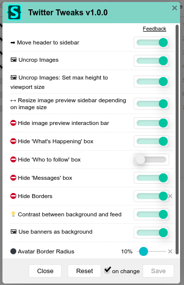
![Screenshot of Twitter Tweaks [UNMAINTAINED]](https://userstyles.world/preview/14/0.webp)
Details
AuthorFreeplay
LicenseNo License
Categorytwitter.com
Created
Updated
Code size23 kB
Code checksum9d0c9e17
Statistics
Learn how we calculate statistics in the FAQ.
Failed to fetch stats.
Description
Notes
In the stylus popup, click the cog icon next to the style name to toggle settings!
twitter is pain
Source code
Source code has over 10K characters, so we truncated it. You can inspect the full source code on install link./* ==UserStyle==
@name Twitter Tweaks by @FreeplayG
@version 1.3.20
@description Uncrop images, hide trends, Avatar roundness, move header aside, and more!!
@preprocessor stylus
-- AUTHOR STUFF --
@namespace Freeplay
@author Freeplay (https://freeplay.codeberg.page/)
@homepageURL https://codeberg.org/Freeplay/UserStyles
@supportURL https://codeberg.org/Freeplay/UserStyles/issues
@var text hehe "As I start to phase out of Twitter, and on to the Fediverse instead, I will be focusing more on other styles. So why not check out Mastodon Modern, too? :)" '"https://twitter.com/FreeplayG/status/1528077571900035074"'
@var text notice 'Make sure you are using the "Stylus" browser extension, not "Stylish"! — Style created by @FreeplayG' "'https://add0n.com/stylus.html'"
@var checkbox moveHeader "↔ Timeline: Move header to sidebar" 1
@var select fullWidthMedia "🖼 Timeline: Media Size" ["Default", "Larger*", "Full-Width"]
@var range avatarRadius "⚫ Timeline: Avatar Roundness" [30, 5, 50, 5, '%']
@var range TLWidth "↔ Timeline: Timeline Width" [600, 600, 1000, 20, "px"]
@var checkbox hideTweetBoxTL "⛔ Timeline: Show Compose Box" 1
@var checkbox hideTLFollow "⛔ Timeline: Show Who to follow, Topics to follow, & Ads" 0
@var checkbox resizeSidebar "↔ Image Preview: Enable Dynamic Sidebar Width" 1
@var checkbox removeImageBar "⛔ Image Preview: Show Interaction Bar" 0
@var checkbox noExplore "⛔ Left Sidebar: Show Explore" 1
@var checkbox noCommunities "⛔ Left Sidebar: Show Communities" 1
@var checkbox noTrends "⛔ Right Sidebar: Show What's Happening " 1
@var checkbox noFollowBox "⛔ Right Sidebar: Show Who to follow " 1
@var checkbox noMessagesBox "⛔ Right Sidebar: Show Messages" 1
@var checkbox noFooter "⛔ Right Sidebar: Footer" 0
@var color themeColor "🌈 Custom Theme Color" #1da1f2
@var select noBorder "⛔ Border Style" ["Default*", "Hide", "keep:Only Timeline Separators"]
@var checkbox columnBG "💡 Add Contrast between background and feed" 0
@var checkbox bgBanner "🖼 Use profile banners as background" 0
@var text customBG "🖼 Custom Background (Link in quotes, image MUST be uploaded to Twitter due to Content Security Policy)" '""'
@var range customBGOpacity" ↳ Opacity" [1, 0.05, 1, .05]
@var range customBGBlur " ↳ Blur" [0, 0, 30, 5, 'px']
@var checkbox moreAnim "🎞️ More Animations" 1
@var checkbox revertFont "🇦 Revert Font" 0
@var checkbox followersCount "🖤 Wellbeing: Show Follower Count" 1
@var checkbox likesCount "🖤 Wellbeing: Show Likes Count" 1
@var checkbox retweetsCount "🖤 Wellbeing: Show Retweets Count" 1
@var checkbox commentsCount "🖤 Wellbeing: Show Comments Count" 1
@var checkbox analyticsButton"🖤 Wellbeing: Show Analytics Button" 1
==/UserStyle== */
@-moz-document domain("twitter.com") {
html {
scrollbar-color: rgba(155,155,155,0.5) transparent;
}
// Make 'replying to' appear as an actually clickable button!
[class="css-1dbjc4n r-18u37iz r-16y2uox r-1wbh5a2"] {
& > [class="css-1dbjc4n r-1iusvr4 r-16y2uox"]:last-child > [role="button"] {
font-size: 0 !important;
padding-bottom: 0;
margin-bottom: 0px;
width: max-content !important;
max-width: 100%;
&:hover span::after {
opacity: .1 !important;
}
& > span {
font-size: 15px;
background-color: rgba(100,100,100,0.2);
padding: 6px 12px;
border-radius: 100px;
display: inline-flex;
align-items: center;
position: relative;
&::before {
content: "✏ ";
font-size: 1.6em;
}
&::after {
content: "";
position: absolute;
inset: 0;
background-color: currentColor;
border-radius: 100px;
z-index: -1;
opacity: 0;
transition: opacity .1s;
}
}
}
}
// Column Width
@media not screen and (max-width: 1278px) and (min-width: 987px) {
if TLWidth == 1000px {
TLWidth = 9999px
}
main > .r-rthrr5, main > .r-33ulu8 {
// min-width: 390px;
width: 390px + TLWidth;
&.r-rthrr5 {
max-width: calc(100vw - 330px);
[data-testid="primaryColumn"] {
max-width: calc(100% - 390px);
}
}
&.r-33ulu8 {
max-width: calc(100vw - 90px);
width: TLWidth;
[data-testid="primaryColumn"] {
max-width: 100%;
}
}
flex-shrink: 100;
[data-testid="primaryColumn"] .r-1ye8kvj {
max-width: 100%;
}
// Messages & Settings
& > div > div > [aria-labelledby="root-header"] {
max-width: 390px;
& + section {
max-width: unset;
width: 0;
flex-grow: 1;
.r-1ye8kvj {
max-width: 100% !important;
}
}
}
// Fix Images
.r-k200y, .r-1s2bzr4 {
align-self: unset;
[role="link"] > div > div > .r-1awozwy {
align-items: unset !important;
}
a[href*="/photo/"] > div {
min-width: 100% !important;
div[style^="background-image: url("] {
filter: blur(10px);
transform: scale(1.1);
opacity: .8;
}
img {
object-fit: contain !important;
opacity: 1;
}
}
}
}
}
if customBG != "" {
body::before {
content: "";
background-image: url(customBG);
background-size: cover;
background-position: center;
position: fixed;
top: 0;
left: 0;
right: 0;
bottom: 0;
opacity: customBGOpacity;
filter: blur(customBGBlur);
z-index: -100;
}
nav:not(.r-rull8r), [data-testid="SideNav_AccountSwitcher_Button"], [data-testid="primaryColumn"] {
opacity = customBGOpacity * 1.5 - .7; // No, I cannot math.
opacityTL = customBGOpacity * 1.5 - .2;
if (opacity > 0) {
div[style*="position: absolute; width: 100%; transform: "] > div {
border-radius: 0 !important;
}
&:not([data-testid="primaryColumn"]) {
border-radius: 16px;
}
&:not([data-testid="SideNav_AccountSwitcher_Button"]):not([data-testid="primaryColumn"]) {
padding: 8px 12px;
}
header &:not([data-testid="primaryColumn"]) {
padding: 6px !important;
max-width: 225px;
transition: padding .2s !important;
@media only screen and (max-width: 1278px) {
padding: 0 !important;
border-radius: 100px !important;
transition: padding .2s, border-radius .2s !important;
}
}
}
body[style*="background-color: rgb(21"] & {
background-color: alpha(rgb(21, 32, 43), opacity);
&[data-testid="primaryColumn"] {
background-color: alpha(rgb(21, 32, 43), opacityTL);
}
}
body[style*="background-color: rgb(255"] & {
background-color: alpha(white, opacity);
&[data-testid="primaryColumn"] {
background-color: alpha(white, opacityTL);
}
}
body[style*="background-color: rgb(0"] & {
background-color: alpha(black, opacity );
&[data-testid="primaryColumn"] {
background-color: alpha(black, opacityTL);
}
}
&[data-testid="primaryColumn"] {
.r-yfoy6g, .r-kemksi, .r-14lw9ot {
&:not(.r-1h3ijdo) {
background: none !important;
}
}
}
}
}
// Hide "Don't Miss What's Happening" SignUp banner.
// Not making it an option, there is already an non-intrusive card that asks you sign-up anyways.
#layers:first-child > [class="css-1dbjc4n r-aqfbo4 r-1p0dtai r-1d2f490 r-12vffkv r-1xcajam r-zchlnj"]:first-child {
display: none;
}
if not themeColor == #1da1f2 {
// Alternates by the color, then when hovered over
.r-l5o3uw, // Blue
.r-1vtznih,
[href="/compose/tweet"][style^="background-color: rgb(29"],
.r-1to6hqq, // Yellow
.r-m5n1nr,
[href="/compose/tweet"][style^="background-color: rgb(255"],
.r-4nw3r4, // Violet
.r-1r4f3zc,
[href="/compose/tweet"][style^="background-color: rgb(249"],
.r-168457u, // Purple
.r-8g4rmw,
[href="/compose/tweet"][style^="background-color: rgb(120"],
.r-2r9icm, // Orange
.r-oo8a77,
.r-s224ru, // Green
.r-1iwjfv5,
[href="/compose/tweet"][style^="background-color: rgb(0"],
{
background-color: themeColor !important;
if luminosity(themeColor) < .3 {
color: white !important;
* {
color: white !important;
}
} else {
color: black !important;
* {
color: black !important;
}
}
&:hover, &:focus {
background-color: darken(themeColor, 10) !important;
}
}
.r-o6sn0f, // GReen
.r-vkub15, // Violet
.r-1gfgf0w, // Yellow
.r-1cvl2hr, .r-kpws4y // Blue
.r-5c1b6u, // Orage
[style^="color: rgb(0"], // I guess this works? Comma's somehow break the stylus preprocessor.
[style^="color: rgb(255"],
[style^="color: rgb(120"],
{
if luminosity(themeColor) < .2 {
// color: lighten(themeColor, 30) !important;
newColor = lighten(themeColor, 30)
} else {
newColor = themeColor;
}
color: newColor !important;
&:hover, &:focus {
color: darken(newColor, 10) !important;
}...