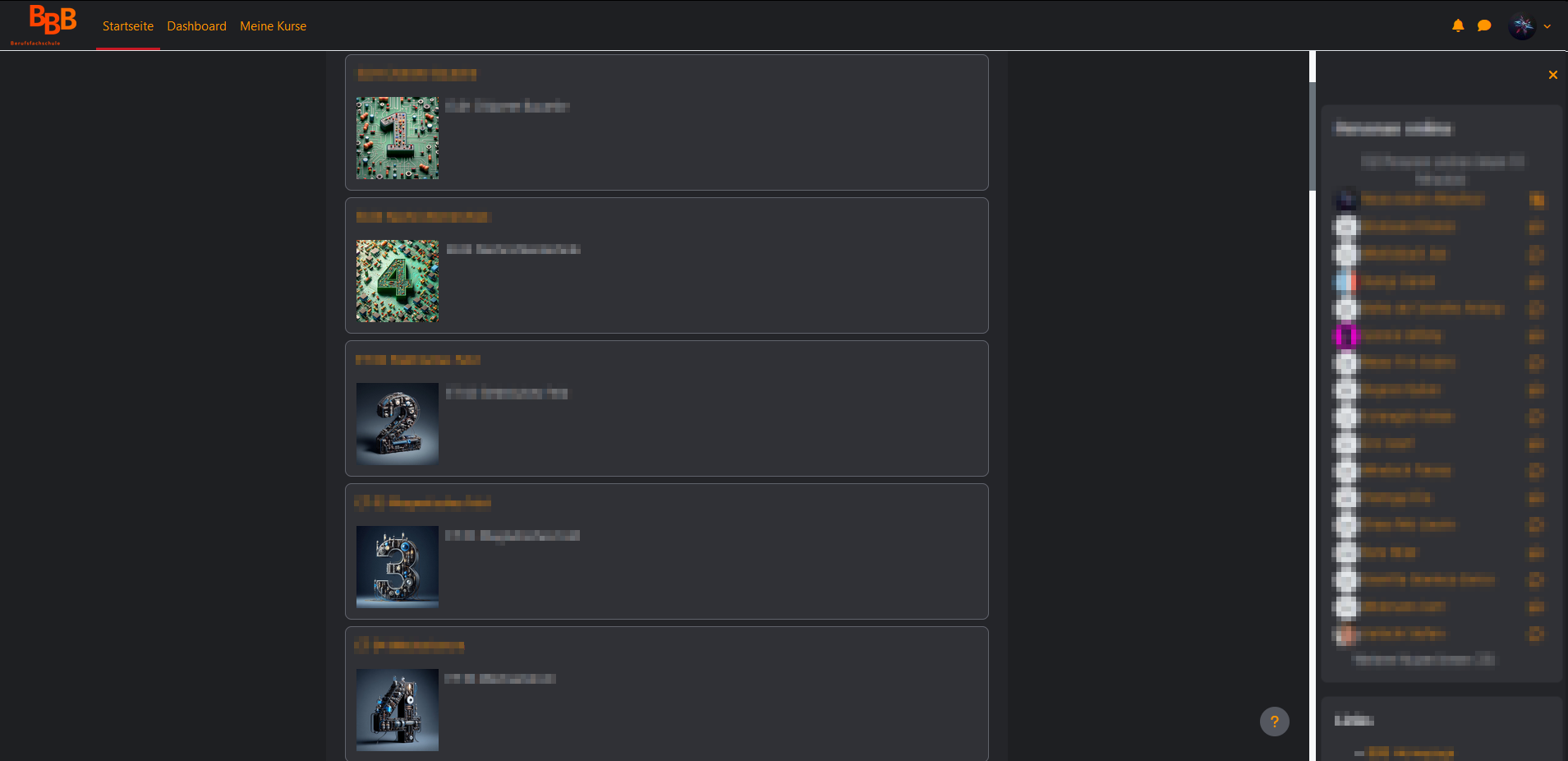
Join the Dark Side with the Moodle Bost Dark Theme
MoodleDarkBoost by Hutch79
Mirrored from https://github.com/Hutch79/MoodleDarkBoost/raw/main/MoodleDarkBoost.user.css
Details
AuthorHutch79
LicenseMIT
Categoryhttps://moodle.bbbaden.ch/
Created
Updated
Size12 kB
Statistics
Learn how we calculate statistics in the FAQ.
Failed to fetch stats.
Description
Notes
This theme may also work with the Classic and other Themes, but it's not guaranteed.
Source code
Source code has over 10K characters, so we truncated it. You can inspect the full source code on install link./* ==UserStyle==
@name MoodleDarkBoost
@namespace https://github.com/Hutch79/MoodleDarkBoost
@version 1.0.2
@description Join the Dark Side with the Moodle Bost Dark Theme
@author Hutch79
@license MIT
@preprocessor stylus
==/UserStyle== */
gray1 = #1e1f22
gray2 = #242529
gray3 = #303136
gray4 = #3c3e44
gray5 = #54575f
gray6 = #60636c
gray7 = #6c6f7a
gray8 = #787c87
gray9 = #858993
gray10 = #93969f
gray11 = #a0a3ab
gray12 = #aeb0b7
gray13 = #bbbdc3
gray14 = #c9cacf
gray15 = #d6d8db
gray16 = #e4e5e7
gray17 = #f1f2f3
invis = #fff0
link = #ff9500
link_hover = #ffe100
@-moz-document url-prefix("https://moodle.") {
/*
Global Stuff
*/
* {
color: gray15
}
body {
background-color: gray1 !important;
}
a {
color: link !important
}
a:hover,
a:focus {
color: link_hover !important background-color=invis !important
}
.aalink.focus,
a.focus.autolink,
.aalink:focus,
a.autolink:focus,
#page-footer a:not([class]).focus,
#page-footer a:not([class]):focus,
.arrow_link.focus,
.arrow_link:focus,
a:not([class]).focus,
a:not([class]):focus,
.activityinstance > a.focus,
.activityinstance > a:focus {
outline: .2rem solid transparent;
color: #1d2125;
background-color: invis;
box-shadow: 0 -.2rem invis, 0 .2rem #343a40;
}
#region-main {
background-color: gray2;
}
.btn-primary {
background-color: gray4;
border-color: gray4;
color: gray
}
.btn-primary:hover {
background-color: gray3;
border-color: gray6;
}
.btn {
color: gray15
}
.footer-popover .bg-secondary {
background-color: gray5 !important;
}
/*
Login Screen
*/
.login-container {
background-color: gray3;
}
.d-flex .btn-secondary,
.login-form .btn-primary {
color: gray17;
background-color: gray7;
border-color: gray7;
}
.d-flex .btn-secondary:hover,
.login-form .btn-primary:hover {
color: gray17;
background-color: gray5;
border-color: gray5;
}
.form-control {
color: gray15;
background-color: gray5;
border-color: gray5;
outline: 0;
box-shadow: 0 0 0 .2rem gray5;
}
.form-control:focus {
color: gray15;
background-color: gray7;
border-color: gray7;
outline: 0;
box-shadow: 0 0 0 .1rem gray15;
}
.login-logo {
background-image: url("https://raw.githubusercontent.com/Hutch79/Hutch79/main/images/BBBAden/Logo%20Darkmode.png");
/* Adjust as needed */
background-position: center;
/* Adjust as needed */
background-repeat: no-repeat;
/* You may add other styles for the container here */
display: inline-block !important;
width: 100%;
height: 200px;
}
.login-logo img {
display: none;
/* Hide the original img */
}
/*
Nav Bar
*/
.navbar {
background-color: gray1 !important;
}
.navbar.fixed-top {
border-bottom: border 1px solid;
}
.navbar-brand {
background-image: url("https://raw.githubusercontent.com/Hutch79/Hutch79/main/images/BBBAden/Logo%20Darkmode.png");
background-size: contain;
background-position: center;
background-repeat: no-repeat;
display: inline-block;
width: 80px;
height: 100%;
}
.navbar-brand img {
display: none;
}
.icon {
color: link !important
}
.icon:hover {
color: link_hover !important
}
.primary-navigation .navigation .nav-link:hover,
.primary-navigation .navigation .nav-link:focus {
background-color: gray2 !important;
}
.navbar.fixed-top .usermenu .dropdown-menu {
background-color: gray4
}
/*
Side Nav
*/
.drawer {
background-color: gray2;
}
.card {
background-color: gray3;
color: gray15;
}
/*
Main Nav
*/
#page.drawers .main-inner {
background-color: gray2;
color: gray15;
}
.coursebox {
background-color: gray3;
border-bottom-color: gray6 !important;
border-left-color: gray6 !important;
border-right-color: gray6 !important;
border-top-color: gray6 !important;
}
/* Course Page */
.courseindex .courseindex-item.pageitem {
background-color: gray4;
}
/* For Compatability with CompactMoodle */
.activityiconcontainer.assessment .activityicon:not(.nofilter), .activityiconcontainer.assessment .icon:not(.nofilter), .activityiconcontainer.collaboration .activityicon:not(.nofilter), .activityiconcontainer.collaboration .icon:not(.nofilter), .activityiconcontainer.communication .activityicon:not(.nofilter), .activityiconcontainer.communication .icon:not(.nofilter) {
filter: brightness(0) invert(1) !important;
}
.alert-success,
.environmenttable .ok {
color: white;
background-color: #357a32;
border-color: #c6dac6;
}
.badge-light {
background-color: gray8;
}
.moremenu .nav-tabs {
background-color: gray2;
}
.secondary-navigation .navigation {
background-color: gray2;
}
.description .course-description-item {
background-color: gray4;
}
.path-grade-report-user .user-report-container,
.grade-report-user .user-report-container {
margin: 20px 0 30px 0;
padding: 10px 10px;
background-color: gray2;
}
.path-grade-report-user .user-grade thead th,
.grade-report-user .user-grade thead th {
background-color: gray3;
color: gray15;
}
.path-grade-report-user .user-grade th.category,
.grade-report-user .user-grade th.category,
{
background-color: gray3;
border: 1px solid gray6;
color: gray15;
}
.path-grade-report-user .user-grade td.item,
.grade-report-user .user-grade {
background-color: gray3;
color: gray15;
border-top: 1px solid gray6;
border-bottom: 1px solid gray6;
}
.path-grade-report-user .user-grade th.column-itemname:not(.header,
.category,
.baggt,
.baggb) {
background-color: gray3;
border-bottom: 1px solid gray6;
border-top: 1px solid gray6;
}
.path-grade-report-user .user-grade .baggt,
.path-grade-report-user .user-grade .baggb,
.grade-report-user .user-grade .baggt,
.grade-report-user .user-grade .baggb {
background-color: gray3;
color: gray15;
}
.path-grade-report-user .user-grade td,
.grade-report-user .user-grade td {
background-color: gray3;
}
.path-mod-assign td.submissionnotgraded,
.path-mod-assign div.submissionnotgraded {
color: gray15;
}
.moremenu .nav-link:hover,
.moremenu .nav-link:focus,
.moremenu .nav-link.active:focus,
.moremenu .nav-link.active:hover {
border-color: transparent;
background-color: gray3;
}
.aabtn.focus,
.aabtn:focus,
.btn-link.focus,
.btn-link:focus,
.nav-link.focus,
.nav-link:focus,
.editor_atto_toolbar button.focus,
.editor_atto_toolbar button:focus,
.editor_atto_toolbar .atto_toolbar_row.focus,
.editor_atto_toolbar .atto_toolbar_row:focus,
[role="button"].focus,
[role="button"]:focus,
.list-group-item-action.focus,
.list-group-item-action:focus,
input[type="checkbox"].focus,
input[type="checkbox"]:focus,
input[type="radio"].focus,
input[type="radio"]:focus,
input[type="file"].focus,
input[type="file"]:focus,
input[type="image"].focus,
input[type="image"]:focus,
.sr-only-focusable.focus,
.sr-only-focusable:focus,
a.dropdown-toggle.focus,
a.dropdown-toggle:focus,
.modal-dialog[tabindex="0"].focus,
.modal-dialog[tabindex="0"]:focus,
.moodle-dialogue-base .closebutton.focus,
.moodle-dialogue-base .closebutton:focus,
button.close.focus,
button.close:focus,
.form-autocomplete-selection.focus,
.form-autocomplete-selection:focus,
[role="treeitem"]:not([aria-expanded="true"]).focus,
[role="treeitem"]:not([aria-expanded="true"]):focus {
outline: 0;
box-shadow: 0 0 0 .2rem invis;
}
.pb-3 .bg-light,
.pb-3 .bg-white {
background-color: gray4 !important;
}
.d-print-block .border {
border: 1px solid gray6 !important;
}
/*
Bewertung
*/
.path-grade-report-user .user-grade td.item,
.grade-report-user .user-grade td.item {
background-color: gray4;
border-top: 1px solid gray7;
border-bottom: 1px solid gray7;
}
.column-itemname.path-grade-report-user .user-grade th.column-itemname,
.grade-report-user .user-grade th.column-itemname:not(.header,
.category,
.baggt,
.baggb) {
background-color: gray4 !important;
font-weight: 400;
border-bottom: 1px solid gray6;
border-top: 1px solid gray6;
border: 1px solid gray6;
}
.path-grade-report-user .user-grade th.column-itemname:not(.header,
.category,
.baggt,
.baggb),
.grade-report-user .user-grade th.column-itemname {
border-bottom: 1px solid gray6 !important;
}
/*
Abgabe Seite
*/
.path-mod .ac...