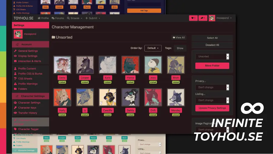
A customizable site skin extension for Toyhou.se.
Infinite Toyhou.se by mosspond
Imported from https://raw.githubusercontent.com/uso-archive/data/flomaster/data/usercss/191245.user.css
Details
Authormosspond
LicenseCC-BY-4.0
Categorytoyhou
Created
Updated
Code size56 kB
Code checksum51e041b3
Statistics
Learn how we calculate statistics in the FAQ.
Failed to fetch stats.
Description
Notes
Userstyle doesn't have notes.Source code
Source code has over 10K characters, so we truncated it. You can inspect the full source code on install link./* ==UserStyle==
@name Infinite Toyhou.se
@namespace USO Archive
@author Nadia Moss
@description A customizable site skin extension for Toyhou.se. Infinite Toyhouse lets you customize the <strong>NON PROFILE</strong> CSS of the site, overriding the default site skin selections. Both premium and non-premium Toyhouse users can use IT.
@version 20201027.18.21
@license CC-BY-4.0
@preprocessor uso
==/UserStyle== */
/* ==UserStyle==
@name Infinite Toyhou.se
@namespace github.com/openstyles/stylus
@version 1.0.0
@description A customizable Toyhou.se override
@author https://twitter.com/mosspond_
==/UserStyle== */
@-moz-document url("https://toyhou.se/"), url-prefix("https://toyhou.se/~forums"), url-prefix("https://toyhou.se/~inbox"), url-prefix("https://toyhou.se/~messages"), url-prefix("https://toyhou.se/~account"), url-prefix("https://toyhou.se/~characters"), url-prefix("https://toyhou.se/~images"), url-prefix("https://toyhou.se/~folders"), url-prefix("https://toyhou.se/~browse"), url-prefix("https://toyhou.se/~bulletins"), url-prefix("https://toyhou.se/~literatures"), url-prefix("https://toyhou.se/~worlds"), url-prefix("https://toyhou.se/~about"), url-prefix("https://toyhou.se/~faq"), url-prefix("https://toyhou.se/~rules"), url-prefix("https://toyhou.se/~tos"), url-prefix("https://toyhou.se/~tickets"), url-prefix("https://toyhou.se/~library"), url-prefix("https://toyhou.se/~literature"), url-prefix("https://toyhou.se/~world"){
/*---------------------VARIABLES----------------------*/
/*Change these and test before adjusting anything else.
To use a prebuilt skin, select ALL of the css and replace.*/
:root{
/*---Main colors----*/
--main-bg: #25181B;
--section-bg: #262424;
--bg-1:#302e2e;
--bg-2:#494241;
--bg-3:#715d54;
--bg-4:#a58771;
--main-text: #dcd1c2;
--secondary-text: #beb19f;
--inverse-text: #25181B;
--main-highlight: #e83058;
--secondary-highlight: #e8305880;
--light-highlight: #f3456b;
/*---Buttons and Alerts----*/
--danger-text:#f1c89f;
--danger-hover:#ff7456;
--danger:#f65432;
--danger-invalid: #b85a46;
--danger-bg:#763f3f;
--danger-trans:#f6543280;
--warning-text:#e6d7aa;
--warning-hover:#e8c875;
--warning:#e6b651;
--warning-invalid:#cb8939;
--warning-bg:#96411e;
--warning-trans:#e6b65180;
--success-text:#d8e2a1;
--success-hover:#c0d34a;
--success:#a6ca4b;
--success-invalid:#8ab835;
--success-bg:#538923;
--success-trans:#a6ca4b80;
/*---Info works best when similar to highlight----*/
--info-text:#ef4b63;
--info-hover: #de2452;
--info: #c0135b;
--info-invalid:#870747;
--info-bg:#670958;
--info-trans:#c0135b80;
--secondary:#beb19f;
--secondary-hover:#a58771;
/*---Fades and Tints----*/
/*Make fades based on main bg and tints based on main text*/
--fade-1:#25181b1a;
--fade-2:#25181b30;
--fade-3:#25181b4d;
--fade-4:#25181b80;
--fade-5:#25181bb3;
--tint-1:#dcd1c21a;
--tint-2:#dcd1c24d;
--tint-3:#dcd1c280;
--tint-4:#dcd1c2b3;
--tint-5:#dcd1c2e6;
}
/*------FULL CODE------*/
mark {
background-color:var(--main-bg);
color:var(--main-text)
}
fieldset {
border:1px solid var(--bg-3);
}
blockquote,
pre {
border:1px solid var(--bg-3);
}
.badge {
border:none
}
.table td,
.table th {
background-color: var(--main-bg) !important
}
.table-bordered td,
.table-bordered th {
border:1px solid var(--bg-2)!important
}
body {
color:var(--secondary-text);
background-color:var(--main-bg)
}
a {
color:var(--main-highlight);}
a:focus,
a:hover {
color:var(--light-highlight);
}
caption {
color:var(--bg-3);
}
hr {
border-top:1px solid var(--tint-1)
}
.mark,
mark {
background-color:var(--warning-bg)
}
.blockquote {
border-left:.25rem solid var(--bg-1)
}
.blockquote-footer {
color:var(--bg-3)
}
.blockquote-reverse {
border-right:.25rem solid var(--bg-1);
border-left:0
}
.img-thumbnail {
background-color: var(--bg-2);
border:1px solid var(--bg-2);
}
.figure-caption {
font-size:90%;
color:var(--bg-3)
}
code {
color:var(--danger);
background-color:var(--section-bg);
}
kbd {
color:var(--inverse-text);
background-color: var(--secondary-text);
}
pre {
color:var(--secondary-text);
}
/*------TABLES------*/
.table td,
.table th {
border-top:1px solid var(--bg-2)
}
.table thead th {
border-bottom:2px solid var(--bg-2)
}
.table tbody+tbody {
border-top:2px solid var(--bg-2)
}
.table .table {
background-color:var(--main-bg)
}
.table-bordered,
.table-bordered td,
.table-bordered th {
border:1px solid var(--bg-2)
}
.table-striped tbody tr:nth-of-type(odd) {
background-color:var(--tint-1)
}
.table-active,
.table-active>td,
.table-active>th,
.table-hover .table-active:hover,
.table-hover .table-active:hover>td,
.table-hover .table-active:hover>th,
.table-hover tbody tr:hover {
background-color:var(--tint-1)
}
.table-success,
.table-success>td,
.table-success>th {
background-color:var(--success-bg)
}
.table-hover .table-success:hover,
.table-hover .table-success:hover>td,
.table-hover .table-success:hover>th {
background-color:var(--success-invalid)
}
.table-info,
.table-info>td,
.table-info>th {
background-color:var(--info-invalid)
}
.table-hover .table-info:hover,
.table-hover .table-info:hover>td,
.table-hover .table-info:hover>th {
background-color:var(--info-invalid)
}
.table-warning,
.table-warning>td,
.table-warning>th {
background-color:var(--warning-bg)
}
.table-hover .table-warning:hover,
.table-hover .table-warning:hover>td,
.table-hover .table-warning:hover>th {
background-color:var(--warning-invalid)
}
.table-danger,
.table-danger>td,
.table-danger>th {
background-color:var(--danger-bg)
}
.table-hover .table-danger:hover,
.table-hover .table-danger:hover>td,
.table-hover .table-danger:hover>th {
background-color:var(--danger-invalid)
}
.thead-inverse th {
color:var(--inverse-text);
background-color:var(--secondary-text);
}
.thead-default th {
color:var(--bg-4);
background-color:var(--bg-1)
}
.table-inverse {
color:var(--inverse-text);
background-color:var(--secondary-text);
}
.table-inverse td,
.table-inverse th,
.table-inverse thead th {
border-color:var(--inverse-text)
}
.form-control {
color:var(--bg-3);
background-color:var(--main-bg);
border:1px solid var(--tint-1);
}
.form-control:focus {
color:var(--bg-3);
background-color:var(--main-bg);
border-color:var(--info);
outline:0;
box-shadow:0 0 0 .2rem var(--secondary-highlight)
}
.form-control::-moz-placeholder {
color:var(--bg-3);
opacity:1
}
.form-control:-ms-input-placeholder {
color:var(--bg-3);
opacity:1
}
.form-control::-ms-input-placeholder {
color:var(--bg-3);
opacity:1
}
.form-control::placeholder {
color:var(--bg-3);
opacity:1
}
.form-control:disabled,
.form-control[readonly] {
background-color:var(--bg-1);
opacity:1
}
select.form-control:focus::-ms-value {
color:var(--bg-3);
background-color:var(--main-bg)
}
.form-control-plaintext {
color:var(--secondary-text);
}
.form-check-input:disabled~.form-check-label {
color:var(--bg-3)
}
/*------Positive feedback------*/
.valid-feedback {
color:var(--success);
}
.valid-tooltip {
color:var(--inverse-text);
background-color:var(--success-trans);
border-radius:.25rem
}
.form-control.is-valid,
.was-validated .form-control:valid {
border-color:var(--success);
}
.form-control.is-valid:focus,
.was-validated .form-control:valid:focus {
border-color:var(--success);
box-shadow:0 0 0 .2rem var(--success-trans)
}
.custom-select.is-valid,
.was-validated .custom-select:valid {
border-color:var(--success);
}
.custom-select.is-valid:focus,
.was-validated .custom-select:valid:focus {
border-color:var(--success);
}
.form-check-input.is-valid~.form-check-label,
.was-validated .form-check-input:valid~.form-check-label {
color:var(--success)
}
.custom-control-input.is-valid~.custom-control-label,
.was-validated .custom-control-input:valid~.custom-control-label {
color:var(--success)
}
.custom-control-input.is-valid~.custom-control-label:before,
.was-validated .custom-control-input:valid~.custom-control-label:before {
border-color:var(--success)
}
.custom-control-input.is-valid:checked~.custom-control-label:before,
.was-validated .custom-control-input:valid:checked~.custom-control-label:before {
border-color:var(--success-invalid);
background-color:var(--success-invalid)
}
.custom-control-input.is-valid:focus:not(:checked)~.custom-control-label:before,
.custom-file-input.is-valid~.custom-file-label,
.was-validated .custom-control-input:valid:focus:not(:checked)~.custom-control-label:before,
.was-validated .custom-file-input:valid~.custom-file-label {
border-color:var(--success)
}
.custom-file-input.is-valid:focus~.custom-file-label,
.was-validated .custom-file-input:valid:focus~.custom-file-label {
border-color:var(--success);
box-shadow:0 0 0 .2rem var(--success-trans)
}
/*-------Negative Feedback------*/
.invalid-feedback {
color:var(--danger)
}
.invalid-tooltip {
color:var(--inverse-text);
background-color:var(--danger);
}
.form-control.is-invalid,
.was-validated .form-control:invalid {
border-color:var(--danger);
}
.form-control.is-invalid:focus,
.was-validated .form-control:invalid:focus {
border-color:var(--danger);
box-shadow:0 0 0 .2rem var(--danger-trans)
}
.custom-select.is-invalid,
.was-validated .custom-select:invalid {
border-color:var(--danger);
}
.custom-select.is-invalid:focus,
.was-validated .custom...