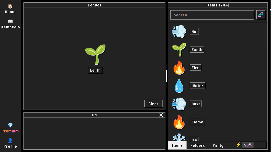
a simple dark theme for allchemy with support for custom colors
allchemy.io dark theme by o_o
Details
Authoro_o
LicenseMIT
Categoryallchemy.io
Created
Updated
Code size7.8 kB
Code checksumad806ae8
Statistics
Learn how we calculate statistics in the FAQ.
Failed to fetch stats.
Description
Notes
forking
feel free to. just make sure to change the namespace so your fork doesn't conflict with this one :)
known issues
- some icons (most notably x and plus) aren't styled
- shadow for trees use the border color instead of the shadow color
- premium features are untested as i don't have it
changelog
- 1.0.8:
- removed a stray border on the nav
- 1.0.7:
- fixed the text color not being applied to premium-styled elements
- 1.0.6:
- removed "show background when in party mode" cuz its detection is buggy
- fixed changing folder color
- added ability to change the premium styling
- fixed black border for "What's Energy?" button
- fixed separator line between canvas and items
- fixed styling for the air plan select button
- fixed styling for hovering over your user icon
- 1.0.5:
- scrollbar support
- show background when in party mode (optional)
- 1.0.3:
- more colors
- you can change the style of the item discover screen rays
- ads no longer have a yellow background on mobile
- energy bar fix
- item tree fixes
- 1.0.2: you can now change the colors
- 1.0.1: checkboxes now actually show as checked
Source code
/* ==UserStyle==
@name           allchemy.io dark theme
@namespace      dabric.xyz/post/allchemy-dark-theme
@version        1.0.8
@description    a simple dark theme for allchemy with support for custom colors
@author         dabric
@license        MIT
@preprocessor   stylus
@var color background "Background" #222
@var color text "Text" #eee
@var color button-icon "Titlebar buttons" #eee
@var color border "Borders" #999
@var color shadow "Shadows" black
@var color folder "Folder" hsl(45, 59%, 26%)
@var color backdrop "Backdrop" black
@var color error "Error" #ef4444
@var color loading-bar "Loading bar" #eab308
@var color first "\"FIRST\" text" #eab308
@var color energy-bar "Energy bar fill" #444
@var color scrollbar "Scrollbar" #eee
@var select rays-style "Rays style" ["default:Allchemy*", "grayscale:Grayscale", "hidden:Hidden"]
@var select canvas-background-style "Canvas Background Style" ["show:Show", "hide:Hide*"]
@var select premium "Premium Style" ["default:Allchemy", "grayscale:Theme colors*", "force:Force match"]
@var color premium-from "Premium 1" #ffb200
@var color premium-to "Premium 2" #c447ff
==/UserStyle== */

@-moz-document domain("allchemy.io") {
  $background = background;
  $text = text;
  $border = border;
  $shadow = shadow;

  // in a css variable to work around folder weirdness
  :root {
    --dabric-folder: folder;
  }

  body {
    background: $background;
    color: $text;
  }

  * {
    scrollbar-color: scrollbar $background !important;
  }

  .border-black {
    border-color: $border;
  }

  .bg-yellow-400 {
    background: backdrop;
  }

 if canvas-background-style == "party" {
  // weird selector looking for the body without the party tab selected
  body:not(:has(.wrapper > div:last-child > div:not(.window) > .tab:nth-child(3).active)) {
    .canvas {
      background-image: none !important;
    }
  }
} else if canvas-background-style == "hide" {
  .canvas {
      background-image: none !important;
    }
}

  .bg-white {
    background: $background;
  }

   .shadow-solid-1 {
    box-shadow: 1px 1px $shadow;
  }
  .shadow-solid-2, .shadow-solid-1.grabbed {
    box-shadow: 2px 2px $shadow !important;
  }
  .shadow-solid-3 {
    box-shadow: 3px 3px $shadow;
  }

  input, button {
    background-color: $background !important;
    color: $text !important;
    border-color: $border !important;
    box-shadow: 2px 2px $shadow !important;

    &.border-0 {
      box-shadow: none !important;
      background-color: transparent !important;
    }

    &::placeholder {
      color: $text;
    }

    &:checked {
      box-shadow: 1px 1px $shadow,inset 0 0 0 2px background !important;
      background: $text !important;
    }
  }

  .tooltip {
    background-color: $background !important;
    box-shadow: 3px 3px $shadow !important;
    color: $text !important;
    border-color: $border !important;
  }

  nav {
    background-color: $background !important;
    border: none !important;
  }

  .title-bar {
    background: $background !important;
    color: $text !important;
    box-shadow: none !important;
    border-color: $border !important;

    .title {
        background: none !important;
    color: $text !important;
    box-shadow: none !important;
    border: none !important;
    }
  }

  .tab {
    background: $background;

    &.active {
      background: $text;
      color: $background;
    }
  }

  .text-red-700 {
    color: error;
  }


  // icons
  .back, .close {
    box-shadow: none  !important;
    background-color: transparent !important;
    border: none;

    // TERRIBLE hack to color the icons
    filter: drop-shadow(0px 100px 0px $text);
    transform: translateY(-100px);
  }
  .click-target {
    // also part of that hack
    overflow: hidden;
  }

  a.router-link-exact-active::after {
    border-color: transparent transparent $text !important;

    @media (min-width: 640px) {
      border-bottom-color: transparent !important;
      border-left-color: $text !important;
    }
  }

  // large energy bar
  .window .flex.border-black .bg-yellow-400:has(.ml-2) {
      background: energy-bar !important;
  }
  // tiny energy bar
  .energy .bar {
    background: $background !important;
    border-color: $border !important;
    box-shadow: 1px 1px $shadow !important;
    .bg-yellow-400 {
      background: energy-bar !important;
      color: text;
    }
  }

  // "You're the FIRST to make this item!"
  .first {
    color: first !important;
  }

  // folder
  @css {
    [style="background: rgb(255, 219, 109);"] {
      background-color: var(--dabric-folder) !important;
    }
  }
  // folder selection window
  div:has(img[alt=📁]) button.flex.items-center.justify-center.w-5.h-5 {
    background-color: folder !important

    & > div {
      background: $text;
    }
  }

  .menu {
    background: $background !important;
    border-color: $border !important;
    box-shadow: 2px 2px $shadow !important;

  }

  #grid a {
    background: $background !important;
    border-color: $border !important;
    box-shadow: 2px 2px $shadow !important;
  }

  // top page loading bar
  #__nuxt > .select-none > div:not(:has(.vm-placement)) {
    background-color: loading-bar;
    box-shadow: 1px 1px $shadow;
  }

  .toast {
    background: $background !important;
    border-color: $border !important;
    box-shadow: 3px 3px $shadow !important;
  }

  // trees and item combination lines
  .line, .line-input::before, .line-input, .line-result {
    border-color: $border !important;
    background-color: $background !important;
  }
  .line-input, .line-result {
     box-shadow: 1px 1px $border !important;
  }

  // discover item background
  .rays {
    if rays-style == grayscale {
      filter: grayscale(1) !important;
    }

    if rays-style == hidden {
      visibility: hidden;
    }
  }

  .gutter > .bg-black {
    background: text;
  }

  // premium stuff
  if premium == grayscale {
    .bg-premium, .premium, .fire {
      filter: grayscale(0) !important;
      --tw-gradient-from: premium-from !important;
      --tw-gradient-stops: var(--tw-gradient-from) var(--tw-gradient-via-position),var(--tw-gradient-to) !important;
      --tw-gradient-to: premium-to !important;
    }
  }

  .fire {
    text-shadow: 0px 2px shadow !important;
  }

  .bg-premium {
    text-shadow: 1px 1px shadow !important;
  }

  // the background for the air button is optimized for black text
  .air {
    color: black !important;
  }


   if premium == force {
      .bg-premium, .premium, .fire, .air {
        // we don't just unset it, because allchemy
        // seems to depend on the stacking context the
        // filter makes
        filter: grayscale(0) !important;
        background: background !important;
        text-shadow: unset !important;
        color: text !important;
      }
    }


  .premium > .text {
    if premium == force {
      background-clip: unset !important;
      filter: unset !important;
      background: unset !important;
      color: $text !important;
    } else if premium == grayscale {
      --tw-gradient-from: premium-from !important;
      --tw-gradient-to: premium-to !important;
    }
  }

  if premium == force or premium == grayscale {
    :is(.bg-premium, .fire) .text {
      color: $text !important;
    }
  }

  .hover_outline-black:hover {
    outline-color: text !important;
  }

}