i have no idea what im doing
Zodiac's terrible Moviewebapp by zodiacbadcoderacc2415346346
Details
Authorzodiacbadcoderacc2415346346
LicenseNo License
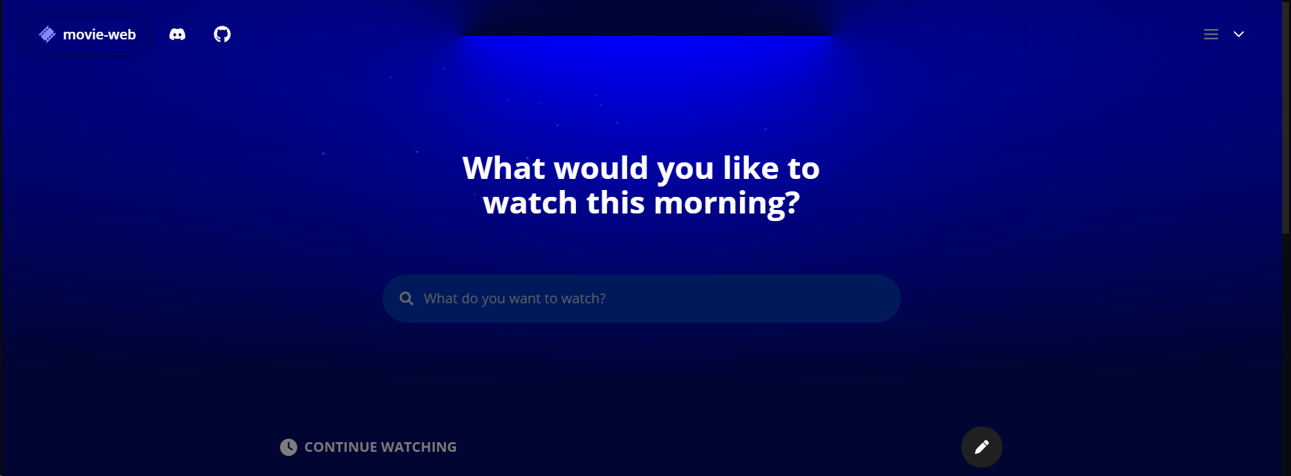
Categorymovie-web.app
Created
Updated
Code size14 kB
Code checksum698e0c9a
Statistics
Learn how we calculate statistics in the FAQ.
Failed to fetch stats.
Description
Notes
check the notes at the top
Source code
Source code has over 10K characters, so we truncated it. You can inspect the full source code on install link./* ==UserStyle==
@name Zodiac's terrible Moviewebapp
@version 20240215.02.42
@namespace https://userstyles.world/user/zodiacbadcoderacc2415346346
@description i have no idea what im doing
@author zodiacbadcoderacc2415346346
@license No License
==/UserStyle== */
@-moz-document url-prefix("movie-web.app") {
/*READ THIS!!!!*/
/*hey if you read the thing above heres some instructions if you want to change the colors*/
/*"significant" color changes have these notes written after them, and they describe what they do, you are probably looking for those, if you arent, ask me on the discord or just look for it yourself*/
/*i think it works on mozilla although idk if this breaks dont expect me to update bcz ill probably forget
!!by the way you have to set the theme in the website settings to gray so it works!!
/*if you want you can use this without credit i dont want credit*/
}
@-moz-document domain("movie-web.app") {
*,
:before,
:after {
--tw-border-spacing-x: 0;
--tw-border-spacing-y: 0;
--tw-translate-x: 0;
--tw-translate-y: 0;
--tw-rotate: 0;
--tw-skew-x: 0;
--tw-skew-y: 0;
--tw-scale-x: 1;
--tw-scale-y: 1;
--tw-pan-x: ;
--tw-pan-y: ;
--tw-pinch-zoom: ;
--tw-scroll-snap-strictness: proximity;
--tw-gradient-from-position: ;
--tw-gradient-via-position: ;
--tw-gradient-to-position: ;
--tw-ordinal: ;
--tw-slashed-zero: ;
--tw-numeric-figure: ;
--tw-numeric-spacing: ;
--tw-numeric-fraction: ;
--tw-ring-inset: ;
--tw-ring-offset-width: 0px;
--tw-ring-offset-color: #00f;
--tw-ring-color: rgb(59 130 246 / .5);
--tw-ring-offset-shadow: 0 0 #0000;
--tw-ring-shadow: 0 0 #0000;
--tw-shadow: 0 0 #0000;
--tw-shadow-colored: 0 0 #0000;
--tw-blur: ;
--tw-brightness: ;
--tw-contrast: ;
--tw-grayscale: ;
--tw-hue-rotate: ;
--tw-invert: ;
--tw-saturate: ;
--tw-sepia: ;
--tw-drop-shadow: ;
--tw-backdrop-blur: ;
--tw-backdrop-brightness: ;
--tw-backdrop-contrast: ;
--tw-backdrop-grayscale: ;
--tw-backdrop-hue-rotate: ;
--tw-backdrop-invert: ;
--tw-backdrop-opacity: ;
--tw-backdrop-saturate: ;
--tw-backdrop-sepia: ;
}
.theme-gray {
--colors-themePreview-primary: 0 0 134;
--colors-themePreview-secondary: 0 0 34;
--colors-pill-background: 64, 64, 64;
--colors-pill-backgroundHover: 79 79 79;
--colors-pill-highlight: 134 134 134;
--colors-pill-activeBackground: 64 64 64;
--colors-global-accentA: 134 134 134;
--colors-global-accentB: 100 100 100;
--colors-lightBar-light: 0 0 255;
/*This is the color for the lightbar and its effects at the top of the main site*/
--colors-buttons-toggle: 69 76 212;
--colors-buttons-toggleDisabled: 44 44 44;
--colors-buttons-secondary: 30 30 30;
--colors-buttons-secondaryHover: 30 30 30;
--colors-buttons-purple: 41 45 134;
--colors-buttons-purpleHover: 51 58 190;
--colors-buttons-cancel: 44 44 44;
--colors-buttons-cancelHover: 60 60 60;
--colors-background-main: 0 5 50;
/*this is the main background, this really only applies to the main menu start thing*/
--colors-background-secondary: 32 32 32;
/*this is a secondary dark background color*/
--colors-background-secondaryHover: 52 52 52;
--colors-background-accentA: 41 45 134;
--colors-background-accentB: 56 56 56;
--colors-modal-background: 21 21 21;
--colors-type-logo: 130 136 254;
--colors-type-text: 124 124 124;
--colors-type-dimmed: 124 124 124;
--colors-type-divider: 44 44 44;
--colors-type-secondary: 107 107 107;
--colors-type-link: 130 136 254;
--colors-type-linkHover: 170 175 255;
--colors-search-background: 0 25 90;
/*this is the dark background color*/
--colors-search-hoverBackground: 32 32 32;
/*this is a secondary dark background color*/
--colors-search-focused: 52 52 52;
--colors-search-placeholder: 102 102 102;
--colors-search-icon: 102 102 102;
--colors-mediaCard-hoverBackground: 32 32 32;
/*this is a secondary dark background color*/
--colors-mediaCard-hoverAccent: 124 124 124;
--colors-mediaCard-hoverShadow: 14 14 14;
--colors-mediaCard-shadow: 26 26 26;
--colors-mediaCard-barColor: 84 84 84;
--colors-mediaCard-barFillColor: 130 136 254;
--colors-mediaCard-badge: 26 26 26;
--colors-mediaCard-badgeText: 107 107 107;
--colors-largeCard-background: 32 32 32;
/*this is a secondary dark background color*/
--colors-largeCard-icon: 51 58 190;
--colors-dropdown-background: 32 32 32;
/*this is a secondary dark background color*/
--colors-dropdown-altBackground: 26 26 26;
--colors-dropdown-hoverBackground: 0 25 90;
/*this is the dark background color*/
--colors-dropdown-text: 124 124 124;
--colors-dropdown-secondary: 102 102 102;
--colors-dropdown-border: 52 52 52;
--colors-dropdown-contentBackground: 0 25 90;
/*this is the dark background color*/
--colors-authentication-border: 64 64 64;
--colors-authentication-inputBg: 32 32 32;
/*this is a secondary dark background color*/
--colors-authentication-inputBgHover: 0 25 90;
/*this is the dark background color*/
--colors-authentication-wordBackground: 0 25 90;
/*this is the dark background color*/
--colors-authentication-copyText: 102 102 102;
--colors-authentication-copyTextHover: 141 141 141;
--colors-settings-sidebar-activeLink: 32 32 32;
/*this is a secondary dark background color*/
--colors-settings-sidebar-badge: 14 14 14;
--colors-settings-sidebar-type-secondary: 79 79 79;
--colors-settings-sidebar-type-inactive: 124 124 124;
--colors-settings-sidebar-type-icon: 124 124 124;
--colors-settings-sidebar-type-iconActivated: 90 98 235;
--colors-settings-sidebar-type-activated: 170 175 255;
--colors-settings-card-border: 52 52 52;
--colors-settings-card-background: 52 52 52;
--colors-settings-card-altBackground: 52 52 52;
--colors-settings-saveBar-background: 21 21 21;
--colors-utils-divider: 60 60 60;
--colors-errors-card: 21 21 21;
--colors-errors-border: 44 44 44;
--colors-errors-type-secondary: 107 107 107;
--colors-about-circle: 44 44 44;
--colors-about-circleText: 141 141 141;
--colors-editBadge-bg: 44 44 44;
--colors-editBadge-bgHover: 49 49 49;
--colors-editBadge-text: 141 141 141;
--colors-progress-background: 141 141 141;
--colors-progress-preloaded: 141 141 141;
--colors-progress-filled: 90 98 235;
--colors-video-buttonBackground: 84 84 84;
--colors-video-autoPlay-background: 30 30 30;
--colors-video-autoPlay-hover: 44 44 44;
--colors-video-scraping-card: 26 26 26;
--colors-video-scraping-loading: 90 98 235;
--colors-video-scraping-noresult: 107 107 107;
--colors-video-audio-set: 90 98 235;
--colors-video-context-background: 17 17 17;
--colors-video-context-light: 124 124 124;
--colors-video-context-border: 37 37 37;
--colors-video-context-hoverColor: 37 37 37;
--colors-video-context-buttonFocus: 44 44 44;
--colors-video-context-flagBg: 44 44 44;
--colors-video-context-inputBg: 37 37 37;
--colors-video-context-buttonOverInputHover: 44 44 44;
--colors-video-context-inputPlaceholder: 84 84 84;
--colors-video-context-cardBorder: 30 30 30;
--colors-video-context-slider: 141 141 141;
--colors-video-context-sliderFilled: 90 98 235;
--colors-video-context-buttons-list: 30 30 30;
--colors-video-context-buttons-active: 17 17 17;
--colors-video-context-closeHover: 24 24 24;
--colors-video-context-type-secondary: 84 84 84;
--colors-video-context-type-accent: 90 98 235;
}
}
.theme-gray {
--colors-themePreview-primary: 134 134 134;
--colors-themePreview-secondary: 124 124 124;
--colors-pill-background: 64, 64, 64;
--colors-pill-backgroundHover: 79 79 79;
--colors-pill-highlight: 134 134 134;
--colors-pill-activeBackground: 64 64 64;
--colors-global-accentA: 134 134 134;
--colors-global-accentB: 100 100 100;
--colors-lightBar-light: 0 0 255; /*secondary lightbar you have to set this to the same one in the first theme-gray*/
--colors-buttons-toggle: 69 76 212;
--colors-buttons-toggleDisabled: 44 44 44;
--colors-buttons-secondary: 30 30 30;
--colors-buttons-secondaryHover: 30 30 30;
--colors-buttons-purple: 41 45 134;
--colors-buttons-purpleHover: 51 58 190;
--colors-buttons-cancel: 44 44 44;
--colors-buttons-cancelHover: 60 60 60;
--colors-background-main: 0 5 50;
--colors-background-secondary: 32 32 32;
/*this is a secondary dark background color*/
--colors-background-secondaryHover: 52 52 52;
--colors-background-accentA: 41 45 134;
--colors-background-accentB: 56 56 56;
--colors-modal-background: 21 21 21;
--colors-type-logo: 130 136 254;
--colors-type-text: 124 124 124;
--colors-type-dimmed: 124 124 124;
--colors-type-divider: 44 44 44;
--colors-type-secondary: 107 107 107;
--colors-type-link: 130 136 254;
--colors-type-linkHover: 170 175 255;
--colors-search-background: 0 25 90;
/*this is the dark background color*/
--colors-search-hoverBackground: 32 32 32;
/*this is a secondary dark background color*/
--colors-search-focused: 52 52 52;
--colors-search-placeholder: 102 102 102;
--colors-search-icon: 102 102 102;
--colors-mediaCard-hoverBackground: 32 32 32;
/*this is a secondary dark background color*/
--colors-mediaCard-hoverAccent: 124 124 124;
--colors-mediaCard-hoverShadow: 14 14 14;
--colors-mediaCard-shadow: 26 26 26;
--colors-mediaCard-barColor: 84 84 84;
--colors-mediaCard-barFillColor: 130 136 254;
--colors-mediaCard-badge: 26 26 26;
--colors-mediaCard-badgeText: 107 107 107;
--colors-largeCard-back...