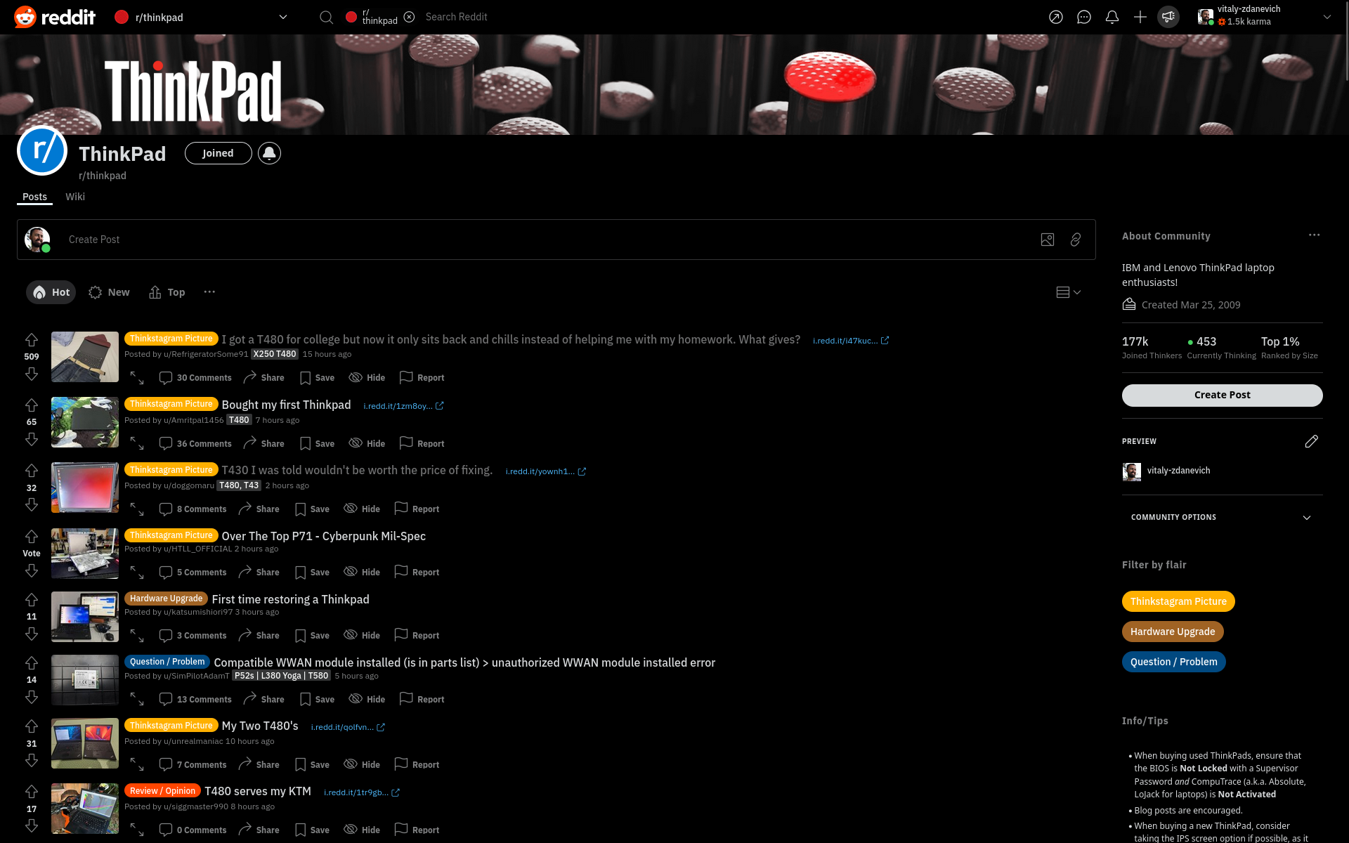
Black theme for Reddit, also remove ad of premium and bottom-right block with languages and other Reddit company links.
Reddit black by vitaly-zdanevich
Mirrored from https://gitlab.com/vitaly-zdanevich-styles/reddit/-/raw/master/reddit-css-black.user.css
Details
Authorvitaly-zdanevich
LicenseApache License 2.0
Categoryreddit.com
Created
Updated
Code size1.7 kB
Code checksum6673895b
Statistics
Learn how we calculate statistics in the FAQ.
Failed to fetch stats.
Description
Notes
Userstyle doesn't have notes.Source code
/* ==UserStyle==
@name           www.reddit.com - November 2024
@namespace      github.com/openstyles/stylus
@version        2.2.0
@description    Black
@author         Vitaly Zdanevich
==/UserStyle== */

@-moz-document url-prefix("https://www.reddit.com") {

	:root * {
		--shreddit-content-background: #000;
		--color-neutral-background: #000 !important;
		--page-y-padding: 0;
	}

	shreddit-app {
		background: #000;
	}

	reddit-header-large {
		opacity: 0;
	}
	reddit-header-large:hover {
		opacity: 1;
	}

	#advertise-button,
	[noun='try_reddit_pro'], /* When click to user image on top-right */
	[noun='advertise'],
	award-button,
	[noun='karma_help'] /* Avatar hover: link "What is karma?" */
	{
		display: none !important;
	}

	/* Fork from https://userstyles.world/style/14881/new-reddit-full-width
	 * because broken on https://www.reddit.com/r/FirefoxCSS/wiki/index/tutorials/#wiki_setup
	 * */

	.m\:grid-cols-\[repeat\(10\2c_1fr\)_repeat\(4\2cminmax\(61px\2c_1fr\)\)\] {
		grid-template-columns: none;
	}

	.xl\:max-w-\[1524px\],
	.xl\:max-w-container-xl {
		max-width: 100% !important;
	}

	#left-sidebar-container,
	#right-sidebar-container,
	.legal-links /* "Reddit Rules", "Privacy Policy", "User Agreement", "All rights reserved" */
	{
		display: none !important;
		width: 0px;
		visibility: hidden;
		overflow: hidden;
	}

	@media (min-width: 1200px) {
		.grid-container,
		.theme-rpl .grid .grid-cols-1 {
			grid-template-columns: 0px 1fr;
		}
	}

	.grid-container {
		grid-template-columns: auto !important;
	}

	.subgrid-container,
	[class = "m:col-start-2"] .box-border .flex .flex-col .order-2 {
		width: 100vw;
		max-width: 100vw !important;
	}

	main {
		width: 98vw !important;
	}

}