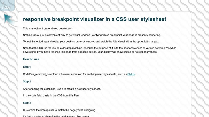
For web developers. You can see which CSS breakpoint is currently active in your responsive design. A tool for getting visual feedback in front-end web design.
CSS Breakpoint Visualizer by Mentalist
Details
AuthorMentalist
LicenseCC-0
CategoryAny site
Created
Updated
Code size2.0 kB
Code checksumcbc03d12
Statistics
Learn how we calculate statistics in the FAQ.
Failed to fetch stats.
Description
Notes
A live demo of this is available on CodePen: https://codepen.io/blendamental/pen/MWzdPjK
This is for use with any site you wish.
How to use:
Method 1: Use the “Install” button and specify URLs to apply it to (default is ALL, which I don't recommend). If you want to customize your breakpoints or other aspects and don't want future updates I may release to overwrite your changes, place your custom CSS in a separate userstyle.
or...
Method 2: From within the Stylus browser add-on, create a new userstyle for the site you're developing, then paste in the CSS. Future updates, if I release any, will not be reflected for you.
Customizing the CSS for your design:
You may want to customize the width values for your breakpoints.
(Default values match those of Bootstrap 5.)
You can enable/disable this userstyle with Stylus as needed while designing.
Source code
/*
CSS Breakpoint Visualizer
https://codepen.io/blendamental/pen/MWzdPjK
https://userstyles.world/style/14899/css-breakpoint-visualizer

How to use:
Set the max-width values for your breakpoints.
(Default values match those of Bootstrap 5.)
Enable this user CSS with Stylus when desired.
*/

/*
below are some details that userstyles.world is picky about including.
More info: https://github.com/openstyles/stylus/wiki/Writing-UserCSS#version
*/
/* ==UserStyle==
@name           Breakpoint Visualizer
@namespace      XML-namespace-URL
@version        1.0.1
==/UserStyle== */
@-moz-document regexp(".*") {
    /* mandatory nothingness */
}

@import url('https://fonts.googleapis.com/css2?family=Roboto&display=swap');
body::after {
	display: block;
	position: fixed;
	z-index: 3000;
	left: -1px;
	top: -1px;
	border-bottom-right-radius: 12px;
	box-shadow: 1px 1px 1px 0px rgba(0,0,0,0.2);
	background-color: rgba(0, 0, 0, 0.0);
  padding-top: 4px;
	padding-left: 10px;
	padding-right: 10px;
	font-family: 'Roboto', sans-serif;
	white-space: pre;
	line-height: 1.2;
	text-align: left;
	letter-spacing: 0.5px;
	text-shadow: 1px 1px rgba(0, 0, 0, 0.33);
	color: white;
	font-size: 24px;
	content: "<sm";
	min-width: 64px;
	height: 36px;
}

@media (min-width: 576px) /*sm*/ {
	body::after {
		content: "sm \A 576";
		background-color: rgba(204, 0, 0, 0.2);
		min-width: 56px;
		height: 64px;
	}
}

@media (min-width: 768px) /*md*/ {
	body::after {
		content: "md \A 768";
		background-color: rgba(220, 102, 0, 0.2);
    min-width: 56px;
	}
}

@media (min-width: 992px) /*lg*/ {
	body::after {
		content: "lg \A 992";
		background-color: rgba(0, 177, 61, 0.2);
	}
}

@media (min-width: 1200px) /*xl*/ {
	body::after {
		content: "xl \A 1200";
		background-color: rgba(0, 107, 149, 0.2);
		min-width: 70px;
}

@media (min-width: 1400px) /*xxl*/ {
	body::after {
		content: "xxl \A 1400";
		background-color: rgba(53, 0, 199, 0.2);
		min-width: 70px;
}