Various tweaks to Neocities. All toggleable and disabled by default
Neocities Goodie Bag by o_o
Details
Authoro_o
LicenseMIT
Categoryneocities
Created
Updated
Code size11 kB
Code checksumd89ab6b7
Statistics
Learn how we calculate statistics in the FAQ.
Failed to fetch stats.
Description
Notes
Features
Click the gear icon next to the userstyle to customize!
General
- Speed up animations - stuff such as modals and tooltips open faster
- Fix various horizontal overflow - prevents various elements (most notably your feed on a short window) from overflowing and looking weird
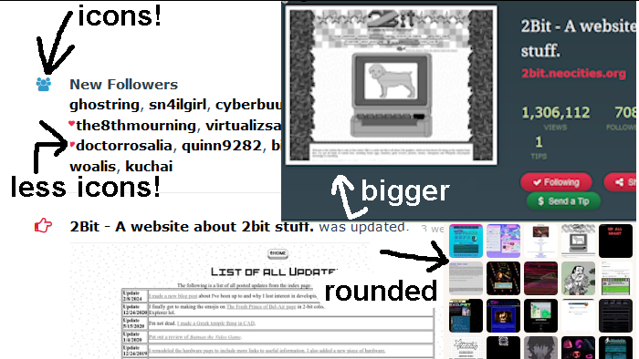
- Popularity metrics - Lets you hide or restrict the visibility of things like the following count and the like button.
- Show off-site social media - Lets you disable the share button and Neocities' social links.
Feed
- User icon - Hides elements of the user icon to the left of the username to shorten things up or to just hide the supporter heart.
- Avatar frame - lets you round out the avatar if you want.
- Replace avatar color indicators with icons - Shows some nice Font Awesome icons instead of a colored border on the avatar (which sometimes doesn't show the avatar at all)
- Move delete button to right side - Moves the delete button so you don't accidentally click it.
- Highlight post when hovering delete - Highlights the corresponding post in red when hovering the delete button.
Profile
- Maximize site preview - Uncrops the site preview and shortens the border to let you see the entire screenshot.
- Add a scrollbar to lengthy follower lists - Adds a scrollbar to lengthy "New Followers" and the following lists on the sidebar so the page isn't wildly long.
Navigation
- Always show subsites - Immediately have the switch sites dropdown menu open when you open the user dropdown for faster switching.
- Always show user dropdown on mobile - Immediately have the user dropdown menu open when you open the navigation on mobile.
Changelog
- 1.5.1
- Capitalization fix
- 1.5.0
- Added mobile navigation animation when using General: Speed up animations
- Added Navigation: always show user dropdown on mobile
- 1.4.0
- Added Feed: Move delete button to right side
- Added Feed: Highlight post when hovering delete
- 1.3.0
- Removed Feed: Fix avatar positioning as this was merged into Neocities
- 1.2.2
- General: Popularity metrics now supports my Neocities hover preview userscript
- 1.2.1
- General: Speed up animations now supports the mobile navigation menu
- Feed: Replace avatar color indicators with icons now properly supports mobile
- Profile: Maximize site preview no longer has a weird space under the site preview on mobile
- 1.2.0
- Added Profile: Add a scrollbar to lengthy follower lists
- 1.1.1
- Readded Feed: Avatar frame, which was removed by mistake
- 1.1.0
- Added General: Popularity metrics
- Added General: Show off-site social media
- Added Navigation: always show subsites
Source code
Source code has over 10K characters, so we truncated it. You can inspect the full source code on install link./* ==UserStyle==
@name Neocities Goodie Bag
@namespace dabric.xyz/post/neocities-goodie-bag
@version 1.5.1
@description Various tweaks to Neocities
@author dabric
@preprocessor stylus
@var checkbox faster-animations "General: Speed up animations" 0
@var checkbox fix-overflow "General: Fix various overflow" 0
@var select show-counts "General: Popularity metrics" ["show:Show", "hide:Restrict visibility", "strict:Hide entirely"]
@var checkbox show-share "General: Show off-site social media" 1
@var select avatar-roundness "Feed: Avatar frame" ["none:Square*", "rounded:Rounded", "circle:Circle"]
@var select user-icon "Feed: User icon" ["show:Show*", "person:Hide supporter", "supporter:Only supporter", "hide:Hide all"]
@var checkbox avatar-color-icons "Feed: Replace avatar color indicators with icons" 0
@var checkbox move-delete-button "Feed: Move delete button to right side" 0
@var checkbox highlight-post-to-delete "Feed: Highlight post when hovering delete" 0
@var checkbox expand-site-preview "Profile: Maximize site preview" 0
@var checkbox overflow-auto-followers "Profile: Add a scrollbar to lengthy follower lists" 0
@var checkbox always-show-subsites "Navigation: Always show subsites" 0
@var checkbox auto-open-user-dropdown-on-mobile "Navigation: Always show user dropdown on mobile" 0
==/UserStyle== */
@-moz-document domain("neocities.org") {
if overflow-auto-followers {
overflow-fade(height, fade) {
max-height: height;
overflow-y: auto;
padding-bottom: fade;
// seems like you cannot use stylus variables in gradients?
--fade-height: height;
--fade-fade: fade;
mask-image: linear-gradient(to bottom, rgba(0, 0, 0, 1) calc(var(--fade-height) - var(--fade-fade)), rgba(0, 0, 0, 0) 100%);
mask-size: height 100%
}
.news-item.follow .content {
overflow-fade(215px, 20px);
}
.following-list, .follower-list {
overflow-fade(490px, 20px);
h3 {
position: sticky;
top: 0;
background-color: #faf6f1;
}
}
}
if always-show-subsites {
nav .dropdown .dropdown-submenu > ul {
display: block;
}
}
unless show-share {
#shareButton {
display: none;
}
// "Neocities is open source. Follow us on Twitter or Facebook."
.footer-Base .credits {
visibility: hidden;
}
}
unless show-counts == show {
strict = show-counts == strict
// when browsing
.site-info > .site-stats {
visibility: hidden;
}
// support for my neocities hover preview userscript
.site-hover-preview ._views-container {
visibility: hidden;
}
// stats in the nav dropdown menu
if strict {
nav .dropdown-menu {
li:nth-child(6) {
display: none;
}
}
}
.stats .stat {
&:nth-child(1),
&:nth-child(2),
&:nth-child(4) {
display: none
}
}
// views on dashboard
.dashboard.header-Outro li:nth-child(3) {
display: none;
}
.col-33 {
> h3:first-child {
display: none
}
.stats {
display: none
}
.follower-list {
if strict {
display: none;
} else {
> a {
display: none;
}
h3 {
margin: 0;
}
}
}
}
.news-item.follow {
display: none;
~ .news-item:nth-of-type(2) {
border: 0;
padding-top: 0
}
}
if strict {
#like, .comment_like {
display: none
}
} else {
#like, .comment_like {
width: 23px;
overflow: hidden;
height: 13px;
display: inline-block;
white-space: pre;
}
}
}
if fix-overflow {
// sidebar on homepage
.large-portrait {
aspect-ratio: 322 / 241;
max-width: 100%;
height: auto;
} //
// preview on update post
.news-item .file {
max-width: 100%;
&:first-child .html-thumbnail.html {
max-width: 100%;
height: auto;
img {
aspect-ratio: 540 / 405;
height: auto;
max-width: 100%;
}
}
}
}
if expand-site-preview {
.interior {
.header-Outro:not(.dashboard) {
.profile-info {
// the 21px is "padding" from the image container being wider than the image itself
padding-left: 20px + 21px;
@media (max-device-width: 480px), screen and (max-width: 800px) {
padding-left: 0px;
margin-top: 0px;
}
}
unset-size() {
aspect-ratio: 540 / 405;
width: 357px;
height: auto;
position: unset;
max-width: 500px;
@media (max-device-width: 480px), screen and (max-width: 800px) {
width: 100% !important;
}
}
.signup-Area.large {
unset-size();
// it wants to size up to 100% with padding, which we do not
// want because that would add weird empty space at the bottom
// due to the aspect ratio. so size using content box, and then
// manually account for the padding on mobile
box-sizing: content-box;
@media (max-device-width: 480px), screen and (max-width: 800px) {
width: calc(100% - 7% * 2) !important;
}
}
.signup-Form {
unset-size();
width: 100%
}
.signup-Form fieldset {
padding: 0px
}
.screenshot {
unset-size();
width: 100%;
}
}
}
}
if faster-animations {
.modal.fade {
transition: opacity .1s ease-out, top .1s ease-out;
top: calc(20% - 10px);
}
.modal-backdrop {
transition: opacity .1s ease-out
}
.fade {
transition: opacity 0.1s ease-out
}
@media (max-device-width: 480px), screen and (max-width: 800px) {
.header-Nav {
transition: .1s ease-out;
transition-property: top, background, border;
top: -25px !important;
background: transparent;
border-bottom-color: transparent;
pointer-events: none;
.small-Nav {
pointer-events: auto;
}
> *:not(.small-Nav) {
opacity: 0;
transition: opacity .1s ease-out;
}
&.show-Nav {
background: #5e95a1;
border-bottom-color: #92B4BD;
> * {
opacity: 1;
pointer-events: auto;
}
}
if auto-open-user-dropdown-on-mobile {
.dropdown-menu {
display: block;
}
}
}
}
}
if auto-open-user-dropdown-on-mobile and !faster-animations {
@media (max-device-width: 480px), screen and (max-width: 800px) {
.header-Nav {
.dropdown-menu {
opacity: 0;
display: block;
transition: opacity 0.35s;
}
&.show-Nav {
.dropdown-menu {
opacity: 1;
}
}
}
}
}
if user-icon==person {
.news-item .user .fa-heart {
display: none
}
}
unless user-icon==show or user-icon==person {
.news-item {
.user {
.fa.fa-user {
display: none
}
if user-icon==supporter {
.fa.fa-user:has(.fa-heart) {
display: unset;
margin: 0;
margin-right: .1em;
}
.fa.fa-user:has(.fa-heart) {
&::before {
display: none;
}
}
}
}
}
}
if avatar-roundness==rounded {
.news-item .icon {
border-radius: 4px
}
.avatar {
border-radius: 4px
}
}
if avatar-roundness==circle {
.news-item .icon {
border-radius: 9999px;
}
.avatar {
border-radius: 9999px
}
}
if avatar-color-icons {
@media screen and (min-width: 800px) {
.news-item {
.icon {
padding-left: 0;
width: 37px;
.avatar {
margin-right: 0 // 49
}
}
.content,
.actions {
margin-left: calc(61px - (49px - 37px)) !important
}
&.follow {
a.avatar {
display: none
}
.icon {
background: transparent;
display: inline-block;
font: normal normal normal 14px/1 FontAwesome;
font-size: inherit;
text-rendering: auto;
transform: translate(2px, 5px);
display: flex;
align-items: center;
justify-content: center;
height: unset;
&::after {
content: "\f0c0";
color: #3399CC
}
}
}
&.update {
a.avatar {
display: none
}
.icon {
background: transparent;
display: inline-block;
font: normal normal normal 14px/1 FontAwesome;
font-size: 1.25em;
text-rendering: auto;
transform: translate(2px, 0px);
display: flex;
align-items: center;
justify-content: center;
height: unset;
margin-top: .45em;
&::after {
content: "\f0a4";
color: hsl(350, 80%, 50%)
}
}
}
}
}
}
if move-delete-button {
:is(.comments, .comment, .news-item) .actions {
display: flex;
min-width: max-content;
gap: 0.35em;
[href*="#delete"], [onclick*="Comm...