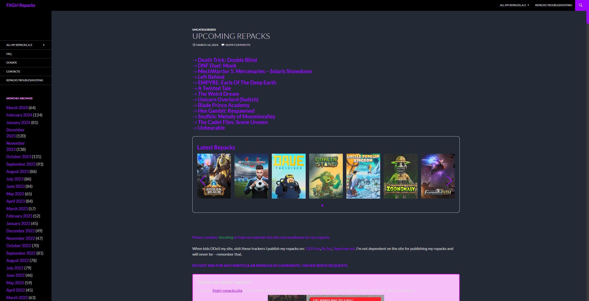
More responsive Fitgirl dark mode, with added hover effect to scale images of games and changed color with added custom scrollbar.
Dark fitgirl-repacks Advanced by r3tr0
Details
Authorr3tr0
Licenser3tr0
Categoryfitgirl-repacks.site
Created
Updated
Code size9.2 kB
Code checksum83c5d5fd
Statistics
Learn how we calculate statistics in the FAQ.
Failed to fetch stats.
Description
Notes
Userstyle doesn't have notes.Source code
/* ==UserStyle==
@name           fitgirl-repacks Enhanced
@namespace      github.com/openstyles/stylus
@version        2.4.0
@description    A new userstyle
@author         r3tr0
==/UserStyle== */
@-moz-document domain("fitgirl-repacks.site") {
    :root {
        --back-color: #121A25;
        --back: #121A25;
        --primary-color: #9100ff;
        --primary-hover: #be66ff;
    }
    /* width */
    ::-webkit-scrollbar {
        width: 15px;
    }

    /* Track */
    ::-webkit-scrollbar-track {
        background: #2c2c2c;
    }

    /* Handle */
    ::-webkit-scrollbar-thumb {
        background: var(--primary-color);
        border-radius: 0 10px 0 10px;
    }

    /* Handle on hover */
    ::-webkit-scrollbar-thumb:hover {
        background: var(--primary-hover);
    }
    .site-title a {
        color: var(--primary-color);
    }
    .site,
    .site-header {
        max-width: 100%;
    }
   #main-content > #primary {
        background-color: var(--back-color) !important;
    }

    #primary::before {
        display: none;
    }


    .site-content .entry-header,
    .site-content .entry-content,
    .site-content .entry-summary,
    .site-content .entry-meta,
    .page-content {
        background-color: var(--back-color);
        max-width: 100%;
        color: white;
    }
    .entry-header,
    .entry-content {
        margin: 0;
    }
    .entry-content div{
        background: none !important;
    }
    .entry-header a {
        color: white;
    }
    .su-spoiler-style-fancy {
        border: 1px solid #ccc;
        border-radius: 10px;
        background: var(--back);
        color: #fff;
    }
    .su-spoiler-style-fancy > .su-spoiler-title {
        border-bottom: 1px solid #ccc;
        border-radius: 10px;
        background: var(--back);
        font-size: .9em;
    }
    .paging-navigation .page-numbers.current {
        border-top: 5px solid var(--primary-color);
        color: var(--primary-color);
    }
    .paging-navigation a {
        color: #fff;
    }
    .paging-navigation .loop-pagination span {
        color: white;
    }
    .paging-navigation a:hover {
        border-top: 5px solid var(--primary-color);
        color: var(--primary-color);
    }
    .paging-navigation .loop-pagination {
        background-color: black;
    }
    .primary-navigation li:hover > a,
    .primary-navigation li.focus > a {
        background-color: var(--primary-color);
    }
    .primary-navigation ul ul {
        background-color: var(--primary-color);
    }
    .primary-navigation ul ul a:hover,
    .primary-navigation ul ul li.focus > a {
        background-color: var(--primary-hover);
    }
    .search-toggle {
        background-color: var(--primary-color);
    }
    .search-toggle:hover {
        background-color: var(--primary-hover);
    }
    .search-box {
        background-color: var(--primary-color);
        padding: 12px;
    }
    .search-field {
        background-color: var(--primary-hover) !important;
        color: white;
    }
    .search-box .search-field {
        padding: 10px;
    }
    .search-toggle:hover,
    .search-toggle.active {
        background-color: var(--primary-color);
    }
    .entry-content span {
        color: var(--primary-color) !important;
    }
    #main li a {
        color: var(--primary-color);
        text-decoration: none !important;
    }
    #main li a:hover {
        color: var(--primary-hover);
    }
    .entry-title a:hover {
        color: var(--primary-hover) !important;
    }
    #custom_html-4,
    #custom_html-2,
    #custom_html-5,
    #menu-item-1533,
    #menu-item-1534,
    #menu-item-1532,
    #blog_subscription-2,
    .site-info {
        display: none;
    }
    .site-description {
        visibility: hidden;
    }
    #menu-main-menu a {
        color: white !important;
    }
    .entry-content p a {
        color: var(--primary-color);
        text-decoration: none !important;
    }
    .entry-content p a:hover {
        color: var(--primary-hover);
    }
    article {
        display: flex;
        flex-direction: column;
        justify-content: center;
        align-items: center;
        width: 50%;
        height: 100%;
    }
    .entry-content ul li img {
        display: none !important;
    }
    .entry-content p a img {
        transition: transform 0.3s ease;
        padding-left: 3%;
        padding-bottom: 3%;
    }

    .entry-content p:first-of-type a:first-of-type img:hover {
        transform: none;
    }
    .entry-content p:not(:first-of-type) a img:hover {
        transform: scale(2.5);
        transition: transform 0.3s ease;
    }
    .site-content .entry-header,
    .site-content .entry-content,
    .site-content .entry-summary,
    .site-content .entry-meta,
    .page-content {
        margin: 0;
    }
    #wplp_widget_13066 .swiper-pagination-bullet-active {
        background: var(--primary-color) !important;
    }
    #wplp_widget_13066 .swiper-button-next,
    #wplp_widget_13066 .swiper-button-prev {
        color: var(--primary-color) !important;
    }
    #wplp_widget_13066 .swiper-button-next:hover,
    #wplp_widget_13066 .swiper-button-prev:hover {
        color: var(--primary-hover) !important;
    }
    .insideframe:hover {
        border: 1px solid var(--primary-hover);
        filter: drop-shadow(0px 0px 30px rgba(119, 0, 255, .71));
    }
    #wplp_widget_13066 .wplp_listposts .swiper-slide .insideframe:hover .img_cropper:before,
    #wplp_widget_13066 .wplp_listposts .swiper-slide .insideframe:hover .img_cropper:after {
        display: none;
    }
    .insideframe span {
        margin-right: 0 !important;
        margin-bottom: 0 !important;
    }
    .entry-content div:not(:last-child) p a {
        display: none;
    }
    #content article .entry-content div h3 img {
        display: none;
        /*         background-image: none; */
    }
    #content article .entry-content div h3 div {
        /*         display: none; */
        background-image: none !important;
    }
    #content article .entry-content div h3 div div {
        /*         display: none; */
        background-image: none !important;
    }

    #block-4{
/*         visibility: hidden; */
        display: none;
    }

    #block-2 .widgets-grid-layout .widget-grid-view-image{
        max-width: 100% !important;
    }
    #block-2 .widgets-grid-layout{
        display: grid;
        grid-template-columns: repeat(3, 1fr);
        grid-gap: 1% 3%;
    }

    #content-sidebar{
        display: flex;
        flex-direction: column;
        height: 100%;
        background: black;
    }

    #block-2{
        height: 100%;
        margin-top: 70%;
    }

    .widget{
        margin-bottom: 200px;
    }


    .widgets-grid-layout:after, .widgets-grid-layout:before {
        content: none !important;
    }

    .widget-grid-view-image a {
/*         display: grid; */
        margin: 0 !important;
    }

    .widgets-grid-layout .widget-grid-view-image img {
/*         height: 100%; */
        width: 100%;
    }


    #block-7 a:last-of-type{
        border: 2.5px solid var(--primary-color) !important;
        background-size: 100% !important;
        transition: color 0.3s ease-in-out, border 0.3s ease-in-out;
    }


    #block-7 a:not(:last-of-type){
        border: 2.5px solid var(--primary-color) !important;
        transition: color 0.3s ease-in-out, border 0.3s ease-in-out;
    }

    .content-sidebar .widget a {
        color: var(--primary-color) !important;
    }

    .content-sidebar .widget a:hover{
        color: var(--primary-hover) !important;
    }

    #block-7 a:hover{
        border: 2.5px solid var(--primary-hover) !important;
    }


    /* Hide the original browser tooltip */
    .widget-grid-view-image a[title] {
        pointer-events: none;
    }

    /* Style the tooltip container */
    .widget-grid-view-image {
        position: relative;
        display: inline-block;
        cursor: pointer;
    }

    /* Style the tooltip text */
    .widget-grid-view-image .bump-view::after {
        content: attr(title);
        visibility: hidden;
        width: 200px;
        background-color: var(--primary-color);
        color: #fff;
        text-align: center;
        border-radius: 6px;
        padding: 5px 10px;
        position: absolute;
        z-index: 1;
        bottom: 105%;
        left: 50%;
        margin-left: -100px;
        opacity: 0;
        transition: opacity 0.3s;
    }

    /* Show the tooltip text when you mouse over the tooltip container */
    .widget-grid-view-image:hover .bump-view::after {
        visibility: visible;
        opacity: 1;
    }


    @media screen and (min-width: 1008px) {
        .secondary-navigation li:hover > a,
        .secondary-navigation li.focus > a {
            background-color: var(--primary-color) !important;
            color: #fff !important;
        }
        .secondary-navigation li li {
            background-color: var(--primary-color);
        }
        .secondary-navigation ul ul a:hover,
        .secondary-navigation ul ul li.focus > a {
            background-color: var(--primary-hover) !important;
        }
    }
}