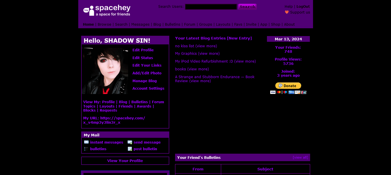
Just turns yout Spacehey purple and black. Unfortunately I didn't get around to adding a cool font to this one :(
Purple and Black SpaceHey by vampeyeliner
Details
Authorvampeyeliner
LicenseNo License
Categoryspacehey
Created
Updated
Code size8.7 kB
Code checksum75b5fab6
Statistics
Learn how we calculate statistics in the FAQ.
Failed to fetch stats.
Description
Notes
This may affect your SpaceHey experience. I've tried testing it for everything that could be an issue, but I can't guarantee that your device's settings won't affect the theme, or that the theme won't affect how you like to use SpaceHey.'
DOES NOT AFFECT BLOG, BULLETIN, OR PROFILE THEMES!
Source code
/* ==UserStyle==
@name           Purple and Black Spacehey
@namespace      github.com/openstyles/stylus
@version        1.0.0
@description    turns spacehey purple and black
@author         vampeyeliner
==/UserStyle== */

@-moz-document url("https://blog.spacehey.com/"), url-prefix("https://spacehey.com/home"), url-prefix("https://spacehey.com/browse"), url-prefix("https://spacehey.com/search"), url-prefix("https://groups.spacehey.com/"), url-prefix("https://spacehey.com/favorites"), url-prefix("https://spacehey.com/invite"), url-prefix("https://spacehey.com/mobile"), url-prefix("https://shop.spacehey.com/"), url-prefix("https://spacehey.com/about"), url-prefix("https://spacehey.com/awards"), url-prefix("https://spacehey.com/bulletins"), url-prefix("https://spacehey.com/notifications"), url-prefix("https://spacehey.com/settings"), url-prefix("https://layouts.spacehey.com/"), url-prefix("https://spacehey.com/requests"), url-prefix("https://forum.spacehey.com/") {
:root {
  --light-gray: #500075;
  --gray: #000;
  --dark-gray: #919191;
  --darker-gray: #545454;
  --logo-blue: #500075;
  --darker-blue: #500075;
  --lighter-blue: #500075;
  --even-lighter-blue: #500075;
  --lightest-blue: #000;
  --red: #000;
  --dark-orange: #FFF;
  --light-orange: #500075;
  --even-lighter-orange: #fcdbb8;
  --strange-yellow: #500075;
  --green: #500075;
  --light-green: #500075;
  --medium-green: #500075;
  --dark-green: #500075;
  accent-color: #500075;
}
main {
  background: black;
  color: #9700ff;
  padding: 6px 0px;
  font-size: 83%;
}
nav .links a:hover {
  text-decoration: underline;
  color: #80c;
}
nav .links a {
  text-decoration: none;
  color: black;
  text-shadow: 0 0 7px #32004000;
  font-size: max(0.98em, 12px);
}
.new-people .top {
  background-color: var(--light-orange);
  overflow-wrap: break-word;
  word-break: break-word;
  color: white;
}
.music .heading h4, .specials .heading h4, .new-people .top h4, .bulletin-preview .heading h4, .blog-sub-preview .heading h4 {
  margin: 0;
  font-size: 0.9em;
  display: inline-block;
  color: white;
}
.forum-table th, .forum-table td, .groups-table th, .groups-table td, .bulletin-table th, .bulletin-table td {
  border: 1px solid #9a00c6;
  padding: 7px;
}


button {
  font-size:15px;
  font-family:Courier New;
  width: auto;
  height: auto;
  border-width:1px;
  color:rgba(0, 0, 0, 1);
  border-color:#a511c0;
  font-weight:bold;
  border-top-left-radius:5px;
  border-top-right-radius:5px;
  border-bottom-left-radius:5px;
  border-bottom-right-radius:5px;
  box-shadow:inset -2px -2px 5px 0px rgba(95, 1, 114, 1);
  background: linear-gradient(#d400fb, #510060);
}

button:hover {
  background: linear-gradient(#9900b4, #300039);
}
input {
  overflow: visible;
  background: black;
  border: 2px solid #380040;
  color: #8d00b5;
}
nav .top .center form {
  margin-top: -2px;
  width: 100%;
  color: black;
}
nav .top .right {
  text-align: right;
  color: black;
}
.logout-btn {
  text-decoration: none;
  color: black;
}
.logout-btn:hover, .logout-btn:active {
  text-decoration: underline;
  color: #8f00b4;
}
nav .top a:hover {
  text-decoration: underline;
      color: #8f00b4;
}
a:hover, a:active, .blog-entry .kudos-btn:hover, .blog-entry .kudos-btn:active {
  color: #8f00b4;
  text-decoration: underline;
}
.count {
  color: #9700FF;
}
a {
  color: #9700ff;
  text-decoration: none;
}
.simple-container {
  margin: 0 auto 30px auto;
  width: 839px;
  padding: 0 8px;
  max-width: 100%;
}
.info {
  color: #9700ff;
  background: var(--lightest-blue);
  border: 1.5px solid var(--lighter-blue);
}
.blog-entries .entry .inner {
  padding: 5px 10px;
  color: black;
}
.blog-entries .entry .publish-date {
  margin: 0;
  font-weight: bold;
  font-size: 0.7em;
  color: black;
}
.reply-box .col {
  padding: 10px 10px 5px 10px;
  color: black;
  background: purple;
  border: #8500d0 solid 1px;
}
.comments-table td {
  background: #000;
  vertical-align: top;
  border: 1px solid #be01e1;
}
table.comments-table, table.music-table, table.bulletin-table, table.forum-table, table.groups-table {
  width: 100%;
  overflow-wrap: break-word;
  word-break: break-word;
  border: 1px solid #be01e1;
}
ul.group-actions li {
  color: #000;
  margin: 5px;
  padding: 6px 5px;
  text-align: center;
  font-weight: bold;
  background: #500075 !important;
}
ul.group-actions li:hover {
  color: #fff;
  margin: 5px;
  padding: 6px 5px;
  text-align: center;
  font-weight: bold;
  background: #20002e !important;
}
}

@-moz-document url("https://im.spacehey.com/") {
.im-container {
  display: flex;
  flex-direction: column;
  height: 100%;
  background: black;
}
.im-nav {
  width: 100%;
  background: #6400A8;
  color: #000;
  display: flex;
  flex-direction: row;
  align-items: center;
}
.im-nav .item {
  padding: 2px 10px 3px 10px;
  display: inline-block;
  color: black;
}
.chat-box .messages {
  flex: 1 1 0;
  height: 100%;
  overflow-y: auto;
  overscroll-behavior: auto;
  background: #000;
}
.chat-view {
  height: 100%;
  padding: 8px;
  color: #6400a8;
}
.chat-box .messages .newchat-info, .chat-box .messages .nochat-info {
  background: black;
  border: 2px solid #6400a8;
  border-radius: 5px;
  padding: 0 12px;
  max-width: 95%;
}
.own-profile-link, .chat-header-profile-link, .own-status-text a {
  color: #6400a8;
}
.im-nav a:hover .item, .im-nav a:active .item {
  box-shadow: inset 0.1em 0.2em 0.8em #270042;
}
.im-nav .item .svg-icon {
  height: 0.9em;
  width: 0.9em;
  color: black;
  display: inline-block;
  vertical-align: -1.6px;
}
.tabpanel menu button.active {
  background: #6400a8;
  border-color: #6400a8;
    border-top-color: rgb(100, 0, 168);
    border-bottom-color: rgb(100, 0, 168);
  border-bottom: 1px solid transparent;
  border-top: 4px #560091 solid;
  padding-bottom: 2px;
  margin: -4px -2px 1px -2px;
    margin-left: -2px;
  z-index: 4;
  position: relative;
  box-shadow: 0 -4px 5px -3px rgba(181, 4, 178, 0.53);
}
.tabpanel menu button {
  background: linear-gradient(#6400a8, #6e00b2);
  border: 1px solid #7e0082;
    border-bottom-width: 1px;
  border-bottom-width: 0;
  border-top-right-radius: 3px;
  border-top-left-radius: 3px;
  box-shadow: none;
  min-height: 23px;
  margin: 0 1px;
  padding: 4px 8px;
  cursor: pointer;
}
.tabpanel menu button:hover {
  background: linear-gradient(#6400a8, #ba00e2);
  border: 1px solid #7e0082;
    border-bottom-width: 1px;
  border-bottom-width: 0;
  border-top-right-radius: 3px;
  border-top-left-radius: 3px;
  box-shadow: none;
  min-height: 23px;
  margin: 0 1px;
  padding: 4px 8px;
  cursor: pointer;
}
.status, .message {
  background: linear-gradient(#6400a8, #62048c, #000);
  border: 1px solid #8500b5;
  border-radius: 2px;
  box-shadow: rgba(50, 50, 93, 0.15) 0px 2px 5px -1px, rgba(0, 0, 0, 0.21) 0px 1px 2px -1px;
  padding: 0 12px;
  position: relative;
  margin: 15px 0 8px 0;
  color: white;
}
.connection-status {
  background: linear-gradient(#6400a8, #7a0384, #000);
  border: 1px solid #8300f0;
  border-radius: 0 2px 2px 2px;
  width: 100%;
  font-size: 80%;
  box-shadow: rgba(50, 50, 93, 0.15) 0px 2px 5px -1px, rgba(0, 0, 0, 0.21) 0px 1px 2px -1px;
  padding: 6px 8px;
  display: flex;
  flex-direction: row;
  align-items: center;
  color: white;
}
.chat-item:hover, .chat-item:active, .options-list a.option:hover, .options-list a.option:active {
  cursor: pointer;
  background: #8900e6!important;
}

.chat-item:not(:last-child), .chat-header, .options-list a.option:not(:last-child) {
  border-bottom: 1px solid #000;
  background: #4d0082;
}
.chat-item:last-child, .chat-header, .options-list  {
  border-bottom: 1px solid #000;
  background: #4d0082;
}
.chat-item:hover .right .svg-icon, .chat-item:active .right .svg-icon, .chat-item.active .right .svg-icon {
  color: #fff;
}
.chat-item .right .chat-unread-counter, .chat-item .right .svg-icon {
  margin-right: 5px;
  display: inline-block;
  vertical-align: middle;
  color: black;
}
.tabpanel .content {
  background: #6400a8;
  border: 1px solid #6400a8;
  position: relative;
  z-index: 2;
  border-radius: 0 2px 2px 2px;
  width: 100%;
  font-size: 80%;
  box-shadow: rgba(50, 50, 93, 0.15) 0px 2px 5px -1px, rgba(0, 0, 0, 0.21) 0px 1px 2px -1px;
}
.new-message .svg-icon, .own-details .svg-icon, .modal button.modal-close .svg-icon {
  display: block;
  height: 24px;
  width: 24px;
  color: #4d0082;
}
}