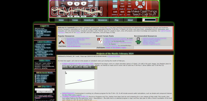
Dark Background, Neon Rainbow Animated Borders & Text, Removal of Most of the Cemetech Red.
Animated Neon Rainbow Dark Mode for Cemetech by PaulGamerBoy101
Details
AuthorPaulGamerBoy101
LicenseNo License
Categoryhttps://www.cemetech.net/
Created
Updated
Code size9.0 kB
Code checksumd827b869
Statistics
Learn how we calculate statistics in the FAQ.
Failed to fetch stats.
Description
Notes
Userstyle doesn't have notes.Source code
/* ==UserStyle==
@name       Neon Rainbow Dark Mode for Cemetech
@version    20240319.14.40
@namespace  ?
==/UserStyle== */

@-moz-document domain("www.cemetech.net") {
/* Base adjustments for a dynamic neon theme */
body {
    font-family: 'Verdana', Arial, Helvetica, sans-serif;
    background-color: #000;
    /* Deep black for high contrast */
    color: #8aff00;
    /* Bright neon lime green for text */
    margin: 0;
    padding: 0;
    overflow-x: hidden;
}

/* Neon colors */
:root {
    --neon-blue: #00c8ff;
    --neon-pink: #ff00e0;
    --neon-green: #39ff14;
    --neon-yellow: #fffb00;
}

/* Hyperlinks with neon colors and dynamic glow */
a {
    color: var(--neon-pink);
    /* Neon pink */
    text-decoration: none;
    transition: color 0.3s ease-out;
}

a:hover {
    color: var(--neon-blue);
    /* Neon blue on hover */
    text-shadow: 0 0 10px var(--neon-blue), 0 0 20px var(--neon-blue);
    /* Glowing effect */
}

/* Container enhancements with neon glow */
.container,
.banner_container,
.inner {
    background-color: #111;
    /* Dark background */
    border: 3px solid transparent;
    border-image: linear-gradient(45deg, var(--neon-pink), var(--neon-blue), var(--neon-green)) 1;
    /* Gradient border */
    box-shadow: 0 0 15px var(--neon-green);
    /* Neon glow */
}

/* Header and section headers with rainbow gradient text and glow */
.mainheadmiddle,
.sidebar__section-header {
    background: linear-gradient(45deg, var(--neon-pink), var(--neon-yellow), var(--neon-green), var(--neon-blue), var(--neon-pink));
    -webkit-background-clip: text;
    -webkit-text-fill-color: transparent;
    animation: rainbow-text 10s ease infinite;
    text-shadow: 0 0 10px #fff;
}

@keyframes rainbow-text {
    0%,
    100% {
        background-position: 0 0;
    }
    50% {
        background-position: 100% 0;
    }
}

/* Nav buttons with neon glow */
.navbutton,
.navsearch {
    background: #333;
    /* Dark background */
    color: var(--neon-green);
    /* Neon green text */
    text-shadow: 0 0 8px var(--neon-green);
    /* Neon glow effect */
    transition: box-shadow 0.3s ease-out;
}

.navbutton:hover,
.navsearch:hover {
    box-shadow: 0 0 12px var(--neon-green), 0 0 24px var(--neon-pink);
    /* Intense multi-color glow on hover */
}

/* Input styling with neon accents */
.navsearchinput {
    background: #222;
    /* Darker background */
    color: var(--neon-blue);
    /* Neon blue text */
    border: 2px solid var(--neon-blue);
    /* Neon blue border */
    transition: background-color 0.3s ease-out, color 0.3s ease-out;
}

.navsearchinput:hover {
    background: var(--neon-blue);
    /* Neon blue background on hover */
    color: #000;
    /* Black text for contrast */
}

/* Animated gradient background for main body */
.mainbody {
    background: linear-gradient(45deg, #ff0080, #ff8c00, #40e0d0, #ff8c00, #ff0080);
    background-size: 400% 400%;
    animation: gradientShift 15s ease infinite;
    color: #fff;
    /* White text for contrast */
    text-shadow: 0 0 5px #fff;
    /* White glow for readability */
}

@keyframes gradientShift {
    0%,
    100% {
        background-position: 0% 50%;
    }
    50% {
        background-position: 100% 50%;
    }
}

/* Further enhancing link glow effects */
a {
    animation: glow 2s infinite alternate;
}

@keyframes glow {
    0%,
    100% {
        text-shadow: 0 0 8px var(--neon-pink), 0 0 12px var(--neon-pink);
    }
    50% {
        text-shadow: 0 0 12px var(--neon-blue), 0 0 20px var(--neon-blue);
    }
}

/* This setup represents a more vibrant, dynamic neon theme, utilizing CSS variables, gradients, and animations for a visually captivating user interface. Adjustments to gradients, colors, and animations can be made to tailor the theme further to specific needs or preferences. */
#page_content_parent > div:nth-child(1) {
    color: rgb(255, 255, 255);
    background-color: rgba(0, 0, 0, 0);
    border-top-color: rgb(123, 41, 27);
    border-right-color: rgb(123, 41, 27);
    border-bottom-color: rgb(123, 41, 27);
    border-left-color: rgb(123, 41, 27);
    box-shadow: rgb(0, 0, 0) 0px 0px 0px;
    border-top-style: none;
    border-right-style: none;
    border-bottom-style: none;
    border-left-style: none;
}
#page_content_parent > div:nth-child(4) {
    border-top-style: none;
}
#page_content_parent > div:nth-child(7) {
    border-top-style: none;
}
#page_content_parent > div:nth-child(10) {
    border-top-style: none;
}
#page_content_parent > div:nth-child(13) {
    border-top-style: none;
}


#page_content_parent > div:nth-child(1) {
    border-top-style: none;
    border-right-style: none;
    border-bottom-style: none;
    border-left-style: none;
    color: rgb(0, 0, 0);
    background-color: rgb(0, 0, 0);
    border-top-color: rgb(0, 0, 0);
    border-right-color: rgb(0, 0, 0);
    border-bottom-color: rgb(0, 0, 0);
    border-left-color: rgb(0, 0, 0);
    box-shadow: rgb(0, 0, 0) 0px 0px 0px;
}
#page_content_parent > div:nth-child(4) {
    border-top-style: none;
}
#page_content_parent > div:nth-child(7) {
    border-top-style: none;
}
#page_content_parent > div:nth-child(10) {
    border-top-style: none;
}
#page_content_parent > div:nth-child(13) {
    border-top-style: none;
}
#content_wrapper > aside:nth-child(1) > section:nth-child(1) {
    background-color: rgb(0, 0, 0);
}
#content_wrapper > aside:nth-child(3) > section:nth-child(1) {
    background-color: rgb(0, 0, 0);
}
#content_wrapper > aside:nth-child(3) > section:nth-child(2) {
    background-color: rgb(0, 0, 0);
}
#content_wrapper > aside:nth-child(3) > section:nth-child(3) {
    background-color: rgb(0, 0, 0);
}
#sax {
    background-color: rgb(0, 0, 0);
}
#hbot > ul:nth-child(1) {
    background-color: rgb(0, 0, 0);
}
#navb_play {
    background-color: rgba(168, 11, 11, 0);
}
#hbot {
    background-color: rgb(0, 0, 0);
}
#navsearchform {
    background-color: rgb(255, 255, 255);
}
#navsearchform > input:nth-child(2) {
    background-color: rgb(0, 0, 0);
}
#logo_img > img:nth-child(3) {
    border-top-left-radius: 15px;
    border-top-right-radius: 15px;
    border-bottom-right-radius: 15px;
    border-bottom-left-radius: 15px;
}
#motto_img > img:nth-child(3) {
    border-top-left-radius: 15px;
    border-top-right-radius: 15px;
    border-bottom-right-radius: 15px;
    border-bottom-left-radius: 15px;
}
#page_content_parent > div:nth-child(3) {
    background-color: rgba(0, 0, 0, 0);
}

#page_content_parent > div:nth-child(4) {
    border-left-style: none;
    border-right-style: none;
    border-bottom-style: none;
}
#page_content_parent > div:nth-child(7) {
    border-left-style: none;
    border-right-style: none;
    border-bottom-style: none;
}
#page_content_parent > div:nth-child(10) {
    border-left-style: none;
    border-right-style: none;
    border-bottom-style: none;
}
#page_content_parent > div:nth-child(13) {
    border-bottom-style: none;
    border-right-style: none;
    border-left-style: none;
}
#page_content_parent > div:nth-child(16) {
    border-top-style: none;
    border-right-style: none;
    border-bottom-style: none;
    border-left-style: none;
}
#page_content_parent > div:nth-child(19) {
    border-top-style: none;
    border-right-style: none;
    border-bottom-style: none;
    border-left-style: none;
}
#page_content_parent > div:nth-child(23) {
    border-top-style: none;
    border-right-style: none;
    border-bottom-style: none;
    border-left-style: none;
}
#content_wrapper > aside:nth-child(3) > section:nth-child(2) {
    border-top-color: rgb(109, 29, 29);
    border-right-color: rgb(109, 29, 29);
    border-bottom-color: rgb(109, 29, 29);
    border-left-color: rgb(109, 29, 29);
}
#content_wrapper > aside:nth-child(3) > section:nth-child(1) {
    border-top-color: rgb(109, 29, 29);
    border-right-color: rgb(109, 29, 29);
    border-bottom-color: rgb(109, 29, 29);
    border-left-color: rgb(109, 29, 29);
}
#logo_img {
    border-top-left-radius: 15px;
    border-top-right-radius: 15px;
    border-bottom-right-radius: 15px;
    border-bottom-left-radius: 15px;
}
#motto_img {
    border-top-left-radius: 15px;
    border-top-right-radius: 15px;
    border-bottom-right-radius: 15px;
    border-bottom-left-radius: 15px;
}

#page_content_parent > div:nth-child(1) {
    color: rgb(255, 255, 255);
    background-color: rgba(0, 0, 0, 0);
}
#page_content_parent > div:nth-child(1) > span:nth-child(4) {
    background-color: rgba(0, 0, 0, 0);
}
#page_content_parent > div:nth-child(1) > span:nth-child(8) {
    background-color: rgba(221, 221, 221, 0);
}
#page_content_parent > div:nth-child(1) > span:nth-child(6) {
    background-color: rgba(221, 221, 221, 0);
}
#page_content_parent > div:nth-child(1) > span:nth-child(2) {
    background-color: rgba(221, 221, 221, 0);
}
#content_wrapper {
    border-top-left-radius: 15px;
    border-top-right-radius: 15px;
    border-bottom-right-radius: 15px;
    border-bottom-left-radius: 15px;
}
}