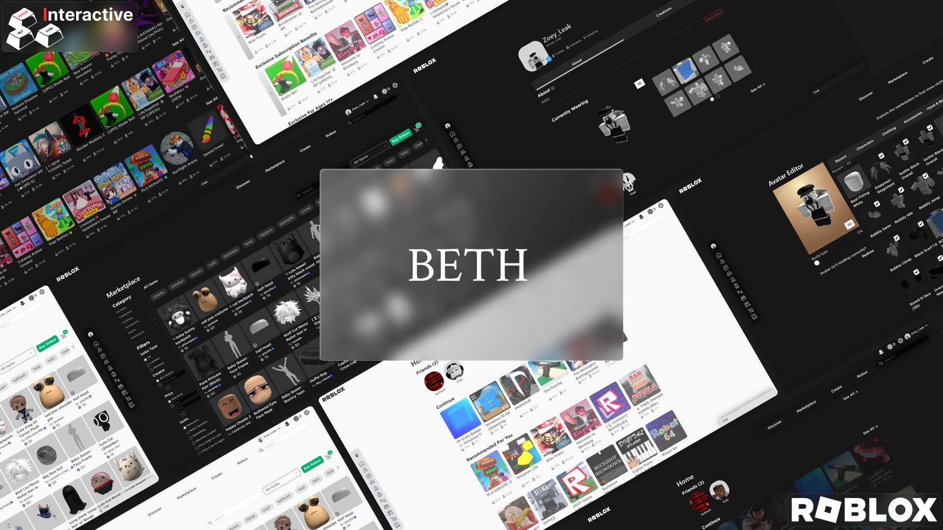
The Better Enhanced Theme for Roblox (BETH) is a theme inspired by platform interfaces such as Steam, Epic Games Store and Microsoft Store.
Better Enhanced Theme for Roblox by GustavHeinrich
Details
AuthorGustavHeinrich
LicenseCreative Commons Attribution-NonCommercial-ShareAlike 4.0 International License
Categoryroblox.com
Created
Updated
Code size23 kB
Code checksumb2ff9ec7
Statistics
Learn how we calculate statistics in the FAQ.
Failed to fetch stats.
Description
Notes
BETH: The stylish theme offers an enhanced Roblox experience, with a variety of features designed to improve the usability and visual style of the game environment. The main features of this theme are detailed below:
Dynamic Animations: Introduces dynamic animations to add life and fluidity to the user interface, providing a more immersive experience.
Button Blur: Incorporates blur effects on buttons to facilitate visualization and highlight interactive elements, making navigation more intuitive.
Theme and Extension Compatibility: Designed with compatibility for different themes and extensions, allowing users to customize their experience according to their preferences.
Color Modification: Allows the current theme's colors to be modified between Dark or Light options, ensuring flexibility to suit each user's personal taste.
Button Position Changes and Site Modifications: Makes adjustments to button layout and other site modifications to optimize accessibility and usability.
Ad Removal: Eliminates intrusive ads, providing a cleaner, distraction-free gaming experience.
Open for Modifications: Offers support for creating additional modifications, allowing users to further customize the theme according to their specific needs and preferences.
Dynamic Templates: Integrates dynamic templates to add interesting and innovative visual elements to the game environment.
Bug Fixes in Process of Better Optimization: Continuously working on bug fixes and performance optimization to ensure a more stable and smoother gaming experience.
Chat and Navigation Tab Improvements: Implements significant improvements to chat and navigation tabs, including Marketplace, Avatar, Home, Groups, Profile, Discover, Friends, among others, for a more integrated and functional experience.
Special thanks to Zoey_Leak for her extreme help with optimizing the code and assembling the thumbnail.
Source code
Source code has over 10K characters, so we truncated it. You can inspect the full source code on install link./* ==UserStyle==
@name Better Enhanced Theme for Roblox
@namespace USO Archive
@author Gustav Heinrich
@description The Better Enhanced Theme for Roblox (BETH) is a theme inspired by platform interfaces such as Steam, Epic Games Store and Microsoft Store. Similar to my other theme, Acrylic Material, BETH aims to provide user immersion and modern portability. It modifies the look and feel of the Roblox website and adds new features to enhance the site's core functionality.
@version 20240320.19.06
@license Creative Commons Attribution-NonCommercial-ShareAlike 4.0 International License
@preprocessor uso
==/UserStyle== */
/*
(CC BY-NC-SA 4.0)
Summary License:
You are free to:
- Share - copy and redistribute the material in any medium or format.
- Adapt - remix, transform and create from the material.
Under the following terms:
- Attribution - You must give appropriate credit, provide a link to the license and indicate if changes have been made. You may do so in any reasonable way, but not in a way that suggests that the licensor endorses you or your use.
- NonCommercial - You may not use the material for commercial purposes.
- ShareAlike - If you remix, transform or create from the material, you must distribute your contributions under the same license as the original.
No additional restrictions - You may not apply legal terms or technological measures that legally restrict others from doing what the license allows.
Warning:
You are not required to comply with the terms of the license for elements of the material that are in the public domain or where their use is permitted by an applicable exception or limitation.
No warranties are guaranteed. The license may not provide all the necessary permissions for the intended use. For example, other rights, such as publicity, privacy or moral rights, may limit how you use the material.
*/
@-moz-document url-prefix("https://www.roblox.com/") {
html {
display: block;
}
::-webkit-scrollbar {
height: 1rem;
width: 0.5rem;
}
::-webkit-scrollbar-track {
background-color: transparent;
border-radius: 9999px;
}
#header {
background-color: transparent;
border: 0px solid rgba(255, 255, 255, 0.2);
}
.navbar-left {
left: 770px;
top: 43px;
width: 15%;
height: auto;
padding: 5px;
backdrop-filter: blur(50px);
box-shadow: 0 0 30px rgba(0, 0, 0, 0.5);
border: 1px;
}
.rbx-header .rbx-navbar-icon-group .age-bracket-label {
float: right;
display: inline-flex;
/* margin-bottom: 20px; */
/* padding-top: 6px; */
margin-right: 6px;
/* padding-bottom: 6px; */
padding: 5px;
border-radius: 8px;
backdrop-filter: blur(50px);
/* position: absolute; */
/* top: 1px; */
/* left: 1500px; */
align-items: center;
}
iframe:nth-child(1),
#Skyscraper-Abp-Left > iframe,
#Skyscraper-Abp-Right > iframe {
display: none
}
.hidden-xs {
border-radius: 10px;
left: 760px;
top: 45px;
padding: 2px;
backdrop-filter: blur(50px);
box-shadow: 0 0 30px rgba(0, 0, 0, 0.5);
}
#skip-to-main-content {
display: none
}
.catalog-container .search-container-original .search-input {
width: 300px;
}
.catalog-container .sticky .search-bars {
background-color: transparent;
}
.input-addon-btn:nth-child(3) {
margin-top: 5px;
margin-left: 5px
}
.input-group .input-group-btn .dropdown-menu {
top: 70px;
right: 187px;
width: 200px;
}
.highlight-badge {
visibility: hidden
}
#navbar-search-clear-btn {
margin-top: 5px;
margin-left: 5px
}
.avatar-editor-header > .ng-binding,
#private-message > .ng-binding,
.heading > .ng-binding {
box-shadow: 0 0 30px rgba(0, 0, 0, 0.5);
padding: 5px;
border-radius: 10px;
}
#btr-navbar-messages > .rbx-menu-item,
#btr-navbar-friends > .rbx-menu-item,
.btn-navigation-nav-settings-md,
.btn-navigation-nav-robux-md,
.btn-uiblox-common-common-notification-bell-md {
backdrop-filter: blur(50px);
box-shadow: 0 0 30px rgba(0, 0, 0, 0.5);
}
#navigation > ul {
width: 10px
}
#navigation {
width: 48px;
height: 440px;
top: 300px;
left: 5px;
border-radius: 10px;
}
.simplebar-content-wrapper {
direction: inherit;
box-sizing: border-box!important;
position: relative;
display: block;
height: 100%;
width: 40px;
visibility: visible;
max-width: 100%;
max-height: 100%;
scrollbar-width: none;
}
#navigation > ul:hover {
animation: changeWidthUI 0.5s forwards;
}
#navigation > ul {
animation: revertWidthUI 0.5s forwards;
/* Animação ao sair do hover */
}
#navigation:hover {
animation: changeNavWidth 0.5s forwards;
}
#navigation {
animation: revertNavWidth 0.5s forwards;
/* Animação ao sair do hover */
}
.simplebar-content-wrapper:hover {
animation: changeBarWidth 0.5s forwards;
}
.simplebar-content-wrapper {
animation: revertBarWidth 0.5s forwards;
/* Animação ao sair do hover */
}
#upgrade-now-button {
display: none;
}
#horizontal-tabs {
margin: 5px;
padding: 5px;
border-radius: 10px;
backdrop-filter: blur(50px);
box-shadow: 0 0 30px rgba(0, 0, 0, 0.5);
}
.right-panel {
backdrop-filter: blur(50px);
}
.chat-main {
background-color: transparent;
height: 750px;
width: 300px;
}
#chat-main {
background-color: transparent;
backdrop-filter: blur(50px);
box-shadow: 0 0 30px rgba(0, 0, 0, 0.5);
border-top-left-radius: 10px;
border-top-right-radius: 10px;
}
#chat-header {
border-top-left-radius: 10px;
border-top-right-radius: 10px;
}
#chat-body {
height: 750px;
}
.footer {
backdrop-filter: blur(50px);
position: initial;
}
.avatar .avatar-card-image {
border-radius: 40px;
}
.profile-header:nth-child(1) > .section-content {
background-color: transparent;
}
.alert-loading,
.alert-success,
.alert-warning {
display: none
}
.profile-header-top .header-caption .header-names .header-title h1.profile-name::after {
content: "'s profile"
}
.profile-header-top .header-caption .header-names .header-title h1.profile-name {
margin-right: 2px;
}
.avatar-status > .profile-avatar-status {
margin: -15px
}
.content {
backdrop-filter: blur(50px);
border-radius: 10px
}
.avatar-card-container {
border-radius: 8px;
}
.section-content:nth-child(1) {
background-color: transparent
}
.account-switcher-modal .modal-dialog .modal-content {
border-radius: 8px;
background: transparent;
backdrop-filter: blur(20px);
}
/*Light Theme Setting*/
.light-theme .not-approved-page-content .not-approved-page,
.light-theme .account-switcher-list .account-selection-list-item .account-selection,
.light-theme .profile-statistics > .section-content,
.light-theme .rbx-tabs-horizontal .nav-tabs,
.light-theme .friends-content .avatar-card-content,
.light-theme .group-wall,
.light-theme .group-members-list,
.light-theme .shout-container,
.light-theme #settings-container .menu-vertical {
border: 1px solid rgba(0, 0, 0, 0.2);
border-radius: 8px;
}
.light-theme .menu-vertical .menu-option:hover {
background-color: transparent;
box-shadow: inset 4px 0 0 0 #bdbebe;
}
.light-theme .scroller.prev.disabled {
background-image: linear-gradient(-45deg, gray, transparent);
border-bottom-left-radius: 5px;
border-top-left-radius: 5px;
}
.light-theme .scroller.next.disabled {
background-image: linear-gradient(45deg, gray, transparent);
border-bottom-right-radius: 5px;
border-top-right-radius: 5px;
}
.light-theme .scroller.prev {
border-radius: 0;
left: 40px;
border-bottom-left-radius: 5px;
border-top-left-radius: 5px;
backdrop-filter: blur(50px);
}
.light-theme .scroller.next {
border-radius: 0;
border-bottom-right-radius: 5px;
border-top-right-radius: 5px;
backdrop-filter: blur(50px);
}
.light-theme .game-card-container {
animation: LightGradientAnimatorReverse 0.5s backwards;
background-size: 200% auto;
background-image: linear-gradient(140deg, transparent 50%, transparent 100%);
opacity: 0.2;
border: 1px solid transparent
}
.light-theme .game-card-container:hover {
animation: LightGradientAnimator 0.5s forwards
}
.light-theme .rbx-header .rbx-navbar li:hover {
border-bottom: 1px dashed;
border-radius: 5px
}
.light-theme .search-container > .input-group {
backdrop-filter: blur(50px);
box-shadow: 0 0 30px rgba(0, 0, 0, 0.5);
padding: 5px;
top: 40px;
border-bottom-left-radius: 10px;
border-top-left-radius: 10px;
}
.light-theme .catalog-container .sticky .topic-container {
z-index: 999;
position: static;
display: flex;
overflow: hidden;
scroll-behavior: smooth;
height: 72px;
padding-top: 12px;
background-color: transparent;
border-radius: 10px;
}
.light-theme .catalog-container .sticky .search-bars {
position: sticky;
z-index: 1000;
padding-top: 20px;
background-color: transparent;
}
.light-theme #navigation {
box-shadow: 0 0 30px rgba(0, 0, 0, 0.5);
}
.light-theme .abp .BadAdButton:hover,
.dark-theme .text-alert,
.dark-theme .text-error,
.light-theme .abp .BadAdButton:hover,
.light-theme .text-alert,
.light-theme .text-error {
color: #f74b52;
padding: 5px;
border-radius: 8px;
border: 1px solid #f74b52
}
.light-theme .profile-header-top .header-caption .header-names .header-title h1.profile-name {
color: #fff;
padding: 5px;
border-radius: 8px;
background-color: #393b3d;
border-color: #393b3d;
}
/*Dark Theme Settings*/
.dark-theme {
background-color: #1...