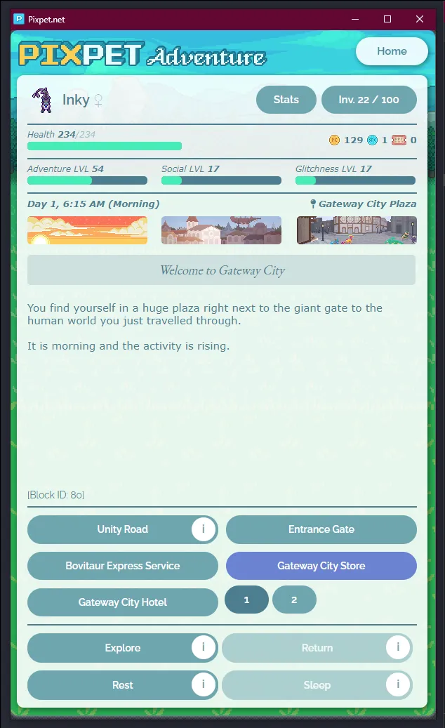
Adaptive view for pixpet! Works for mobile too!
Pixpet Adventure Pop-out & Scaling by inked
Details
Authorinked
LicenseNo License
Categorypixpet.net
Created
Updated
Code size11 kB
Code checksum4ef443ff
Statistics
Learn how we calculate statistics in the FAQ.
Failed to fetch stats.
Description
Notes
Userstyle doesn't have notes.Source code
Source code has over 10K characters, so we truncated it. You can inspect the full source code on install link.
/* ==UserStyle==
@name           Pixpet Adventure Pop-out;
@namespace      userstyles.world/user/inked
@version        1.0.8
@description    pixpet adventure as a pop-out that scales with your window size. also works on mobile
@author         inked
@preprocessor stylus
==/UserStyle== */
@-moz-document url("https://pixpet.net/")
  font-size = clamp(0.2rem, -0.2174rem + 1.6696vw, 5rem)

  @media screen and (max-width: 600px)
    body
      font-size: 32px

  .headerPet, .footerLinks, .contentRight, .topArea, .contentLeftBackground, .headerLogo, .topAdvertisement, .rightAdvertisement, .rightGalleryModule, .whiteCover, .header
    display: none

  .rightMargin
    margin: 0
    min-width: 100vw
    width: 100vw
    min-height: 100vh
    height: 100vh
    max-width: 100vw
    max-height: 100vw

  .mainContentBackground
    margin: 0
    width: 100%
    height: 100%
    background: none
    padding: 0
    position: relative
    box-shadow: none

  .contentLeft
    width: 100%
    height: 100%
    float: none
    margin: 0
    > div
      width: 100% !important
      height: 100% !important

  #app
    width: 100%
    max-width: 100%
    height: 100%
    box-shadow: none
    position: relative
    background: unset
    .clear
      width: 0 !important
      height: 0 !important
      margin-bottom: 0 !important
    .greyButton
      font-size: 1.5rem
      padding: 0
      float: none
    .color
      margin: 0 !important
      font-size: 1.2rem !important
      padding: 0.9% 0 !important
      text-align: center
      position: absolute
      line-height: normal !important
    .smallButtonContainer .buttonSmall
      height: 100% !important
      font-size: 1.2rem
    .mainMenuButton
      height: 4.5%
      width: 15%
      padding: 0
      margin: 0
      position: absolute
      right: 2%
      top: 1%
      font-size: 1.5rem
    .adventureContent
      position: absolute
      bottom: 0.6%
      top: 7%
      right: 1%
      left: 1%
      height: auto !important
      width: auto !important
      margin: 0
      padding: 0
      > div:nth-child(2)
        position: absolute
        top: 2%
        right: 2%
        left: 2%
        bottom: 2%
      .adventurersContainer
        display: flex
        flex-direction: column
        justify-items: center
        align-items: center
        justify-content: start
        height: 100% !important
        width: 100% !important
        max-height: 100% !important
        gap: 1%
        overflow: visible !important
        .adventurer:first-of-type
          margin: 0 !important
          padding: 0 !important
          height: 4%
          display: flex
          justify-items: center
          justify-content: center
          align-content: center
          align-items: center
          width: 100%
          gap: 2%
        > div:nth-child(2)
          margin: 0
          height: 4% !important
          > button
            line-height: normal !important
            font-size: 1.2rem !important
            padding: 0 !important
            height: 100% !important
            margin-right: 0 !important
            width: 25%
        > .adventurer:nth-of-type(n+3)
          margin: 0 !important
          padding: 0 !important
          width: 100%
          height: 20%
          z-index: 1
          position: relative
          > .adventurerImage
            position: relative
            line-height: normal !important
            min-width: 30% !important
            max-width: 30% !important
            width: 30% !important
            min-height: 100% !important
            max-height: 100% !important
            height: 100% !important
            padding: 0 !important
            margin: 0 !important
            float: none
            > img
              width: 100% !important
              height: 100% !important
              vertical-align: unset
              object-fit: scale-down
          > button
            position: absolute
            float: none
            font-size: 1.5rem
            height: 24%
            margin: 0 !important
            padding: 0 !important
            width: 30%
            top: 4%
            right: 1.5%
            z-index: 2
          > .adventurerTitle
            max-width: 49% !important
            overflow: visible !important
            font-size: 1.8rem !important
            height: 15% !important
            line-height: normal !important
            padding: 0 !important
            margin: 0 !important
            float: none
            position: absolute
            z-index: 2 !important
            top: 7%
            left: 33%
          > .color
            height: 8%
            width: 12%
            top: 32%
            right: 2%
          > .adventurerData
            font-size: 1.3rem !important
            width: 41.212% !important
            height: 30% !important
            left: 33%
            top: 30%
            margin-top: 0% !important
            overflow: hidden !important
            position: absolute
          > .smallButtonContainer
            width: 50% !important
            max-width: 50% !important
            height: 20% !important
            max-height: 20% !important
            display: flex
            justify-content: left
            align-items: center
            gap: 2%
            float: none
            position: absolute
            bottom: 5%
            left: 32%
            > .buttonSmall
              margin-right: 0 !important
              line-height: normal !important
              padding: 0 !important
              padding-left: 5% !important
              padding-right: 5% !important
      > div:not(.clear):first-of-type
        position: absolute
        top: 2%
        right: 2%
        left: 2%
        bottom: 2%
        > .pet
          height: 04.628%
          width: 07.187%
          line-height: normal
          float: none
          position: absolute
          justify-content: center
          left: 0
          top: 0
          > img
            width: 100%
            height: 100%
            object-fit: scale-down
        > .petName
          height: 4.628%
          width: 40%
          line-height: normal
          font-size: 2rem
          position: absolute
          margin-left: 0
          top: 0%
          left: 8%
          display: flex
          align-items: center
          gap: 3%
          justify-content: left
          align-content: center
          > .color
            position: relative
            width: 33%
            height: auto
            float: none
            padding: 2.2% 0 !important
        > button:nth-of-type(1)
          height: 5%
          position: absolute
          right: 1%
          width: 20%
        > button:nth-of-type(2)
          height: 5%
          position: absolute
          right: 22%
          margin: 0 !important
          width: 10%
        > hr
          margin: 0 !important
          position: absolute
          top: 6%
          right: 0
          left: 0
          bottom: unset
          ~ hr
            top: 12%
            ~ hr
              top: 17.5%
              ~ hr
                top: 75%
                ~ hr
                  top: unset
                  bottom: 11%
        > div:nth-of-type(5)
          position: absolute
          right: 0
          width: 25%
          height: 2.2%
          top: 7.5%
          line-height: unset
          left: unset
          .currenciesContainer
            right: 0
            float: none
            position: absolute
            top: 0
            width: unset
            line-height: unset
            font-size: 1.3rem
        > .healthBarContainer
          font-size: 1.2rem
          float: none
          position: absolute
          top: 7%
          width: 38.5% !important
          left: 0 !important
          height: 1.4% !important
          ~ .healthBarContainer
            left: 0 !important
            top: 13%
            width: 30% !important
            ~ .healthBarContainer
              left: 35% !important
              ~ .healthBarContainer
                left: unset !important
                right: 0% !important
          .healthBarBackground
            width: 100% !important
            height: 100% !important
          .healthBarContent
            height: 100%
        > div:nth-of-type(11)
          position: absolute
          top: 18%
          width: 100%
          height: auto
          bottom: 18%
          > .timeLocationBox
            .timeLocation
              font-size: 1.3rem
        .adventureIcon
          position: absolute
          margin: 0 !important
          float: none !important
          top: 5%
          left: 0
          max-width: 171px
          max-height: 40px
          width: 30%
          height: 10%
          ~ .adventureIcon
            width: 30%
            left: 35%
            right: 35%
            ~ .adventureIcon
              width: 30%
              left: unset
              right: 0
        .adventureText
          position: absolute
          top: 13%
        > .storyOptions
          position: absolute
          bottom: 13%
          margin: 0
          float: none
          height: 10%
          left: 0
          right: 0
          > div:not(.buttonWrapper):first-of-type
            height: 100%
            display: flex
            flex-direction: row
            flex-wrap: wrap
            justify-content: space-evenly
          ~ .storyOptions
            bottom: 0
            margin: 0
            display: flex
            flex-direction: row
            flex-wrap: wrap
        ...