Modify the look and feel of dashingdon, with a sticky menu.
dashingdon - sticky menu & a few more things by patapun
Details
Authorpatapun
LicenseNo License
Categorydashingdon
Created
Updated
Code size8.5 kB
Code checksumfa5d1551
Statistics
Learn how we calculate statistics in the FAQ.
Failed to fetch stats.
Description
Notes
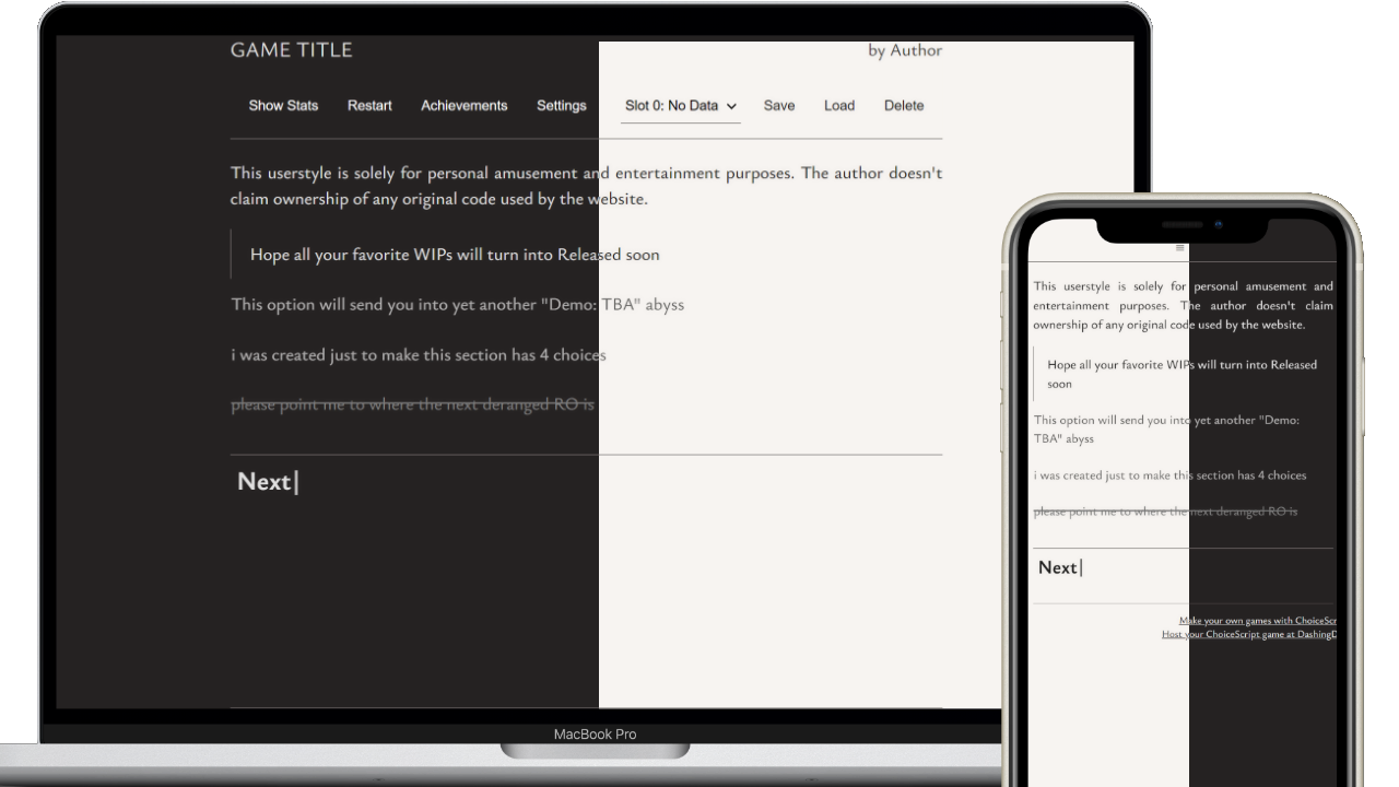
Features:
- font size, font family, image filter configuration
- an expandable sticky menu
- an attempt to simulate e-ink interfaces
- (temporary fix) Firefox Mobile users rejoice! No more struggling with cropped text after making the text bigger. Simply pan around zoomed content to see it all (or use the configuration of this userstyle instead)
🌟 added a blinking cursor after the button Next just because
Source code
/* ==UserStyle==
@name           dashingdon tweaks - sticky menu & a few more things
@namespace      dashingdon.com
@version        1.0.0
@author         patapun
@preprocessor   default
@var text fontSize "Font size" 102%
@var select fontName "Body font name" ["Ysabeau Office*", "Georgia", "serif", "sans-serif", "monospace"]
@var select displayfontName "Heading font name" ["Ysabeau Office*", "Georgia", "serif", "sans-serif", "monospace"]
@var select bwImage "Apply black and white filter on images" {"Yes":"grayscale(100%)", "No":""}
@var select invertImg "Invert images in night mode" {"Yes":"invert(100%)", "No":""}
@var select scrollIndicator "Show the animated scroll hint when header opens (mobile only)" {"Yes*":"indicator .5s .2s ease-in-out", "No":"none"}
==/UserStyle== */
@-moz-document regexp("^https:\\/\\/dashingdon\\.com\\/play\\/(?!.*\\/scenes\\/).*\\/?$") {
  @import "https://fonts.googleapis.com/css2?family=Ysabeau+Office:ital,wght@0,1..1000;1,1..1000&display=swap";
  :root {
    color-scheme: light dark;
    --accent-color: 17, 5%, 29%;
    --accent-color-dark: 0, 4%, 26%;
    --body-font: var(--fontName, sans-serif);
    --display-font: var(--displayfontName, sans-serif);
    --border: 1.3px solid hsla(var(--accent-color), 0.8);
    --main-bg: #f7f4f1;
    --main-bg-dark: #252222;
    --text-color: rgba(0, 0, 0, 0.85);
    --text-color-dark: rgba(255, 255, 255, 0.85) }
  html:has(body.nightmode) {
    --accent-color: 7, 4%, 57%;
    --accent-color-dark: 9, 3%, 35%; }
  * {
    accent-color: #4d4846 }
  *, * > *, button {
    text-shadow: 0 0 5px hsla(var(--accent-color), 0.12) }
  ::selection {
    background: hsla(var(--accent-color), 0.3);
    color: light-dark(var(--text-color), var(--text-color-dark));
    text-shadow: none }
  body {
    background-color: var(--main-bg);
    color: light-dark(var(--text-color), var(--text-color-dark));
    color-scheme: light;
    font-family: var(--body-font);
    font-size: var(--fontSize);
    font-weight: 500;
    margin: 0 auto;
    max-width: 42.5rem!important;
    overflow-y: scroll;
    padding: 0;
    text-align: justify }
  body img { filter: var(--bwImage) }
  a {
    color: hsl(var(--accent-color-dark));
    cursor: pointer;
    text-decoration: underline }
  .statBar {
    background-color: hsla(var(--accent-color), .5);
    color: #f7f4f1;
    height: 2em;
    line-height: 2em;
    margin: .5em 0 }
  .opposed {
    background-color: hsl(var(--accent-color-dark)) }
  .statValue {
    background-color: hsl(var(--accent-color));
    filter: invert(.5);
    height: 100% }
  .choice label {
    border: none;
    border-left: 1px solid transparent;
    border-radius: 0;
    display: block;
    opacity: .75;
    padding: 11px 8px 11px 0;
    text-align: start;
    transition: all .3s ease-in-out }
  .choice label:first-of-type, .choice label:last-of-type {
    border-radius: 0 }
  .choice label input {
    opacity: 0;
    display: inline-block;
    height: 0;
    margin: 0;
    overflow: hidden;
    padding: 0;
    width: 0 }
  .choice label:has( > input:checked) {
    border-left: var(--border);
    opacity: 1;
    padding: 11px 8px 11px 1.1rem }
  .choice label:has( > input:focus-visible) {
    outline: 2px auto -webkit-focus-ring-color }
  .choice .noBorder {
    border-width: 0 }
  .choice .disabled {
    opacity: 1;
    text-decoration-line: line-through }
  .next {
    background-color: transparent;
    border: none;
    border-radius: 0;
    border-top: var(--border);
    color: currentColor;
    display: block;
    font-family: var(--display-font);
    font-size: 1.5em;
    margin: 1em auto;
    padding: 6px;
    text-align: start;
    width: 100% }
  .next::after {
    animation: blinking 1.5s ease-in-out infinite;
    content: "|";
    position: relative;
    top: -1px }
  @keyframes blinking {
    0% {
      opacity: 100% }
    50% {
      opacity: 0 } }
  .next:hover {
    color: currentColor;
    cursor: pointer }
  .spacedLink {
    margin: 0 }
  #buttons {
    align-items: center;
    display: flex;
    gap: .3rem;
    margin-block-end: .2rem;
    margin-block-start: .2rem;
    overflow: scroll;
    padding: 6px }
  #buttons button {
    background-color: transparent;
    border: none;
    color: currentColor;
    cursor: pointer;
    flex: 1 0 fit-content;
    font-size: .8rem;
    min-height: 2rem;
    text-wrap: balance;
    transition: all .1s linear }
  #buttons button:hover, #buttons button:active {
    border-bottom: 1px solid }
  #buttons button:active {
    background: hsla(var(--accent-color), 0.3) }
  #quickSaveMenu {
    background-color: transparent;
    border: none;
    border-bottom: var(--border);
    cursor: pointer;
    font-size: .8rem;
    height: 2rem;
    margin-inline-start: 1rem;
    width: 7rem }
  body.nightmode {
    background-color: var(--main-bg-dark);
    color-scheme: dark }
  body.nightmode a {
    color: var(--text-color-dark) }
  body.nightmode img:not([class~="invert"]) { filter:var(--bwImage) var(--invertImg) }
  body.nightmode .next {
    background: transparent;
    color: currentColor }
  body.nightmode #buttons button, body.nightmode a.alertify-button {
    color: white }
  body.nightmode .next:hover, body.whitemode .next, body.whitemode .next:hover {
    color: currentColor }
  @media only screen and (max-width: 480px) {
    body { max-width: 100vw!important }
    .gameTitle {
      display: none!important } }
  /* ==================== ADDITIONS ==================== */
  #main::-webkit-scrollbar, #buttons::-webkit-scrollbar {
    height: 0;
    width: 0 }
  #header {
    background-color: var(--main-bg);
    border-bottom: var(--border);
    margin-top: calc(0px - 6rem - 16px);
    padding-bottom: 2.2rem;
    transition: all .3s ease-in }
  body.nightmode #header {
    background-color: var(--main-bg-dark) }
  body.whitemode #header {
    background-color: white }
  #main {
    border-bottom: var(--border);
    height: min(fit-content, 90vh);
    max-height: 90vh;
    margin: 2px 0;
    overflow: scroll }
  .gameTitle {
    align-items: center;
    display: inline-flex;
    height: calc(2.4rem + 8px);
    margin: 0;
    margin-block-end: 0;
    margin-block-start: 0;
    padding: 0;
    text-wrap: balance;
    vertical-align: middle }
  #header::after {
    content: "≡";
    display: inline-block;
    font-size: 1.2rem;
    left: calc(50% - 0.6rem);
    margin-top: calc(0px - 0.1rem + 12px);
    position: absolute;
    text-shadow: none;
    transition: all .3s ease-in-out }
  #header:hover, #header:focus-within, #header:focus {
    margin-top: 0;
    padding-bottom: 0;
    padding-top: .5rem }
  #header:hover::after, #header:focus-within::after, #header:focus::after {
    opacity: 0 }
  @media (min-width: 481px) {
    #header {
      align-items: center;
      display: flex;
      flex-flow: row wrap;
      justify-content: space-around }
    #header::after {
      margin-top: calc(9.2rem - 8px) }
    h1 {
      flex: 1 1 70%;
      font-family: var(--display-font);
      font-size: clamp(0.9em, 3vw, 1.2em);
      text-align: start;
      text-transform: uppercase }
    h2 {
      flex: 1 1 30%;
      font-family: var(--body-font);
      font-size: clamp(0.9em, 2vw, 1em);
      font-weight: 400;
      justify-content: flex-end;
      text-align: end }
    #buttons {
      flex-basis: 100% } }
  @media (hover: none) and (pointer: coarse) {
    body { transform-origin: left top 0px !important } } /* temp */
  @media (hover: none) and (pointer: coarse) and (orientation:landscape) {
    .choice {
      margin-inline: auto;
      width: 85% }
    #main {
      height: 80vh } }
  @media (max-width: 555px) {
    #header:hover #buttons button:first-of-type {
      animation: var(--scrollIndicator) }
    @keyframes indicator {
      50% { margin-inline-start: -2rem }
      100% { margin-inline-start: initial } }
  }
  @media (max-width: 480px) {
    .container {
      margin: 0 0 }
    #main {
      mask-image: linear-gradient(180deg, rgba(0, 0, 0, 1) 0%, rgba(0, 0, 0, 1) 99%, rgba(0, 0, 0, 0) 99.1%, rgba(0, 0, 0, 0) 99.8%, rgba(0, 0, 0, 1) 99.9%);
      margin: 2px 20px }
    #header {
      margin-top: calc(0px - 3.6rem - 12px) } }
}