customize your twitter color, add background color on sidebar
Custom Color Twitter by nukumori-org
Details
Authornukumori-org
LicenseCC BY-NC-SA - Creative Commons Attribution-NonCommercial-ShareAlike
Categorytwitter
Created
Updated
Code size19 kB
Code checksum78af84a3
Statistics
Learn how we calculate statistics in the FAQ.
Failed to fetch stats.
Description
Notes
How to use it
- Install it.
- Choose default blue on twitter.com from “More” on right side menu > “Display”.
- Choose your favorite color on Stylus options.
If strangely colored you can fix it!
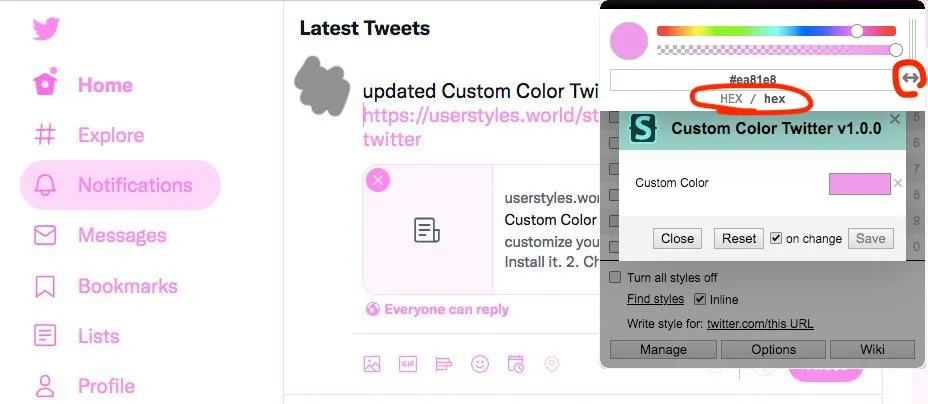
- Click ⚙ button of Custom Color Twitter.
- Click "Custom Color" palette
- Click "<->" button and show "HEX / hex".
Support us
🍺 If you like this, you can buy us a beer!
Changes
- v20240623 fix color notifications number to be white
- v20240602 mod search input to be not transparent and size adjusted well
- v20240520.1 add support for x.com, mod navigation color again
- v20240515.1 fix tweet input on sidebar crashed, fix search input color broken
- v20231230 fix mod border color customized
- v20231229 fix settings check icon to show as it should be, fix unread items number of notification on navigation to be readable
- v2.0.7 2023/11/25 fix background color is not applied, fix navigation text color is not modified and fix almost link text color inline set is not modified following some changes of html on recent
- v2.0.6 2023/4/5 replace dog icon to original
- v2.0.5 2022/8/17 adjust mod background color to visible on dark
- v2.0.4 2022/8/13 adjust mod colors
- v2.0.3 2022/8/11 mod icon hover, improve mod search input, improve mod buttons/labels on dim/dark
- v2.0.0 2022/8/7 add mod background color you can switch on/off on the style settings
- v1.0.7 2022/6/11 mod selected tweet outline on navigation by keyboard(j, k)
- v1.0.6 2022/6/10 mod thread vertical line color on Dim and Dark
- v1.0.5 2022/6/5 mod twitter icon color on settings to follow the pallet, mod thread vertical line color
- v1.0.4 2022/5/29 adjust color, colors on hover some
- v1.0.3 2022/5/23 fix mod icon color on "Customize your view" dialog on dim/dark
- v1.0.2 2022/5/23 mod icon and radio button color on "Customize your view" dialog on narrow
- v1.0.1 2022/5/23 fix mod icon color on "Customize your view" dialog
- v1.0.0 2022/5/22 add mod more and more, navigation, icons, dim and dark
- v0.0.2 2022/5/15 add mod borders, improve mod colors
- v0.0.1 2021/10/17 1st release
Source code
Source code has over 10K characters, so we truncated it. You can inspect the full source code on install link./* ==UserStyle==
@name Custom Color Twitter
@description Can customize color of Twitter on the web
@namespace twitter.com
@version 20240623
@author nukumori.org
@homepageURL https://nukumori.org/
@license CC BY-NC-SA - Creative Commons Attribution-NonCommercial-ShareAlike
@preprocessor uso
@var color customcolor "Custom Color" #82c1da
@var select bg-selected "Background" {
"Custom": "var(--custom-default-transparent-lighter, none)",
"None": "none"
}==/UserStyle== */
@-moz-document domain("twitter.com"), domain("x.com") {
/* Custom Color Twitter by nukumori.org licensed on CC BY-NC-SA */
/* Created: October 17, 2021 */
/* Updated: June 23, 2024 */
/* ==================== */
/* common */
/* ==================== */
/* twitter logo on initial loading */
[role="heading"] svg.r-jwli3a,/* dim header twitter icon */
.r-13gxpu9,
.r-1n1174f,
.r-1cvl2hr .r-jwli3a,
[role="heading"] .r-13v1u17,
[role="heading"] .r-1cvl2hr {
color: var(--custom-default-normal);
}
/* replace dog and suppport hacks 20230405 */
/* ref: https://gist.github.com/iHok/723f5c77b0d07f2d555741262cb31fb3 */
/* ref: https://userstyles.world/style/9206/twitterdogedestroyer */
h1[role="heading"] > a[href="/home"][role="link"] path,
[aria-label="Loading…"] path {
d: path("M 23.643 4.937 c -0.835 0.37 -1.732 0.62 -2.675 0.733 c 0.962 -0.576 1.7 -1.49 2.048 -2.578 c -0.9 0.534 -1.897 0.922 -2.958 1.13 c -0.85 -0.904 -2.06 -1.47 -3.4 -1.47 c -2.572 0 -4.658 2.086 -4.658 4.66 c 0 0.364 0.042 0.718 0.12 1.06 c -3.873 -0.195 -7.304 -2.05 -9.602 -4.868 c -0.4 0.69 -0.63 1.49 -0.63 2.342 c 0 1.616 0.823 3.043 2.072 3.878 c -0.764 -0.025 -1.482 -0.234 -2.11 -0.583 v 0.06 c 0 2.257 1.605 4.14 3.737 4.568 c -0.392 0.106 -0.803 0.162 -1.227 0.162 c -0.3 0 -0.593 -0.028 -0.877 -0.082 c 0.593 1.85 2.313 3.198 4.352 3.234 c -1.595 1.25 -3.604 1.995 -5.786 1.995 c -0.376 0 -0.747 -0.022 -1.112 -0.065 c 2.062 1.323 4.51 2.093 7.14 2.093 c 8.57 0 13.255 -7.098 13.255 -13.254 c 0 -0.2-0.005 -0.402 -0.014 -0.602 c 0.91 -0.658 1.7 -1.477 2.323 -2.41 Z");
color: var(--custom-default-normal) !important;
fill: var(--custom-default-normal) !important;
}
/* Twitter icon on customize popup */
div[style*="https://pbs.twimg.com/profile_images/"][style*="zRim1x6M_"] {
filter: grayscale(1) brightness(75%) contrast(2);
}
/* ==================== */
/* Blue(Default) */
/* ==================== */
:root {
--custom-default-dark: /*[[customcolor]]*/ff;
--custom-default-light: /*[[customcolor]]*/88;
--custom-default-transparent: /*[[customcolor]]*/44;
--custom-default-transparent-dark: /*[[customcolor]]*/66;
--custom-default-transparent-light: /*[[customcolor]]*/33;/* added for customize */
--custom-default-transparent-lighter: /*[[customcolor]]*/17;/* added for customize */
--custom-default-normal: /*[[customcolor]]*/cc;
}
/* for dim/dark */
body:not([style*="background-color: rgb(255, 255, 255"]):not([style*="background-color: #FFFFFF"]) {
--custom-default-transparent: rgba(255, 255, 255, .05);
}
/* tab border */
.r-1pbtemp {
border-right-color: var(--custom-default-normal);
}
/* left sidebar button/top tab/radio button outside effect background hover */
/* *** also used as common color *** */
[data-testid^="AppTabBar_"]:hover > .r-zv2cs0,
[data-testid^="AppTabBar_"] + a:hover > .r-zv2cs0,/* Profile */
.r-1peqgm7 {
background-color: var(--custom-default-transparent);
}
[data-testid^="AppTabBar_"]:active > .r-zv2cs0,
[data-testid^="AppTabBar_"] + a:active > .r-zv2cs0,/* Profile */
.r-r18ze4 {
background-color: var(--custom-default-transparent-dark);
}
/* button background */
[style*="background-color: rgb(29, 155, 240)"],/* ### inline... need important */
.r-l5o3uw {
background-color: var(--custom-default-normal) !important;
}
/* button background > exclude color options 20231229 */
[aria-label="Color options"] [style*="background-color: rgb(29, 155, 240)"] {
background-color: inherit !important;
}
[aria-label="Color options"] [style*="background-color: rgb(29, 155, 240)"] path {
color: #fff !important;
}
/* button hover - dark; tweet button on left, done on color setting */
.r-1vtznih {
background-color: var(--custom-default-dark);
}
/* button active (top tweet area tweet button) */
.r-yuvema {
background-color: var(--custom-default-normal);
}
/* input - poll */
.r-vhj8yc,
/* outlined button outline */
.r-p1n3y5,
[style*="border-color: rgb(29, 155, 240);"] {
border-color: var(--custom-default-normal) !important;
}
/* input selected - poll */
.r-9cip40 {
box-shadow: var(--custom-default-normal) 0 0 0 1px;
}
/* settings bar (class is universal just style is different)*/
.css-1dbjc4n.r-1awozwy.r-18u37iz.r-16y2uox.r-hdaws3[style="background-color: rgb(142, 205, 248);"],
.css-1dbjc4n.r-1awozwy.r-18u37iz.r-16y2uox.r-4v7adb[style="background-color: rgb(142, 205, 248);"] {
background-color: var(--custom-default-light) !important;
}
/* settings bar thumb (class is universal just style is different) */
.css-1dbjc4n.r-sdzlij.r-7dny9e.r-tbmifm.r-16eto9q[style="background-color: rgb(142, 205, 248);"],/* added20210813 for Settings >... Display*/
[role="dialog"] .css-1dbjc4n[style="background-color: rgb(142, 205, 248);"],/* dim */
[role="dialog"] .css-1dbjc4n[style="background-color: rgb(142, 205, 248);"],/* dark */
[role="dialog"] .css-1dbjc4n[style="background-color: rgb(142, 205, 248);"] {
background-color: var(--custom-default-light) !important;
}
[role="radiogroup"] [title="Blue heart"]:before {
content: "Altanative";
background-color: var(--custom-default-normal);
color: var(--custom-default-normal);
}
/* wheel */
svg > circle[style*="stroke: rgb(29, 155, 240)"] {
stroke: var(--custom-default-normal) !important;
}
/* ==================== */
/* Add-on */
/* ==================== */
/* text, icon */
[style*="color: rgb(29, 155, 240);"],/* inline... need important */
.r-1cvl2hr, /* icon: authorized user, tweet area */
.r-1n1174f /* text: link */ {
color: var(--custom-default-normal) !important;
}
/* button */
[role="button"][style*="background-color: rgb(15, 20, 25);"],/* "Follow" button on "Discover new Lists" */
[role="link"].r-sdzlij.r-peo1c {
background-color: var(--custom-default-normal) !important;
}
[aria-label*="Follow"][role="button"] .r-18jsvk2 {/* "Follow" text inside follow button */
color: var(--custom-default-normal);
}
[aria-label*="Follow"][role="button"]:hover .r-18jsvk2 {/* "Follow" text inside follow button */
color: var(--custom-default-dark);
}
[role="link"].r-sdzlij.r-peo1c:hover,
[aria-label*="Follow"][role="button"]:hover {
background-color: var(--custom-default-light) !important;
}
/*** active ***/
[role="link"].r-sdzlij.r-peo1c:active,
[aria-label*="Follow"][role="button"]:active {
background-color: var(--custom-default-normal) !important;
}
/*** hover ***/
[aria-label*="Follow"][role="button"][data-testid*="unfollow"]:hover/* button - follow button on hover */ {
background-color: #fff !important;
border-color: var(--custom-default-dark) !important;
}
[role="button"].r-oelmt8:hover {/* "Follow" button on "Discover new Lists" */
background-color: var(--custom-default-dark) !important;
}
/* button/and icons on initial inline colors... */
[style*="background-color: rgb(249, 24, 128)"] {
background-color: var(--custom-default-normal) !important;
}
[style="color: rgb(249, 24, 128);"] {
color: var(--custom-default-light) !important;
}
/* icon/menu hover */
.r-1ydqjzz {
background-color: var(--custom-default-transparent) !important;
}
/* icon active */
.r-h9yrwi {
background-color: var(--custom-default-transparent-dark) !important;
}
/* right advertizement items */
.r-1hdo0pc,/* dark content tab */
.r-3al2xr,/* dim content tab */
.r-g6ijar,/* dim */
.r-1panhkp,/* hover */
.r-1218gd,/* hover*/
.r-1d6w8o1/* backgrounds */ {
/*background-color: var(--custom-default-transparent-light) !important;*/
background-color: var(--custom-default-transparent-lighter) !important;
border-color: var(--custom-default-transparent-light);/* ### 20220519 for right side content */
}
/* hover tweet */
.r-1cuuowz {
background-color: var(--custom-default-transparent-light) !important;
}
/* search input */
.r-1sw30gj {
background-color: var(--custom-default-transparent-dark);
}
/* <-/-> buttons on Explore tab */
a[role="link"][style*="background-color: rgb(15, 20, 25);"],/* black button - ex."change location" on explore */
[role="button"][style*="background-color: rgba(15, 20, 25, 0.75);"] {
background-color: var(--custom-default-normal) !important;
}
.r-19130f6,/* added in some reason */
a[role="link"].r-oelmt8,/* black button on hover - ex."change location" on explore */
[role="button"].r-pjtv4k/* hover */ {
background-color: var(--custom-default-dark) !important;
color: #fff !important;/* to distinguish text */
}
[role="alertdialog"] [role="button"].r-pjtv4k/* button on dialog when dim/dark */ {
background-color: var(--custom-default-transparent-light) !important;
}
/*** borders ***/
.r-1d6w8o1/* sidebar what's happening/who to follow block w/ background color */ {
border-color: var(--custom-default-transparent);
}
.r-1ets6dv,/* search input */
.r-jxzhtn {
border-color: var(--custom-default-transparent);
}
.r-140t1nj/* tottom border */ {
border-bottom-color: var(--custom-default-transparent);
}
.r-j5o65s {
border-bottom-color: var(--custom-default-transparent);
}
.r-c554xy,/* ex. input for new message search people */
.r-1dgieki {
border-top-color: var(--custom-default-transparent);
}
/* bellow tweet input */
.r-1sw30gj {
background-color: var(--custom-default-transparent);
}
/* for borders */
.r-18bvks7,/* dim */
.r-1kqtdi0/* dark */ {
border-color: var(--custom-default-transparent-dark);
...