Custom background, 4 custom choice styles for choiceofgames and dashingdon (+ a toggle to show a tiny avatar of your PC)
dashingdon/choiceofgames-custom background/choices by patapun
Details
Authorpatapun
LicenseNo License
Categorydashingdon, choiceofgames
Created
Updated
Code size9.2 kB
Code checksumce22b136
Statistics
Learn how we calculate statistics in the FAQ.
Failed to fetch stats.
Description
Notes
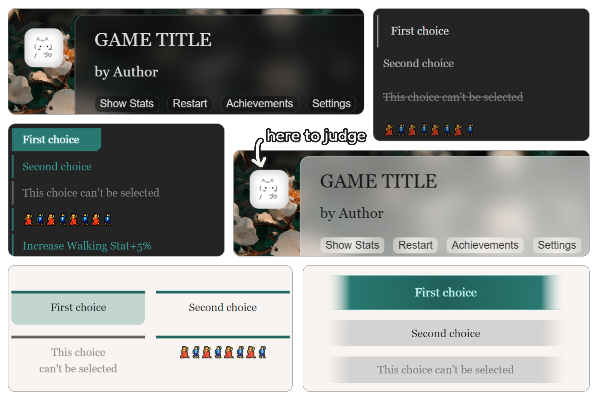
Features:
- custom background + glassmorphism body
- 4 custom choices: TES-esque for medieval fantasy stories, Cyberpunk(?) for... cyberpunk stories, Horizontal for horizontal stories???, Minimal for minimalists.
- toggle on a tiny avatar of your PC (or anyone) to judge your decision silently
- this userstyle can also be applied on moody.ink but the custom background will mess up its layout
Source code
/* ==UserStyle==
@name           dashingdon, choiceofgames - custom background/choices
@namespace      dashingdon.com, choiceofgames.com
@version        1.0.0
@description    dashingdon, choiceofgames - custom background/choices
@author         patapun
@preprocessor   stylus
@var text fontSize "Font size" 102%
@var checkbox maximalismWoo "Show background" 0
@var text bgUrl "Background URL (insert between quotation marks)"  "''"
@var checkbox toggleAvatar "Toggle avatar (PC/Tablet only)" 0
@var text avtUrl "Avatar URL (insert between quotation marks)"  "''"
@var color checkedColor "Color for selected choice (excl. Minimal/None)" #297871
@var select choiceStyle "Choice style" {"TESesque":"tes", "Horizontal":"horizontal", "Cyberpunkesque":"cyberpunk", "Minimal":"minimal", "None*":"none"}
==/UserStyle== */

@-moz-document regexp("^https:\\/\\/dashingdon\\.com\\/play\\/(?!.*\\/scenes\\/).*\\/?$"), domain("choiceofgames.com") {
  $main-bg=#f7f4f1;
  $main-bg-dark=#121212;
  if maximalismWoo {
    create-gradient(color-main) {
      radial-gradient(circle, rgba(color-main, 0.9) 0%, rgba(color-main, 0.5) 80%, rgba(color-main, 0.5) 100%)
    }
    create-button() {
      #buttons button { background: @background }
    }
    html {
      background: url(bgUrl) no-repeat fixed center;
      background-size: cover
    }
    .container { padding: 0 1rem }
    body {
      background: create-gradient(rgb($main-bg))
      backdrop-filter: blur(12px) saturate(55%)
      -webkit-backdrop-filter: blur(12px) saturate(55%)
      border-radius: 12px
      border: 1.5px solid rgba(255, 255, 255, 0.155)
      create-button()
    }
    body.nightmode {
      background: create-gradient(rgb($main-bg-dark))
      create-button()
    }
    body.whitemode {
      background: create-gradient(white)
      create-button()
    }
    .container {
      max-height: 95vh
      overflow-y: scroll
      &::-webkit-scrollbar {
        width: 10px
      }
    }
  }
  #buttons button {
    color: currentColor
    background: transparent;
    border: 1.3px solid rgba(#959595, .25);
    border-radius: 6px
    cursor: pointer
    padding: 2px
    padding-inline: 6px
  }
  if choiceStyle=="minimal" {
    .choice {
      border-left: 1px solid transparent
      padding: 11px 8px 11px 0
      text-align: start
      div {
        border: 0
        border-radius: 0
      }
      label {
        opacity: 0.75
        border: none
        border-radius: 0 !important
        transition: all .3s ease-in-out
        &:has( > input:focus-visible) {
          outline: 2px auto -webkit-focus-ring-color
        }
        &:has( > input:checked) {
          border-left: 1.5px solid currentColor
          opacity: 1
          padding: 11px 8px 11px 1.1rem
        }
      }
      input {
        -webkit-appearance: none
        margin: 0
      }
      .disabled {
        opacity: 1
        text-decoration-line: line-through
      }
    }
  }
  if choiceStyle=="tes" {
    create-gradient(color-main, color-middle) {
      linear-gradient(90deg, rgba(255, 255, 255, 0) 0%, color-main 10%, color-middle 50%, color-main 90%, rgba(255, 255, 255, 0) 100%)
    }
    .choice {
      input {
        -webkit-appearance: none
        margin: 0
      }
      div {
        border: 0
        border-radius: 0
        &:first-of-type {
          border-radius: 0
        }
        &:last-of-type {
          border-radius: 0
        }
        &:hover {
          background: transparent
        }
      }
      label {
        border: none
        border-radius: 0 !important
        display: block
        padding: 0.45rem
        margin: 0.9rem 2rem
        text-align: center
        text-wrap: balance
        mask-image: create-gradient(black, black)
        background: alpha(#959595, 0.35)
        transition: all 0.3s cubic-bezier(.15, .54, .65, .89)
        transition: all 0.1s cubic-bezier(.15, .54, .65, .89)
        &:hover {
          background: alpha(#959595, 0.55) !important
        }
        &:has( input:checked) {
          padding: 0.7rem 0.3rem
          color: lighten(checkedColor, 80%)
          font-size: 1.1rem
          text-shadow: 0 0 2px lighten(checkedColor, 25%)
          background: create-gradient(checkedColor, darken(checkedColor, 20%)) !important
          border-top: 1px solid lighten(checkedColor, 10%)
          border-bottom: 1px solid lighten(checkedColor, 10%)
        }
        &:has( > input:focus-visible) {
          outline: 2px auto -webkit-focus-ring-color
        }
      }
      .disabled {
        color: #808080
        text-shadow: none
      }
    }
  }
  if choiceStyle=="horizontal" {
    .shuttle { display: none; }
    .choice input {
      -webkit-appearance: none
      margin: 0
    }
    .choice { /*credit to smolcss.dev*/
      --min: 18ch
      --gap: 1rem
      display: grid
      grid-gap: var(--gap)
      margin: 1.8rem auto
      grid-template-columns: @css {repeat(auto-fit, minmax(min(100%, var(--min)), 1fr))}
    }
    .choice div {
      position: relative
      border: 0
      box-sizing: border-box
      border-radius: 0 0 10px 10px !important
      transition: all 0.3s ease-in-out
      &:first-of-type {
        border-radius: 0
      }
      &:last-of-type {
        border-radius: 0
      }
    }
    .choice div::before {
      content: ''
      display: block
      box-sizing: border-box
      position: absolute
      width: 100%
      height: 100%
      border-top: 0.25rem solid darken(checkedColor, 15%)
      pointer-events: none
    }
    body.nightmode .choice div::before { border-top: 0.25rem solid lighten(checkedColor, 15%) }
    .choice label {
      border: none
      border-radius: 0 !important
      display: block
      height: fit-content
      padding: 0.8rem
      word-break: break-word
      text-align: center
      text-wrap: balance
    }
    .choice div:hover {
      background: alpha(checkedColor, 0.18)
    }
    body.nightmode .choice div:hover { background: alpha(lighten(checkedColor, 15%), 0.18) }
    .choice label:hover {
      background: none !important
    }
    .choice div:has( input:checked) {
      background: alpha(checkedColor, 0.25)
    }
    body.nightmode .choice div:has( input:checked) { background: alpha(lighten(checkedColor, 15%), 0.25) }
    .choice label:has( > input:focus-visible) {
      outline: 2px auto -webkit-focus-ring-color
    }
    .choice .disabled, .choice div:has( .disabled) {
      filter: grayscale(100%)
      opacity: 0.95
    }
  }
  if choiceStyle=="cyberpunk" {
    gradient-hack(color) {
      linear-gradient(90deg, alpha(color, 1) 0%, alpha(color, 1) 50%, alpha(color, 0) 50%)
    }
    .choice {
      margin: 2rem auto
    }
    .choice input {
      -webkit-appearance: none
      margin: 0
    }
    .choice div {
      box-sizing: border-box
      width: fit-content
      border: 0
      border-radius: 0
      margin-top: 0.3rem
      border-left: 3px solid darken(checkedColor, 3%)
      mask-image: linear-gradient(140deg, rgba(0, 0, 0, 1) 96%, rgba(0, 0, 0, 0) 96.2%, rgba(0, 0, 0, 0) 100%)
      transition: all 0.3s ease-in-out
      &:first-of-type {
        border-radius: 0
      }
      &:last-of-type {
        border-radius: 0
      }
    }
    .choice label {
      border: none
      border-radius: 0 !important
      display: block
      width: fit-content
      color: darken(checkedColor, 3%)
      padding: 0.3rem 2rem 0.3rem 0.8rem
      transition: all 0.3s ease-in
    }
    body.nightmode .choice label { color: lighten(checkedColor, 15%) }
    .choice label:hover {
      background: none !important
    }
    .choice div:hover {
      background: alpha(checkedColor, 0.15)
    }
    .choice div:has( input:checked) {
      background-image: gradient-hack(checkedColor)
      text-shadow: 0 0 2px lighten(checkedColor, 60%)
      background-size: 200% 200%
      animation: background 0.5s ease-in-out forwards
    }
    @keyframes background {
      0% {
        background-position: right
      }
      100% {
        background-position: left
      }
    }
    .choice label:has( input:checked) {
      color: lighten(checkedColor, 95%)
    }
    .choice label:has( > input:focus-visible) {
      outline: 2px auto -webkit-focus-ring-color
    }
    .choice div:has( .disabled), .choice .disabled {
      filter: grayscale(100%)
      text-shadow: none
    }
  }
  if toggleAvatar {
    @media (min-width: calc(43rem + 100px)) {
      body::before {
        content: ''
        display: block
        position: fixed
        box-shadow: 0px 5px 15px 5px rgba(0,0,0,0.1),inset 0px 0px 10px 3px rgba(0,0,0,0.2);
        border-radius: 12px
        width: clamp(3rem,5vw,80px)
        height: clamp(3rem,5vw,80px)
        background: url(avtUrl) no-repeat center;
        background-size: cover
        margin-left: calc(0px - clamp(3rem, 0.2308rem + 6.1538vi, 5rem)) /*credit to utopia.fyi*/
        top: 1rem
      }
    }
  }
}